OUR BLOG

Here you will find our latest works, company news and more. We update it on a regular basis so be sure to come back soon. Please like, share, pin or tweet the post you enjoy.

Laundry Detergent Package Design for St. Louis Area Manufacturer

Posted on April 27, 2015

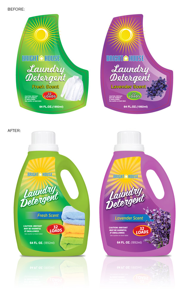
Stellar Manufacturing recently contracted Visual Lure to spruce up a couple labels for their new line of laundry detergent. The store buyer, the person in charge of selecting what products will go in a store, turned down the initial labels that were designed by another graphic designer. Stellar came to us to develop package designs that the buyer wouldn’t say no to, and we did just that. With only one minor round of revisions, the buyer accepted our designs.

The moral of this story is to hire and invest in a good package designer the first time around. Subpar package design is one of the main reasons products get turned down by buyers. Having visual pleasing, eye-catching packaging is critical in the success of a product. With all the other products on the shelf, yours needs to stand out, look professionally designed and give buyers an immediate sense of trust.

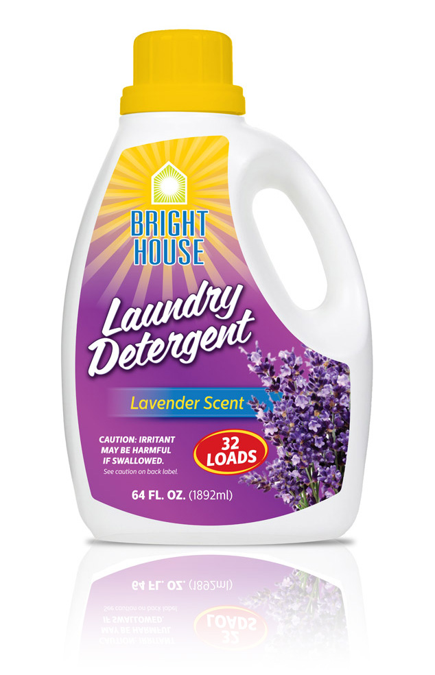
Below are the before and afters of the first two scents in Stellar’s new line of Bright House Laundry Detergents, Fresh Scent and Lavender.
BH-BfrAtr-package-design

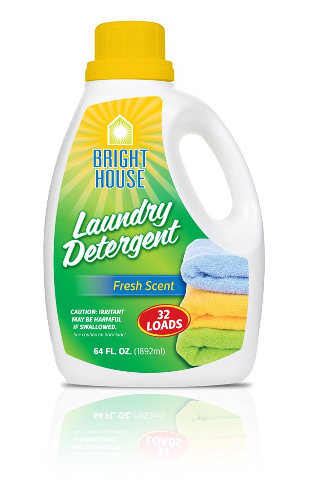
…and here are our original designs, which we still feel are stronger:
BHLDFS-package-design

BHLDLS-package-design

Contact Visual Lure today at 618.407.9231 for a FREE package design quote. We would love to help you get your products past the store buyer and onto shelves.

Package/Label Design for a St. Louis Metro East Glass Cleaner Manufacturer

Posted on November 6, 2014

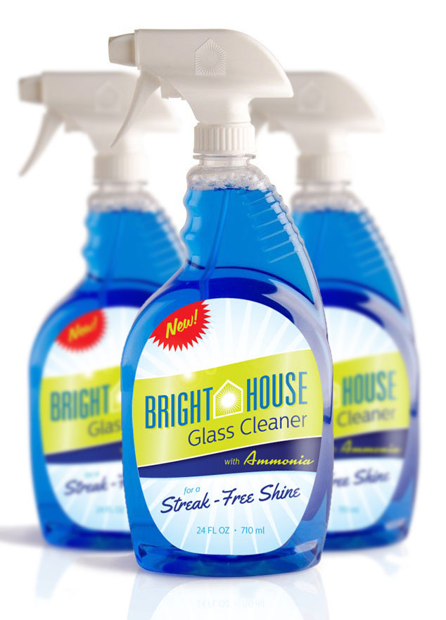
Visual Lure recently completed the following label/package design for Bright House Glass Cleaner. Bright House is a manufacturer of household cleaning products and is located in the St. Louis Metro East in Columbia, Illinois. Visual Lure has also designed packaging for other Bright House products including their dishwashing soap. Click here to view that design project.

We feel that the new packaging looks “fresh and clean” which are the characteristics you want a glass cleaner to have. We were able to achieve this look by using a subtle “shiny/gleaming” background, a bright green and blue color palette along with clean and modern typography. The fire engine red “new burst” will also help the label jump off the shelf and attract eye-balls which is what good package design does.

Bright House Glass Cleaner package design

What to see more?ย  Click here to view additional package design projects ยป

Need help with a package design project? Give us a call or shoot us an email, we would love to provide you with a FREE quote.

Package Design for Pleasant Touch Dishwashing Soap

Posted on July 28, 2014

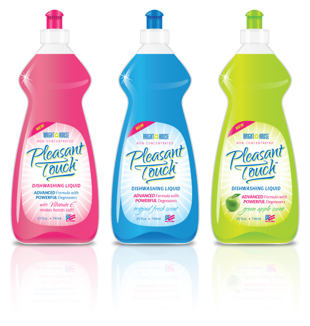
A St. Louis metro east manufacturer recently contracted Visual Lure to design a logo and packaging label for a new dish soap they are currently developing called Pleasant Touch. There will be three different products at initial launch: original fresh scent, green apple scent, and one with Vitamin E (to keep customer’s hands soft).

Below is our proposed design for the new bottles. We are currently waiting for feedback and will share any updates related to this project.

package graphic design for Pleasant Touch Dish Soap

Check out our graphic design portfolio, click the following link to learn more about our graphic design services, or contact us today if you are in need of professionally designed packaging.

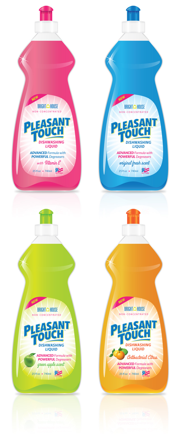
UPDATE: Our client decided to add one additional scent, switch out the logo to another one we designed and make a couple minor adjustments. Here are the final four designs:

pleasant-touch-packaging

Packaging Design for St. Louis Air Freshener Manufacturer

Posted on October 25, 2013

Our client asked that we remove this post. Please click here to view more of our packaging design work ยป

We can not stress enough the importance of quality packaging design. Having a quality product DOES NOT MATTER if the packaging doesn’t catch consumer’s eyes in a sea of its competition. If you are looking for professional packaging design, whether youโ€™re in the St. Louis, MO area or anywhere else in the country, contact Visual Lure for a FREE quote today.

Learn more about our graphic design services and donโ€™t forget to check out our graphic design portfolio.

St. Louis Packaging Design for Automatic Toilet Bowl Cleaners

Posted on June 13, 2013

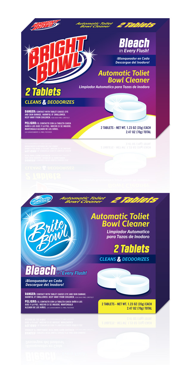
A St. Louis Metro East manufacturer of automatic toilet bowl cleaners recently contracted Visual Lure to design its new packaging. They haven’t decided on whether to use the name Bright Bowl or Brite Bowl, and they wanted to have packaging design options for both.ย  However, once they reviewed our initial design options, they may utilize both.

Of their two main competitors, one uses blue packaging and the other uses green. They wanted their product to look completely different so they didn’t want to uses either of those colors. They also wanted their product to appeal to their main target audience, women, so we decided to use the color purple.ย  Color studies and research have shown that women like it.

Below are the two packaging design options we provided.ย  Check back soon to see if they use one design or both.

St. Louis package design for brite/bright bowl

If you are looking for professional packaging design, whether you’re in the St. Louis, MO area or anywhere else in the country, contact Visual Lure today.

Learn more about our graphic design services and donโ€™t forget to check out our graphic design portfolio.

Package Design for New USAF Band of Mid-America CD

Posted on May 6, 2011

Visual Lure was recently contracted to design the packaging for a new CD being released by the United States Air Force Band of Mid-America.ย  It will be featuring the sounds of Clifton Williams, a famous composer and Air Force veteran.ย  Here is a sneak peek at our proposed cover which will feature Clifton’s signature embossed and foil stamped on a nice textured paper.

CD packaging design

Final Jackrabbit Energy Chews Package Design

Posted on January 15, 2010

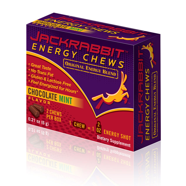
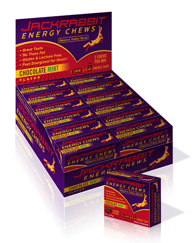
Here is the final package design for Jackrabbit Energy Chews.

Jackrabbit Energy Chews package design

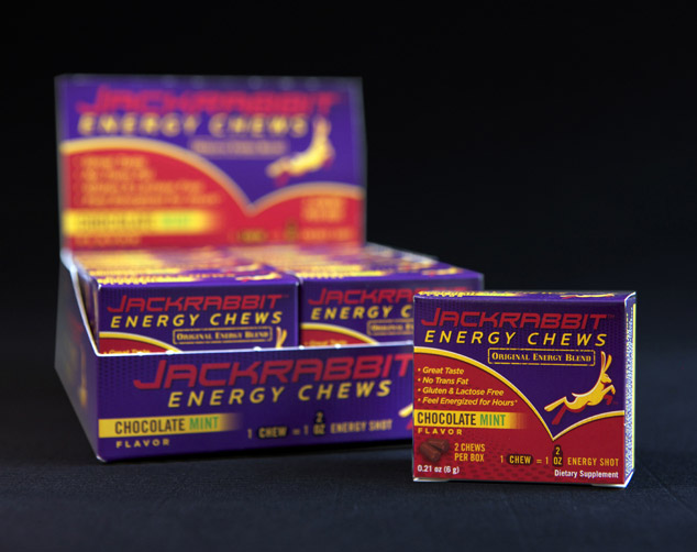
Complete Packaging System

Here is the actual package design photographed:

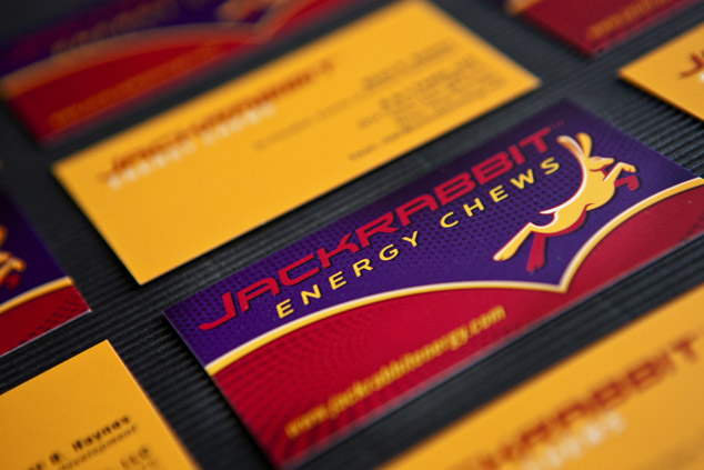
and the business cards we designed: