LOGO CLEANUPS, MODIFICATIONS, REDESIGNS & UPGRADES
Do you have an existing logo that looks dated or unrefined but you’re hesitant to explore a complete redesign because you feel it has too much brand equity or brand recognition? Or maybe you just need an existing logo converted into vector artwork with different formats. Either way, Visual Lure can help. Take a look at some of our sample logo refreshes below and contact us today for a free logo upgrade quote!
Below are a handful of before/after logo samples:
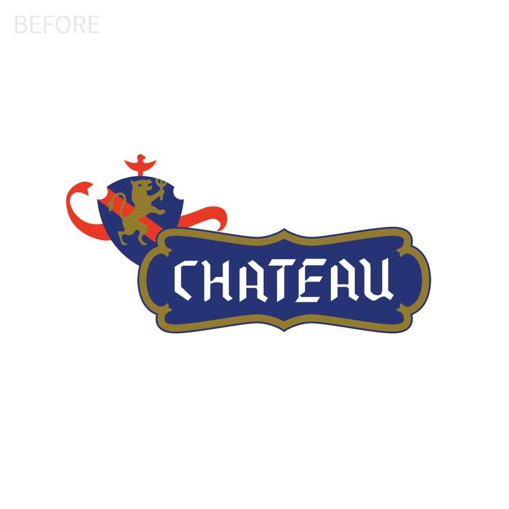
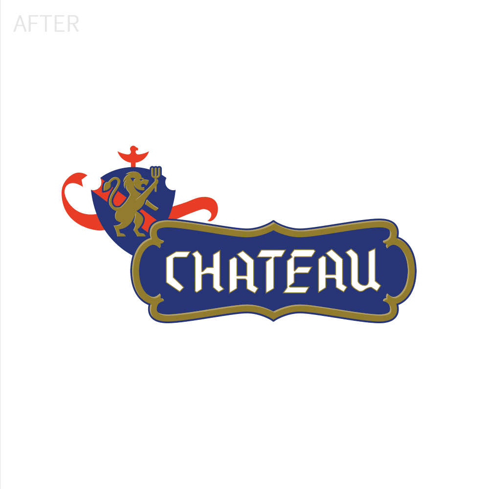
CHATEAU LOGO CLEANUP
The major issue with the old logo was that the lion no longer looked like a lion. It had skinny legs, the head looked funny, and the details had gotten lost over time. We redrew the lion by hand and converted it in Adobe Illustrator. The red stripe was competing with the lion so we added an outline around it for better definition. Lastly, we provided the logo in a vertical format option along with multiple one-color lockups.
Logo Lockups & Sample Deliverables:![]()
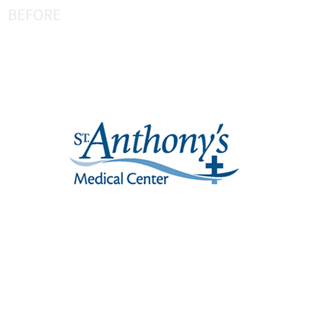
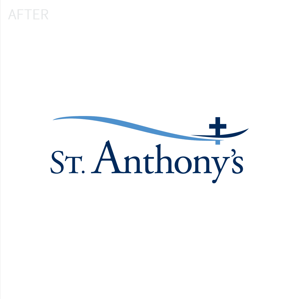
ST. ANTHONY’S LOGO REDESIGN
St. Anthony’s requested a new logo, yet they still wanted to stay true to their original design. The old logo’s “cross curve” felt amateurish and not quite dialed in, and the typography looked dated. Our solution was to simplify the curve, move it to the top, and refine the logotype.
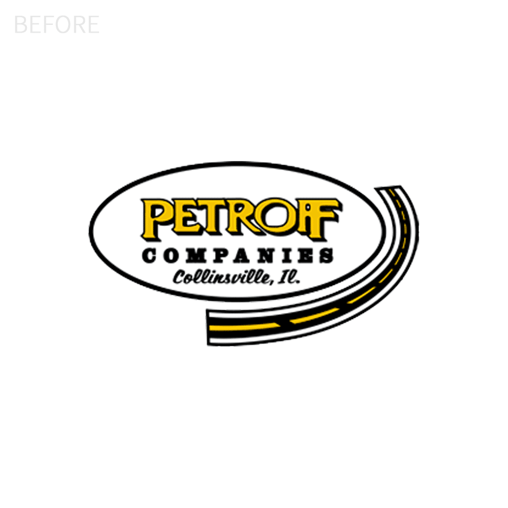
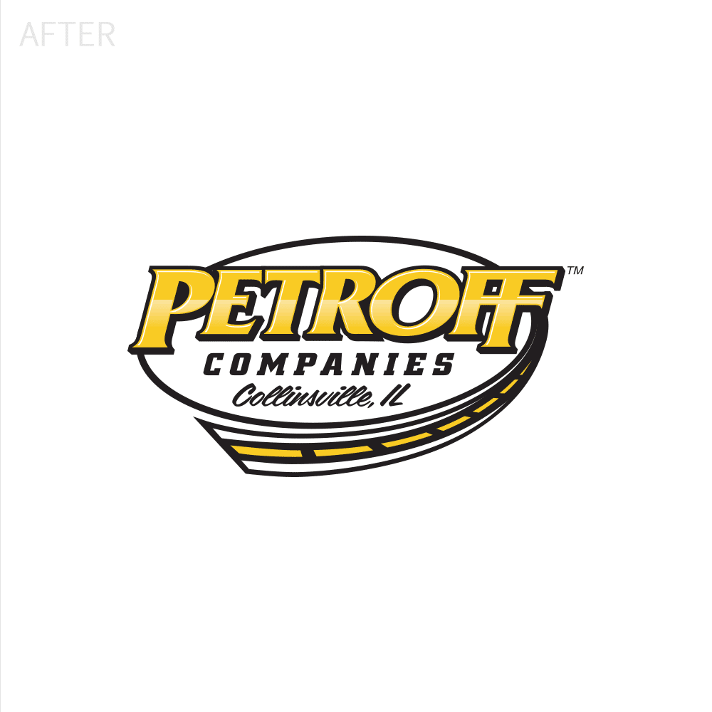
PETROFF LOGO UPGRADE
The old logo for Petroff was most likely created by an entry-level graphic designer or converted by a sign guy with limited vector experience. It was all in individual pieces making it look extremely basic. Visual Lure leveraged the concept behind their existing logo and completely redesigned it. We integrated the road with the circle and overlaid the type so that the logo felt like one cohesive piece. We also italicized the type to give it a sense of motion.
Logo Lockups & Sample Deliverables:
![]()
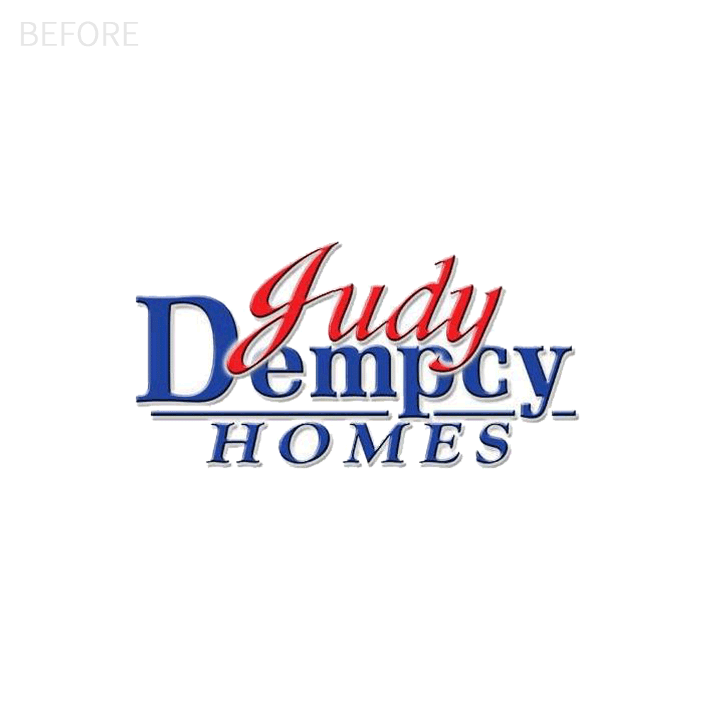
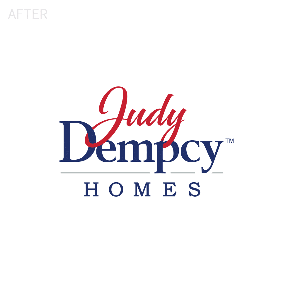
JUDY DEMPCY LOGO UPGRADE
Judy Dempcy Homes came to Visual Lure for a logo upgrade. The old logo felt dated, a little cramped vertically, and there was no need for the drop shadow. We updated the “Judy” type with a more friendly and approachable script, opened it up vertically to give it some breathing room, and interlooped a couple of letters to make it look more custom.
Logo Lockups & Sample Deliverables:
![]()
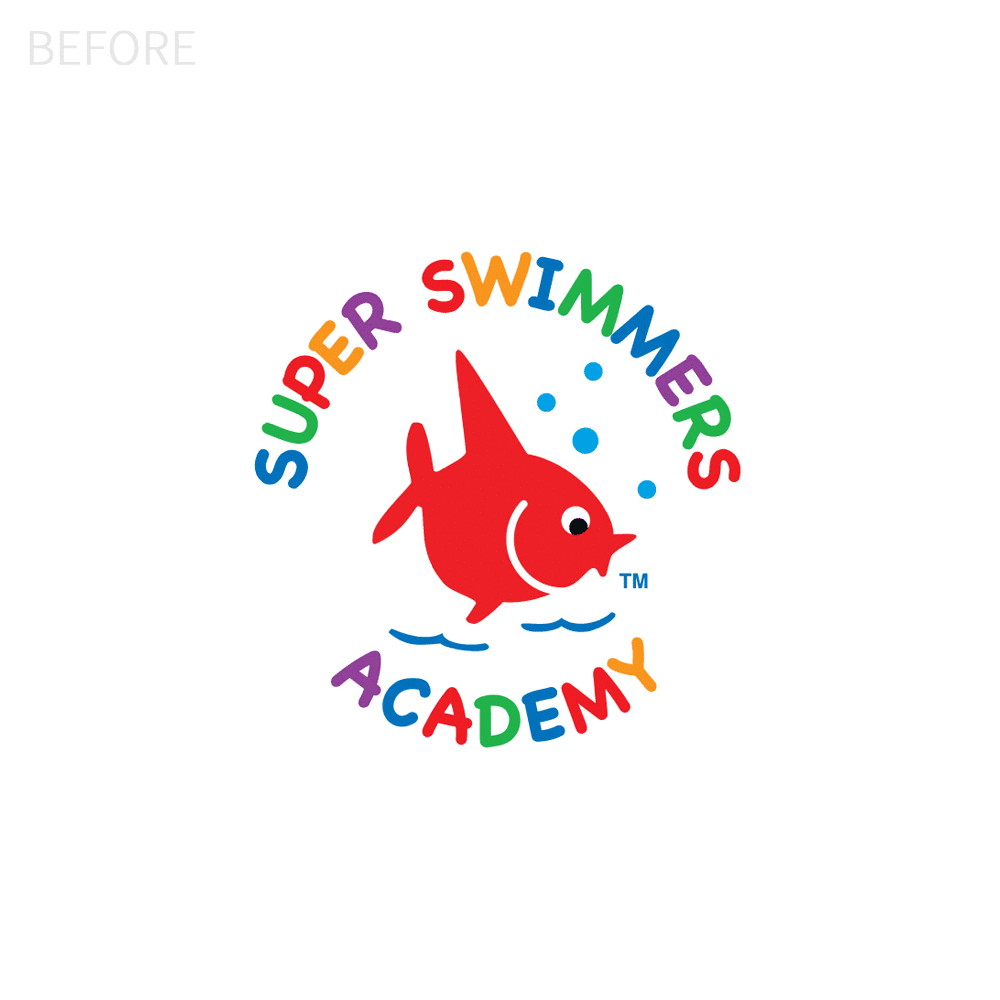
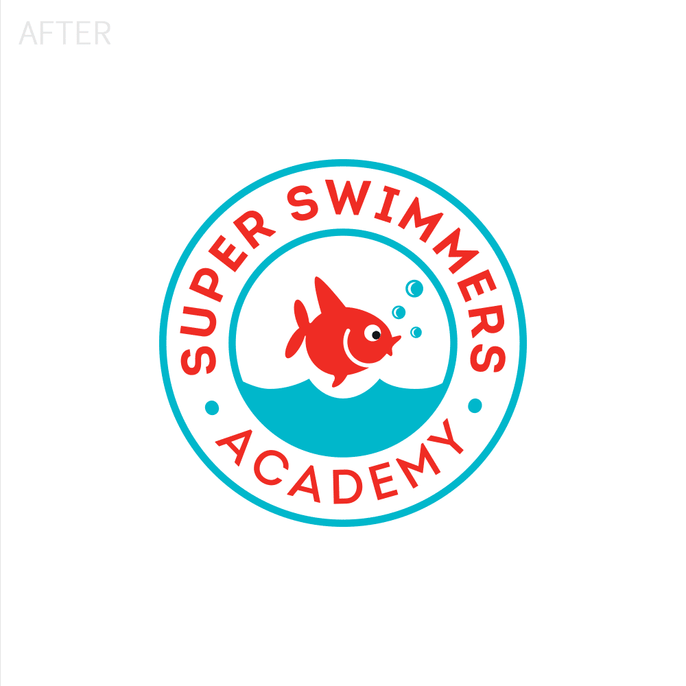
SUPER SWIMMERS LOGO UPGRADE
When Super Swimmers approached Visual Lure for help, they were seeking to refine their logo. The type being used felt cliché, there was no need for all the different colors, and the fish illustration was a little off. The top fin was too large and the curves of the fish looked choppy. We redrew the fish, selected a new typeface that looked friendly, and dropped it to two colors.
Logo Lockups & Sample Deliverables:
![]()
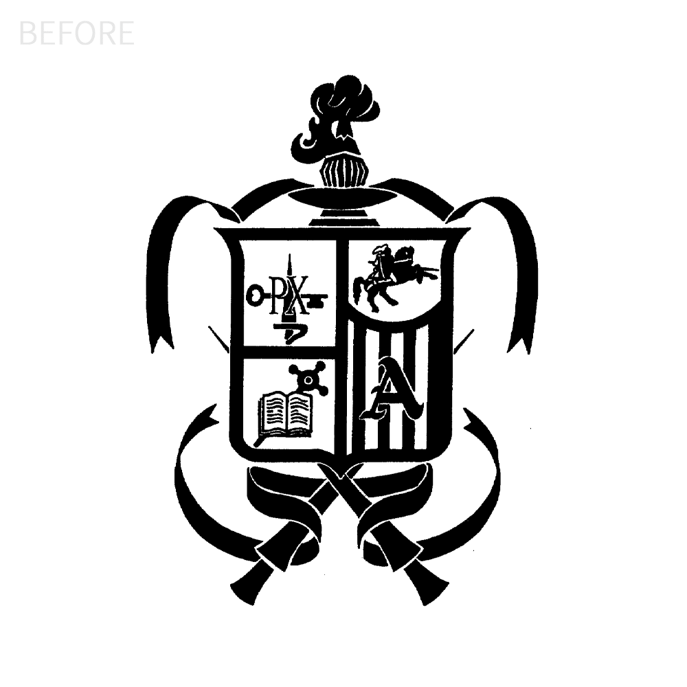
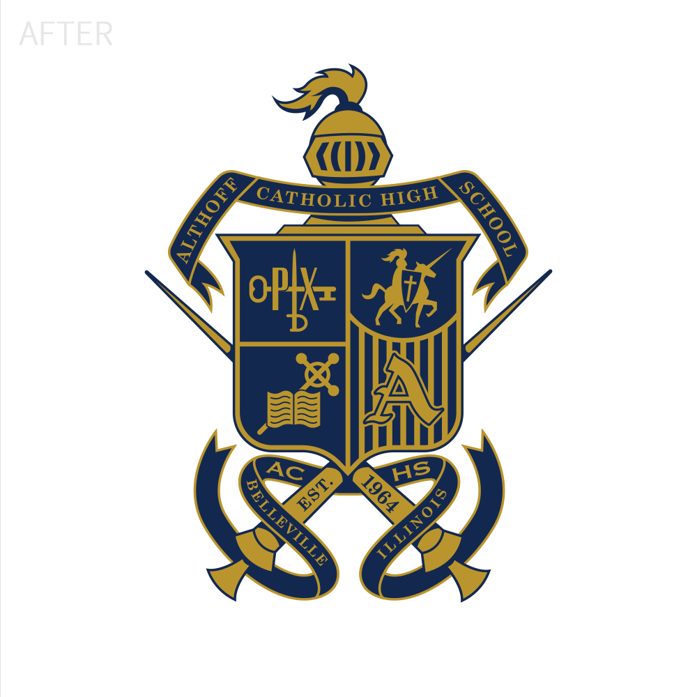
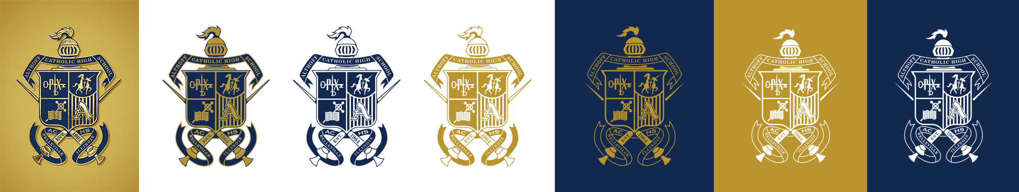
ALTHOFF CREST CLEANUP
Evident issues include spacing problems, variations in size, and an overall lack of clarity. Moreover, the horse and knight seem to be outdated clip art, leading to a loss of detail and a somewhat blob-like appearance when resized to fit within the crest. The excessively exaggerated plume on the helmet further complicates identification.
Logo Lockups & Sample Deliverables:
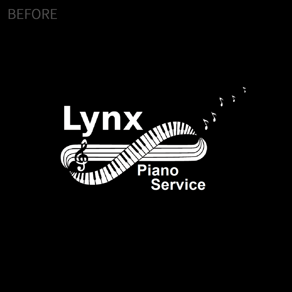
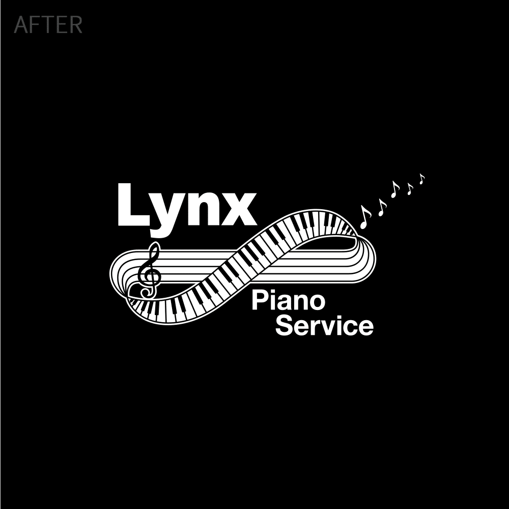
LYNX PIANO SERVICE LOGO CLEANUP & VECTOR CONVERSION
Lynx came to Visual Lure to simply convert their logo into vector artwork. They hired another designer to do the conversion, but it was all a little off. The spacing didn’t look right, the treble clef was chopped into three pieces and they wanted the loop to connect. We addressed those issues in our conversion, giving them exactly what they wanted.
ABMAT LOGO REDRAW & CLEANUP
This logo looked like it had been cut out with scissors. The thickness of the letters were inconsistent, and the letterforms were completely distorted. We redrew this logo by hand and then converted it to vector artwork. We also increased the size of the registered trademark symbol and the patent number – as those were not legible at small sizes.
![]()
![]()
ARTUR EXPRESS LOGO UPDATE
Using their original logo, we cleaned it up, modernized the type, and balanced off all the spacing.
![]()
![]()
BELL BUD/KETTLEBELL ROPES LOGO UPGRADE
The creators of Kettlebell Ropes were using a hand drawn illustration of their mascot, Bell Bud, which looked unprofessional to say the least. They wanted him refined and converted into vector artwork so that it could be used in silk screening. We redrew Mr. Bud turning the handle into buff arms, and changed his expression – keeping it friendly – but adding a wink.
![]()
![]()
Logo Lockups & Sample Deliverables:
![]()
BJJLA LOGO UPDATE
We refined BJJLA’s existing logo—originally designed with what appeared to be clip art or stock imagery—to create a more balanced and legible design. In the original, “Lifestyle Academy” was squeezed into a small section of the black belt, making it nearly half the size of the other text. When converting the logo into vector art, we redrew the belt to allow for consistent font sizing, matching the word “Brazilian” for improved readability and visual harmony.
![]()
![]()
Logo Lockups & Sample Deliverables:
![]()
LEARN MORE ABOUT OUR LOGO DESIGN SERVICES
LOGO DESIGN PORTFOLIO
Want to see more of our logo design work? Check out our complete logo database:
LOGO DESIGN PROCESS
If you decide to have Visual Lure design your logo, this is how the process will go:
BRANDING PORTFOLIO
If you’re looking for more than just a logo, but a comprehensive branding package, check out some of our branding work: