OUR BLOG

Here you will find our latest works, company news and more. We update it on a regular basis so be sure to come back soon. Please like, share, pin or tweet the post you enjoy.

Justen Hong Featured in VoyageSTL’s Most Inspiring Stories in St. Louis

Posted on July 15, 2024

Justen Hong was recently featured in VoyageSTL’s “Most Inspiring Stories in St. Louis.” VoyageSTL aims to spotlight the amazing individuals who bring life and vibrancy to the St. Louis, MO area. The publication highlights incredible artists, creatives, entrepreneurs, and change-makers, celebrating their unique stories.

VoyageSTL is part of the LA-based Voyage Group of Magazines. Their mission is to promote small businesses, artists, creatives, and makers by providing a platform for these hidden gems to share their stories in their own words.

Justen Hong VoyageSTL interview

Click here to read the interview ยป


Logo & Packaging for New Healthy Dog Snacks Brand

Posted on June 11, 2024

DogNosh, an emerging pet brand specializing in dog snacks, enlisted Visual Lure for the development of their new logo and packaging design. As a brand focused on promoting canine health, they expressed a preference for the color green and sought a modern and refreshing aesthetic. Below, we present our initial logo concepts, followed by corresponding packaging designs.

In the top left corner, we present a logotype featuring a custom hand-drawn ‘g’, subtly incorporating a hidden dog face within the ‘og’ combination. The custom ‘g’ in the logo provides a sense of fun and uniqueness, contributing to its memorability.

In the top right corner, we explore a modern condensed logotype, with customized lettering and curved edges strategically placed for added visual interest.

For a touch of playfulness, we developed a logotype in the bottom left corner, where we integrated a dog tail into the letter ‘S’. This whimsical element adds charm while maintaining the brand’s essence.

Lastly, we ventured into more unconventional territory with a design aimed at disrupting the typical visual landscape of dog snack packaging. This concept pushes boundaries to ensure maximum visibility and shelf impact, setting DogNosh apart from mainstream competitors.


Logo design options for healthy dog snacks

Packaging Design Options:

Following the logo exploration phase, we delved into designing packaging options tailored to each prospective logo. This process allowed us to visualize how each logo would translate onto packaging, ensuring coherence and resonance with DogNosh’s brand identity.

DogNosh packaging design all

Packaging Option 1:

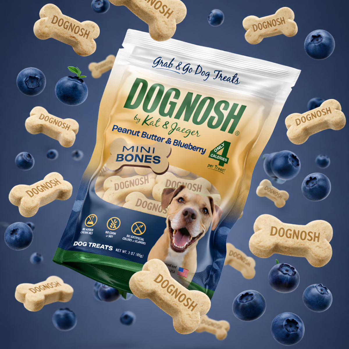
DogNosh packaging design option 1

Packaging Option 2:

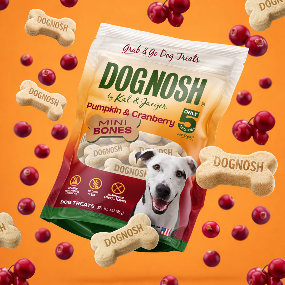
DogNosh packaging design option 2

Packaging Option 3:

DogNosh packaging design option 3

Packaging Option 4:

DogNosh packaging design option 4

More to come…

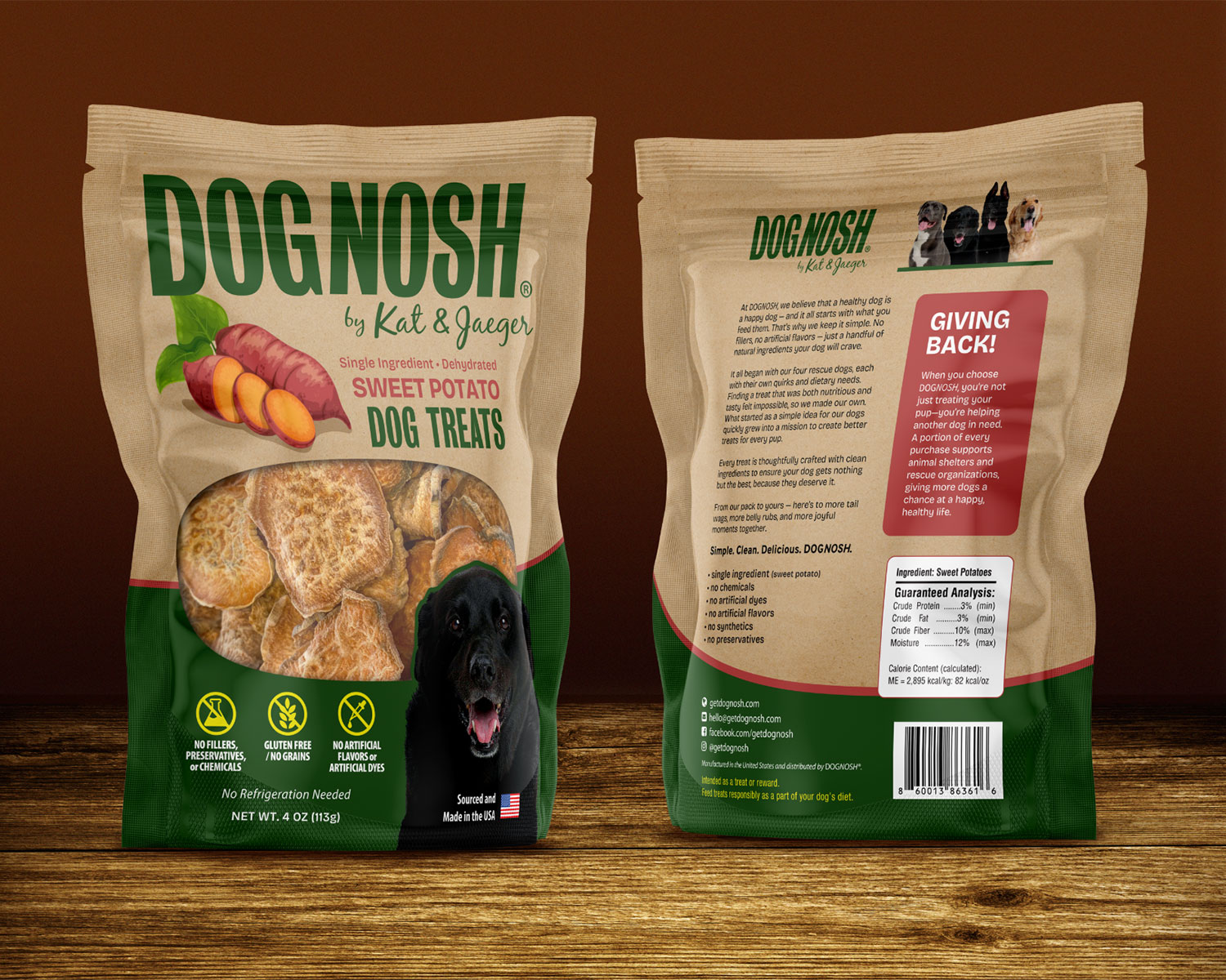
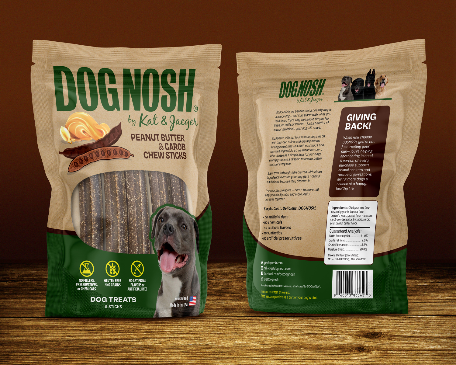
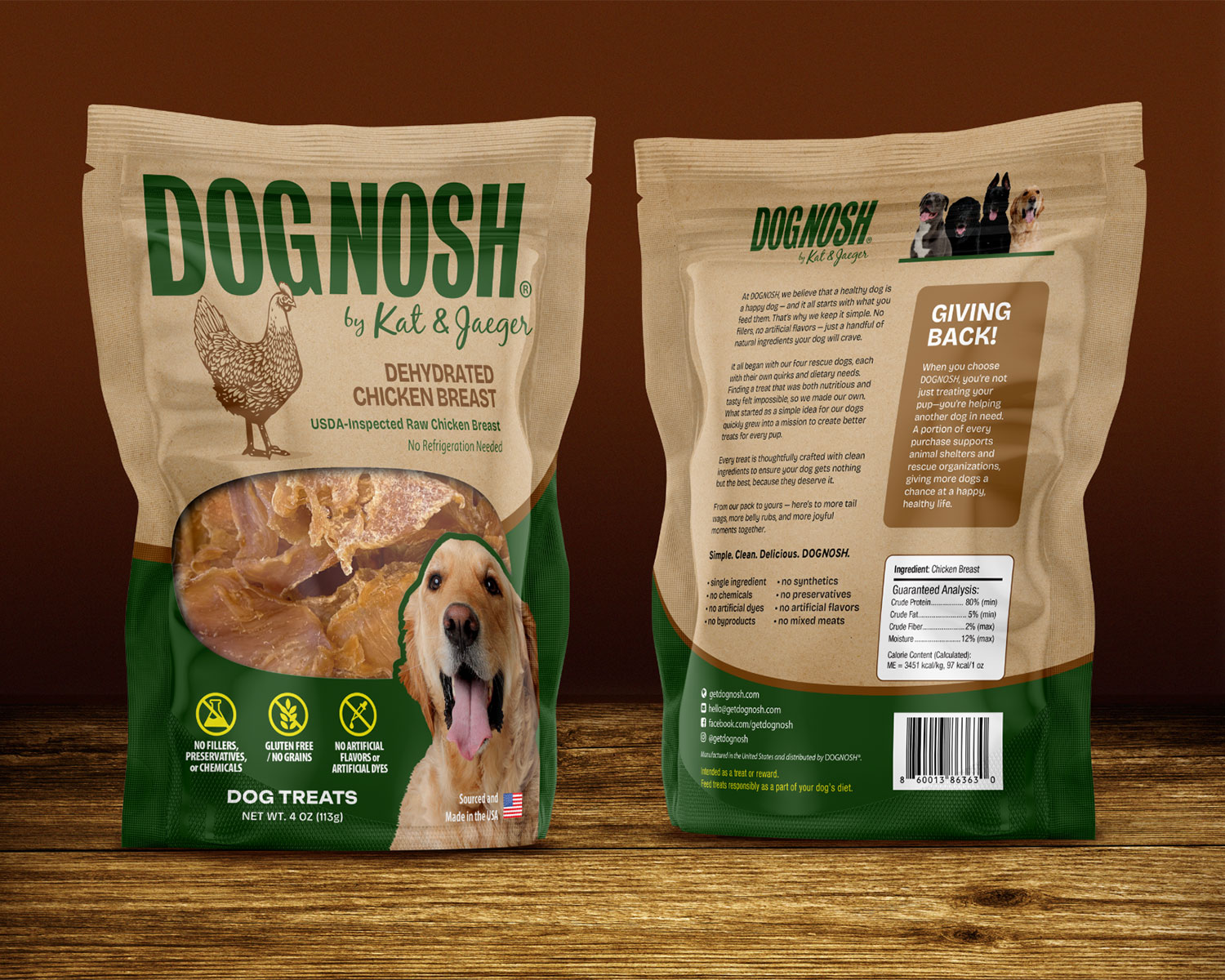
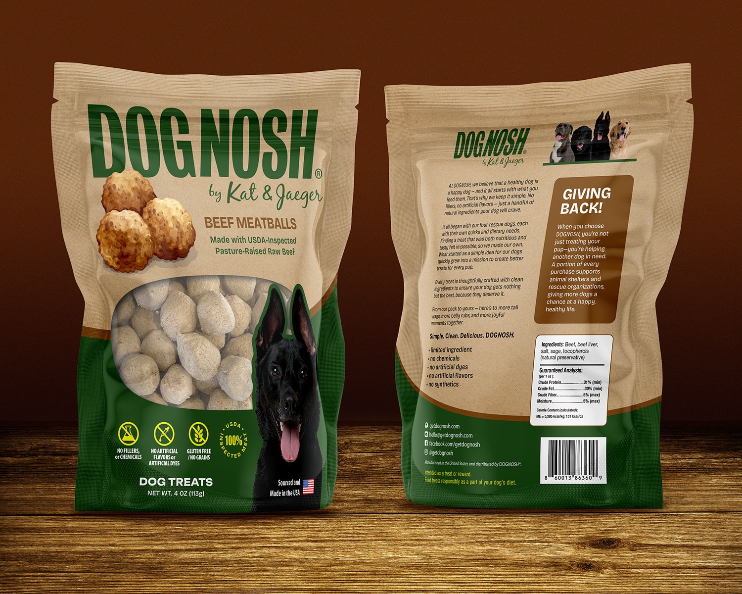
Dognash is gearing up to launch four new exciting products in total! Stay tuned to discover which packaging they’ve selected for the first product, and keep an eye out for the unique designs of the remaining three packages.


Need expert branding and package design services?

If you’re on the brink of launching a new product and require expert branding and package design services, look no further than Visual Lure. Contact us today for a FREE quote. Don’t gamble with subpar or novice designers. Ensure your product makes a lasting impression from the start, preventing potential rejections from buyers due to lackluster presentation.

For further insights into our packaging services, explore:

Cleaning Up & Fixing a Logo to One of My Favorite Restaurants

Posted on April 29, 2024

Mungo’s Italian Eatery, located in Collinsville, Illinois, is one of my family’s favorite restaurants. My wife and I have been patrons since the mid-1990s, and their logo has always bothered me. It appears as though it was cut out with scissors, with messy proportions, inconsistent letter thickness, and improper sizing. So, I took it upon myself to meticulously redraw and refine every aspect by hand.

Here is the before & after:

mungos-logo-before-after

…and here are some lockups:

mungos-logo-lockups

mungos logo before after 2

…and here are a couple mockups:

mungos-logo-glassย  mungos-logo-apron

embossed-leather mungos logo

Needs a logo spruced up?

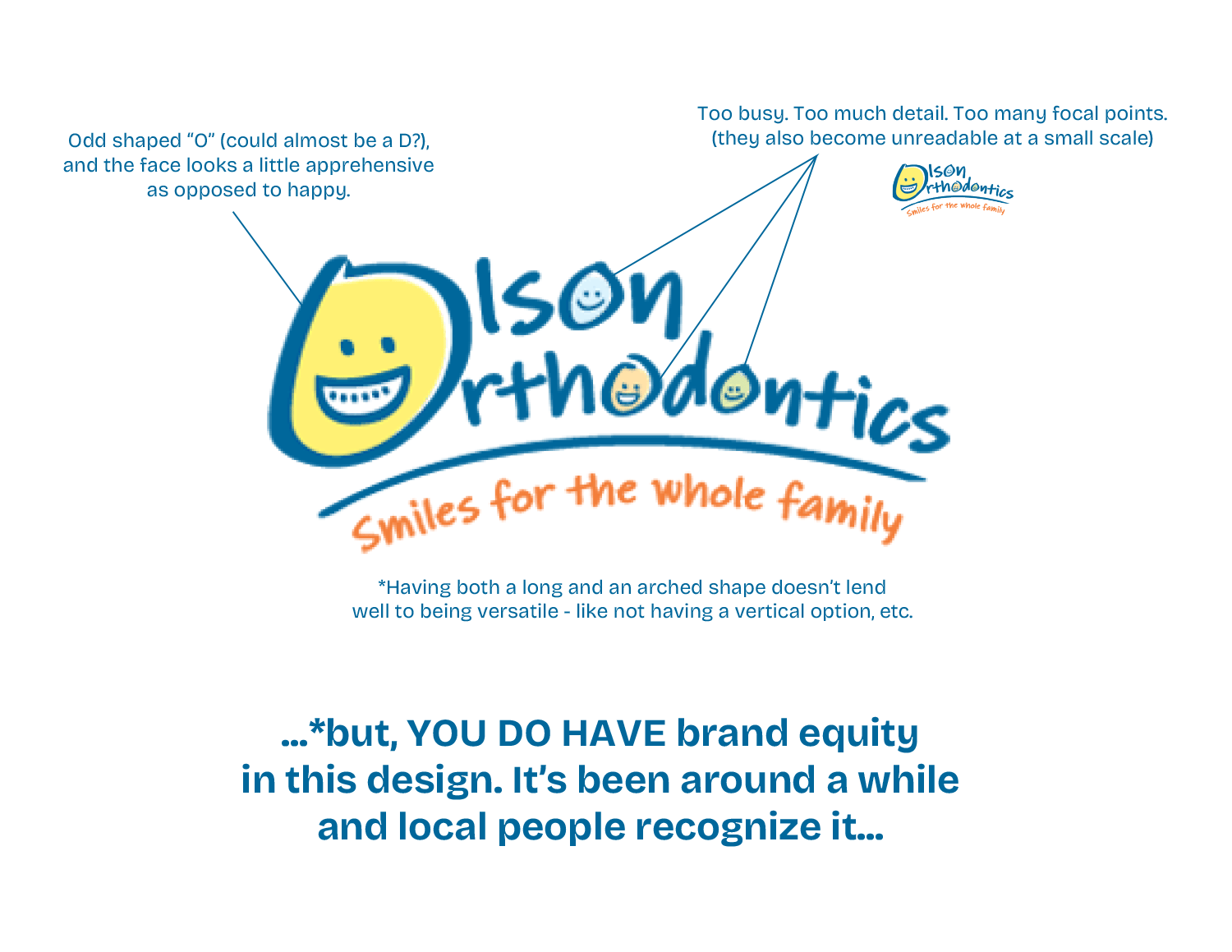
Does your logo have current brand equity, but it doesn’t look great and lacks visual appeal? Does your logo simply need to be cleaned up, refined, or slightly modernized? If so, we can help. Shoot us an email or give us a call today – as we would love to help.

New Logo for Private Bar/Lounge Coming to O’Fallon, Illinois

Posted on

BEYOND is a private, members-only bar/lounge coming to the Blade Building’s 5th floor in O’Fallon, Illinois. The founder described the establishment as follows:

BEYOND isnโ€™t just a haven for the finest cocktails, but a sanctuary where people gather to inspire and be inspired. Our Founding Fathers envisioned BEYOND as a place where people could shed the weight of everyday expectations and dare to dream bigger and reach further. And so, BEYOND lives up to its name, helping its members reach BEYOND their dreams, see BEYOND the possible, and believe in their wildest imagination. Pursue what seems impossible. Go BEYOND.

Here were our initial explorations which were heavily inspired by bourbon logos and labels:

Beyond logo options

…and here are the final logo lockups. The final logo was inspired by a barrel, but in an abstract/ambiguous way as bourbon, whiskey, and wine all use barrels to age and refine.

Beyond logo final lockups

…and here are some mock-ups to show how the logo can be implemented:

Beyond logo glass beyond hat design Beyond logo pin design

Full Branding Package for a Local Cleaning Company

Posted on July 12, 2023

Visual Lure recently partnered with a local cleaning company to undergo a comprehensive rebranding. Our extensive package encompassed logo design, identity design, branding materials, advertisements, website development, and ongoing SEO services. The previous company name, “The Clean Queen,” was initially fitting when it was comprised of a small group of women. However, as the company expanded and welcomed both men and women into its team, it became necessary to update the name. Additionally, considering the client’s aspirations for possible future franchise expansions, a more versatile name was desired.

We embarked on the rebranding journey by focusing on the logo design. Presented below are the initial options we developed. The top option showcases a sun rising against a blue sky, symbolizing a “starting a new day”, complemented by two leaves representing “freshness”. The middle option features a simple yet elegant custom hand-drawn typeface – exuding cleanliness and freshness. Lastly, the bottom option incorporates clean sparkles to form a letter F monogram.

Fresh Start cleaning logo options

After careful consideration, the client selected the following option as their preferred logo. Here are all the final logo lockups we delivered:Fresh Start final logo lockups

Building upon the logo, we proceeded to develop a comprehensive identity package for the client. This included a basic styling guide, business cards, letterheads, trailer, and additional supplementary materials.

FSCC identity design

FSCC business card design

FSCC vehicle wrap design

We wrapped up the package with a fully custom, search engine optimized WordPress website.

Fresh Start web design

Furthermore, we are committed to providing ongoing SEO services and consulting to ensure the client’s website achieves high rankings and effectively converts visitors into loyal customers.

We are thrilled with the final outcome and firmly believe that the new brand exudes an exceptional sense of cleanliness and freshness.

Check out the new Fresh Start Cleaning website at www.fscleanco.com ยป

Click here to see the entire branding package ยป