Logo Redesign for a St. Louis based Railway Company
Our client wanted to change their logo from its full name, to its initials, due to confusion with another branch of their business. They wanted to keep the existing color pallet while maintaining some type of cohesion between the old logo and the new. So, we modernized the icon and added some strength to the logo that we thought was lacking. While we did like the old logo, it felt a little fragile for such a rugged industry. Here is the before and after:

Logo Redesign
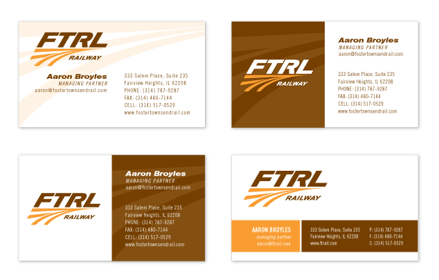
…and here are the business card design options we provided:

business card design options
Categories:Logos & Branding

