In 2026, Visual Lure will celebrate 25 years in business, so I decided to create a special 25th-anniversary logo to mark the occasion. I started sketching and came up with about six solid concepts, then began rendering them out. Over the next few days, new ideas kept coming—one after another—until I had around fifteen. At that point, I figured I might as well see if I could reach twenty-five. I revisited a few old anniversary logos and other Visual Lure logo explorations, reworking them into 25th-anniversary versions, and eventually hit the goal. Here they are, in all their glory, along with brief descriptions of how each one came to be.
…and thank you to all my clients—past and present—for supporting the thing I love to do. Thanks also to my business partners, vendors, and my wife for all the support over the past 25 years. In an industry where design companies often come and go, it’s a true testament that I’ve been able to do this for so long. Thank you again!
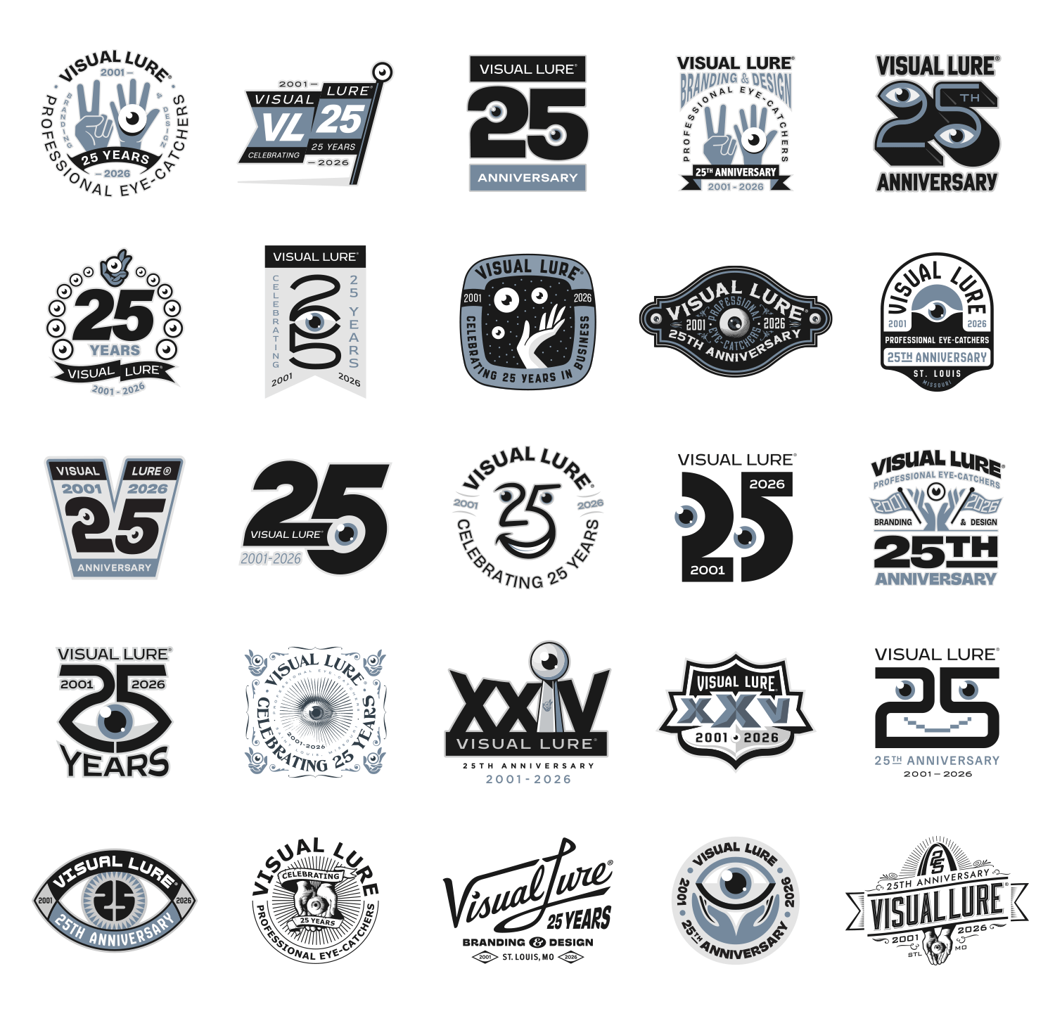
The Break Down:
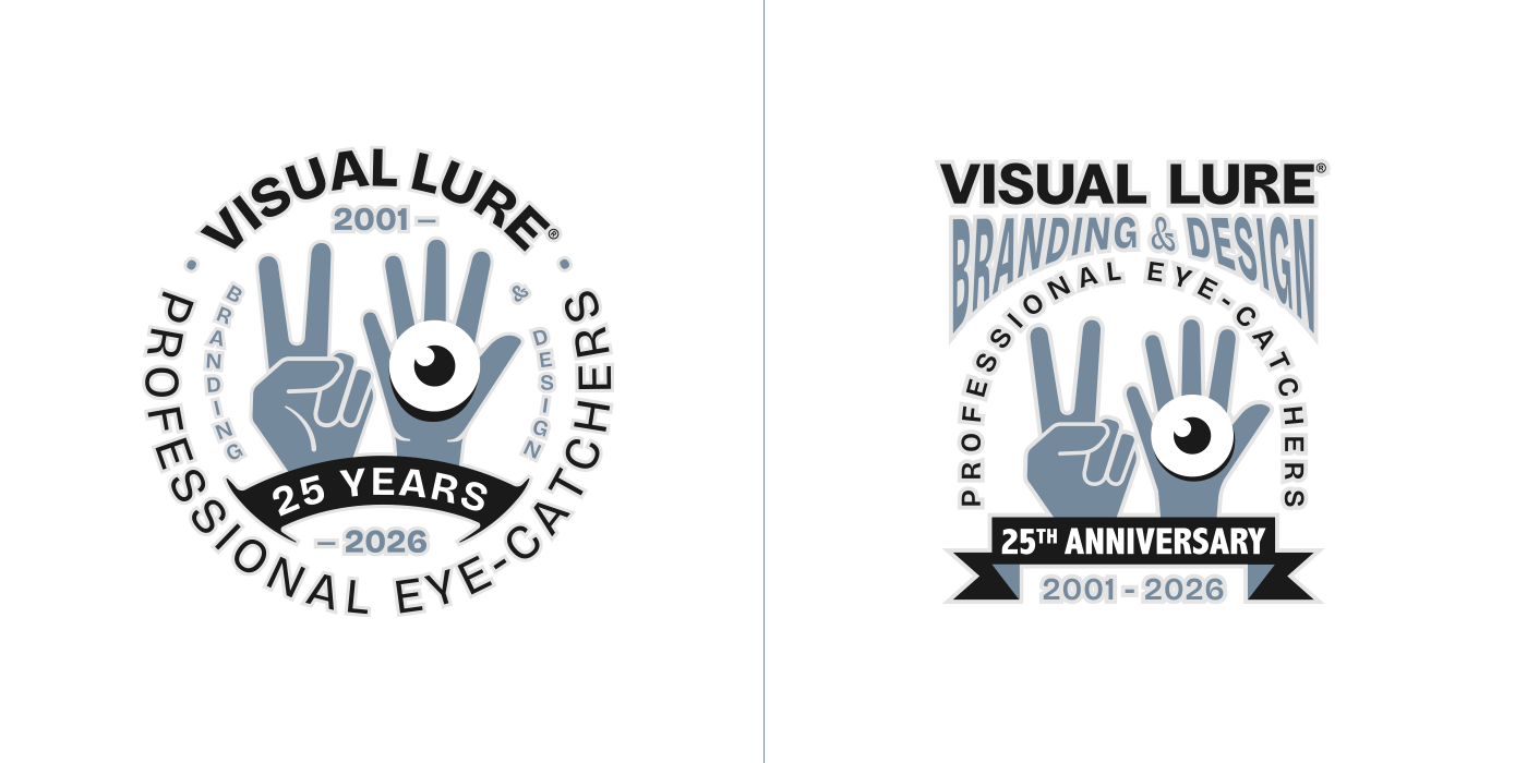
My first idea was to find a way to use a hand and an eyeball while also representing the number 25. What better way than with two hands—one showing two fingers and the other showing five—while the hand with five holds an eyeball?
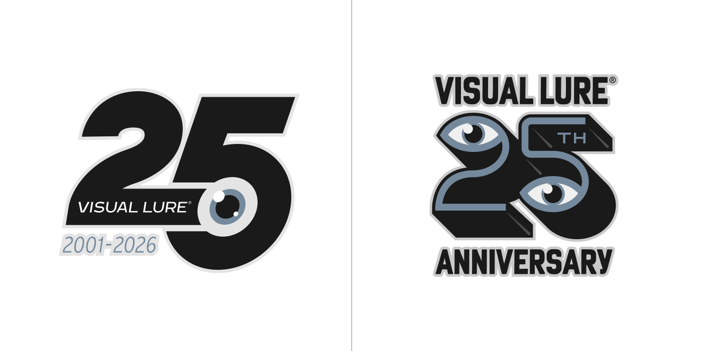
Then I explored ways to incorporate one or two eyeballs into the negative space of the number 25—or even make them part of the numerals themselves.
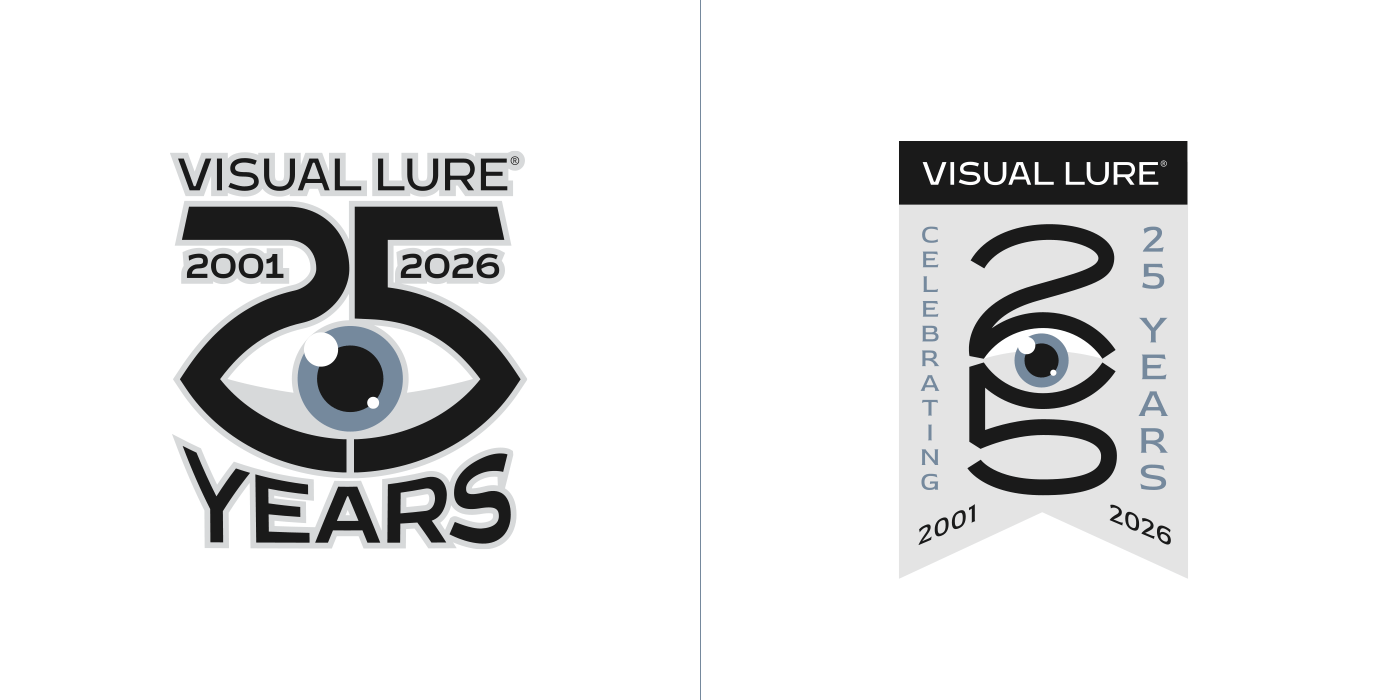
…and a few more variations on that same concept.
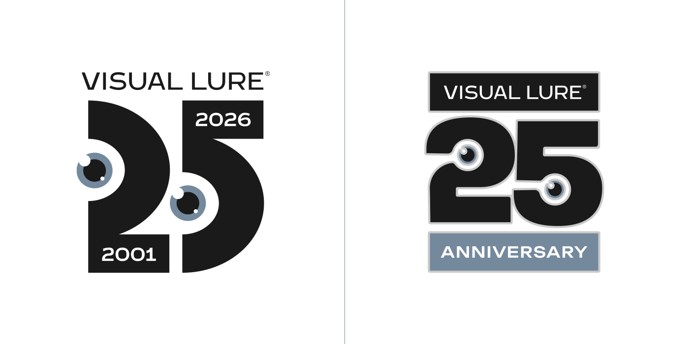
…and more…
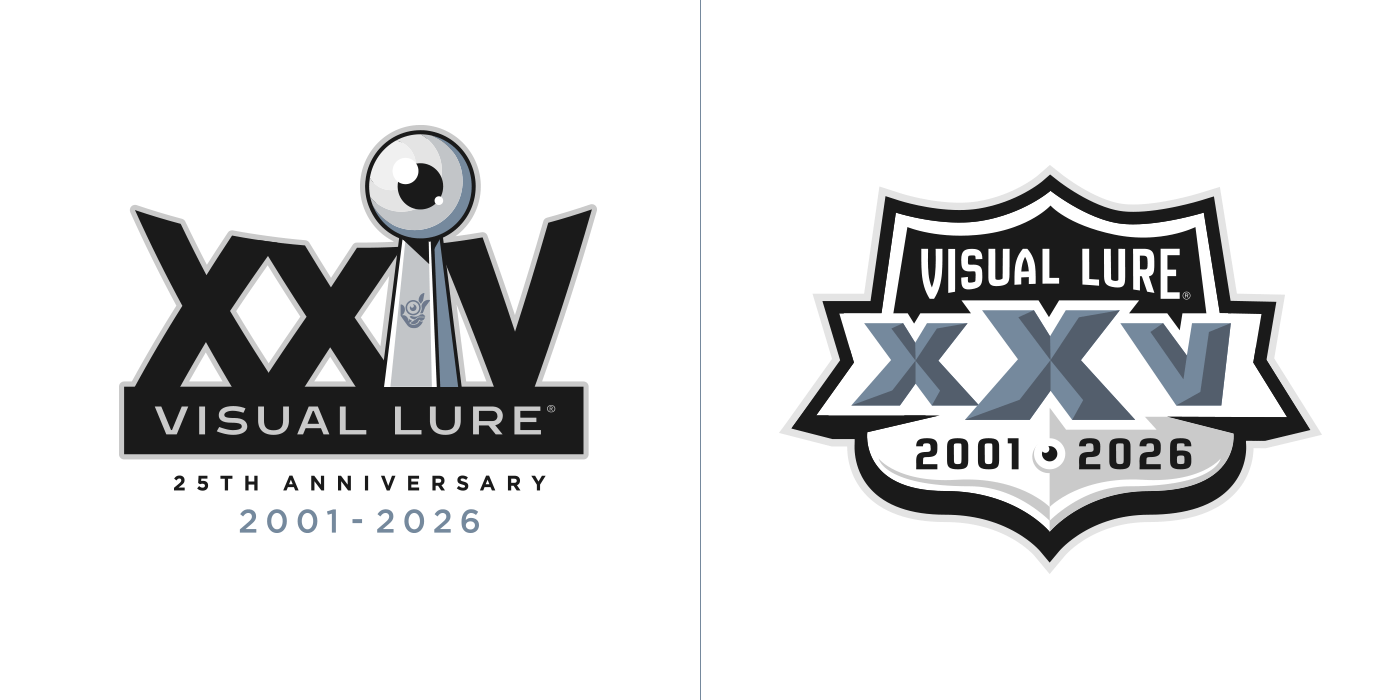 As I started running out of ideas, I looked for more out-of-the-box ways to represent 25 and thought of Roman numerals. What better approach than to parody some classic Super Bowl logos—just had to sneak an eyeball in there. (The graphics shown here are unofficial, fan-created parody designs. They are not authorized, endorsed, or sponsored by the National Football League, the Super Bowl, or any related entities. No commercial use is intended and these designs will not be sold or distributed.)
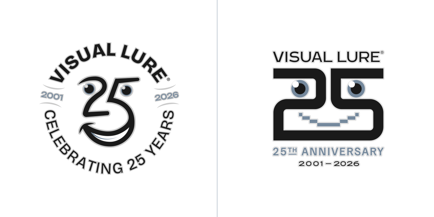
In my quest to incorporate eyeballs into the design, I started noticing faces within the shapes of the number 25.
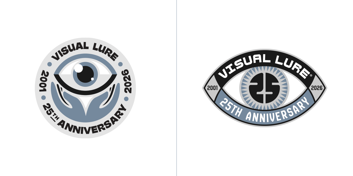
…and even more eyeballs—including one concept where the entire mark becomes an eye with a “25” as the pupil.
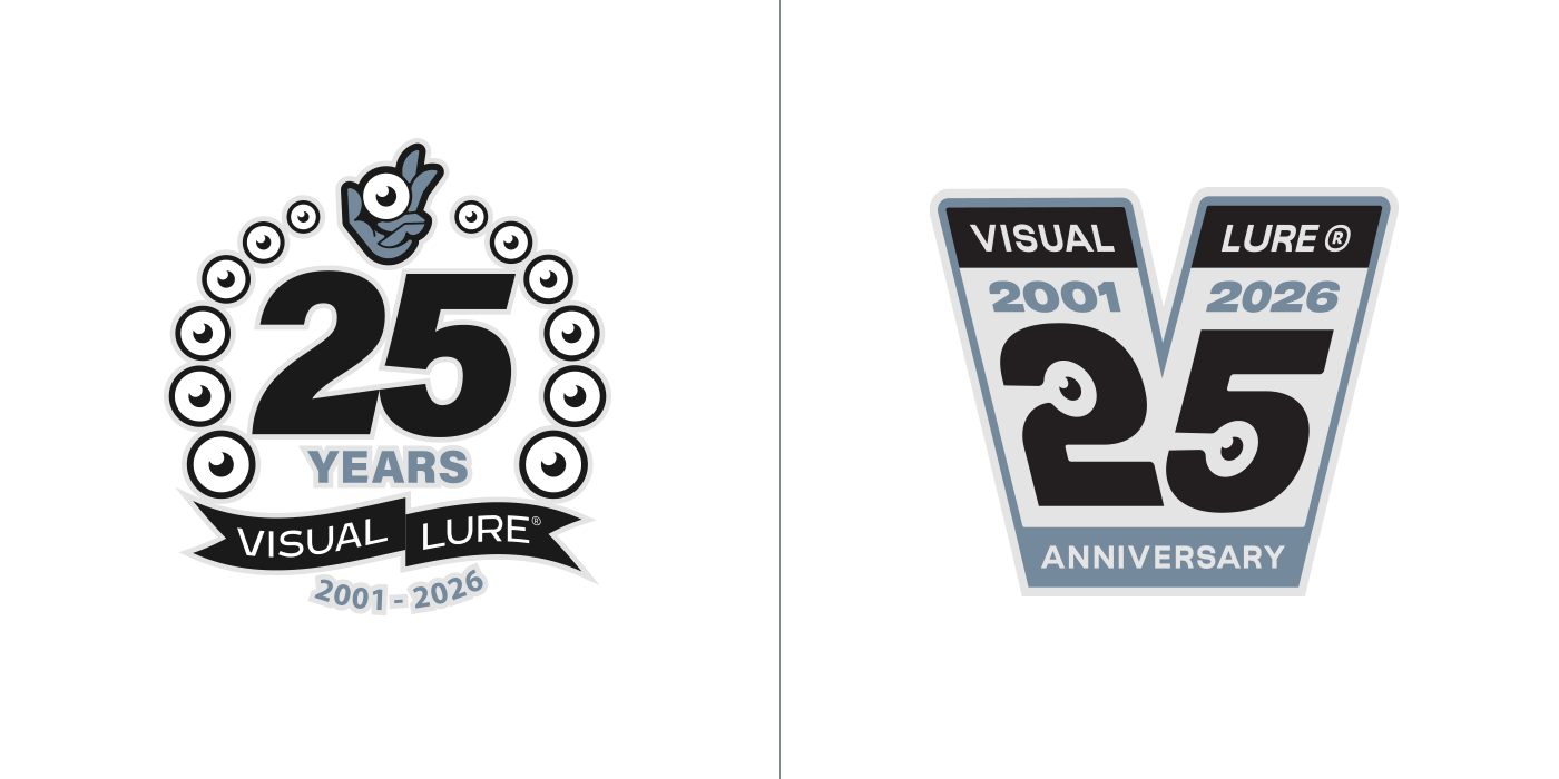
How about an eyeball wreath and a large “V” featuring some negative-space eyeballs…
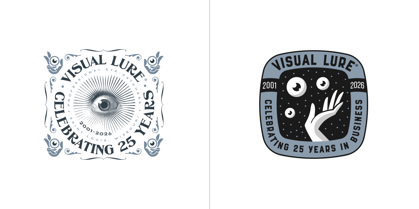
After about fifteen logos, I was running out of ideas, so I revisited some old explorations. The logo on the left was one of my 20th-anniversary concepts updated for 25, and the one on the right came from a recent logo exploration for some shirt designs.
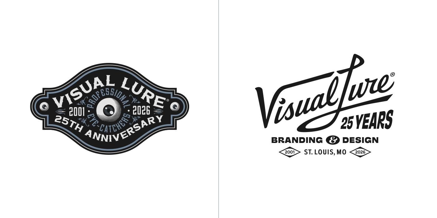
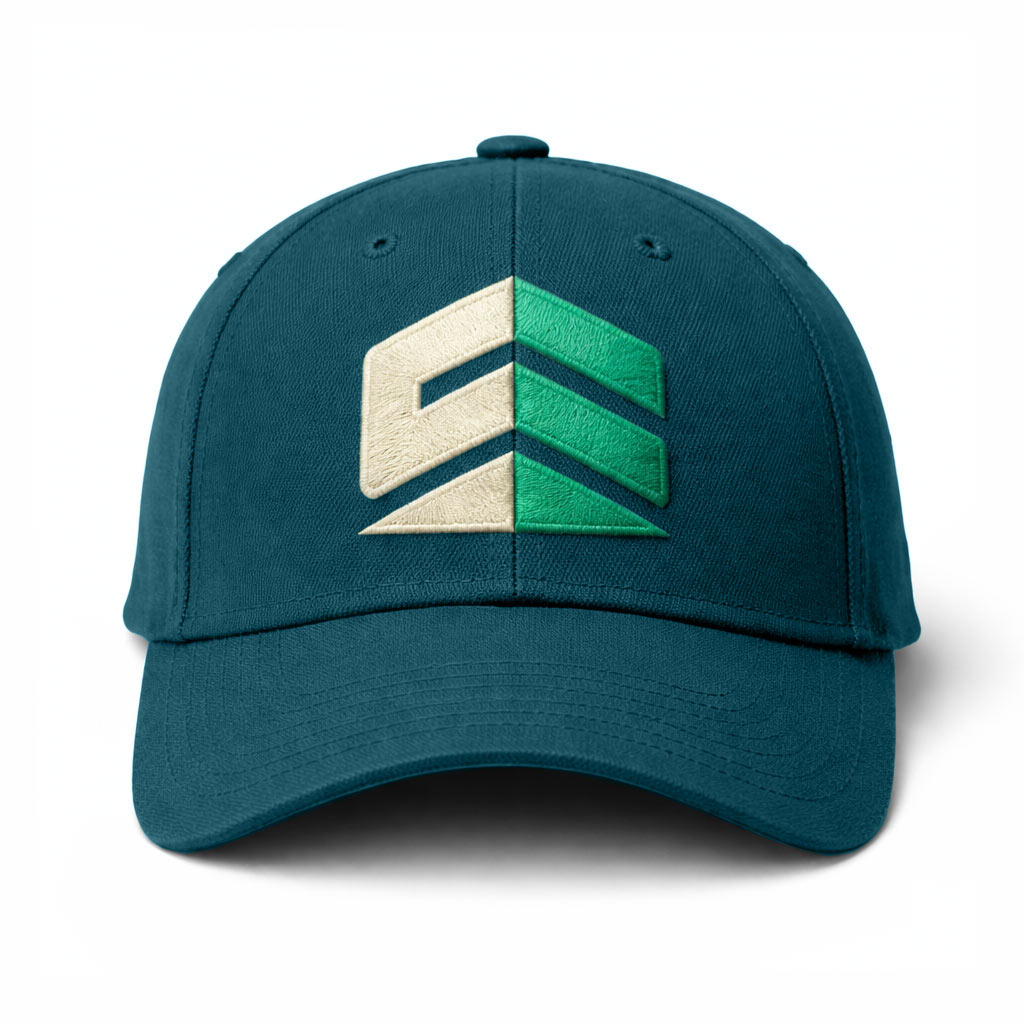
The logo on the left was originally an old concept for a wooden sign that I converted into a 25th-anniversary logo, while the one on the right was a hat design that I actually had made and embroidered.
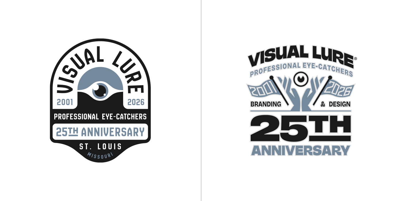
The logo on the left was another old exploration that I converted, while the one on the right features my award-winning “hands holding an eyeball” logo that was selected for LogoLounge Book 15.
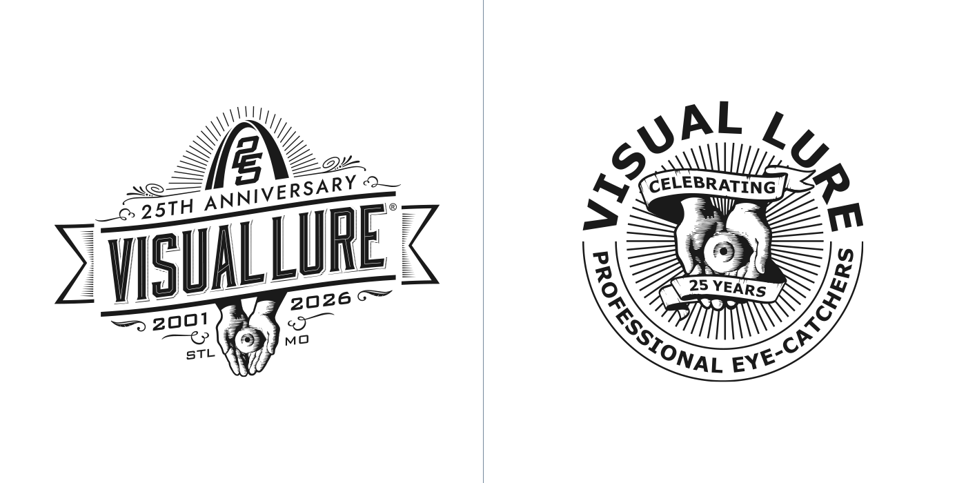
The design on the left was an old t-shirt graphic that I converted, and the logo on the right is a modified version of our 15th-anniversary mark.
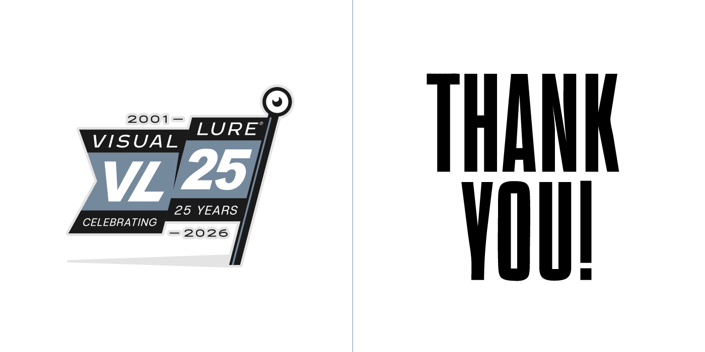
…and last but not least, a flag planted in the ground with an eyeball at the top of the pole—symbolizing the sense of achievement I feel for making it this far. Thanks again to everyone! God bless, and here’s to another 25 years!