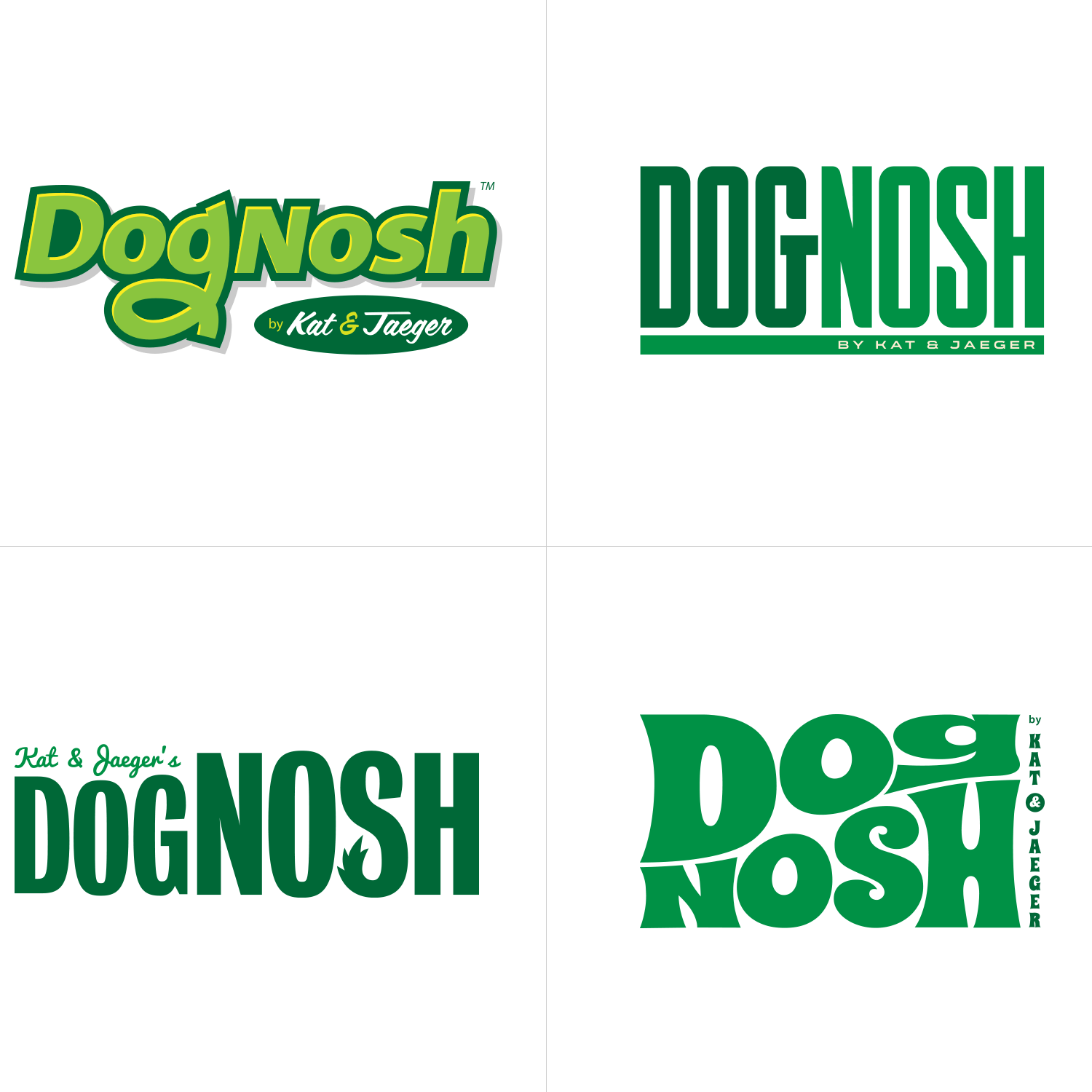
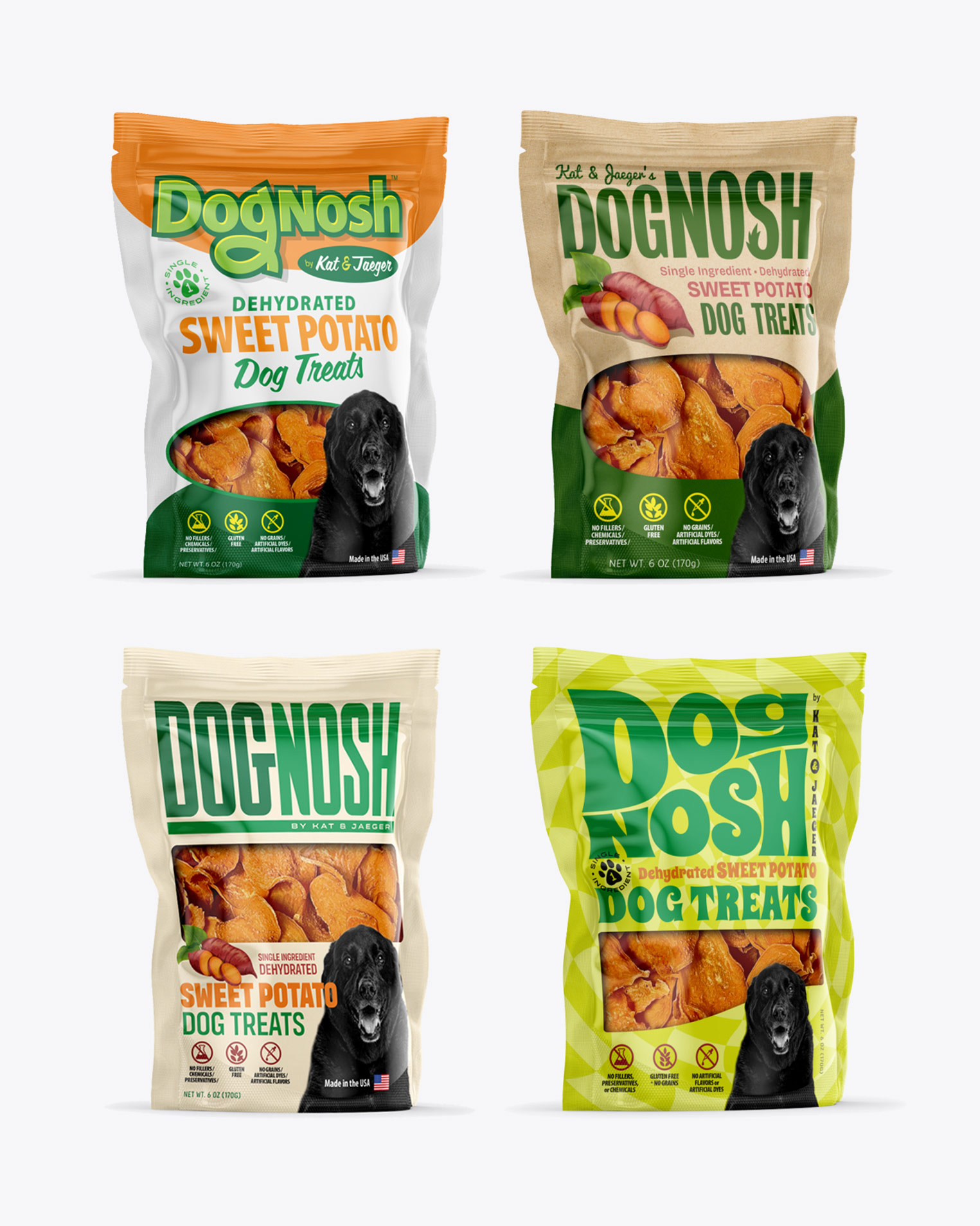
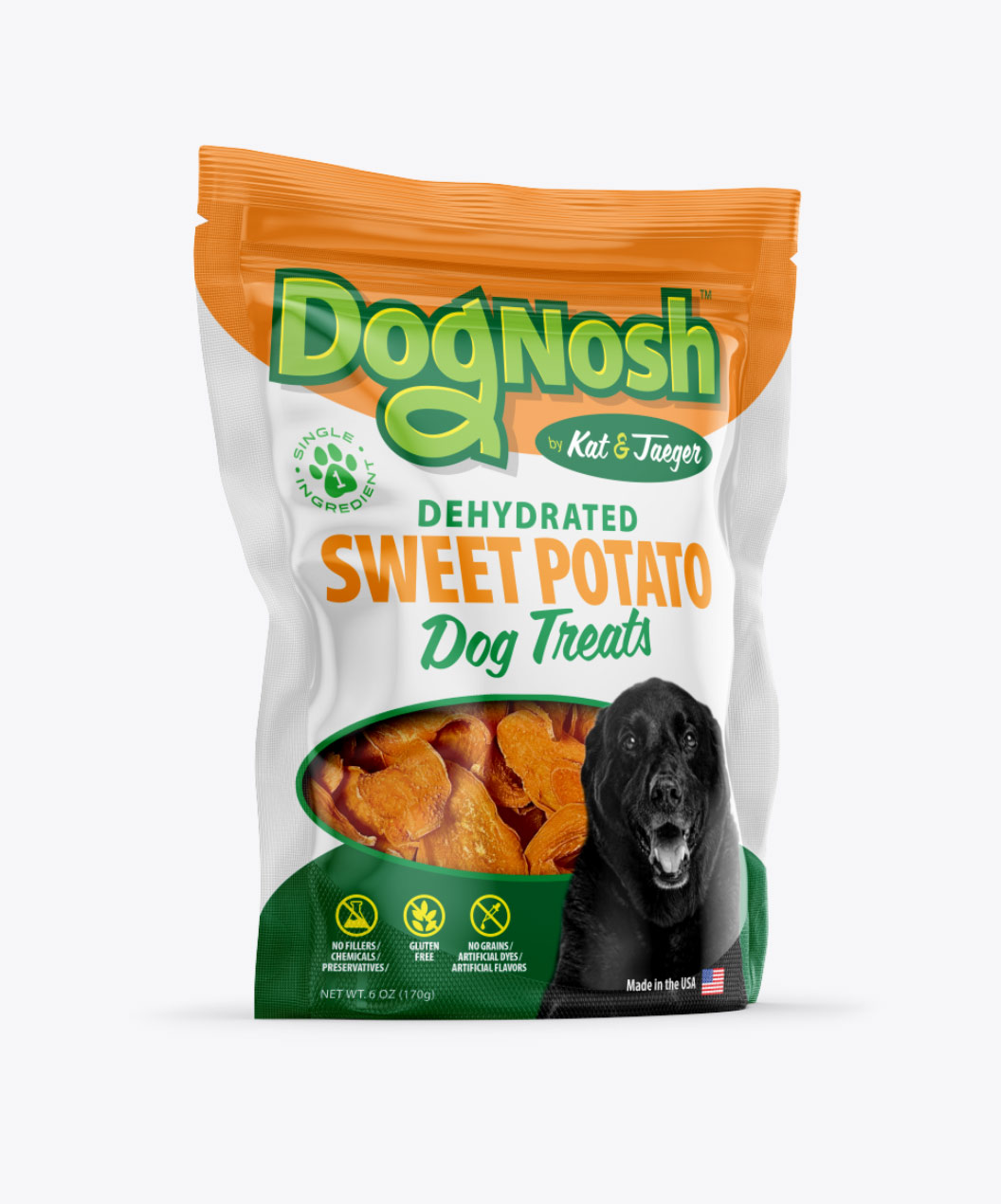
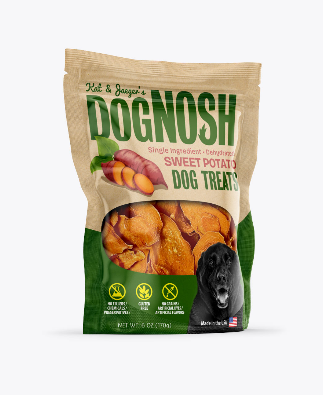
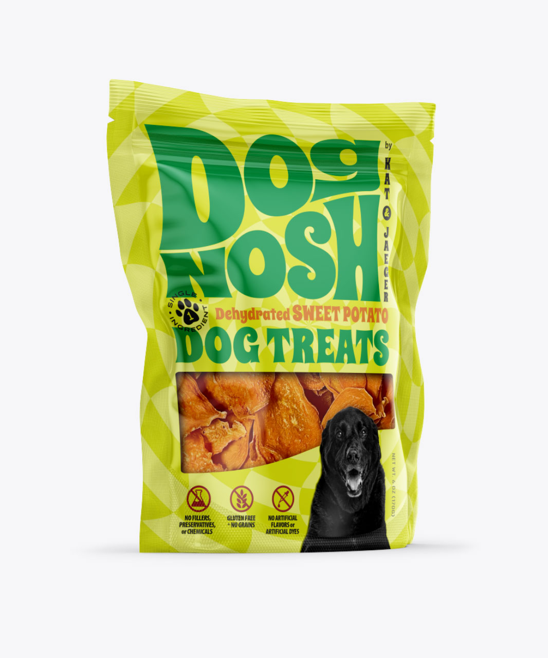
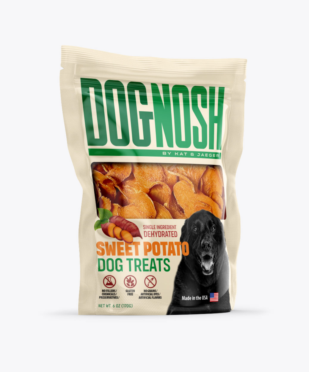
DogNosh, an emerging pet brand specializing in dog snacks, enlisted Visual Lure for the development of their new logo and packaging design. As a brand focused on promoting canine health, they expressed a preference for the color green and sought a modern and refreshing aesthetic. Below, we present our initial logo concepts, followed by corresponding packaging designs.
In the top left corner, we present a logotype featuring a custom hand-drawn ‘g’, subtly incorporating a hidden dog face within the ‘og’ combination. The custom ‘g’ in the logo provides a sense of fun and uniqueness, contributing to its memorability.
In the top right corner, we explore a modern condensed logotype, with customized lettering and curved edges strategically placed for added visual interest.
For a touch of playfulness, we developed a logotype in the bottom left corner, where we integrated a dog tail into the letter ‘S’. This whimsical element adds charm while maintaining the brand’s essence.
Lastly, we ventured into more unconventional territory with a design aimed at disrupting the typical visual landscape of dog snack packaging. This concept pushes boundaries to ensure maximum visibility and shelf impact, setting DogNosh apart from mainstream competitors.
