OUR BLOG

Here you will find our latest works, company news and more. We update it on a regular basis so be sure to come back soon. Please like, share, pin or tweet the post you enjoy.
Logo, Identity & Website for a St. Louis Metro East Railroad Company
Posted on March 15, 2018

The Prairie Line is a St. Louis Metro East/Southern Illinois railroad, transportation and logistics company. Lead by a team of highly experienced partners, The Prairie Line prides itself on providing personalized service that often gets lost in the rail industry. Additionally, their ability to cut through red tape and deliver quick decisions (along with their cargo) sets this company apart.

Below you will find everything from the initial logo design options to their newly painted locomotives and custom WordPress website, all which Visual Lure designed.

The Logo:

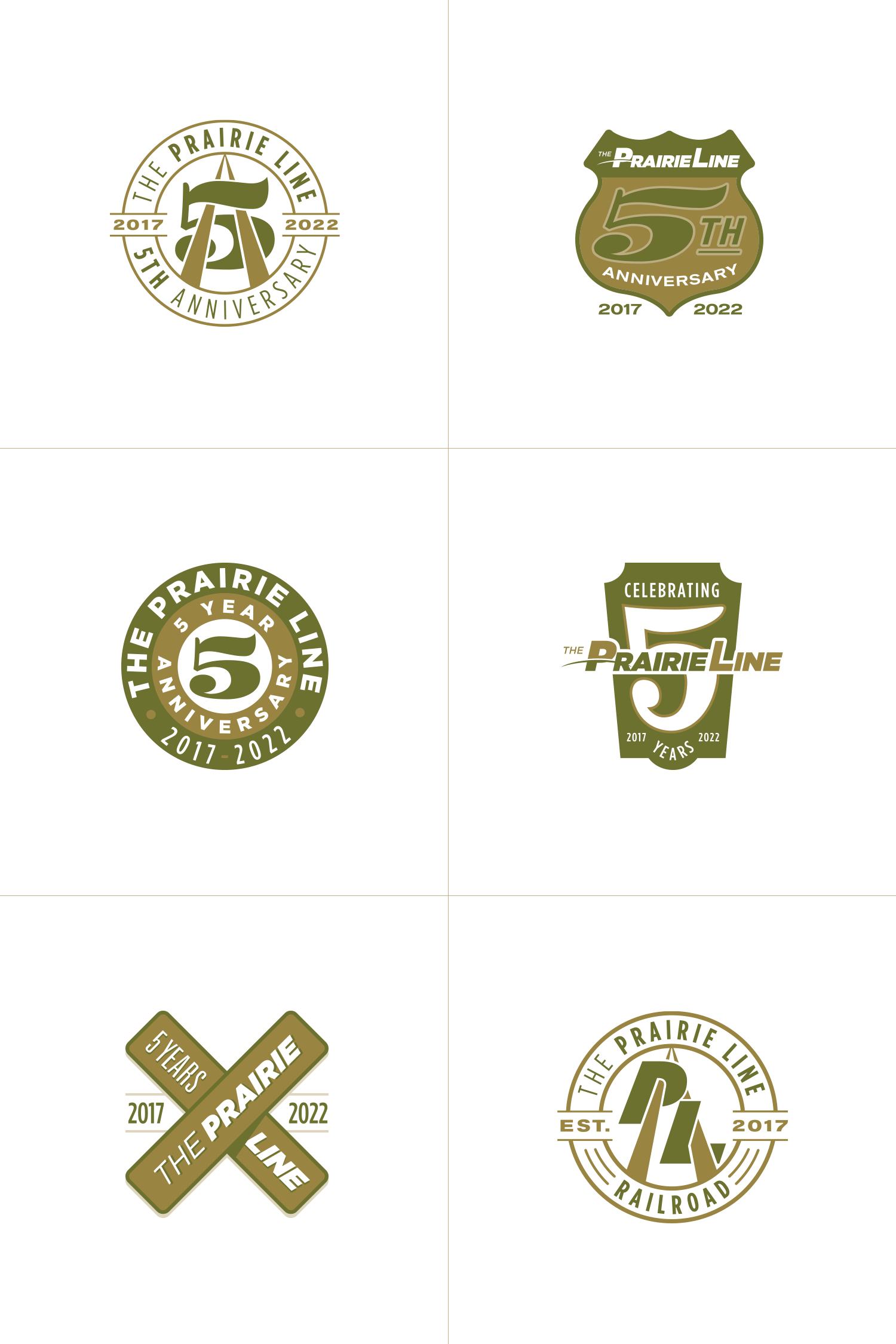
The top left logo option uses a single line to make two “i”s tying the two word marks together, the top right option (which ended up being the final logo) plays off a line dividing the “P”, the bottom left logo features prairie grasses that make negative space in the type, and the last logo is a P created with a single line that also mimics railroad tracks. Below the options are the final logo lockups.


TPL logo options & final logo

Color Palette, Typefaces & Paint Scheme:

We selected a color palette inspired by colors of prairie grasses with clean, easy to read typefaces making sure signage and locomotive numbers are readable from a distance. The paint scheme was inspired by the curve in the logo and the placement gives the locomotives a sense of motion.


TPL color palette & typefaces TPL business cardsTPL locomotive paint schemeTPL painted locomotive


Custom WordPress Website:

We wrapped up this branding project with a fully custom, responsive designed WordPress website. The site features a sticky header and menu bar for convenient navigation, a couple custom sliders for the “what makes us different” and the “leadership” sections, and an auto-populated news feed that is fed from the fully integrated blog.

TPL website design 2 TPL website design

CLICK HERE to view more of our branding projects ยป or CONTACT US today to learn more about any of our branding and design service!


Logo for EverTinder, a Fire Starting Kit

Posted on February 27, 2018

Visual Lure recently completed a new logo for EverTinder, a fire starting kit that easily makes fire without a lighter, match or any combustible materials (It can even be taken on a plane as none of the materials are banned). Once the initial fire is started, it then creates the char needed to make the next fire in an endless cycle. Therefor it makes infinite fire, hence the dual-meaning tagline “Fire for Life”.

We prefer to do our creative briefs for logos in a conversation as you never know where it will lead. It also tends to be more fun and free flowing than filling out some type of brief questioner.

During our initial meeting, Chris – the owner of EverTinder, demonstrated the product outside our office and I was blown away. I remember as a kid trying to start a fire with one of those Boy Scout fire kits with flint and steel or a couple of sticks. It’s almost impossible. Chris opened his little kit, placed some charcoal looking material in a stainless steel cup with a little steel net. Using a flint and stone he shot one tiny spark into the charcoal material and it instantly created a tiny ember. He then blew on it a couple times and the little ember started to grow. He placed some wood shaving on top of that and in less than a minute or two he had made a fire. We were impressed at how easy it was.


Process EverTinder Uses to Make Fire

EverTinder fire starting process

During our creative brief, Chris mentioned that he wanted the logo to have some type of icon or mark that possibly used circling arrows or the recycle symbol. Even though the product is universal, he wanted it to have a more masculine or “outdoorsy” feel. Lastly he wanted to use a yellow and black color palette.


Getting Started

The first thing we do with any new logo project is write down any words that come to mind when thinking of the product or company. For EverTinder our list included: fire, flame, wood, logs, outdoors, survival, endless, infinite, arrows, recycle, ash, and charcoal. We then brainstormed for ideals on how we can tie at least two of these together in some type of clever way, as we find witty logos tend to be memorable, an extremely import feature you want a logo to have.

From there we ALWAYS start with sketches. We never jump right into the computer as we feel the concept is just as important as the art itself.


Our Initial Sketches

Initially all our sketches were playing with fire and flames. Our first idea that we though had potential was having the logs of the fire be an infinity symbol to represent the endless supply of fires. Our last BIG idea, which we LOVED, was to incorporate a Phoenix. The fire bird that raises from the ashes, almost exactly what this product does (it creates fire from the ashes it makes). As we always try to create logos with a dual meaning or a clever concept, we had the wings of the Phoenix also create the letter “E” for EverTinder.

EverTinder logo sketches


Initial Designs

Here are our initial logo options we presented to the client:

EverTinder initial logo concepts


The Final Logo

After receiving feedback from the client, he wanted the logotype to be in a stencil format so that the entire logo could be cut out of steel. He also changed his mind on the color palette once he saw some additional options. After a couple minor rounds of revisions to the one he liked best, here is the final logo. We also created a couple secondary marks.

EverTinder final logos

…and here are renderings of it engraved and cut out of metal:

EverTinder stainless steel logo

…along with a couple sample mock ups to show how the logo could be implemented:

EverTinder business cards 1 EverTinder business cards 2

Want to see more of our logo design work? Click here to view our logo design portfolio, or click here to view some of our branding projects.


Visual Lure Awarded with 12 Logos in LogoLounge 10

Posted on June 13, 2017

Logo Lounge 10 awards announcement graphic

When we see an email in our inbox from LogoLounge with a subject line that reads “Congratulations from LogoLounge, Your Work Selected!” we get happy. Real happy!

It means that our hard work has paid off, and that some of the greatest logo designers in the World think our logos are some of the best made on planet Earth. This year, there were over 40,000 logos submitted and reviewed by an international judging panel of design superstars, including Andreas Karl, Aaron Draplin, Von Glitschka, Alex Tass, Chad Michael, Yo Santosa, Emily Oberman, Su Mathews Hale, Felix Sockwell and Alex Trochut.

We are both honored and humbled that designer of this caliber have selected our work for LogoLounge 10. This will be the 7th LogoLounge book that our work is featured in, with a total of 31 logos to date. It also beats our previous record of 8 logos in one book – with 12 this time around.


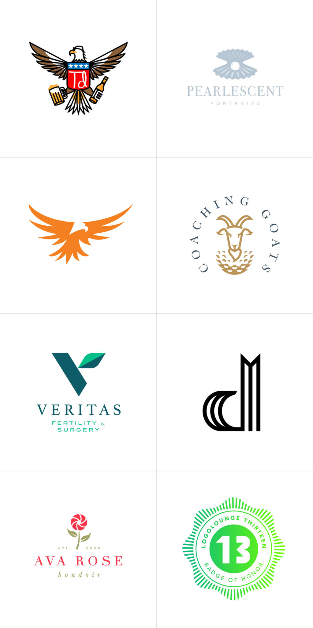
Here are our award-winning logos selected:

St. Louis award winning logos in LogoLounge 10

Brief descriptions of the chosen logos:

from left to right, top to bottom…

1. All Stars Tree Solutions: this was one of our proposed logos that was not selected by our client. It features a shield/crest with a star tree surrounded by four leaves that represent the seasons, and roots that represent strength and experience.

2. Midwest Mulch & Compost: this was an unselected logo that features two trees and two piles of mulch (in the negative space) that also form a subtle letter M. The final logo is very similar with two trees hidden in the negative spaces of the M.

3. Jeff Allen Photography: this too was an unselected logo. It features a timeless merged JA monogram.

4. Unposed Photography: this was a runner-up logo that almost made it. It was designed for a Galena, IL commercial and wedding photography studio.

5. Hannah Marie Photography: logo options for a well-known Canadian photographer featuring a monogram with a diamond motif border.

6. Studio O Photography: this was a logo that got buried after we decided to change the name of the studio. It features a merged monogram that is both the letter S and O.

7. Like Home: unselected logo option for a St. Louis, MO based French pastry shop.

8. Hopkins Craft Whiskey: this was our favorite logo design option for a St. Louis, MO craft whiskey distiller. They went with a different logo.

9. Salt 911: another logo that underwent a name change after the first round of logos. It features a shield/crest with eagle, stars and leaves mimicking a police badge.

10. Giochi Board Game Cafรฉ: what better way to represent a board game cafรฉ than with a chess piece drinking a cup of coffee. This was an unselected logo, however the final logo uses the same exact concept, just rendered using a different design style.

11. Lee Stark Photography: Here’s a logo that was actually selected by our client. Lee is an outdoor photographer who specialized in rustic landscape photography. The logo was hand-drawn with a sharpie, scanned into the computer, and converted into vector artwork.

12. Pam Baumann Photography: Pam is a photographer from Limerick, Pennsylvania. She wanted an “earthy/rustic” logo so we designed her a camera shutter made out of colorful earth-tone leaves.


Final Logo Comparisons

A couple people on social media thought it was odd that so many of our logos selected for the book where not selected by our clients. So we decided to show the actual final logos that were chosen just for comparison. Here they are in the same order as above:

Our client's final logo selections

About LogoLounge

LogoLounge is without a double the greatest series of logo design publications in the World. Designers, both new and established, submit their work annually and a panel of world-class judges select the cream of the crop.

LogoLounge is also know for releasing their annual logo trends report which showcases the latest design aesthetics and styles of the year. Learn more at LogoLounge.com or find there books at any fine book store.

The LogoLounge Website Features:

  • Over 250,000 searchable logos
  • Fresh inspiration and ideas, with new logos uploaded daily
  • Network of designers, including leaders and legends in the industry
  • Logo design news and articles

LogoLounge10 Cover Design


Want to see more of our logo design work? Click here to view our logo design portfolio, or click here to view some of our branding packages.


Logo & Package Design for a St. Louis Supplements Company

Posted on November 10, 2016

2nd Impact is a St. Louis, Missouri based supplement and nutrition company that produces a superior line of Whey Protein and Creatine products. They use the most expensive, highest grade ingredients to produce a premium line of supplements. They initially came to Visual Lure for a logo, and after completion of that, they immediately engaged us to design all their packaging. See the progression of the logo and packaging below.


2nd Impact provided the exact colors they wanted and requested a simple text-based logo. Here are the initial logo design options:

2nd Impact logo design round 1


…and here is round 2 of the logo…

2nd Impact logo design round 2


…and here are the final logos in both color and black and white:

2nd Impact final logos


Once the logo was completed we immediately went into designing the packaging as they wanted to get into production right away. Here are the first two design rounds of the package design:

2nd Impact packaging design options


…and here are all the final labels for their initial product line:

2nd Impact Packaging Design All

View the entire branding package here ยป

Click here to view our entire package design portfolio, or click here to learn more about our packaging design services.

ย For a package design quote, please call 618.407.9231 or email us at info@visuallure.com.

Logo Designs for Marilyn Lou Boudoir & SoCal Headshots

Posted on June 19, 2016

One of my favorite photographers is Michael Anthony out of Los Angeles, California. He and his wife Jennifer are both extremely talented engagement and wedding photographers whose unique style is defined by what they do with natural light and off-camera flash. Michael’s signature shots look like magical movie posters or dramatic romance novel covers. They are truly pieces of art. Just take a look at a couple of his images below:

el-matador-beach-engagement-photography-1top-wedding-photographer-los-angeles beach-wedding-photos-california tm045z40kd2

Visit michaelanthonyphotography.com to view more of Michael’s photography.

We were honored when they came to us to design logos for two of their new independent sub-brands, one for a new boudoir line, and the other for a new headshot company.

While Michael was in town speaking at Shutterfest ’16, we met up for lunch one day to discuss the new brands. When we got into the car to go to lunch, neither Michael nor Jen knew what they wanted to call their new boudoir company. We started brainstorming on the ride from Union Station to Anthony’s (maybe a mile or so), and by the time we arrived at the restaurant, Marilyn Lou Boudoir was born. The name is based off Jen’s middle name, and part of her maiden name, which we all liked because it had an old Hollywood sound to it. Perfect for a glamorous, upscale and classy boudoir brand in Los Angeles. On that short ride, we also came up with the idea of naming their photography collections after old Hollywood starlets. During lunch, we all agreed that the logo should use a script or handwritten typeface.

Below you can see the logo, along with a sample branding package including colors, typefaces, patterns and identity design. We really love how this color palette and identity design have a feminine and classic look, yet still feels modern. We also tied Michael’s brand to the new boudoir one by using his heart mark for the dot of the i in Marilyn.

Marilyn Lou Boudoir branding designMarilyn Lou Boudoir identity design

Marilyn Lou Boudoir watermark logo

Sample Watermark


Next we discussed the SoCal Headshots logo. Michael wanted the logo to feel fresh and hip, while having a friendly, approachable Southern California vibe to it. We feel the final logo is exactly that. Check out the logo and brand samplings below:

branding & logo design SoCal Headshots

SAMPLE WATERMARKS:

SoCal-watermark-logo2

SoCal-watermark-logo

Click here to view more of our Photography Branding work ยป

Branding Package for a Tampa, Florida Photography Studio

Posted on June 4, 2016

Donnie Jones Photography is a Tampa, Florida photography studio that specializes in weddings, engagements, high school senior portraits and maternity photography. Donnie is a very talented photographer and someone who understands the importance of building a brand and doing everything right the first time around. He is pretty much our ideal client and we can’t wait to see his success.

Donnie Jones Photography came to Visual Lure wanting a luxury, high-end looking branding package, and we’re confident that we delivered. It started with the logo which features an integrated DJ monogram along with a logo for his premier Gold Collection. We then designed an identity package which included business cards, letterhead and envelopes. We finished everything off with a fully-custom, responsive, fast-loading, easy to maintain WordPress website. The website features a large random loading image on the home page, a fully integrated blog, a sticky header, masonry light box photo galleries and subtle CSS animation effect that give the site a sense of elegance and sophistication.


DJP-logo-branding

Tampa, Florida wedding photographer Donnie Jones

DJP-wordpress-web-design


Learn more about Visual Lure’s logo design & branding or web design services ยป


Professional Photographer Logo Designs Catch Up

Posted on October 26, 2015

Visual Lure designs a ton of logos for professional photographers. Why? For a couple reasons:

1.Because we truly understand the photography business.

How? Well it all started out with our good friend Salvatore Cincotta. We’ve known Sal since he was working at Microsoft and just starting his home-based photography business.ย We’ve always shared contacts, resources and we have done whatever we could to help each others companies succeed. In the very beginning, we would talk with Sal about his branding, promotion strategies and all aspects of the business almost on a daily basis. It was during this time that Sal was developing and refining his current business system which he now teaches to other professional photographers. We know this system first hand and have actually had the pleasure of watching it transform over the years. Today Sal is a world-class photographer, educator, author and entrepreneur with multiple award winning companies. Just this year his umbrella company was on the list of Inc. 5000’s fastest growing companies.

2. Because we write about branding for one of the top professional photography resources and publication in the market: Behind the Shutter and Shutter Magazine.

Justen Hong of Visual Lure writes articles about branding and marketing for Behind the Shutter and Shutter Magazine. Topics include articles about logo design, website design, package design and search engine optimization (SEO). We also speak every year at Shutterfest (Behind the Shutter’s annual photography conference held in St. Louis, MO). This leads to a lot of photographers contacting us for help in defining their brand (which usually starts with a new logo).

3. Because of photographer referrals.

When you combine the referrals from Sal, all the Shutter entities along with all our happy photographer clients, it leads to more photography logos. Which leads us to the true purpose of this post. We simply do not have the time to write up a blog post for every photography logo we design, so we decided to pack a bunch into one post. Below you can see a small collection of logos we’ve designed for photographers from all over the United States, and one from Austria. The collection features monogram logos, a couple crest/seal logos, and a few typography-based logos.

If you’re looking for a new photography logo that will stand out and last the test of time, contact Visual Lure today. We would love to help.

photographers logo designs

View more of our photography logos & branding projects ยป