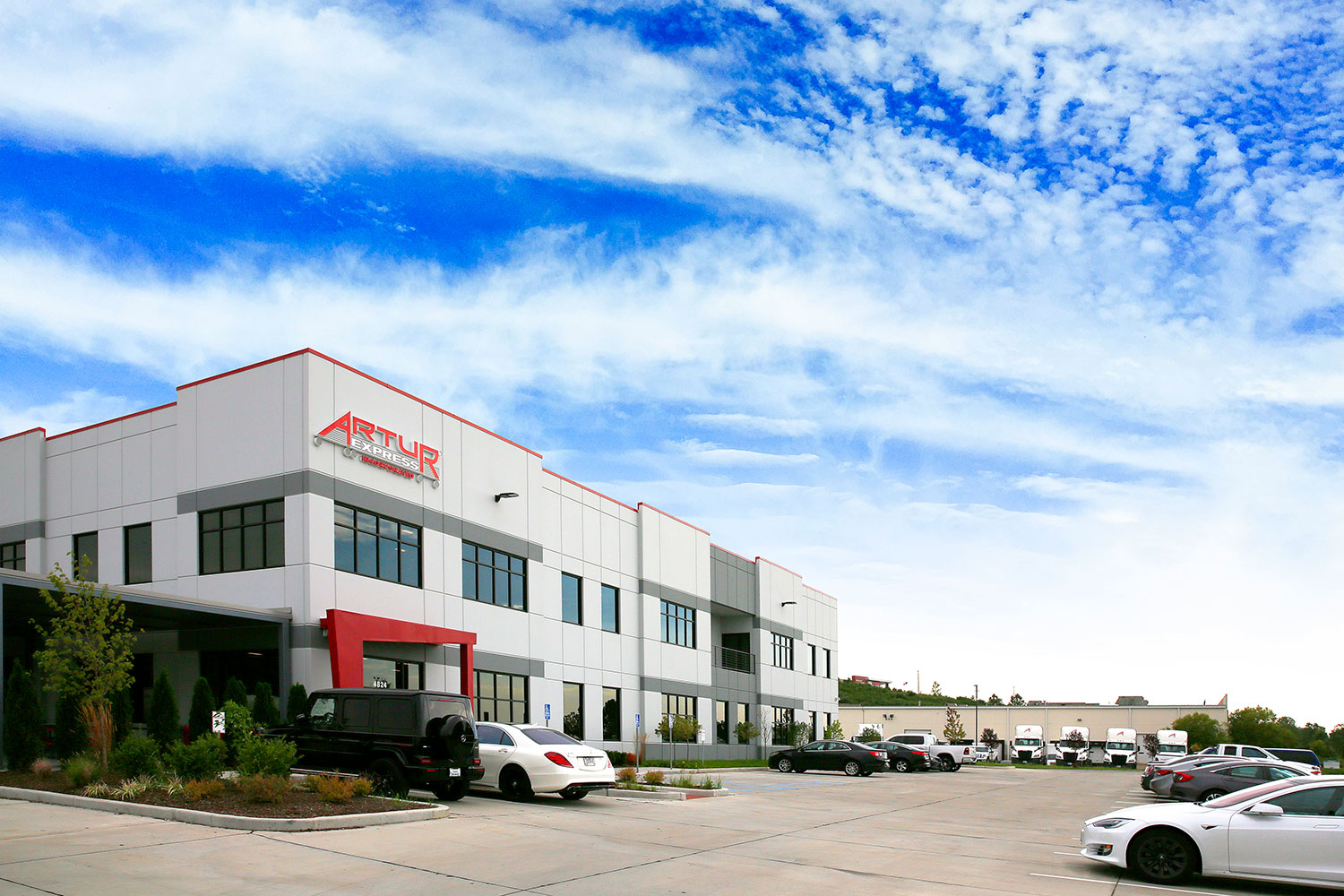
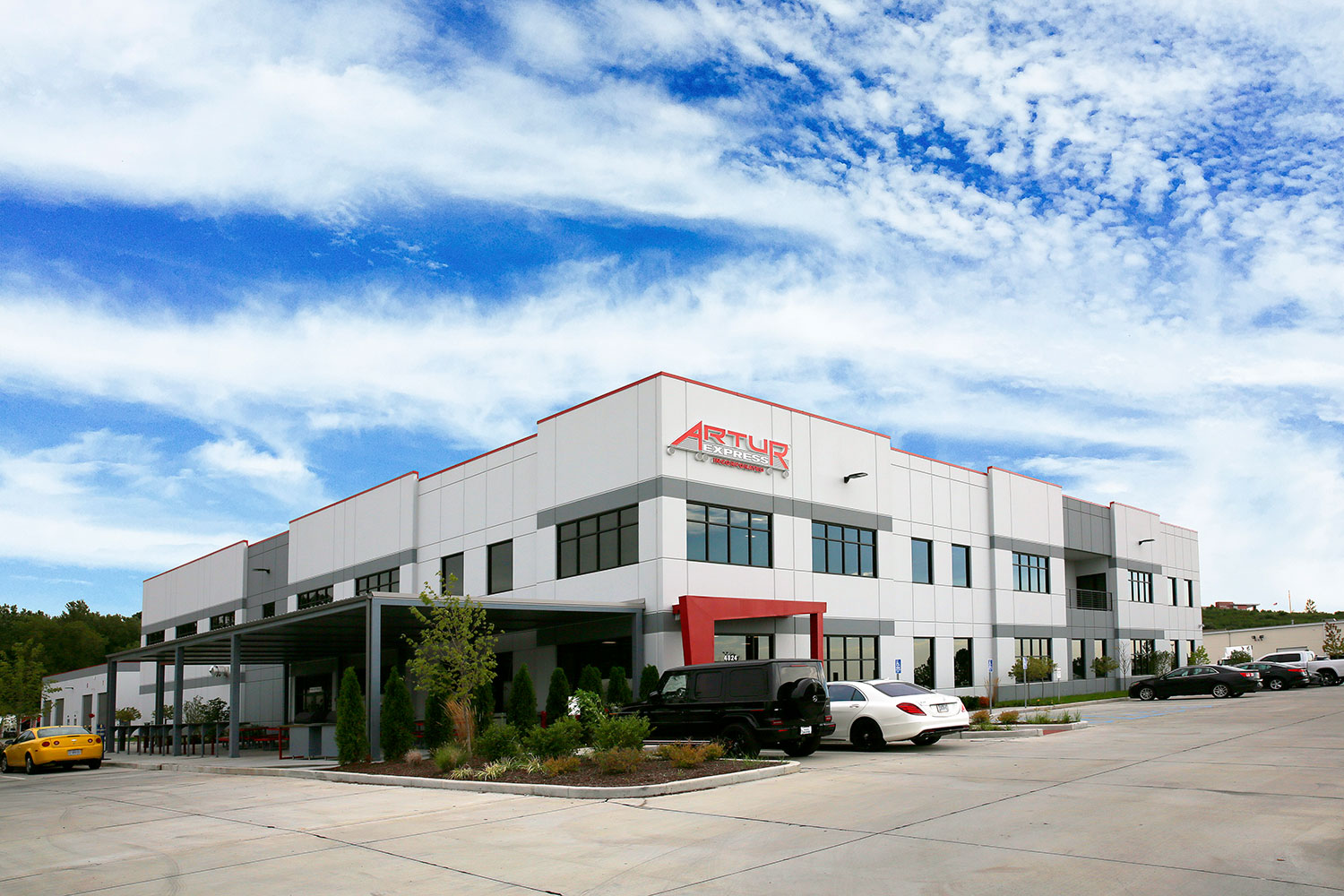
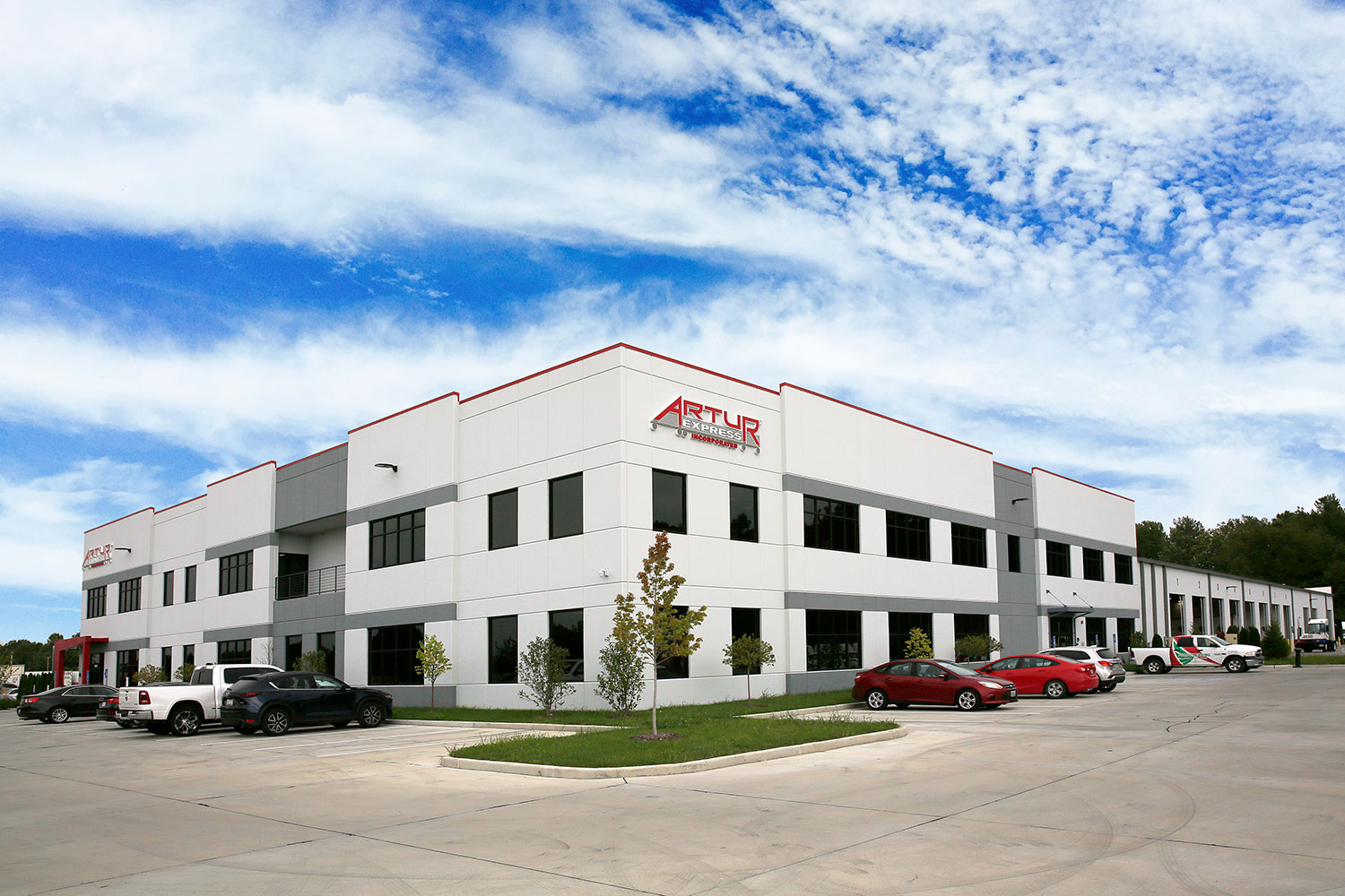
Signage & Environmental Graphics for New Artur Express Headquarters
Visual Lure had the pleasure of designing all the signage and environmental graphics for the new Artur Express headquarters in Hazelwood, Missouri. Artur is a longtime client and one of the fastest growing logistics/transportation companies in the United States (recently making Inc. 5000’s Fastest Growing Private Companies for 2020, ranking no. 4,419 with three-year revenue growth of 73%).
Visual Lure designed all the signage and Designery of St. Louis fabricated and installed it. We also designed the vinyl and glass graphics which were installed by Artur’s in-house vinyl team. See all the photos of their new HQ below (photography by Visual Lure).
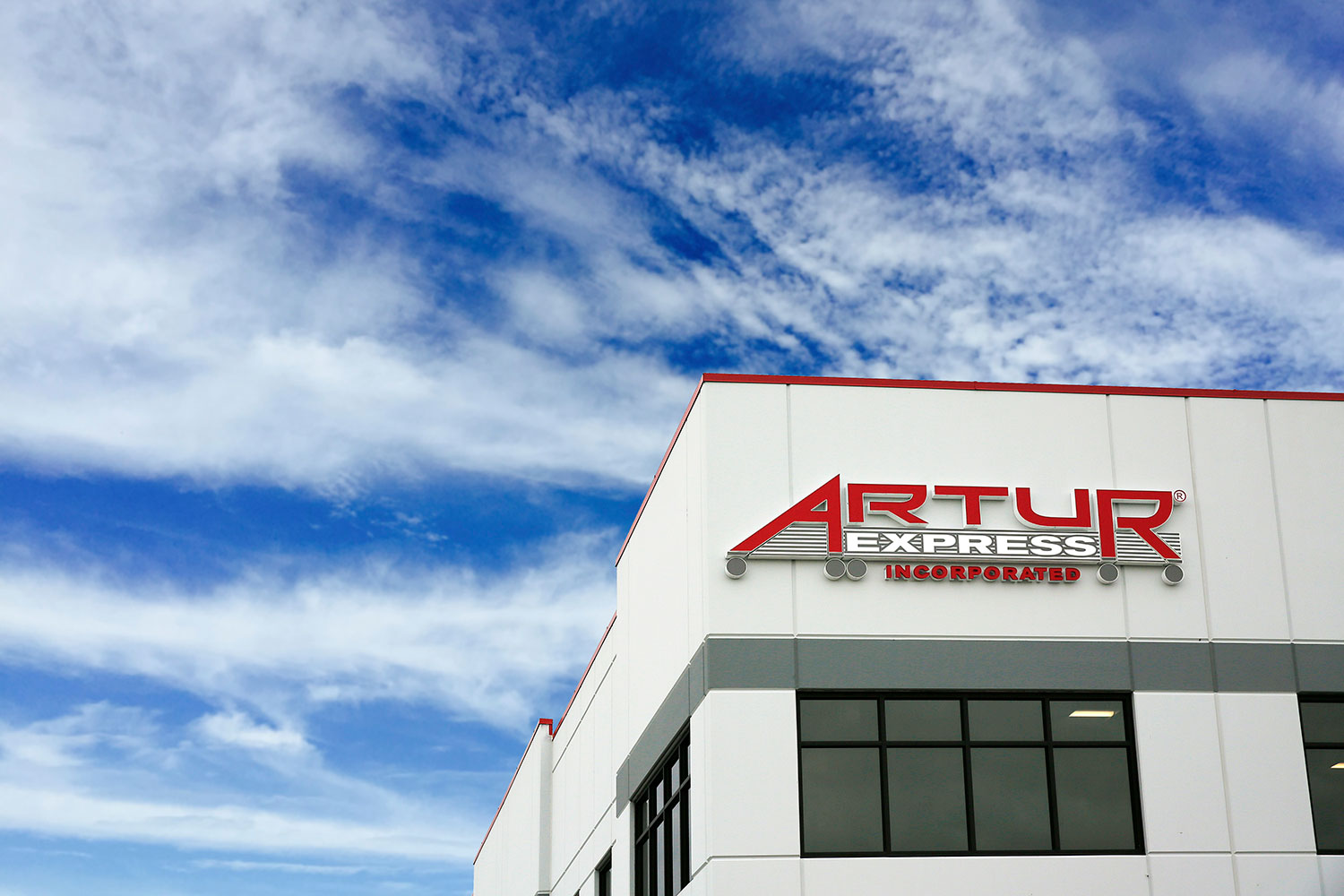
Exterior Logo Signage:
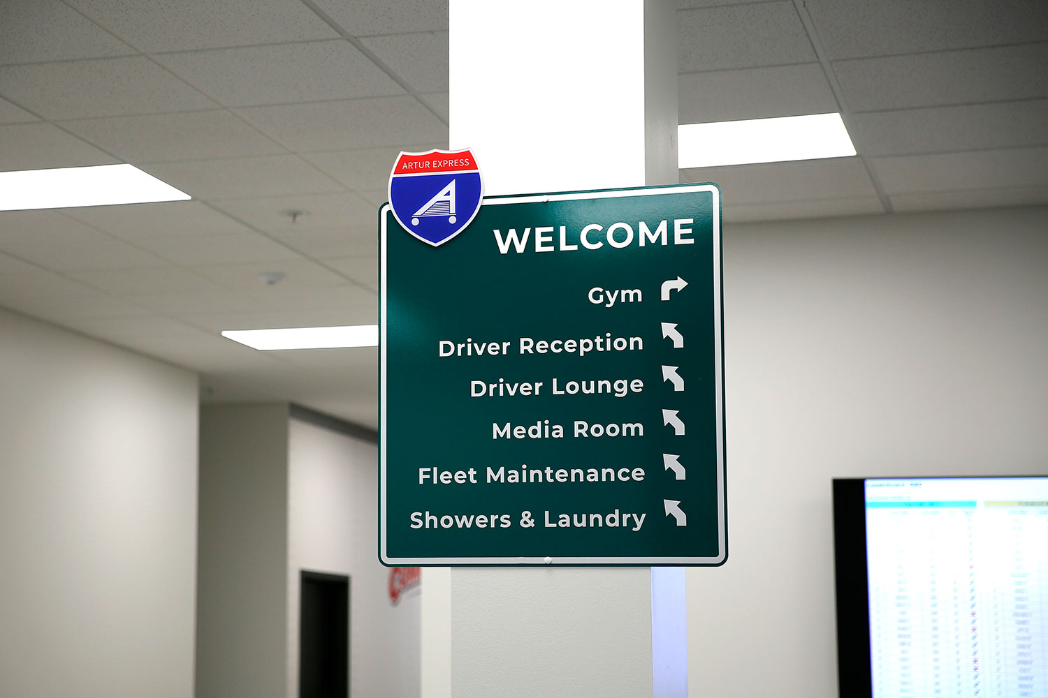
The Welcome Sign
Since Artur Express is a logistics/transportation company, Visual Lure thought what better way to welcome visitors to their new headquarters than with a Welcome Highway Sign. We came up with this concept and installation direction.
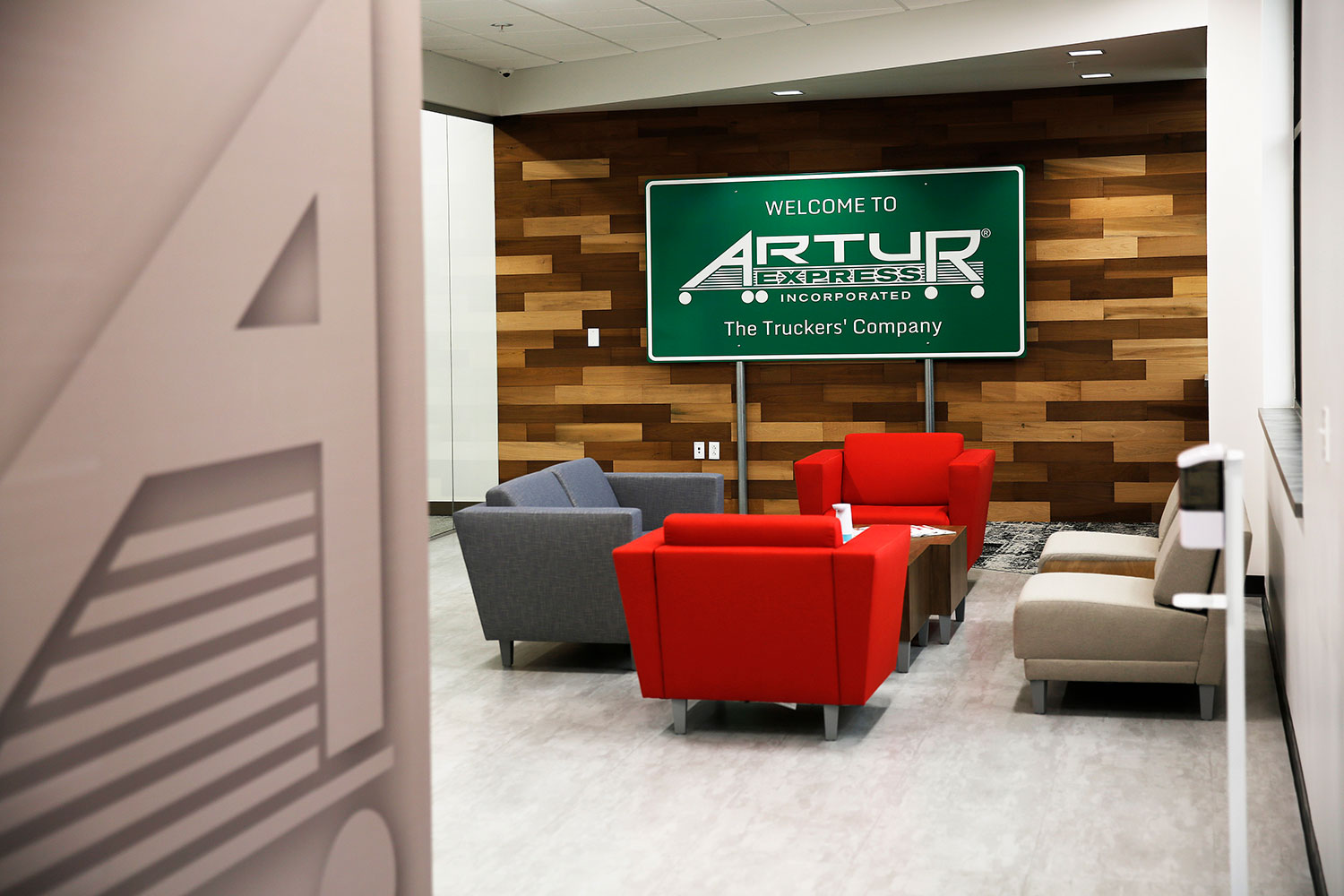
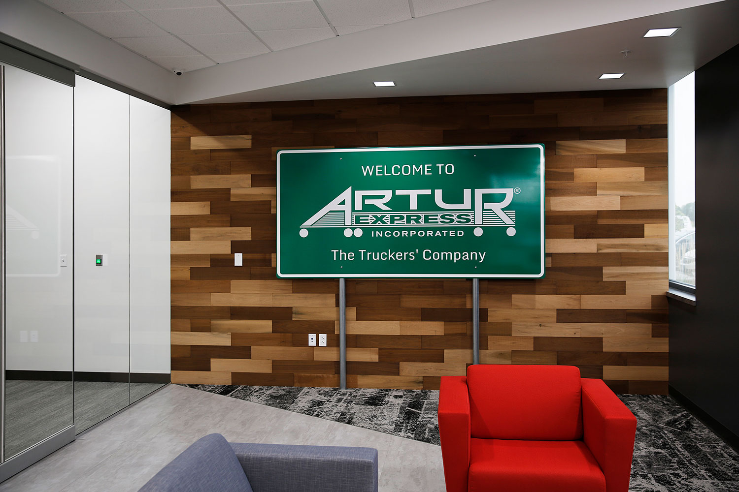
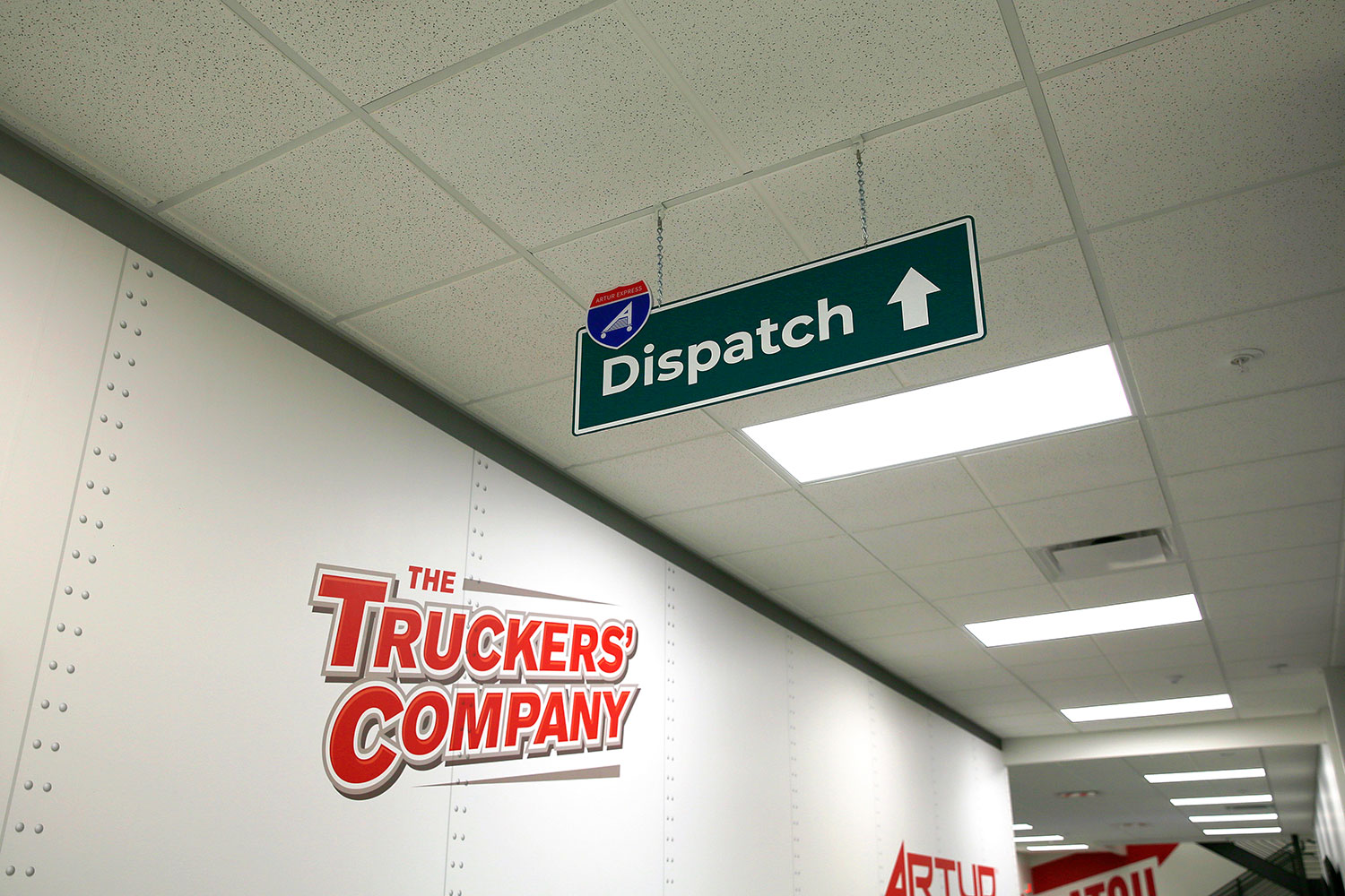
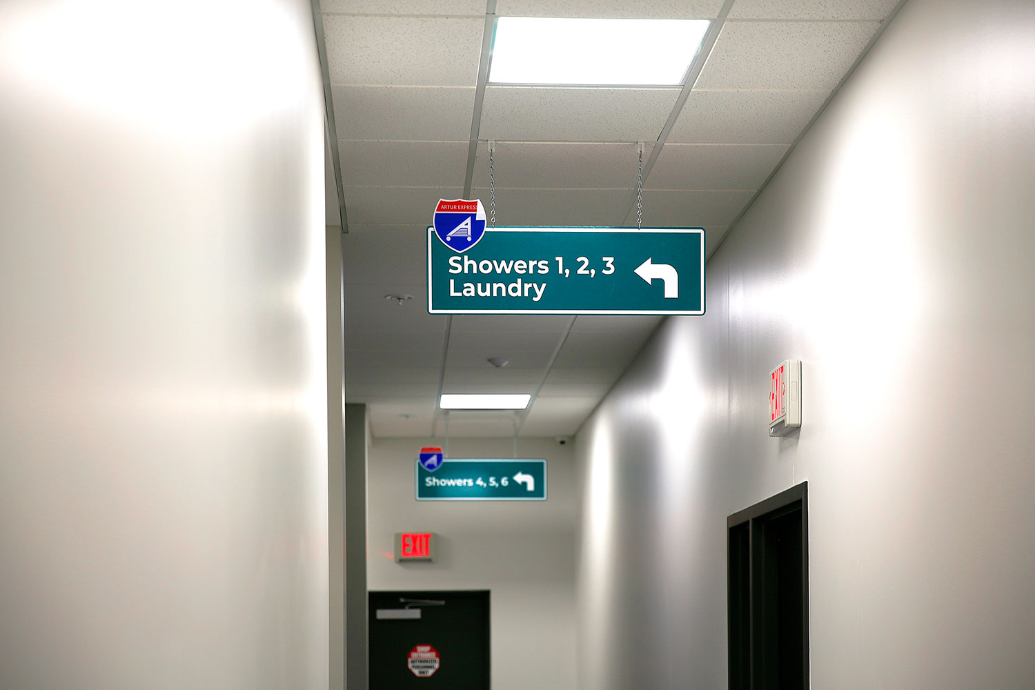
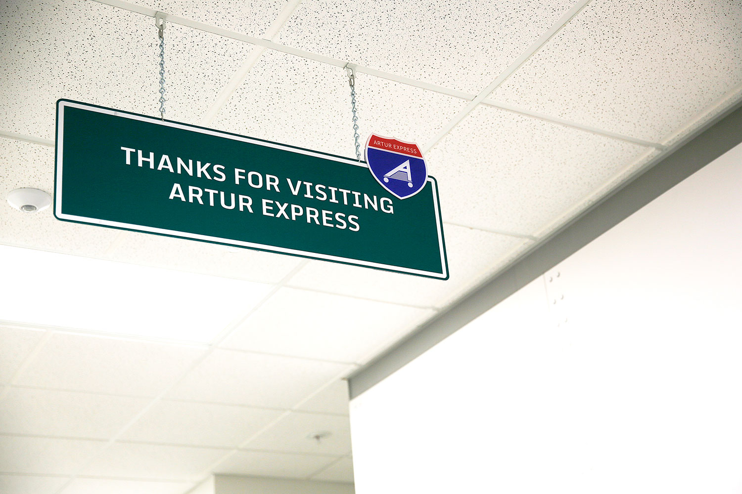
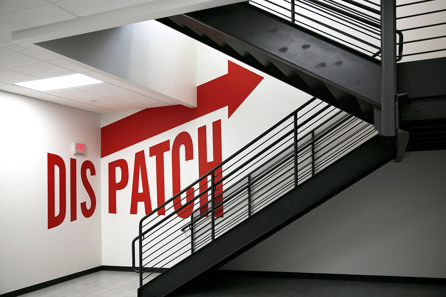
…we then carried this theme throughout the building with directional signage – adding a custom Interstate Artur Badge. See more samples below:
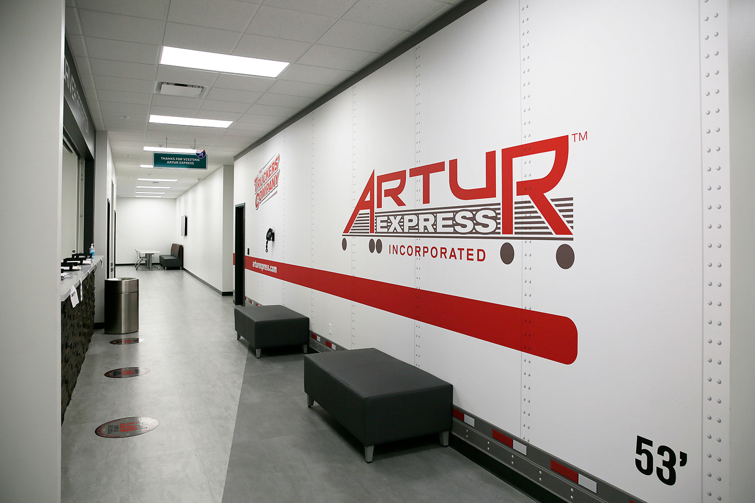
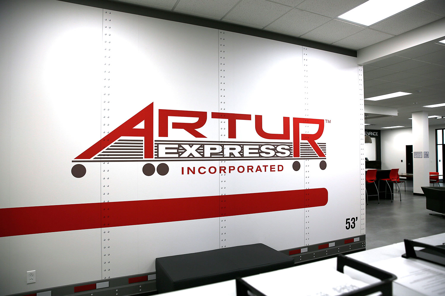
The Trailer Wall:
We made one of their main focus/high traffic walls look like one of Artur’s actual semi trailers:
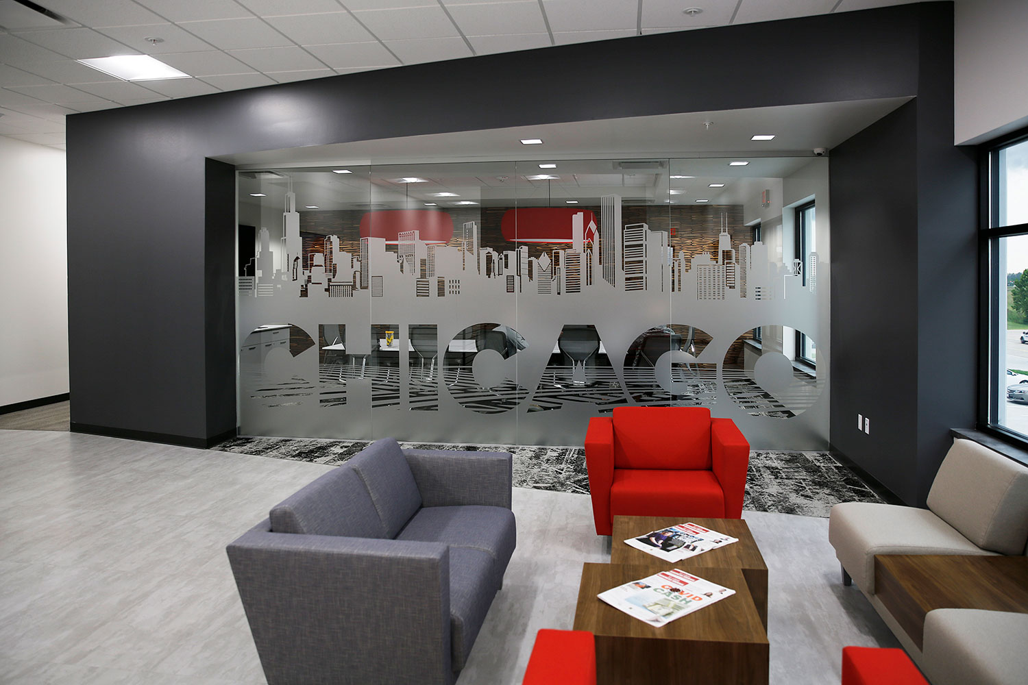
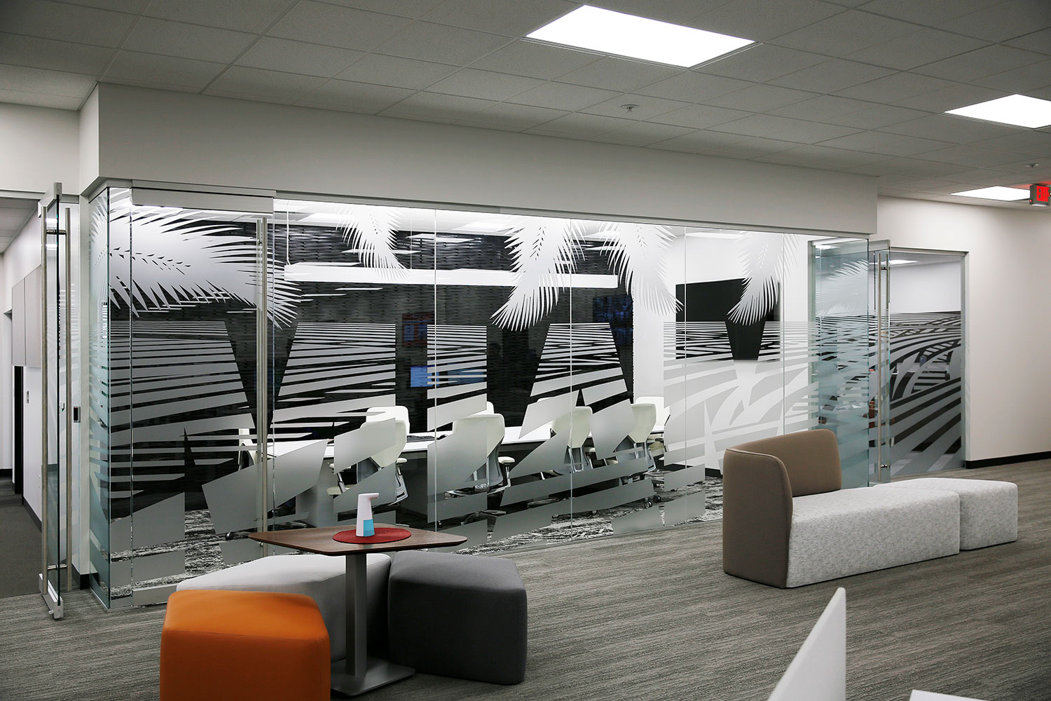
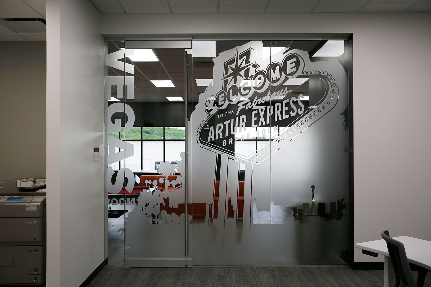
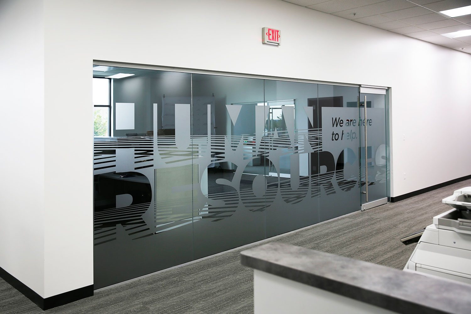
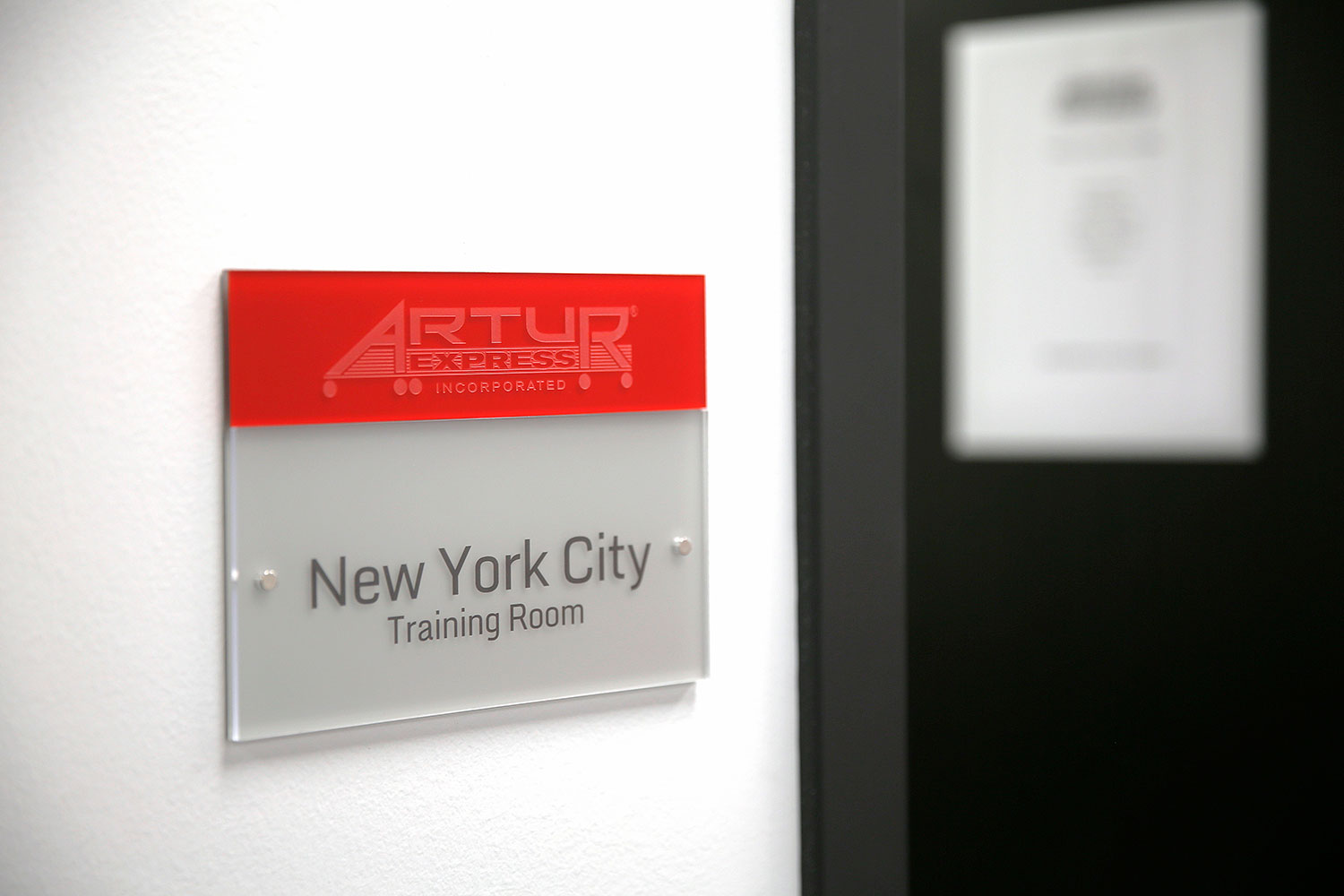
Glass Vinyl Graphics:
The new headquarters has multiple meeting rooms so they named them all after large U.S. cities. For semi-privacy, and identifying the names, we designed vinyl for all the glass walls.
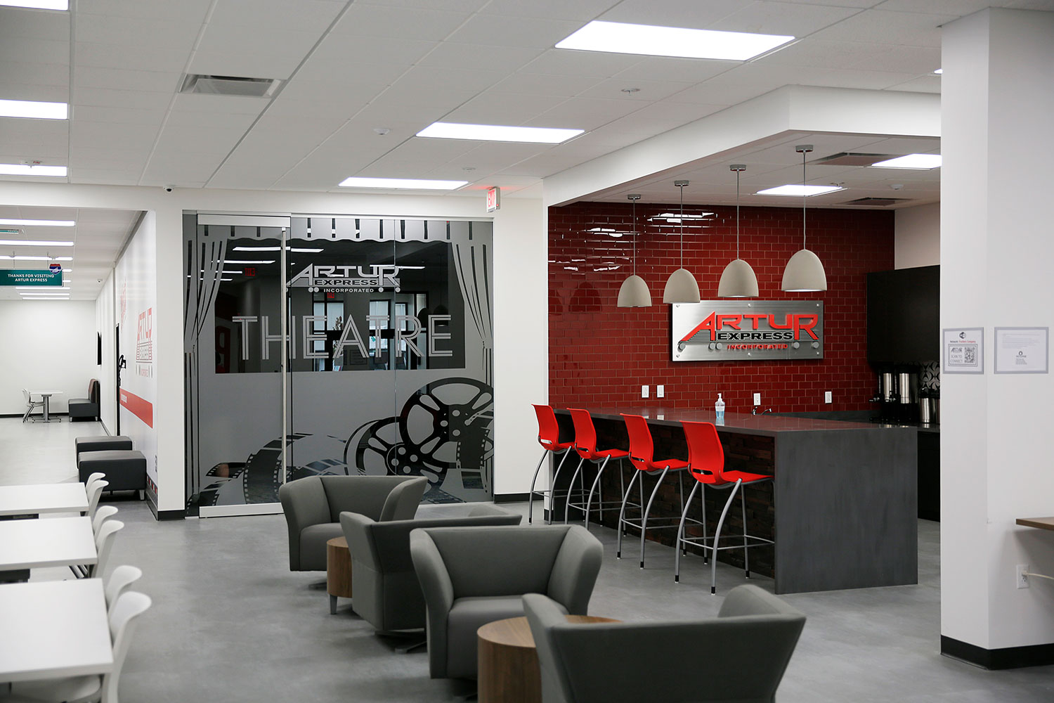
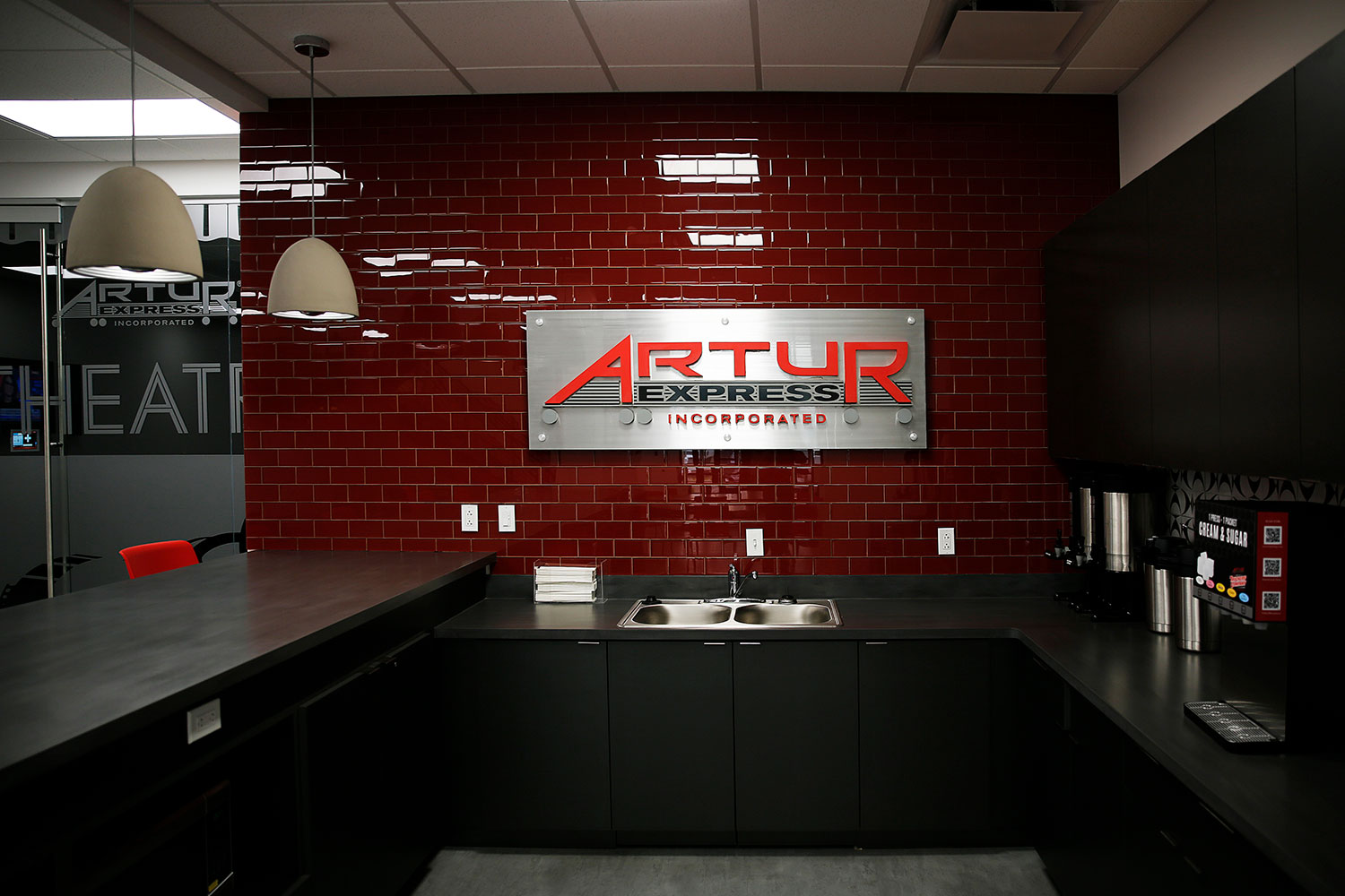
Misc. Signage & Graphics:
![]()
![]()
Artur’s new headquarters turned out AWESOME!!! We couldn’t be any happier with how everything came together. It has been amazing watching this company grow and it’s been our pleasure helping them along the way.
View more branding work we’ve done for Artur »

 Postcards