OUR BLOG
Here you will find our latest works, company news and more. We update it on a regular basis so be sure to come back soon. Please like, share, pin or tweet the post you enjoy.
Here you will find our latest works, company news and more. We update it on a regular basis so be sure to come back soon. Please like, share, pin or tweet the post you enjoy.
![]()
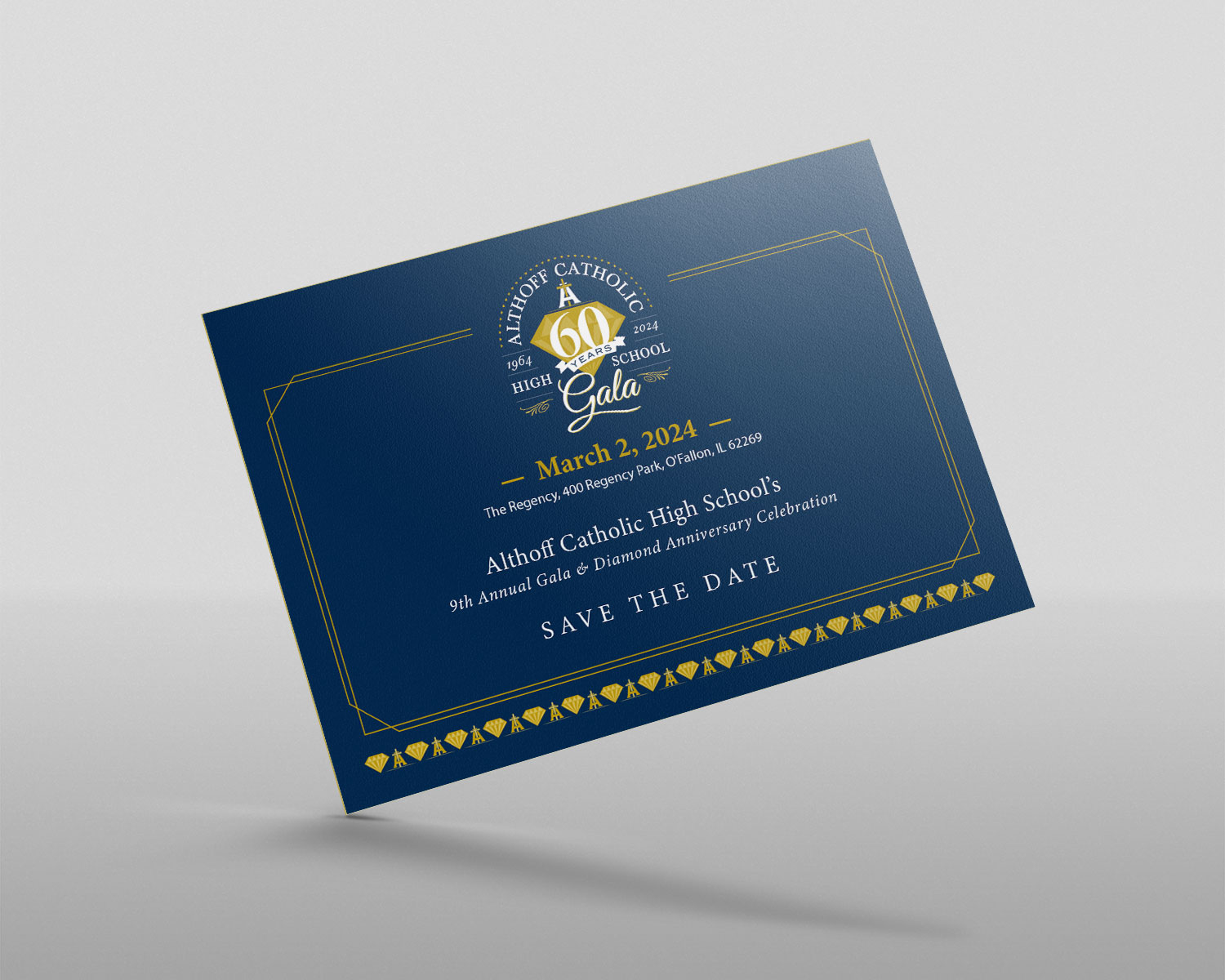
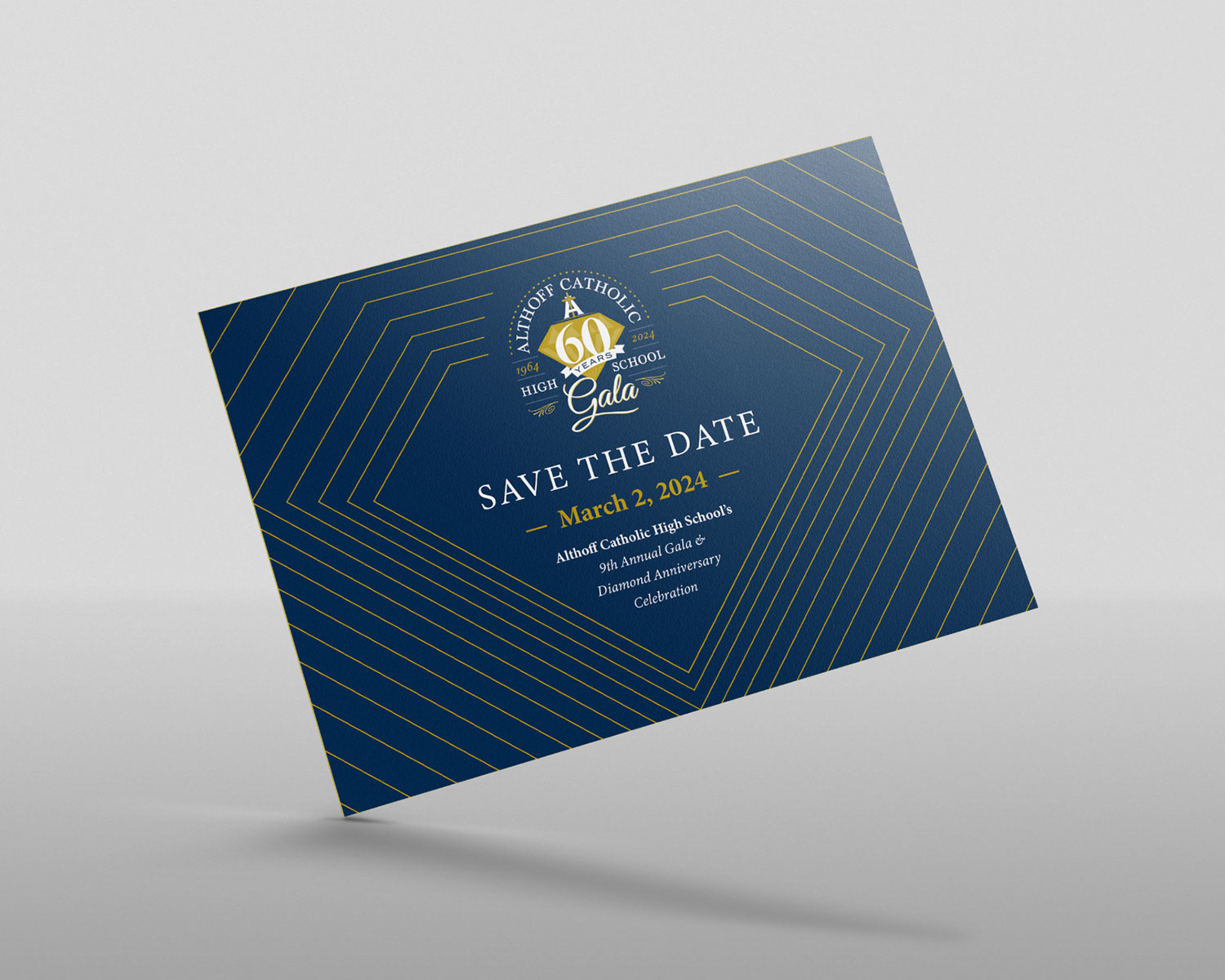
Once the logo was complete, we proceeded to design the Save the Dates for the Gala. Here is the selected design, and below that is one of the options — which was our favorite:
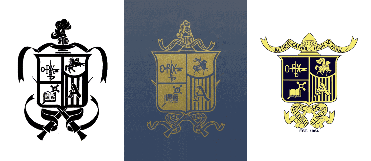
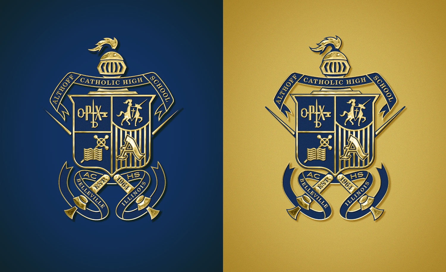
Presenting our updated and refined crest design, meticulously crafted to address spacing, proportions, and clarity concerns. All elements have been redrawn by hand, ensuring a fresh and polished appearance. The helmet is now easily identifiable, the illustrations in each quadrant of the shield are fixed and fit perfectly, the proportion of the shield and lances has been harmonized, and all text is now legible.
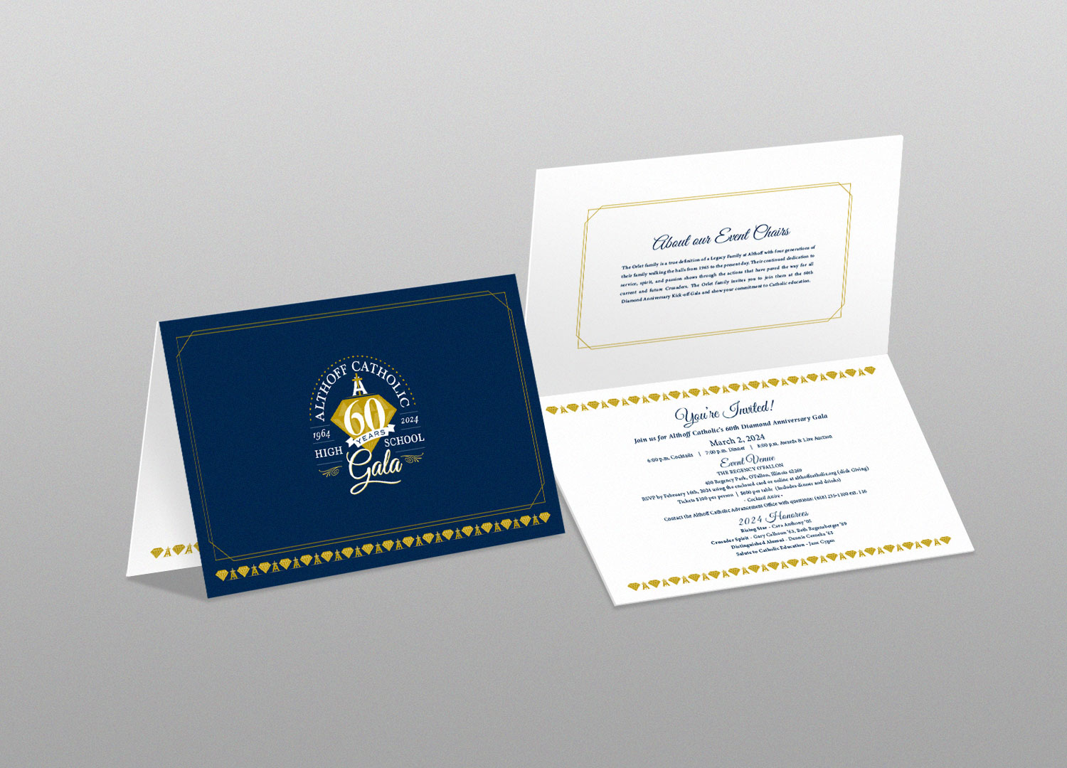
…and with some added effects/bling:
We were thrilled to have the opportunity to revamp the logo for a local O’Fallon, Illinois trophy shop known as B&P Trophy House. Established in 1979 by Bill and Pat, this business boasts a rich history and is currently under the leadership of their grandson, Buster. Specializing in crafting custom-made trophies, plaques, corporate awards, medals, name tags, and personalized gifts, B&P Trophy House has always been the go-to destination for all things trophy-related in the local community.
Their previous logo left much to be desired, as it was little more than an unaltered font paired with generic clip art. However, with our redesign, we’ve breathed new life into their brand. The fresh and dynamic final logo we’ve created truly stands out.
The new and improved logo features a trophy and plaque elegantly incorporated into a sporty and modern badge/crest style. This design not only captures the essence of the trophy shop’s dedication to sports and achievement but also infuses a contemporary and appealing flair into their new identity. It’s a reflection of B&P Trophy House’s commitment to quality and a symbol that represents their legacy in the community.
![]()
![]()
…And here are the final logo lockups, which include a full-color version with gradients and added effects, a solid two-color option, as well as a couple one-color alternatives:
![]()
Click here to view our logo design portfolio, or click here to view some of our branding projects.
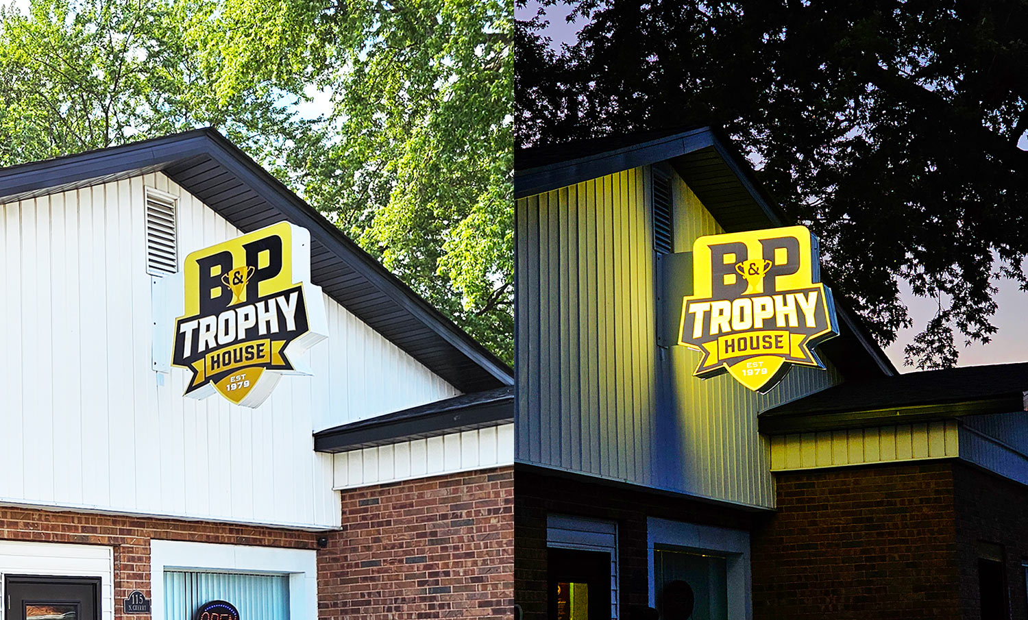
B&P recently installed a new sign featuring the logo we designed, and it looks fantastic – both during the day and illuminated at night!
![]()
Visual Lure is thrilled to announce that our work has been recognized and selected for publication in the esteemed LogoLounge, a leading publication within the industry. We are deeply honored by this achievement, which highlights our dedication to exceptional logo design. This year, we are delighted to share that 14 of our logos have been chosen as winners across a diverse range of industries. This will also mark a significant milestone as it features the largest number of logos we’ve ever had selected for a single book. Our previous achievement was showcased in LogoLounge Book 10, where we proudly presented a collection of 12 logos.
These outstanding logos not only demonstrate our creative prowess but also contribute to a grand total of 64 awards garnered over the course of 11 LogoLounge books. Below, we proudly present each of the 14 award-winning logos, accompanied by details and descriptions that encapsulate our approach and solution.
![]()
Last Prisoner Project Icon: The presented logomark was conceptualized as a potential logo for a nationwide, nonpartisan nonprofit organization committed to advocating for cannabis criminal justice reform. The icon itself embodies a minimalist yet impactful design: a confident and striking depiction of a broken chain, symbolizing the core principles of liberation and freedom.
![]()
West Wind Equipment Leasing Monogram Logo: This monogram logo features the letter ‘W’ being blown by heavy winds, and the wind/motion marks create the letter ‘E’, which is the second letter of the monogram.
![]()
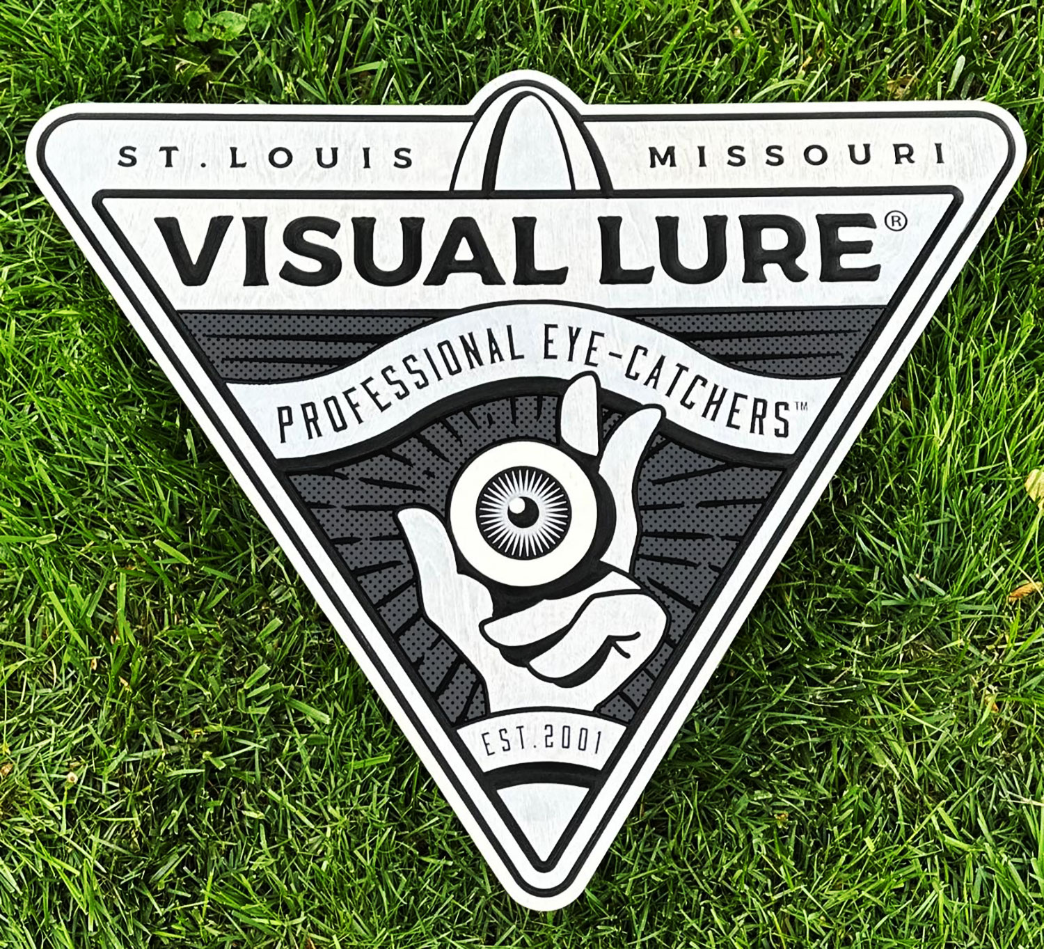
Visual Lure Logo: This is an in-house logo for our company. It features an eyeball being held by two hands, symbolizing our tagline ‘Professional Eye-Catchers.’ The design is further enclosed within a V-shaped crest.
![]()
Borderlines Logo: This is a proposed logo for a University travel program that took students to learn more about the southern border with Mexico. The design features a cactus to represent the desert landscape, an accent border line for emphasis, and is encased within a compass.
![]()
Relationship Church Logo: This concept served as a proposed logo for a community church in the St. Louis area. The design ingeniously portrays a congregation of fish coming together in worship, beautifully forming the shape of a cross that symbolizes their faith.
![]()
Chirp Chirp Logo: This logo is for an up-and-coming golf apparel company, Chirp Chirp. Emanating from its name, we ingeniously crafted two chirping birds, with one subtly nestled within the negative space of the other – while also creating the letter ‘C’. The logotype is custom, and the ‘P’s give it a sense of playfulness along with making the type feel custom and unique.
![]()
Ameripol Staffing Logo: This conceptual logo was designed for an international staffing company headquartered in Poland, catering to American enterprises. The icon seamlessly integrates the elements of an American flag, adorned with a prominent star, while strategically positioned stripes below ingeniously come together to also shape the letter ‘A’, succinctly encapsulating the company’s transatlantic connection.
![]()
Plasticity Boom Logo: This logo distinctly embodies the eruption of creative ideas within the mind – and what better symbolism to capture this than an atomic bomb detonating within a human head? The clever utilization of negative space forms a dual representation, where the mushroom cloud elegantly morphs into the shape of a brain. This design encapsulates simplicity, clarity, and memorability – all indispensable attributes of a great logo.
In addition to its inclusion in LogoLounge 14, this design has also earned recognition from Design Rush, being honored as one of the best examples of negative space logos.
![]()
Ali Lou Photography Logo: This was a proposed logo for a professional photographer. The typographic-based design showcases an array of intricate loops, imbuing the logo with an air of elegance and motion, perfectly reflecting the artist’s craft.
![]()
Silver Sparrow Photography Logo: This proposed logo was envisioned for a professional photography studio located in Denver, Colorado. The logo ingeniously integrates a camera aperture, masterfully transforming its elements into the graceful form of a sparrow, symbolizing both the artistry of photography and a touch of freedom.
![]()
TackleMax Logo: This proposed logo features a TM monogram suspended over water and enclosed within a circle. It was designed for a fishing bait company specializing in lures that mimic the natural movements of prey.
![]()
Patriot Security Logo: This is a logo created for a security service provider in the St. Louis area. The client’s request was to integrate a minuteman figure into the logo, and our solution involved placing the minuteman within a shield, symbolizing security. Additionally, the shield itself is designed as an American flag.
![]()
Chirp Chirp Logo Option: This was another option we designed for Chirp Chirp, an up-and-coming golf apparel company. This concept showcases a bird perched on a golf club, with two beaks in a chirping pose, cleverly aligning with the company’s name.
![]()
Empennage Wealth Management Logo: This logo was crafted for a wealth management company servicing in the greater St. Louis region. Given their significant clientele within the commercial pilot industry, they sought to incorporate aviation elements (it also inspired their name). Utilizing the concept of an ’empennage,’ the stabilizing tail surfaces of an aircraft, we ingeniously fashioned an icon that seamlessly merges an empennage with the letter ‘E’.
![]()
I’m sincerely thankful to LogoLounge for this honor. Their dedication to the industry and logo design itself is truly meaningful and reinforces the value of my work. Their recognition fuels my creative spirit and underscores the impact of my efforts. Thank you for brightening my journey and fostering pride in my passion and vocation.
The Dappleton Hotel is an upscale luxury hotel located in Hermann, MO, currently in its planning and development stages. They approached Visual Lure with a desire for a logo that embodies a sense of opulence. The logo design specifications included a portrayal of a Dapple Dachshund dog, the incorporation of a DH monogram, and they provided this mood board as inspiration for the design:
![]()
After a couple of rounds of monograms and slight modifications to the dog, we proudly present the final logo:![]()
Accompanying the final logo are numerous lockup options, designed to complement a diverse array of branding elements for a wide range of uses. We made slight modifications to the lockups positioned on a dark background, as the highlights needed to be reversed for them to appear correctly.![]()
It has been an honor to be part of this project, and we are eagerly anticipating the unveiling of the new hotel. Perhaps the employees will wear pins like these. There are so many possibilities with the final lockups…
![]()
Click here to view our logo design portfolio », or click here to see entire branding packages »
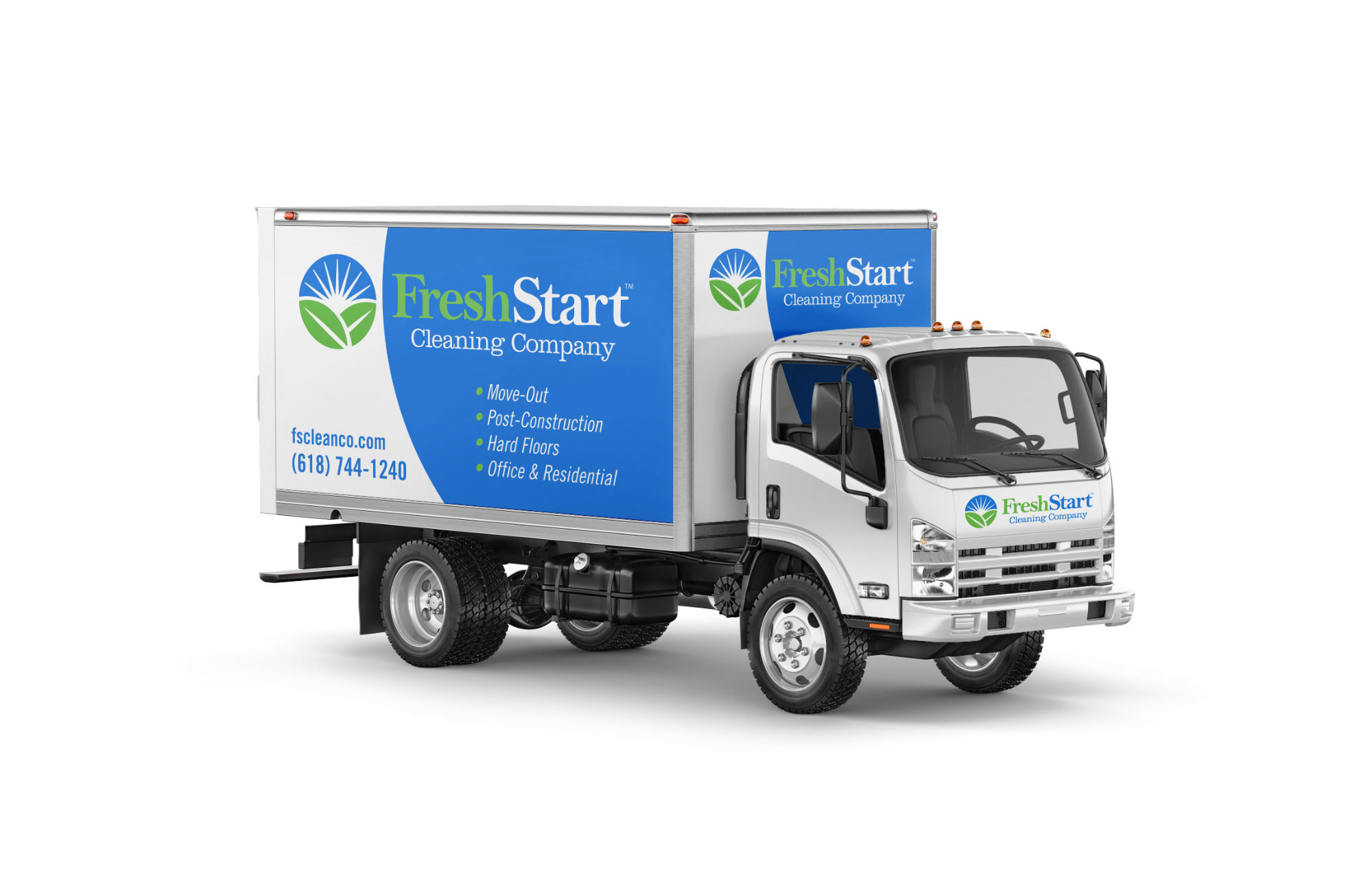
Visual Lure recently partnered with a local cleaning company to undergo a comprehensive rebranding. Our extensive package encompassed logo design, identity design, branding materials, advertisements, website development, and ongoing SEO services. The previous company name, “The Clean Queen,” was initially fitting when it was comprised of a small group of women. However, as the company expanded and welcomed both men and women into its team, it became necessary to update the name. Additionally, considering the client’s aspirations for possible future franchise expansions, a more versatile name was desired.
We embarked on the rebranding journey by focusing on the logo design. Presented below are the initial options we developed. The top option showcases a sun rising against a blue sky, symbolizing a “starting a new day”, complemented by two leaves representing “freshness”. The middle option features a simple yet elegant custom hand-drawn typeface – exuding cleanliness and freshness. Lastly, the bottom option incorporates clean sparkles to form a letter F monogram.
![]()
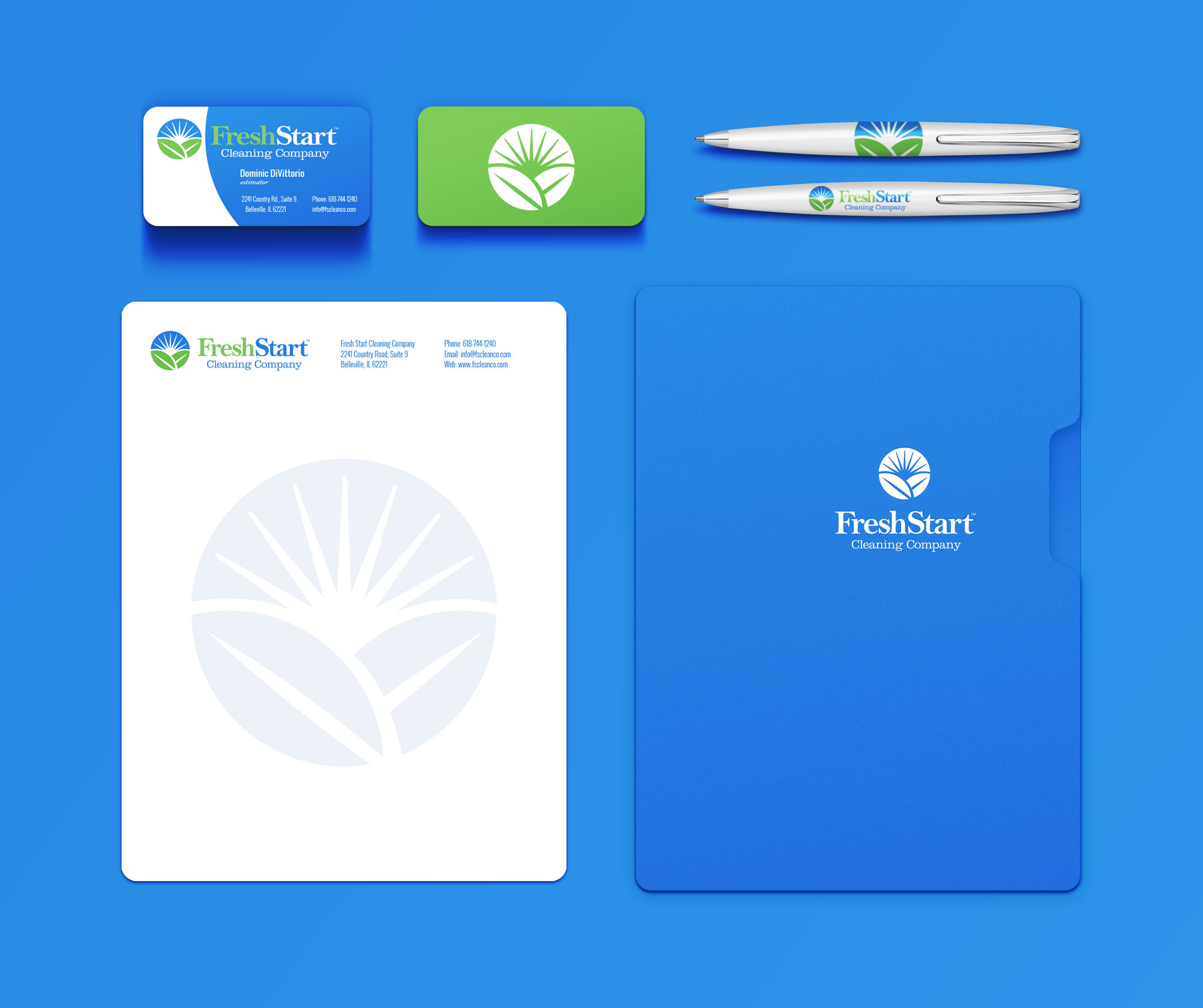
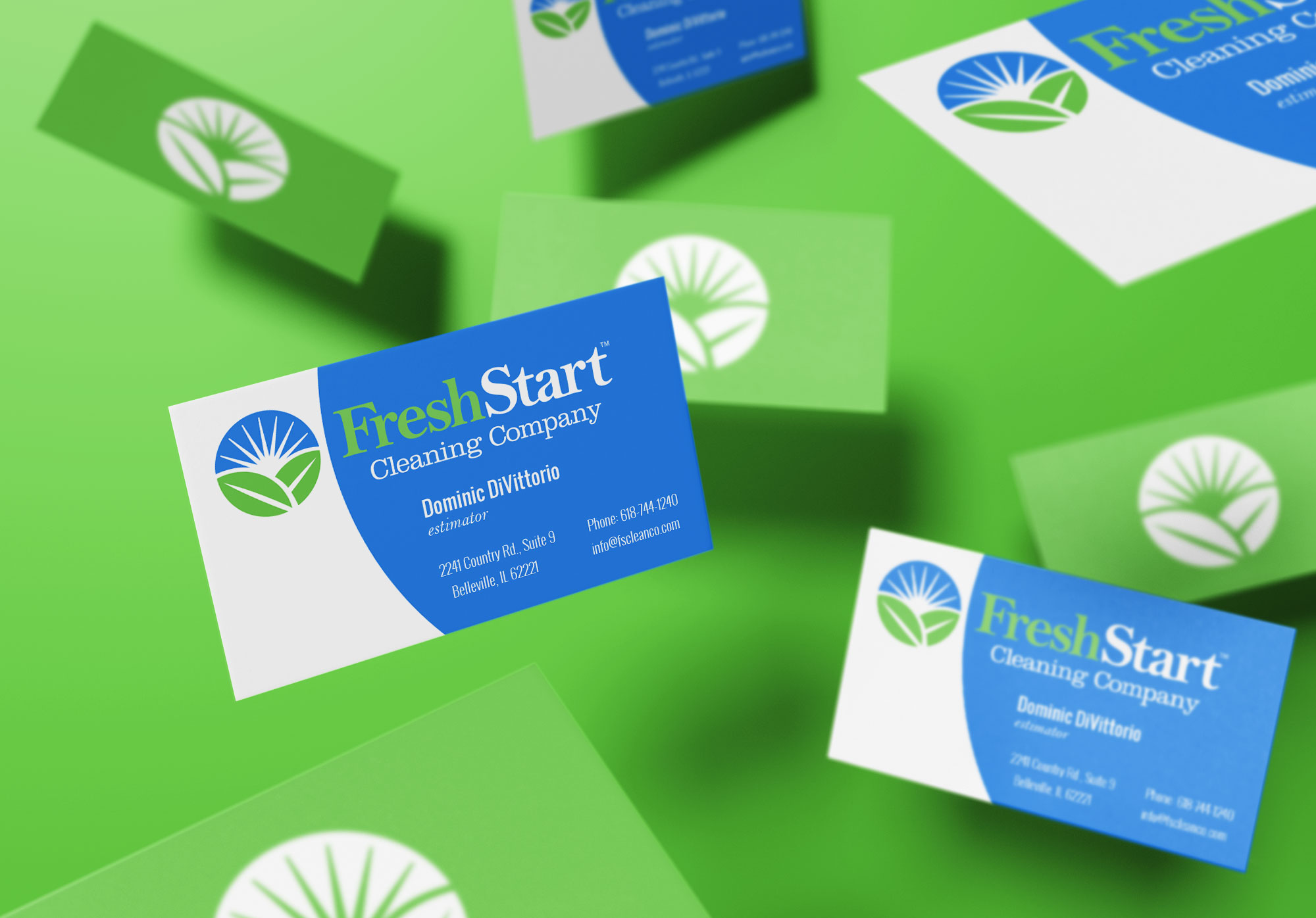
After careful consideration, the client selected the following option as their preferred logo. Here are all the final logo lockups we delivered:![]()
Building upon the logo, we proceeded to develop a comprehensive identity package for the client. This included a basic styling guide, business cards, letterheads, trailer, and additional supplementary materials.
We wrapped up the package with a fully custom, search engine optimized WordPress website.
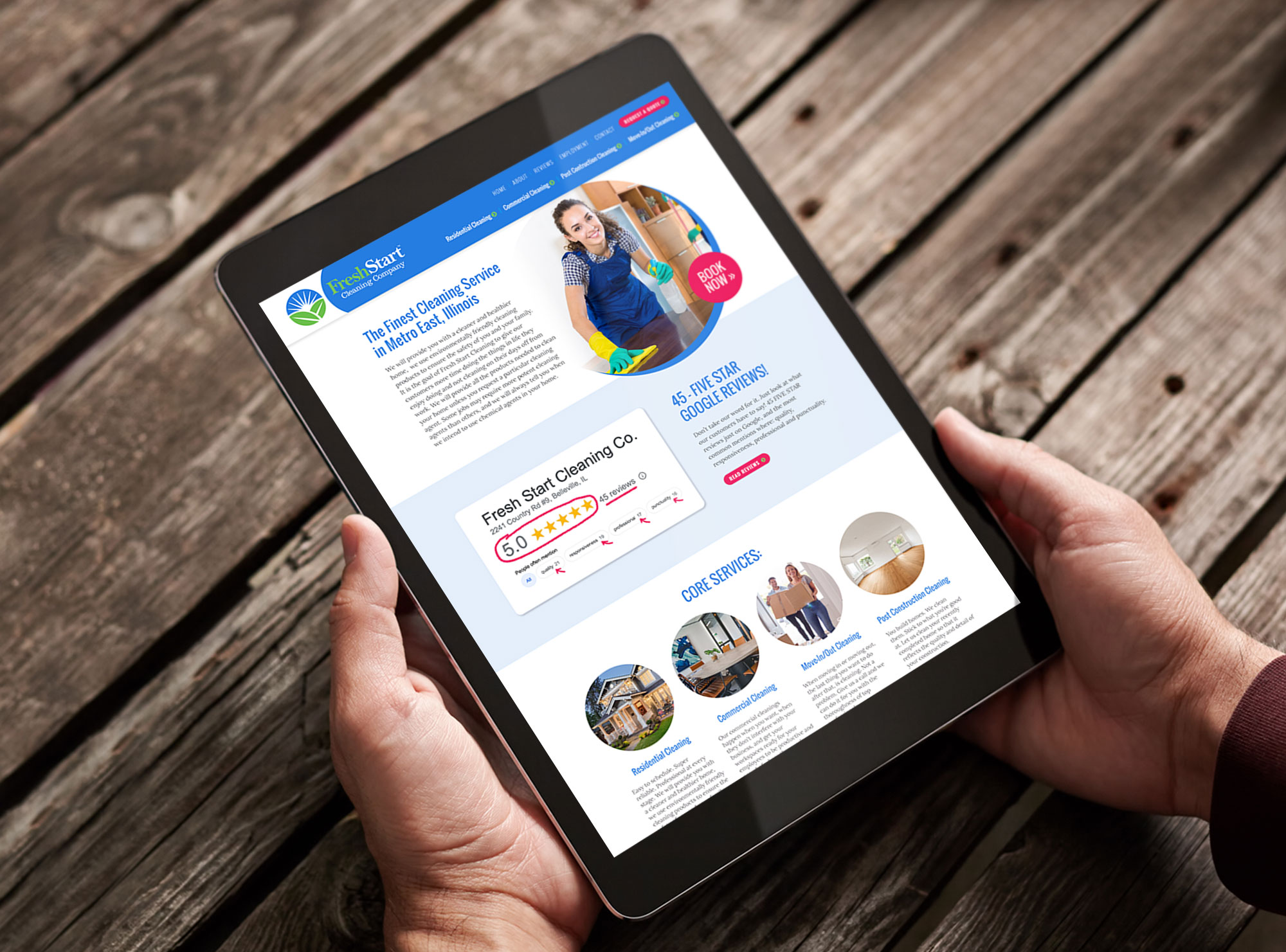
Furthermore, we are committed to providing ongoing SEO services and consulting to ensure the client’s website achieves high rankings and effectively converts visitors into loyal customers.
We are thrilled with the final outcome and firmly believe that the new brand exudes an exceptional sense of cleanliness and freshness.
Check out the new Fresh Start Cleaning website at www.fscleanco.com »
Click here to see the entire branding package »
While recently scrolling through Instagram, I stumbled upon an incredible handcrafted wooden sign that immediately caught my attention. Its intricate details and carefully placed colors impressed me, compelling me to click the profile. Upon visiting, I discovered a huge selection of remarkable signs and was immediately convinced that I needed to have one made for myself. To my pleasant surprise, the cost was very affordable, and the level of craftsmanship was truly exceptional. The sign I requested was two feet wide and cost approximately $250.
The process was seamless and efficient. I provided my logo design in vector format, and within a day, I received a CAD drawing/rendering of the sign for my approval. Once I gave the green light, the sign was promptly created and shipped within 14 days. It now proudly hangs above my office computer.
![]()
If you’re in search of an exquisitely crafted wooden sign for interior purposes, I wholeheartedly recommend Cornbread Customs. These two talented individuals (Han & Tony), based in Nebraska, create stunning signs with utmost skill and precision. They have truly mastered the art of sign making. You can find their exceptional work at CornbreadCustoms.com or on Instagram here: instagram.com/cornbread_custom_signs.
