What are Negative Space Logos?
Negative spaces logos are logos with a design element “hidden” in the negative/white space of the logomark or logotype.
Why are Negative Space Logos Popular?
Negative spaces logos are popular because they tend to be more memorable than other types of logos, and memorability is arguably the most important characteristics of logo design. They are also more difficult to create and only happen through sketching and extensive exploration. You simply can’t say “Make me a negative space logo with this…” It has to happen naturally, and you won’t be able to make a negative space design out of every logo.
Visual Lure’s Best Negative Space Logos
Over the years we have designed many negative spaces logos – with a couple winning awards and being featured in international publications. Below is a small collection of our favorites.
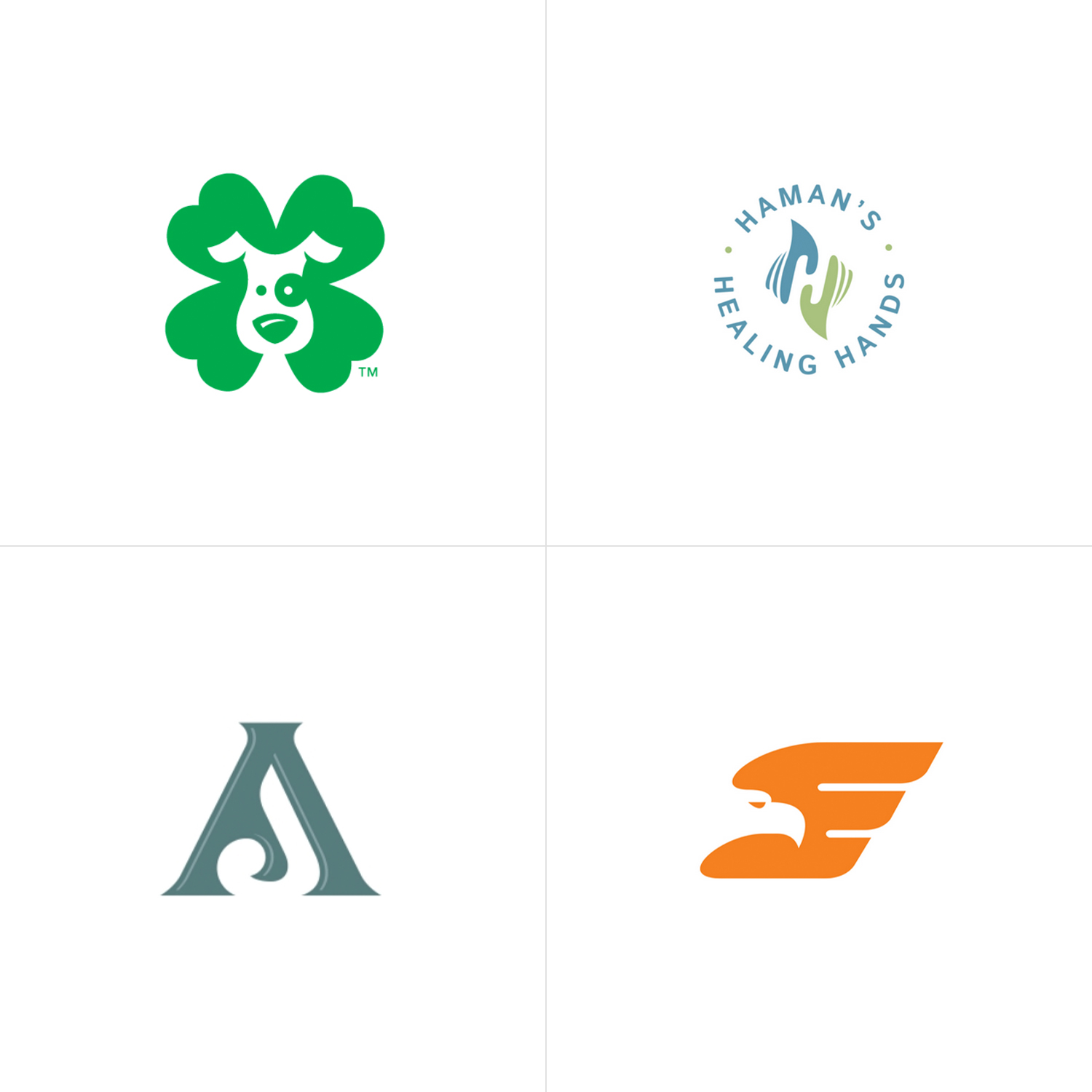
Top Left: Lucky Mutts Doggie Daycare Logo. This logo features a dog hidden in the negative space of the four leaf clover. This logo won 2nd place in Logo Wave Awards International, Wave 5, and was presented a Best Logo Design Award from Design Rush. Top Right: Haman’s Healing Hands Logo. This logo was for a St. Louis area massage therapist. The logo features a hidden H in the negative space of the hands. Bottom Left: Amber Jones Photography. We simply hid the letter “J” inside the “A” – making it memorable and stylistic. Bottom Right: Eagle was a program for a St. Louis area logistics company. We made the eagle head in the negative space of the “E”. The “E” also created the wings.
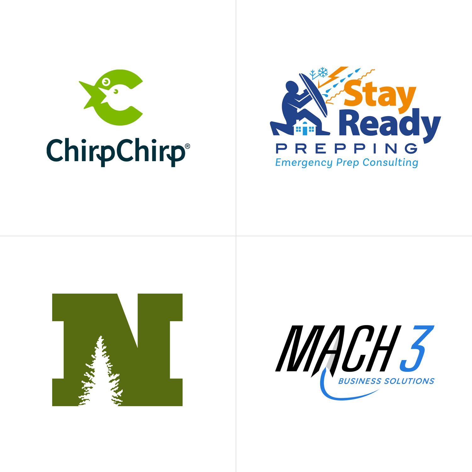
Top Left: Chirp Chirp Logo. This logo features a negative space bird inside another bird, both chirping, hence the name “Chirp Chirp”. Top Right: Stay Ready Prepping Logo. This logo was designed for a prepping consultant in the St. Louis area. It features a house in the negative space between the guard’s legs. Bottom Left: Northland Forest Products. We utilized their existing tree logo to create one of the notches in the letter ‘N’. Bottom Right: Mach 3 Business Solutions. In this unused proposed logo, there is a rocket ship in the negative space of the letter ‘A’.
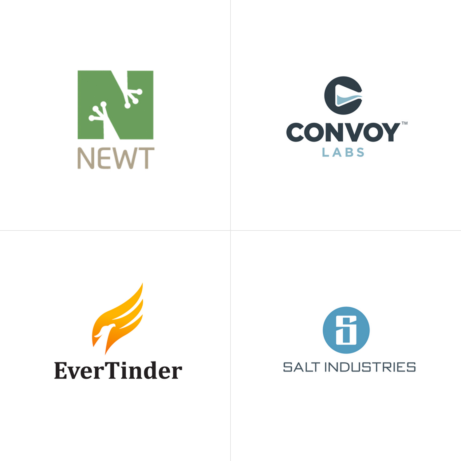
Top Left: NEWT logo where we used the legs of the newt to create the letter ‘N” using negative space. (this logo was awarded placement in LogoLounge Book 9) Top Right: Convoy Labs logo. This logo features a lab beaker/flask in the negative space of a circle to create the letter “C”. Bottom Left: EverTinder logo. This logo features a negative space phoenix head and a flame that doubles as an “E”. Bottom Right: Salt Industries Logo. Here we hid a letter “i” for industries in the negative space of the “S”.
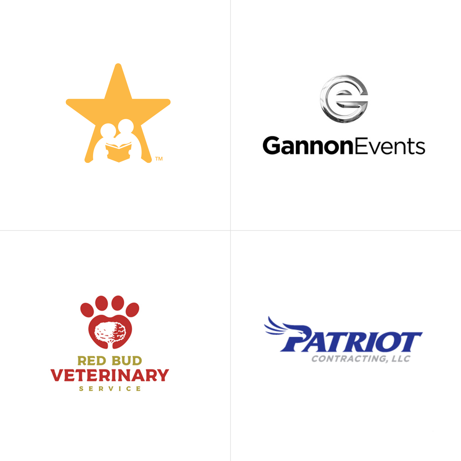
Top Left: Logo for a tutoring company where we embedded a tutor and student in the negative space of a star. Top Right: Gannon Events Logo. There is a hidden e inside the negative space of the “G”. Bottom Left: Red Bud Veterinary logo option where we added a “Red Bud” tree inside a paw. Bottom Right: Patriot Contracting logo option where an eagle’s head is in the negative space of the “P”.
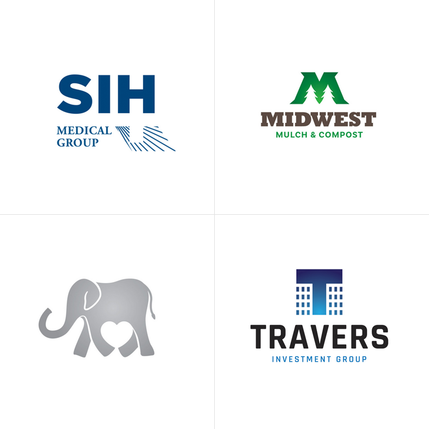
Top Left: In this logo, we hid a medical cross in the negative space directly below the “H”. Top Right: This logo features two hidden trees inside the negative space of the “M”. Bottom Left: this logomark has a hidden heart in the negative space of the elephants legs. Bottom Right: For this commercial real estate development company we created two building in the negative space of a box in order to create a letter “T” for Travers.
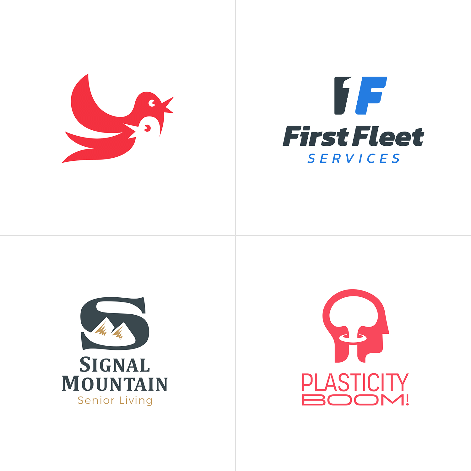
Top Left: Logo for a confidential project that features two birds chirping – with the negative space creating the head and voice bubble of the other. Top Right: in this logo, the number one is hidden in the negative space. Bottom Left: this logomark features mountains peeking through the negative space of the letter S. Bottom Right: This award-winning logo features a nuclear mushroom cloud that also creates the shape of the brain – representing “an explosion of ideas”.
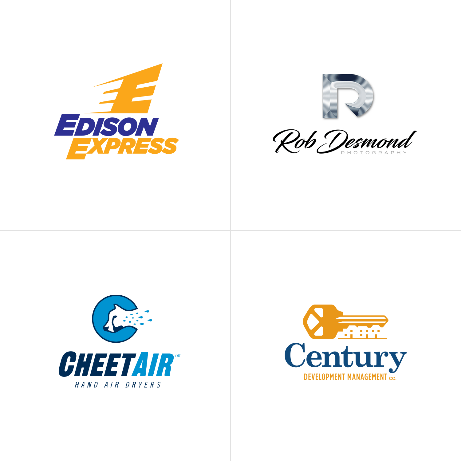
Top Left: There is a hidden E in the negative space of the other E that doubles as motion lines giving the logo a sense of speed/express. Top Right: There is a hidden R in the negative space of the D. Bottom Left: The negative space the cheetah’s head cuts out also creates the letter C. Bottom Right: The negative space of the key notches creates the roof line of an apartment complex.
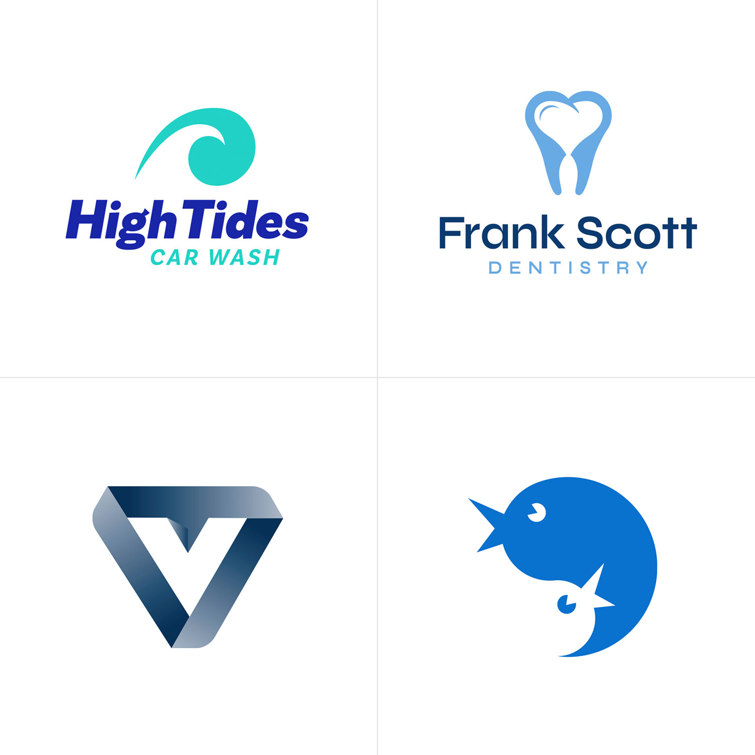
Top Left: There is an ocean wave in the negative space of the water droplet, creating a unique and memorable shape. Top Right: There is a hidden heart in the negative space of the tooth. Bottom Left: There is a V in the negative space of this strong three dimensional interlocking shape. Bottom Right: Logo for a confidential project that features two birds chirping – with the negative space creating the head of a second bird.
Want to see more of our logo design work?
Click here to view our logo design portfolio, or click here to view some of our branding projects.