Custom WordPress Development for St. Louis Wedding Planner
Visual Lure had the pleasure of working with Kristin Weis (again), and Cheree Berry Paper, to develop Kristin Ashley Events’ new custom WordPress website. Kristin Ashley Events is a premier St. Louis, MO full service wedding and event planning company that provides proposal planning, full wedding coordination, month of coordination along with à la carte options. Without doubt, they are one of the best wedding planning companies in the greater St. Louis area.
The fine designers at Cheree Berry Paper provided the new design and Visual Lure took those comps and turned them into a fully functioning responsive WordPress website. The new website features swaying roll-over frames on the home page and custom admin sections for the portfolio and press pages making it easy for Kristin to maintain. Visual Lure also designed the new contact and blog pages staying true to the aesthetic we were provided. This will be the third website we’ve developed for KAE.
Visit www.kristinashleyevents.com to check out the new website.
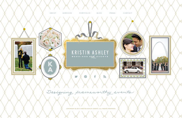
new home page design with swaying frames
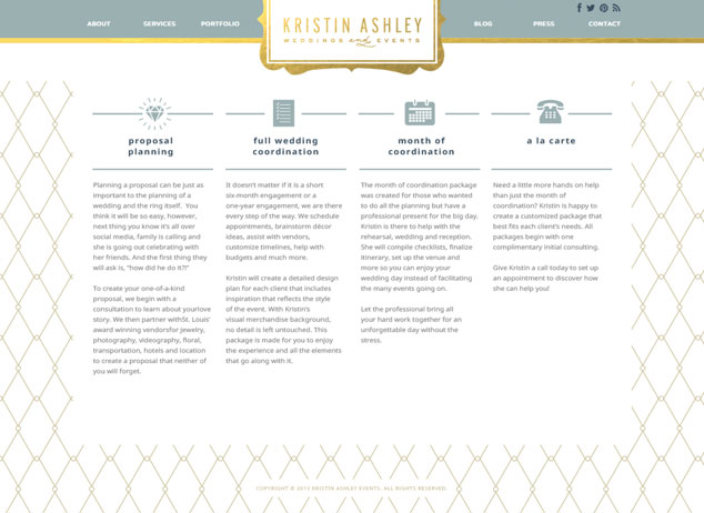
services pages
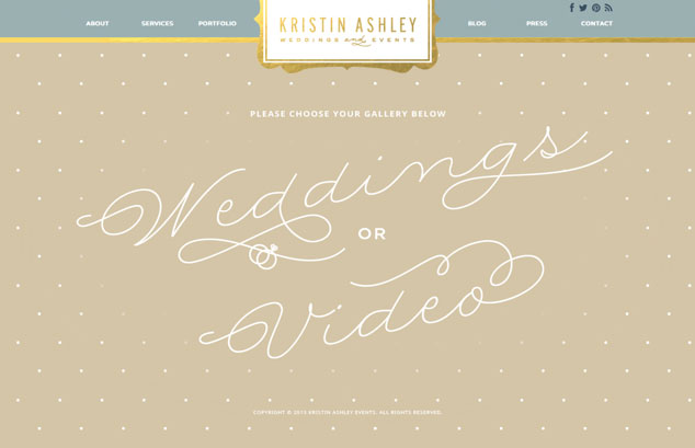
portfolio landing page
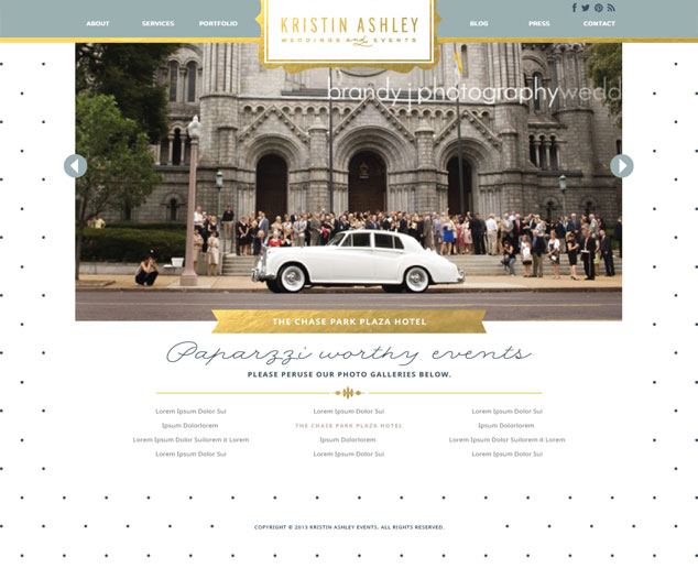
photo gallery
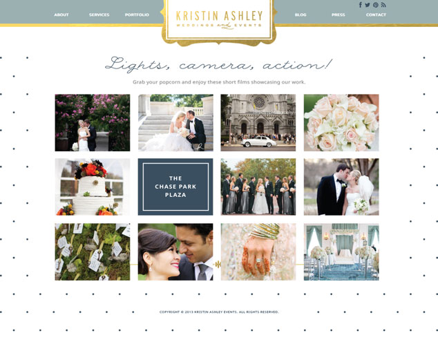
video gallery
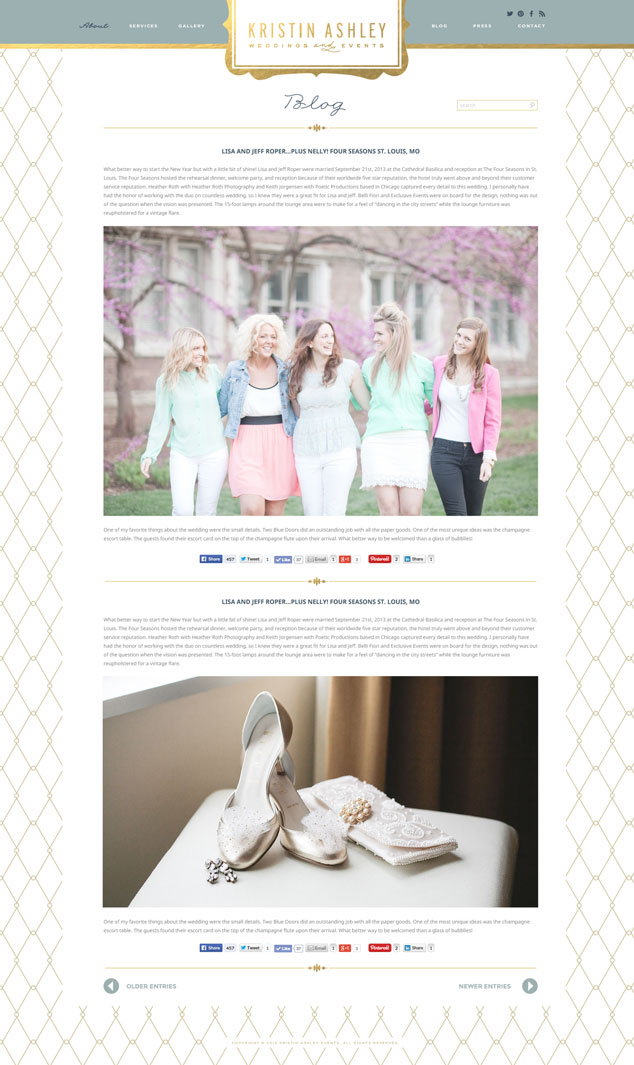
blog page
Learn more about our web design or WordPress design services, or contact us today for a free website consultation.