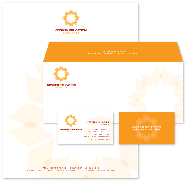
Goshen Education Consulting Logo & Identity Design
Here is the final logo design and identity package for Goshen Education Consulting. The logo mark is made out of overlapping books which form a star and a flower. The star represents guidance and enlightenment, and the flower represents growth.

Goshen Education Logo & Identity Design
Below are the other two logo design options we provided. In our discovery stage, the owner mentioned he had used the lighthouse as a symbol in the past and wanted to explore that option, so we came up with the logo on the left, which is a lighthouse combined with a Greek column. The column represents the educational industry, and the lighthouse represents the company and how it “guides” educational institutions to “enlightenment” through consulting. The logo design option on the right is simply a book with a bookmark, that when combined, forms the letter “G” for Goshen.

Unused Goshen Logo Design Options

