OUR BLOG

Here you will find our latest works, company news and more. We update it on a regular basis so be sure to come back soon. Please like, share, pin or tweet the post you enjoy.

New WordPress Website for Brewster Companies

Posted on November 30, 2017

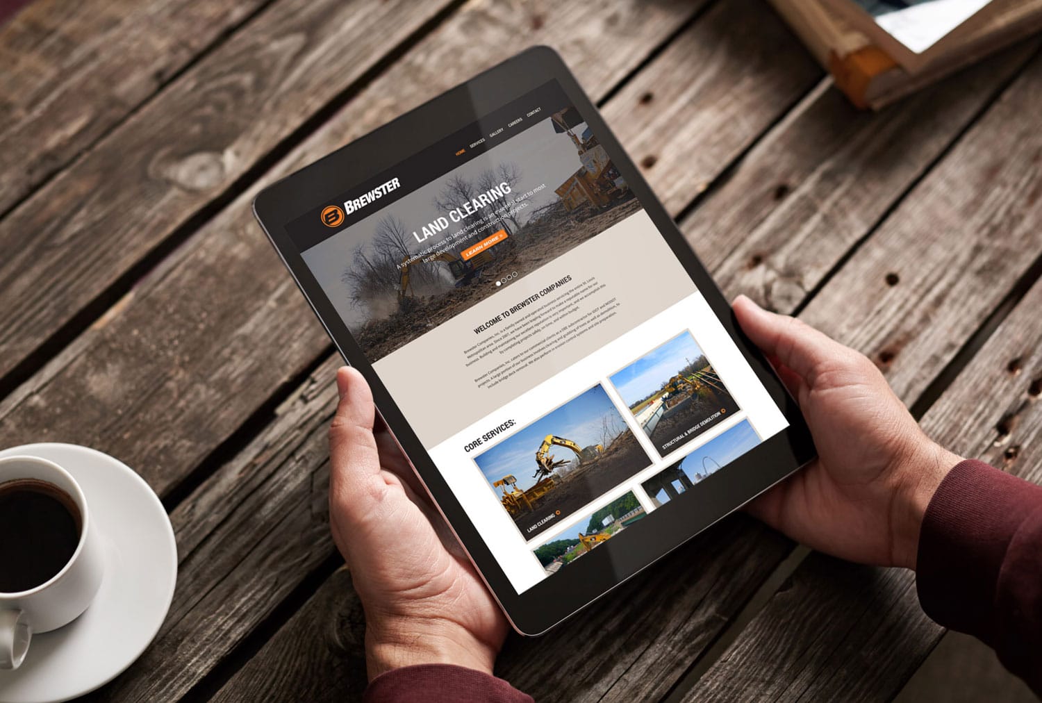
Visual Lure recently designed and developed a new custom WordPress website for Brewster Companies. Brewster is a family owned and operated excavating company based out of Maryville, Illinois that specializes in land clearing, structural and bridge demolition, site preparation and erosion control. As a Disadvantaged Business Enterprise, Brewster have earned a solid reputation for safety, high standards and delivering projects on time and in budget. They work with private owners, state agencies as well as local municipalities. Their client list includes: IDOT, MODOT, Ameren, Waste Management, Alcoa and more.

Brewster's new WordPress website

The new website was built in WordPress using a custom coded,ย responsive designed/mobile friendly theme. It features a clean, simple layout, multi-column layout options, and simple to maintain slideshows.


Photography

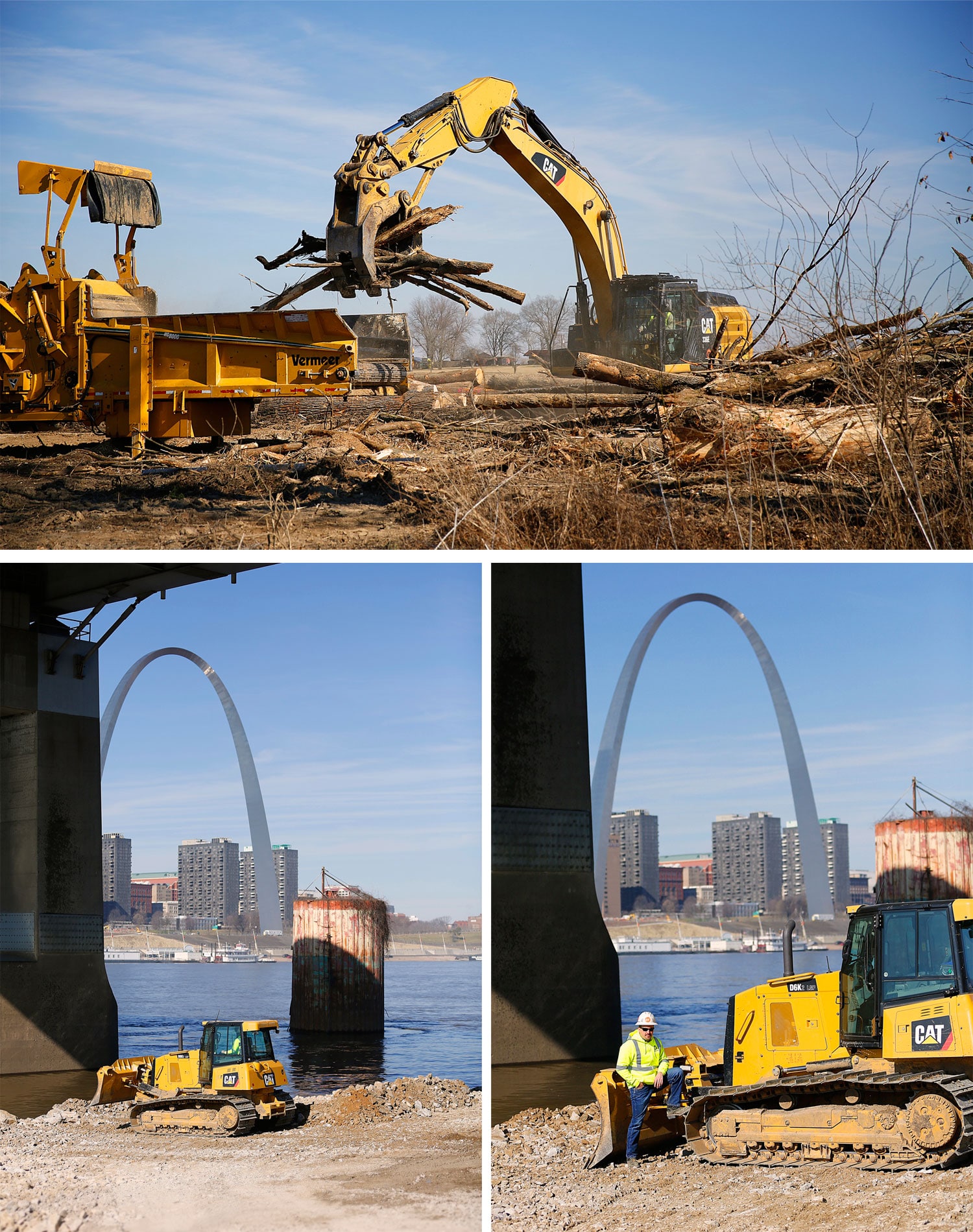
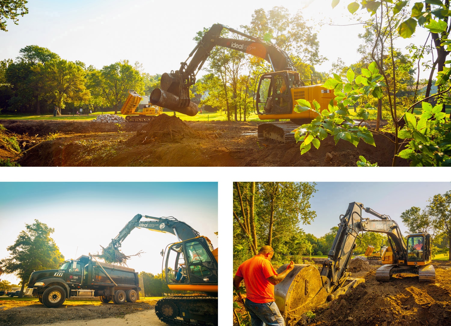
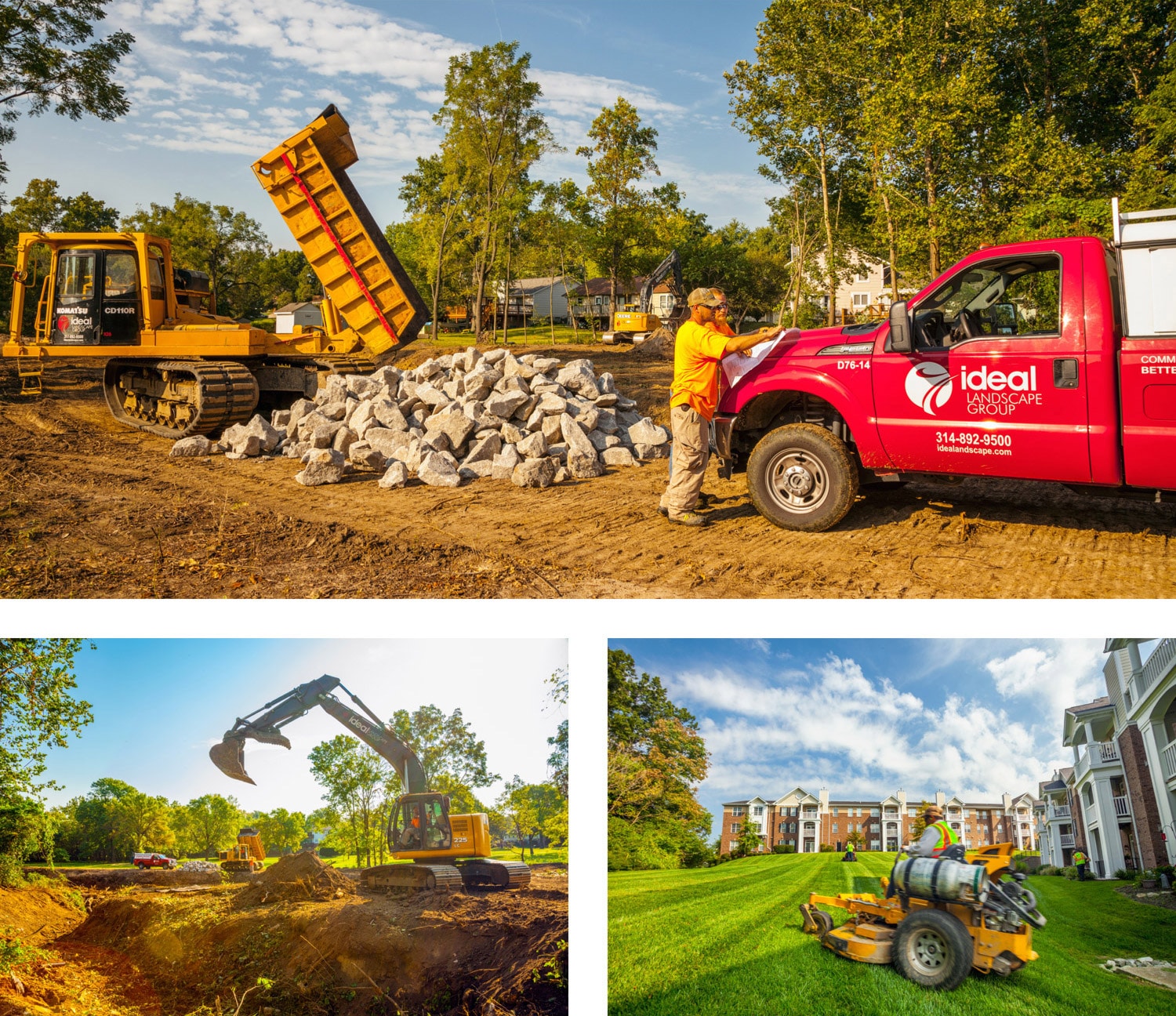
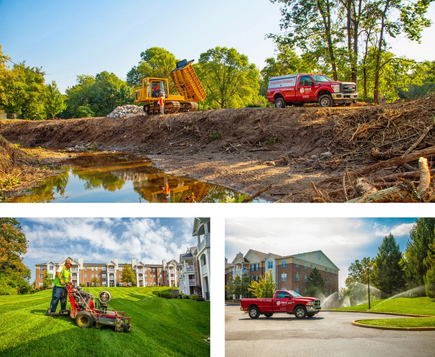
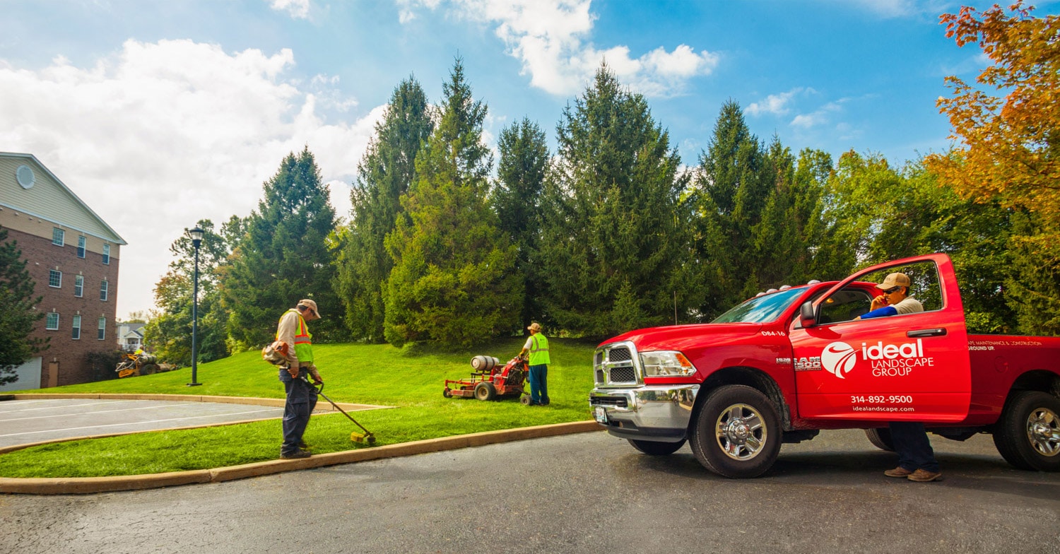
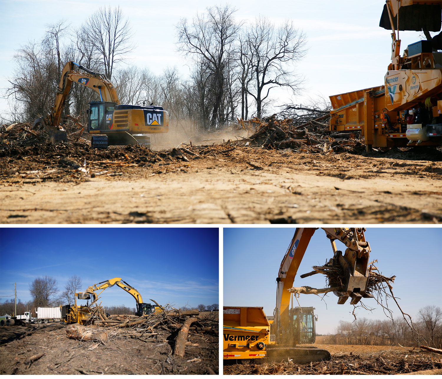
In addition to designing and developing the new website, Visual Lure also provided photography services – shooting multiple Brewster work sites. Below are a couple of our favorite images from those shoots.

Brewster St. Louis PhotographyBrewster St. Louis Photography 2

Visit Brewster Website ยป


Learn more about Visual Lure’s WEB DESIGN SERVICES, WORDPRESS DEVELOPMENT SERVICES, or view our WEBSITE PORTFOLIO.


New Website, Catalog & Print Ads for a Colorado Cattle Tag Company

Posted on September 28, 2017

Ritchey Livestock ID, based out ofย a Brighton, Colorado, is the creator and manufacture of the World’s greatest cattle tags! What makes theirs the best? Ritchey tags are 100% fade proof. How? Their tags have a core color with 2 outside colors. The colors are NOT layers, they can not peel apart or separate because they are made out of one solid piece of material. When engraved, or heat stamped, the core color is revealed – therefor the tag number, brand, or whatever information that has been applied never wear offs.

Visual Lure was recently contracted by Ritchey to redesign their e-commerce website. We were in charge of the design, while another company handled the development. The new responsive designed website was built in WordPress using WooCommerce for the online store. Immediately after completing the design of the website, Ritchey re-engaged us to design a new product catalog along with multiple print ads. See samples below:


WordPress/WooCommerce Website Redesign
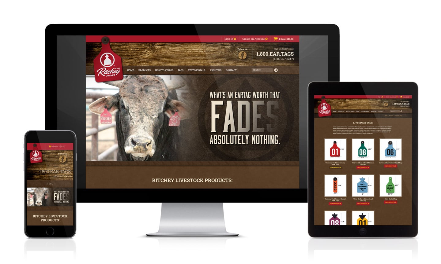
Ritchey Responsive website design

Like so many other websites, their old site was not mobile friendly, and with Google’s new mobile first indexing and over 1/2 of all web browsing done on smart phones – this was an issue. The new site, now utilizing a responsive design, renders beautifully on all devices.
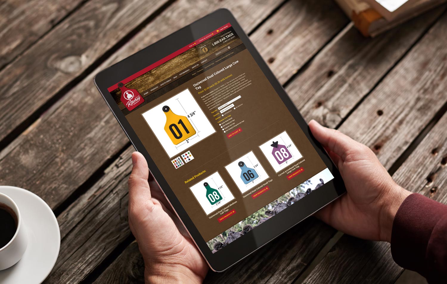
New Sample Product Website Page

The new e-commerce store, powered by WooCommerce, has been simplified and streamlined to help improve conversion rates. We also implemented conditional logic on many of the product order forms to make the checkout process fell less daunting.


Old Homepage Design:
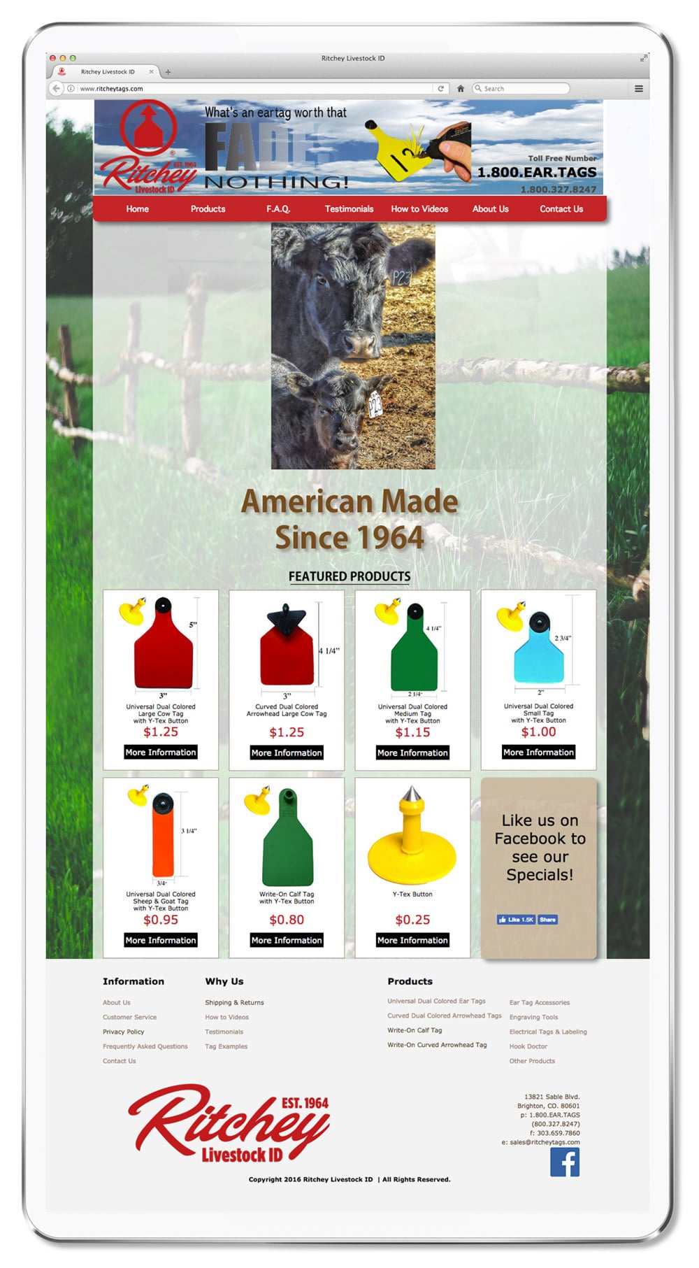
Old Ritchey Website design

The old website, which looked like a generic template, had tons of issues. It was not responsive, the checkout process was confusing and not user-friendly, and the design was void of all character.


New Homepage Design:
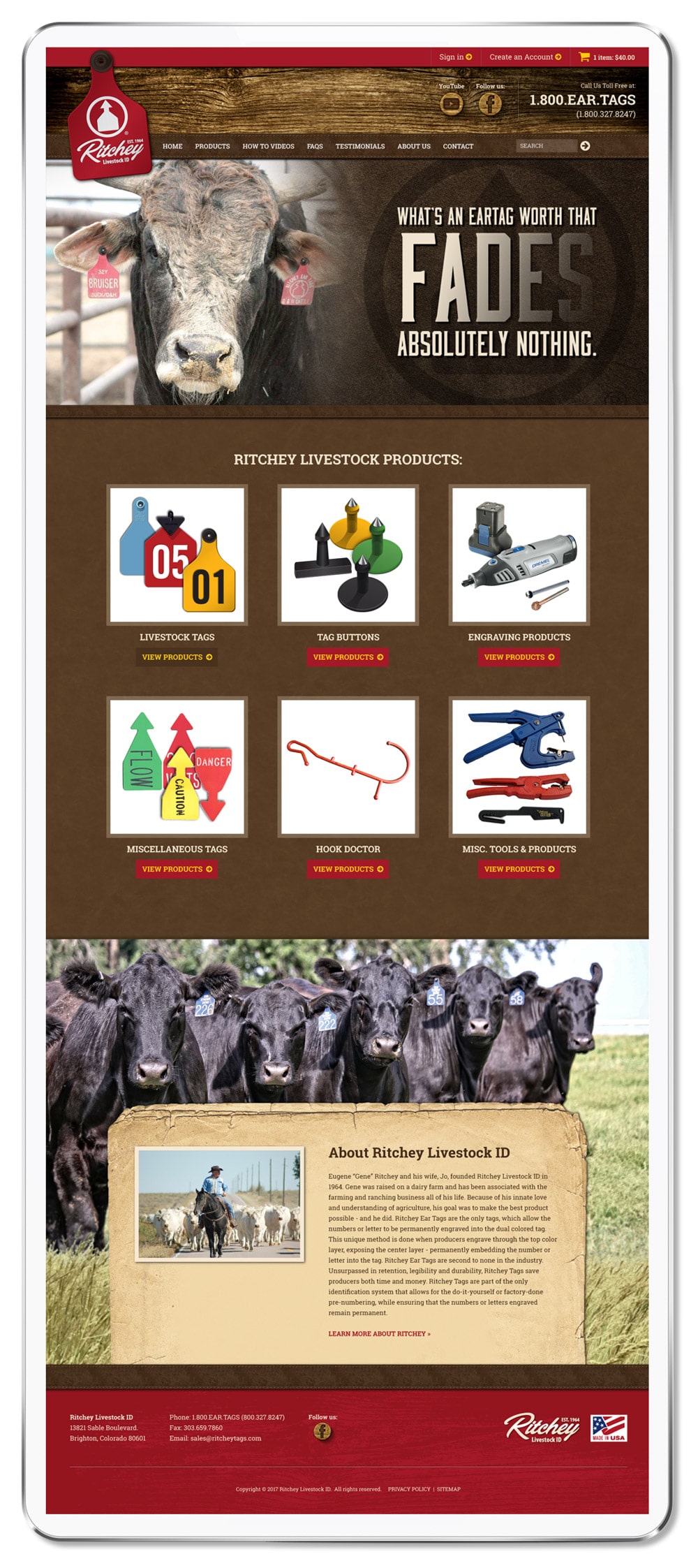
New Ritchey Website Design

The new design now has a rustic aesthetic using weathered wood, old paper, leather and cow hide textures along with cattle photos to appeal more to ranchers, their core target market. In additional to the website, Visual Lure also digitally recreated all their cattle tags to ensure correct colors and product consistency.


Catalog Print Design

Immediately after completing the design of the website, Ritchey hired us to redesign their product catalog. Other than the website, this is their main marketing tool, and like the old site – it too lacked character. Here is the cover and a sample spread from their old catalog:
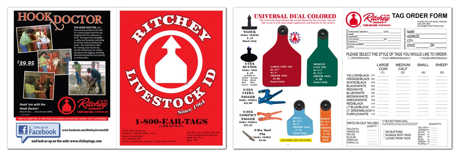
Old Ritchey Product Catalog

Building a Visually Cohesive Brand

Using the same rustic wood background, old paper and leather textures from the new website, the catalog now complements it, and becomes the first step in the development of creating a visually cohesive brand. Below you can see the new cover, a new ad for their Hook Doctor product, and a couple sample spreads (along with some of the new digitally rendered cattle tags).
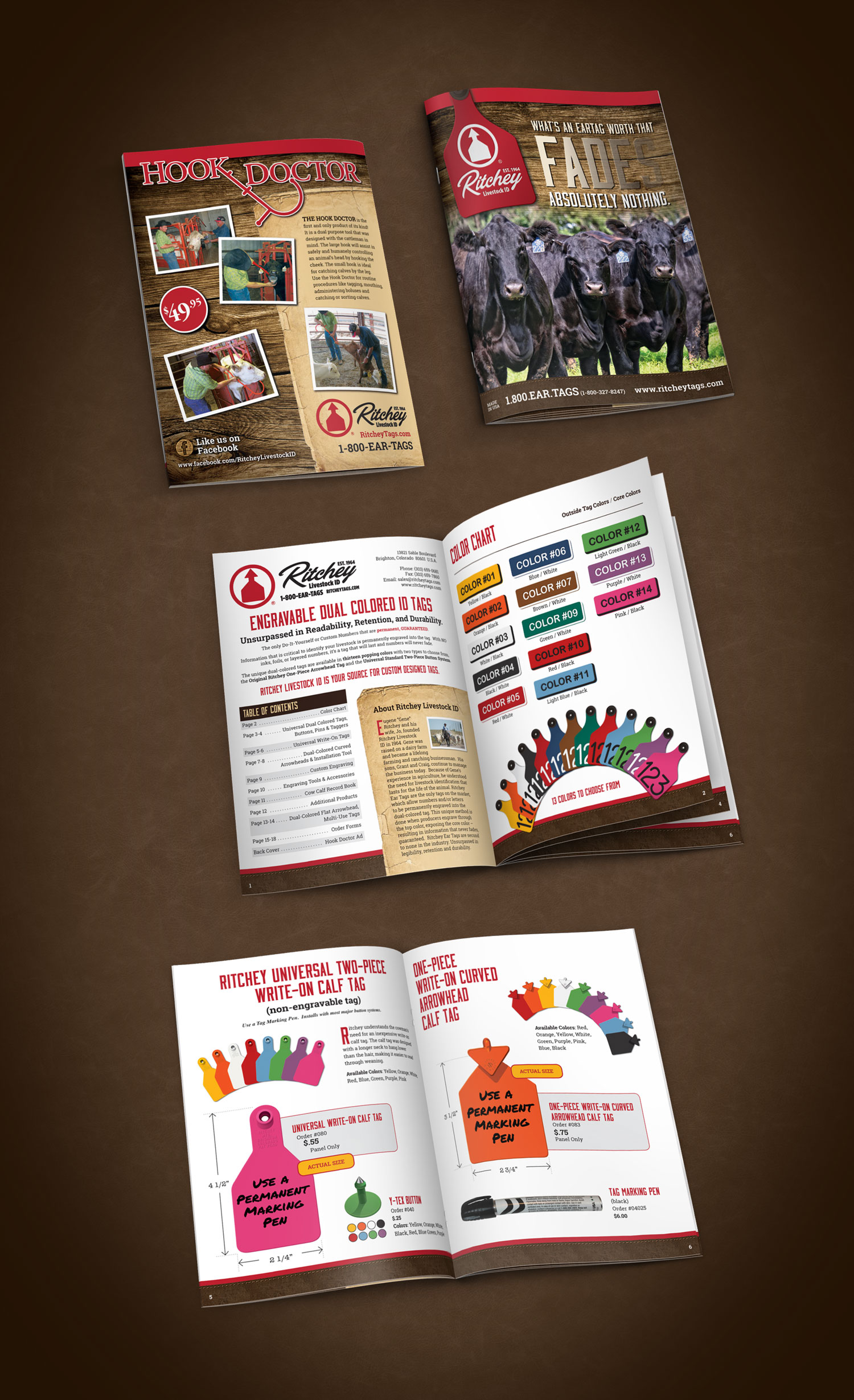
New Ritchey Catalog Design


Print Ads

Lastly, Ritchey engaged us to design some of their print ads. Here is the first one we designed announcing the release of their new pink tags:
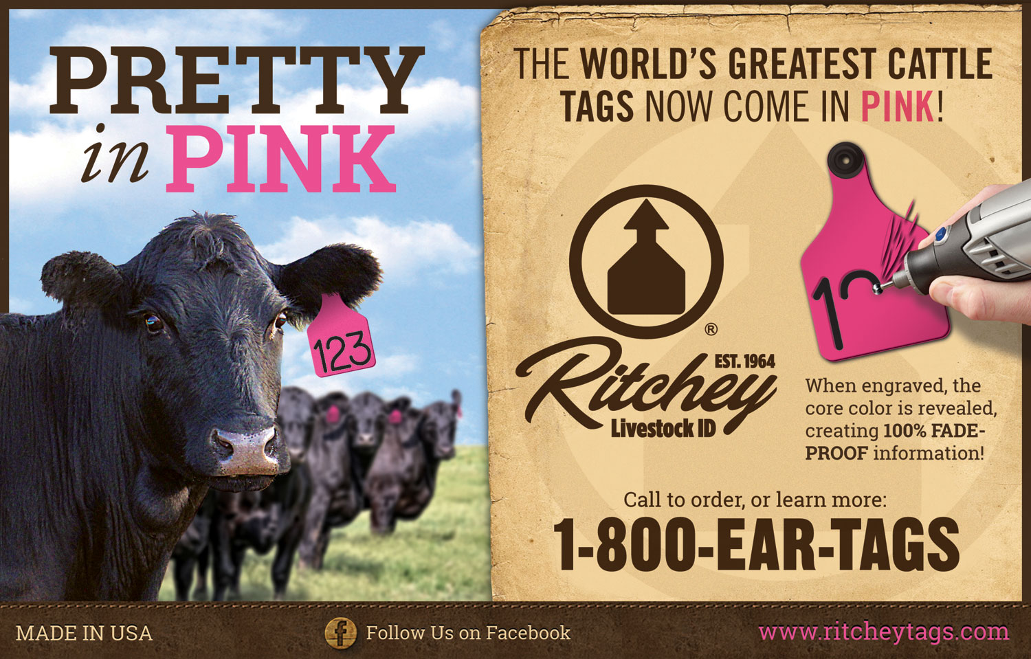
Ritchey Pink Tag Print Ad

Ad Redesign (Before)

Ritchey Bw Ad1


Ad Redesign (After)

Ritchey Bw Ad 2

Whether you need help with a new e-commerce website, print/graphic design, or assistance with creating a visually cohesive brand – contact Visual Lure today for a FREE quote.
 

New Custom WordPress Website for Ideal Landscape Group

Posted on April 5, 2017

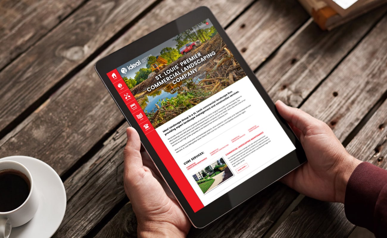
ideal landscape group WordPress website design

Ideal Landscape Group recently contracted Visual Lure to help improve their online presence by redesigning their website. Ideal is a premier St. Louis commercial landscaping company that specializes in commercial groundskeeping, construction, irrigation, snow & ice removal and playground installation. In addition to design and development of the new site, Visual Lure coordinated the copywriting and photography through our strategic partnerships. Cindy Sorgea wrote the copy and Matt Marcinkowski captured the imagery.

The new custom WordPress website features:

  • Sticky navigation (main sidebar and secondary navbar on template pages) for convenient navigation
  • A custom Core Services section with navigation
  • Custom developed section/WordPress post types for the projects gallery that makes it easy to add, edit, organize and remove featured projects
  • Slider style photo galleries that use WordPress’ native gallery for easy maintenance with a stacked image transition on mobile
  • A seamlessly integrated blog with featured image and excerpt landing page
  • Added column structures to expand layout options
  • Search engine optimized for St. Louis commercial landscaping and all their core services

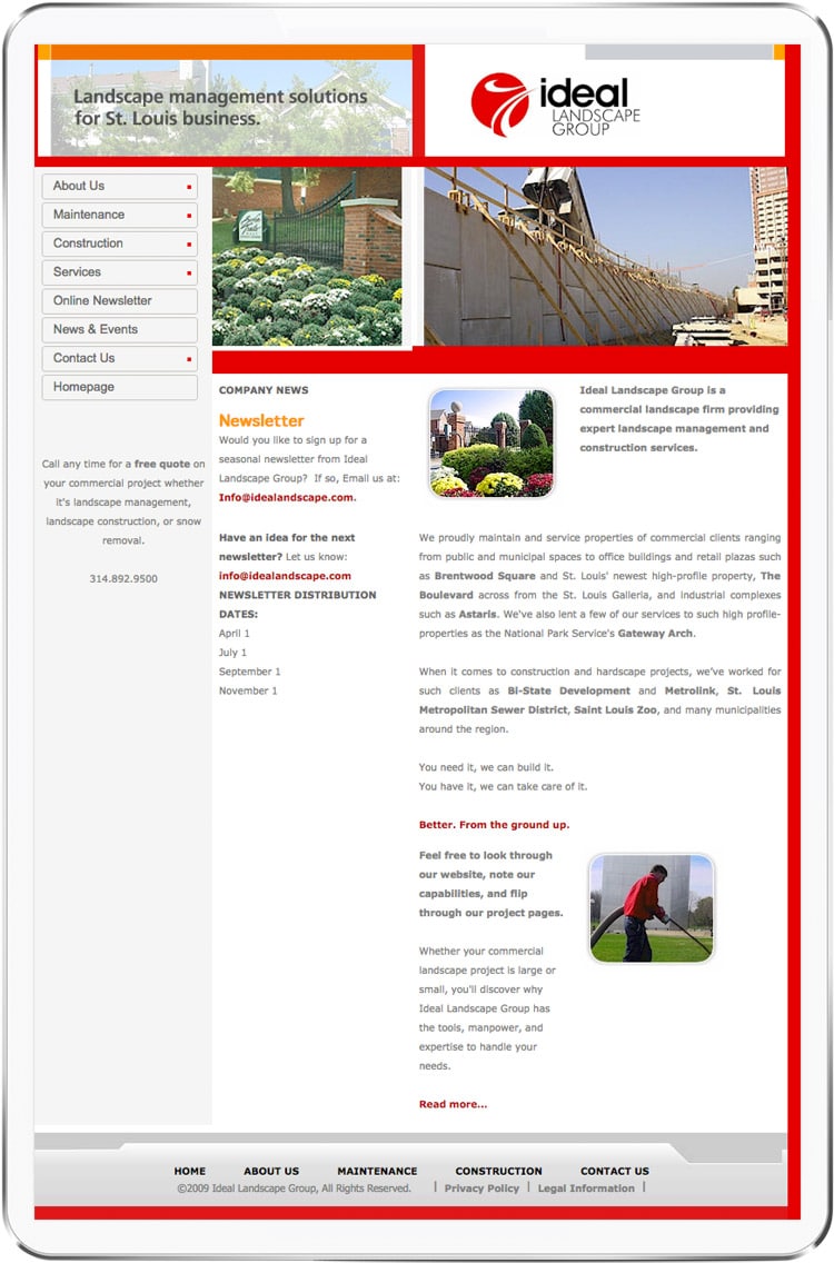
Old Homepage Design:

old Ideal Landscape homepage design

The old website (home page shown above) was extremely dated; at least 8 years old. It was not mobile friendly or responsive, therefor providing a bad user experience on mobile devices. It had a strange layout, all types of spacing issues and dated photography. Over the years, and especially since Google’s “Mobilegeddon”, the site had seen a steady decrease in traffic and drop in organic rankings.


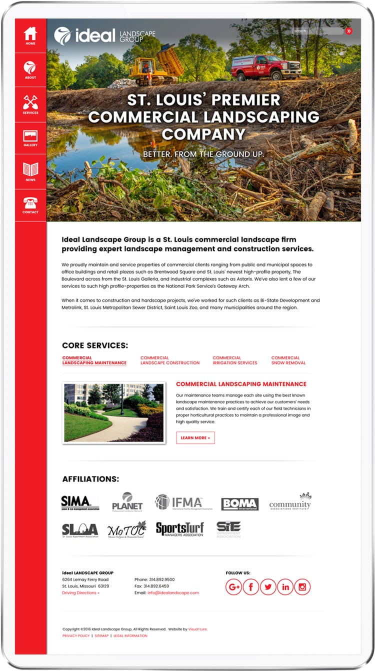
New Homepage Design:

new Ideal Landscape homepage design

The new home page design is now better organized with a much improved flow. The side navigation bar is sticky, staying in place while the user scrolls. This makes it easy to navigate the site, no matter where you are on the page. There is a custom Core Services section (slideshow) showcasing a featured image, intro copy and learn more buttons to drive users to those landing pages. Below that is an Affiliations section that uses a simple WordPress image widget to add, edit, remove or reorganize the affiliate logos.


Website Photography

We had the pleasure of working with Matt Marcinkowski for the new site photography. We art directed a couple of shots, but it was mostly just Matt doing his thing. With some of the locations providing limited photo opportunities, Matt really turned nothing into something great. Below are some samples of the new photography.

ideal landscaping photography 1ideal landscaping photography 2ideal landscaping photography 3ideal landscaping photography 4

The Results + Organic Search Rankings

Since the new site has been indexed by Google, the (now properly search engine optimized) website has skyrocketed into top positions on the first page of Google for almost all of their core targeted search terms. Currently the website is ranking #1 on the first page of Google for “st louis commercial landscaping”, “st louis commercial landcare”, st louis commercial groundkeeping”, “st louis commercial landscape construction” along with most variations of those search terms. This has led to a solid stream of high value leads for Ideal and they are currently bidding on a handful of projects (leads acquired through the new site) that would pay for the new website 10 times over.


Visit Ideal Landscape ยป

Click here to learn more about our website design and development services ยป

New Website Design for Cricket’s Photo & Cinema

Posted on January 11, 2017

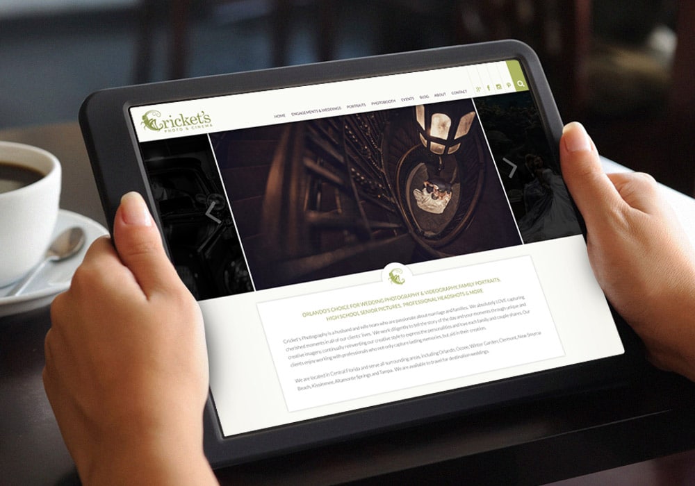
Visual Lure recently launched a new website for Cricket’s Photo & Cinema. Cricket’s is a premier photography studio serving the greater Orlando, Florida area with its studio located in Winter Garden. We originally designed Cricket’s logo a couple years ago, and they came back to us when they were ready to improve their online presence. The new website was built in WordPress utilizing a fully custom, search engine optimized, responsive (mobile, tablet and desktop friendly) design.

The new custom WordPress website features:

  • A sticky header for convenient navigation
  • An easy to maintain home page slideshow
  • A custom testimonials widget with smooth transitions
  • A featured image blog feed
  • Masonry style photo galleries that use WordPress’ native gallery for easy maintenance
  • A seamlessly integrated blog with featured image and excerpt landing page
  • Related blog post feed for improved click-through rate
  • Added column structures to expand layout options
  • Search engine optimized for multiple photography focuses

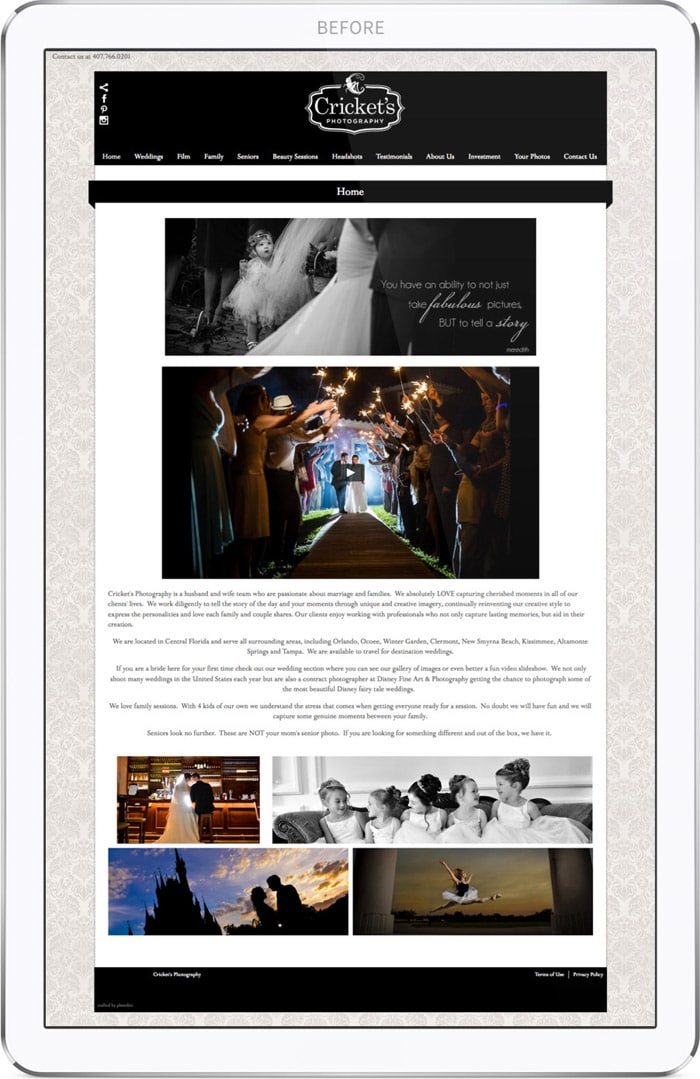
Old Homepage Design:

Cricket's Photo & Cinema's old website home page design

The old website (home page shown above) was not very user friendly. The blog was completely hidden, only to be found if you hovered over the four images towards the bottom of the home page. There were too many main navigation tabs, some links where the same color as the background, therefor completely hidden unless you accidentally hovered over them. The photo galleries and blog landing page took forever to load and the site wasn’t properly search engine optimized. Lastly the old template limited how content could be displayed and gave the site a generic cookie cutter feel.


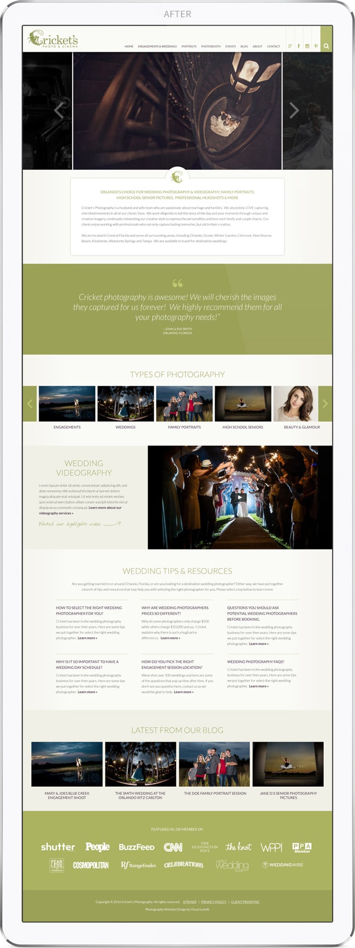
New Homepage Design:

Cricket's Photo & Cinema's new website home page design

The new home page design in much more content rich, which is great for search engine ranking, along with enticing users to click deeper into the site. The sticky header, as mentioned above, allows the user to navigate the entire site at all times – no matter how far down they scroll. Social media tabs are tied directly into the navigation bar, along with a slider search field. Below that is an easy to maintain slideshow and a custom testimonials section. Next we added a “Types of Photography” section allowing users to scroll/slide to any of their services. Following is a videography and wedding tips area, and the homepage is completed with a latest blog post and affiliation section.

Visit Cricket's Photo & Cinema ยป

Click here to learn more about our website design and development services ยป

Website Redesign for a St. Louis Metro East Home Builder

Posted on December 5, 2016

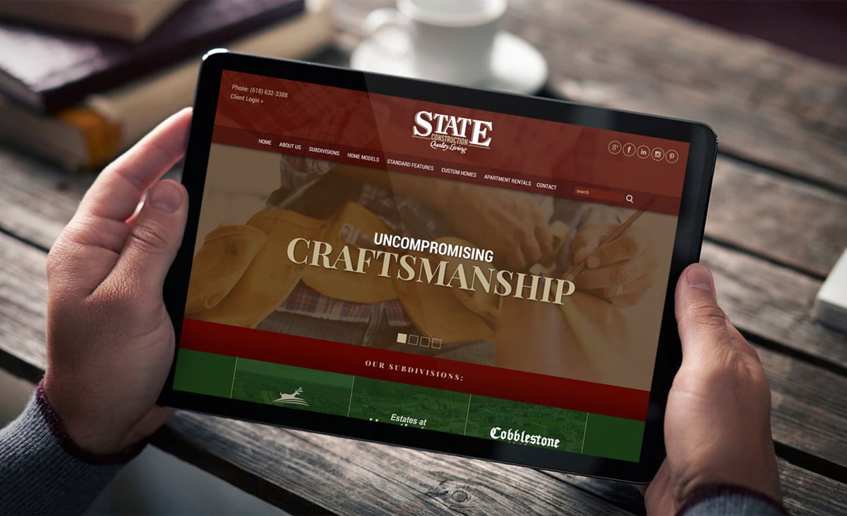
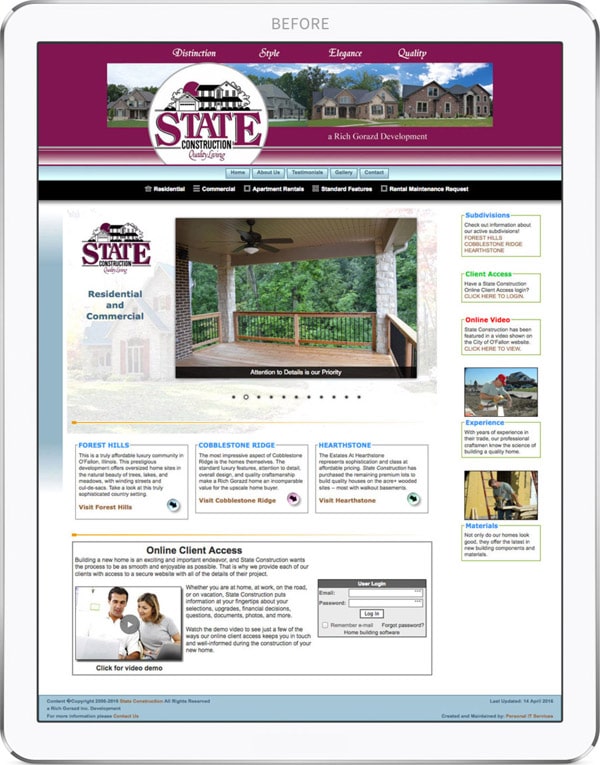
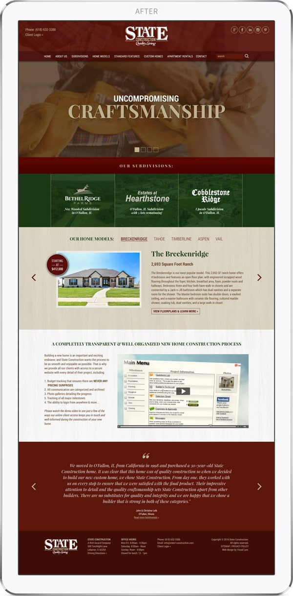
statecon3-web-design

Visual Lure recently completed a new website for State Construction, a premier residential home builder based in O’Fallon, Illinois. The company was started in 1967 with the goal of building quality luxury homes at affordable and competitive prices. They have a great local reputation for building superior-quality homes, and for having a completely transparent construction process that eliminates all pricing surprises.

The new website was developed responsively in WordPress with features that include:

  • an easy to maintain home page slideshow
  • custom page templates for the subdivisions and home model sections
  • easy to update masonry/lightbox style photo galleries
  • a sticky header for convenient navigation of the site
  • a custom home models section for quick view of each home
  • short code columns for layout flexibility
  • a custom testimonials widget and more…

Old Homepage Design:

State Construction old website design

The old website was extremely dated. It was not mobile friendly, or responsive, therefor delivering a bad user experience on tablets and particularly on smart phones. In additional to this, the design was distracting with no real focal points, two random tiers of navigation, the color palette was unsophisticated making the site feel cheap, and an extra logo and random content seem to be used to simply fill up space.


New Homepage Design:

State Construction new website design

The new home page design features their phone number and client login access right in the header for convenience. The two tiers of navigation have been consolidated into one bar, and now houses a search field. The new slideshow replaces random house photos with the three main strengths of their brand: Uncompromising Craftsmanship, Superior Quality and an Impeccable Reputation. Next it features the company’s current three subdivisions and their five main home models, which after some basic research, proved to be what potential customers were looking for. Below that is a video and description of their transparent construction process. The homepage is completed with a custom testimonials widget and a footer with important contact information.

Click here to visit the new State Construction website ยป

Click here to learn more about our website design and development services ยป

Visual Lure Named as a Top St. Louis Web Design Agency by UpCity

Posted on October 3, 2016

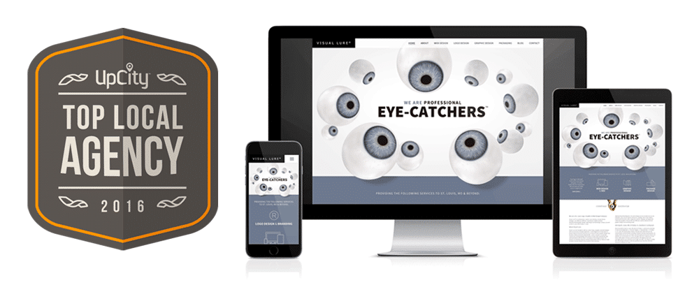
Top St. Louis web design agency

Earlier this year Visual Lure was named as one of The Best Web Designers in St. Louis by Expertise.com. Today we are proud to announce that another organization has honored Visual Lure. UpCity has named Visual Lure a Top Local St. Louis Web Design Agency for 2016. The criteria was based on how well the company represents itself online; from the user experience of the company’s website, to their social media presence and prominence in organic search results.

What Does This Mean?

UpCityโ€™s Top Local Agency marketplace is a resource designed to connect small and medium sized local businesses with high-quality digital marketing service providers in their local area, allowing business owners to get the services they need quickly, from a service provider they can trust. The UpCity team independently reviews agencies across North America to determine the best service providers in each local market, ensuring that no matter where you are, great digital marketing services are never more than a click away.

About UpCity

UpCity provides a comprehensive local inbound marketing platform to help digital marketing agencies scale SEO, local and social marketing services. The UpCity platform serves as a single operating system that includes robust project management, sales tools, reporting, and can be fully white labeled to streamline client engagements from onboarding to ongoing engagement. UpCity, a venture capital-backed business based in Chicago, was founded in 2009. Learn more at www.upcity.com.

Visual Lure’s Web Design Services

Call us at 618.407.9231, email us at info@visuallure.com or click here to learn more about our web design services ยป


Holly Ireland Photography Website Redesign

Posted on September 11, 2016

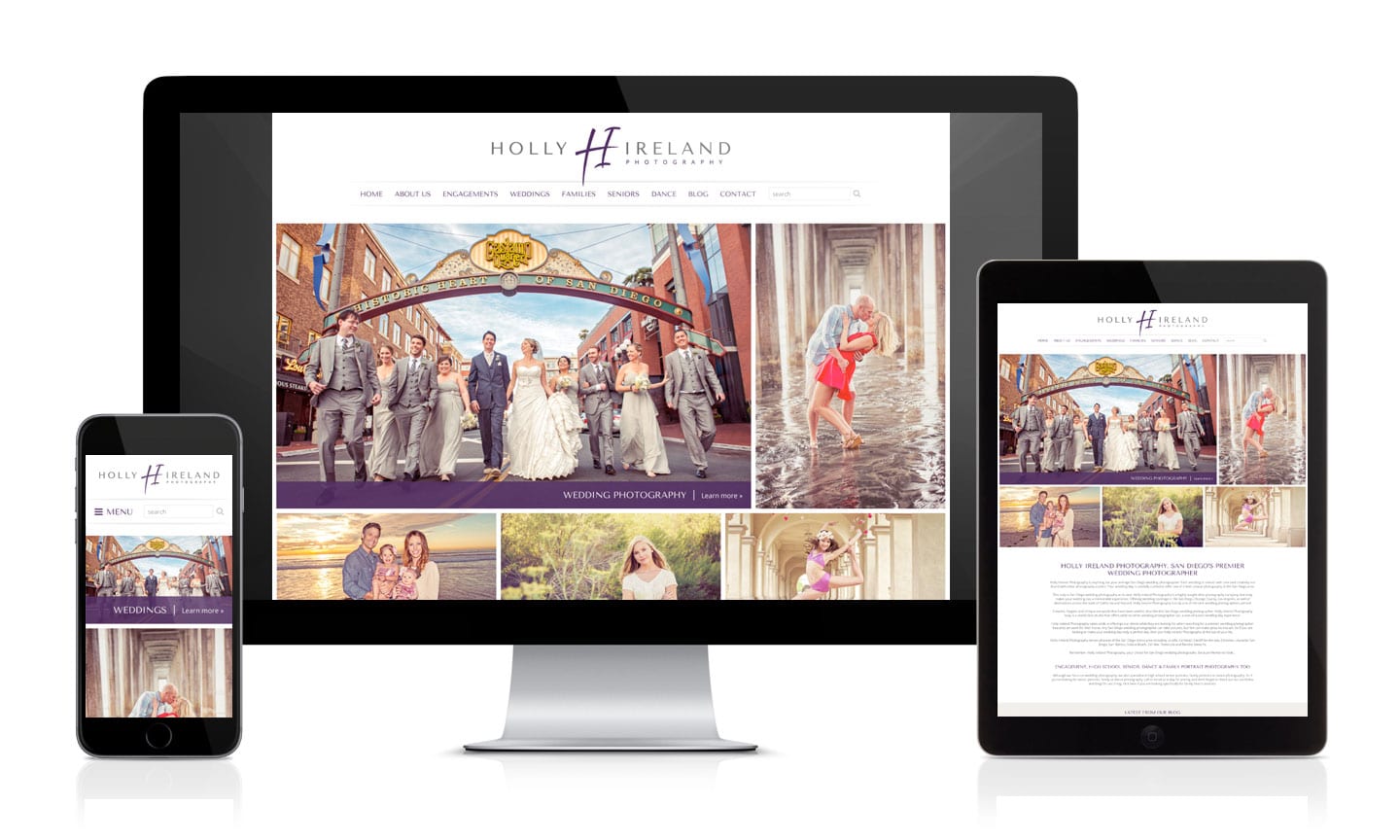
New Holly Ireland Photography WordPress Website

Visual Lure is proud to announce the redesign and relaunch of a new custom WordPress website for Holly Ireland Photography. Holly is our favorite San Diego photographer who specializes in engagement, wedding, family, high school senior and dance photography. Even though we designed Holly’s old site, it had become dated by how it was coded and the load times had become subpar. The new site loads quickly and the code is now much cleaner. We have already seen a huge spike in search engine rankings since the relaunch, which was one of the main reasons for the redesign.

The old website ranked organically on page 3 or 4 of Google for “San Diego family photographer”, and since the redesign, you can now see it on the middle of page 1.ย  The new site ranks #2 on the first page for “San Diego senior photographers” and any variation of that search phrase. (I would consider this #1 on page 1 as the first organic listing is Yelp). One of Holly’s passions is dance photography and if you search “San Diego dance photographers” you will not only see that her site ranks #1 on the first page, but also #2 and #3. Lastly, we saw a huge improvement on her rankings for “San Diego wedding photographer”. Her old site bounced between pages 4 and 5, and the new site has been bouncing between pages 2 and 3.

From a design and development standpoint, the new website features a masonry collage on the home page with a cool hover effect, a sticky header for more user friendly and convenient navigation, a custom animated testimonials widget, fast loading masonry photo galleries and a quick loading blog landing page. On a responsive level, the new website renders much better on tablets and smart phones.

Lastly, we would like to congratulate Holly on being named San Diego’s Top Wedding Photographer by San Diego’s A-List. This was no small feat as there were over 160 photographers in the running. Even more impressive was that there were over 45,000 votes cast. Again, kudos to Holly Ireland Photography (and her husband Bruce) for being ranked #1!

Learn more about our Search Engine Optimization/SEO and custom WordPress web design services.