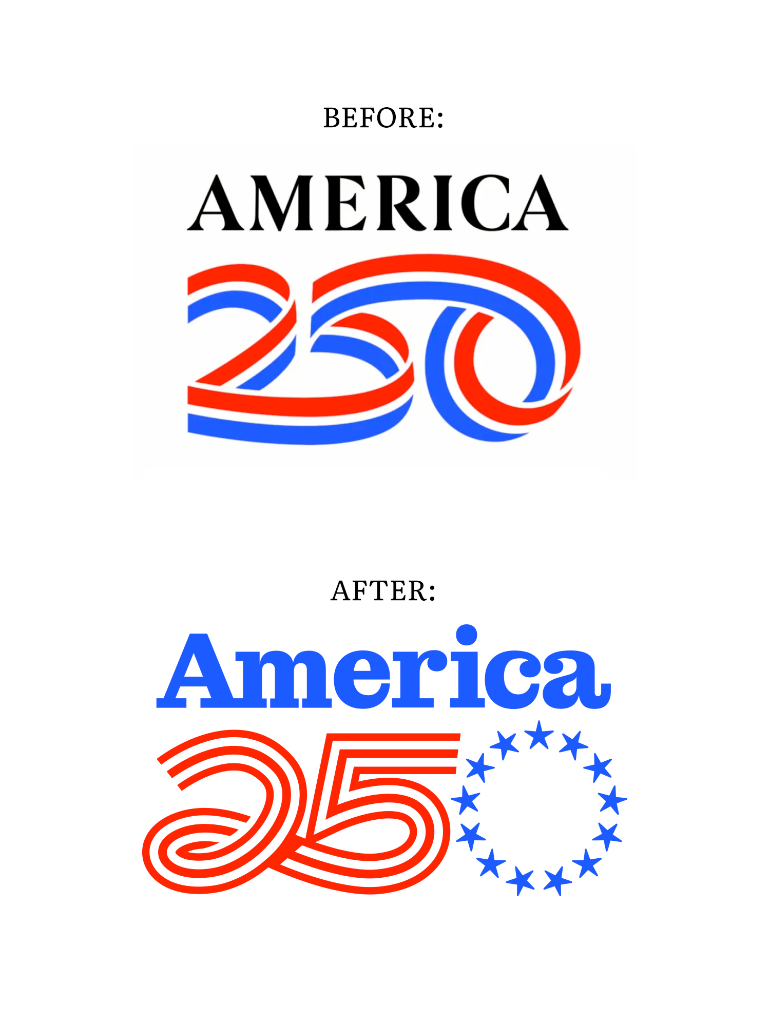
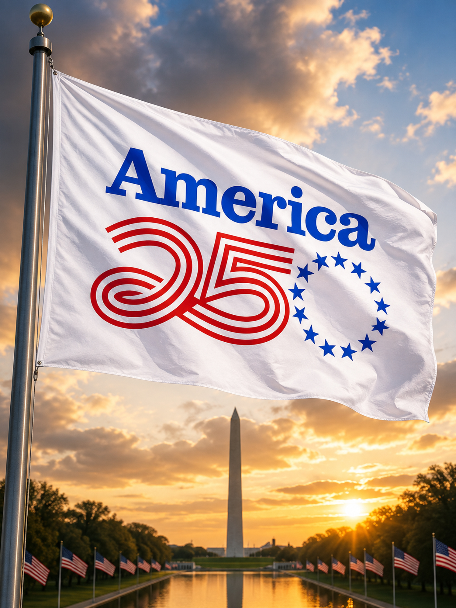
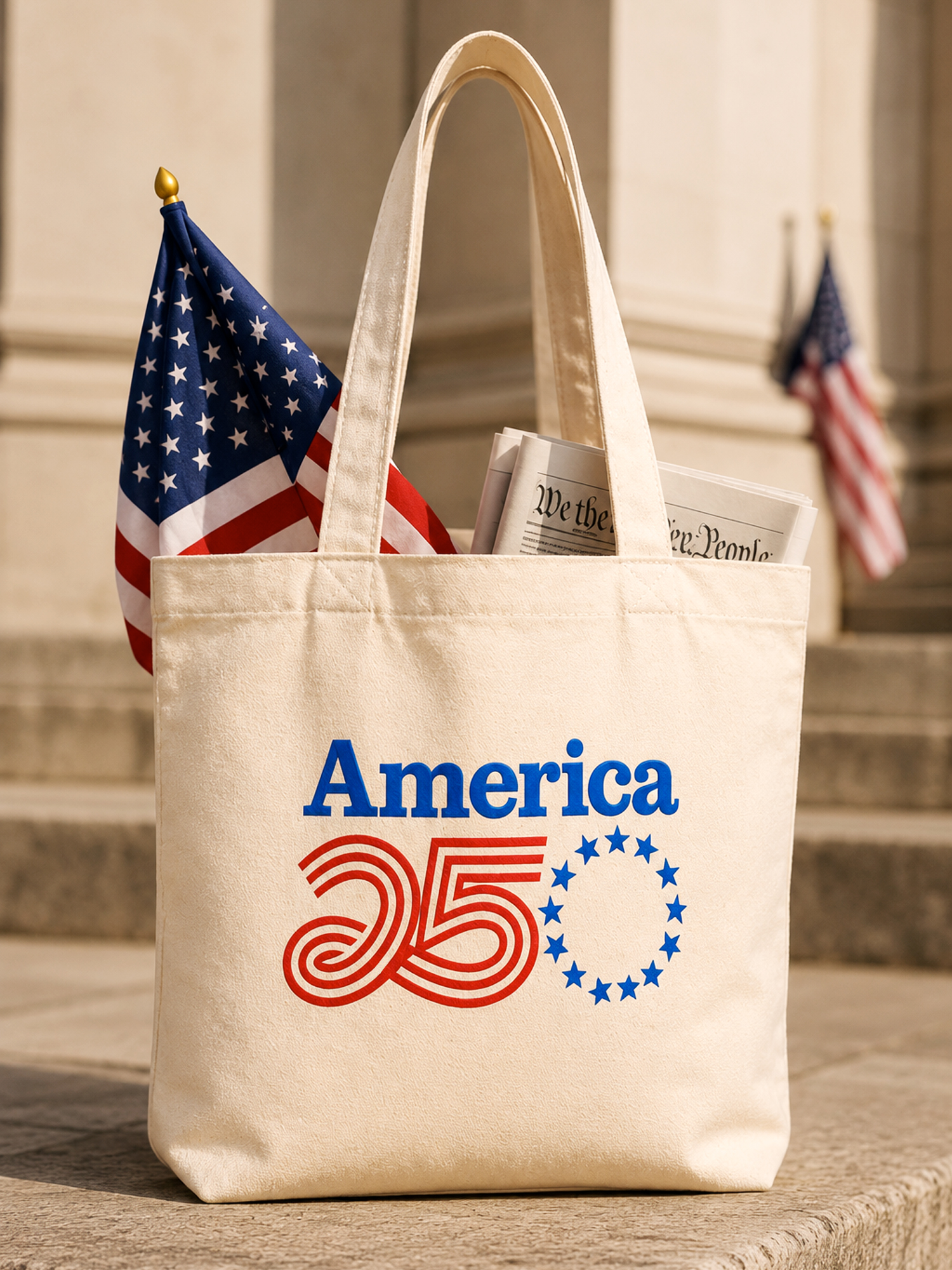
Visual Lure’s Version of the America 250 Logo
When I first saw the America 250 logo, my initial reaction was that it felt more French than American, and the typography didn’t immediately evoke a strong sense of American heritage either. It got me thinking about how I might have approached the design. My first thought was to incorporate the Betsy Ross flag—specifically using its iconic circle of 13 stars as the “0” in 250. Doing so would create a direct visual connection to the founding of the nation. From there, the flag’s stripes could be integrated into the “25” to further reinforce the patriotic theme. I would also explore a typeface with a stronger American character and historical feel to better support the concept.
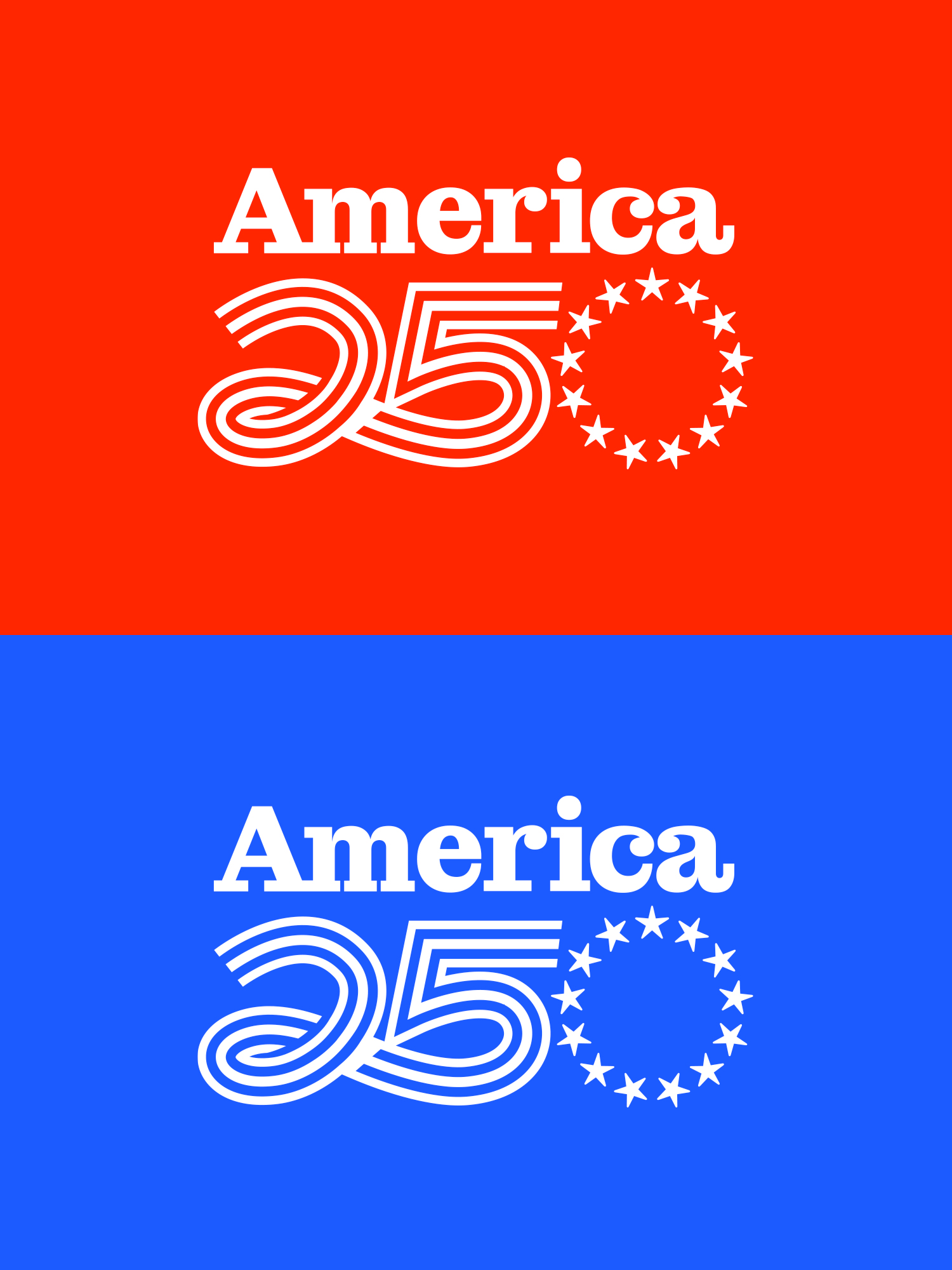
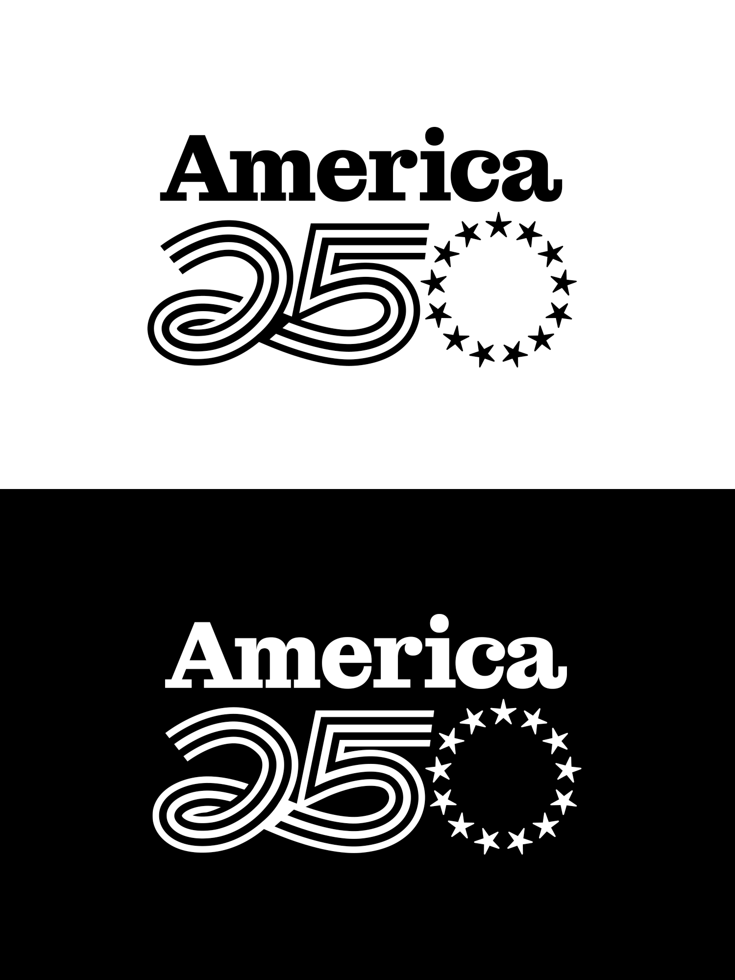
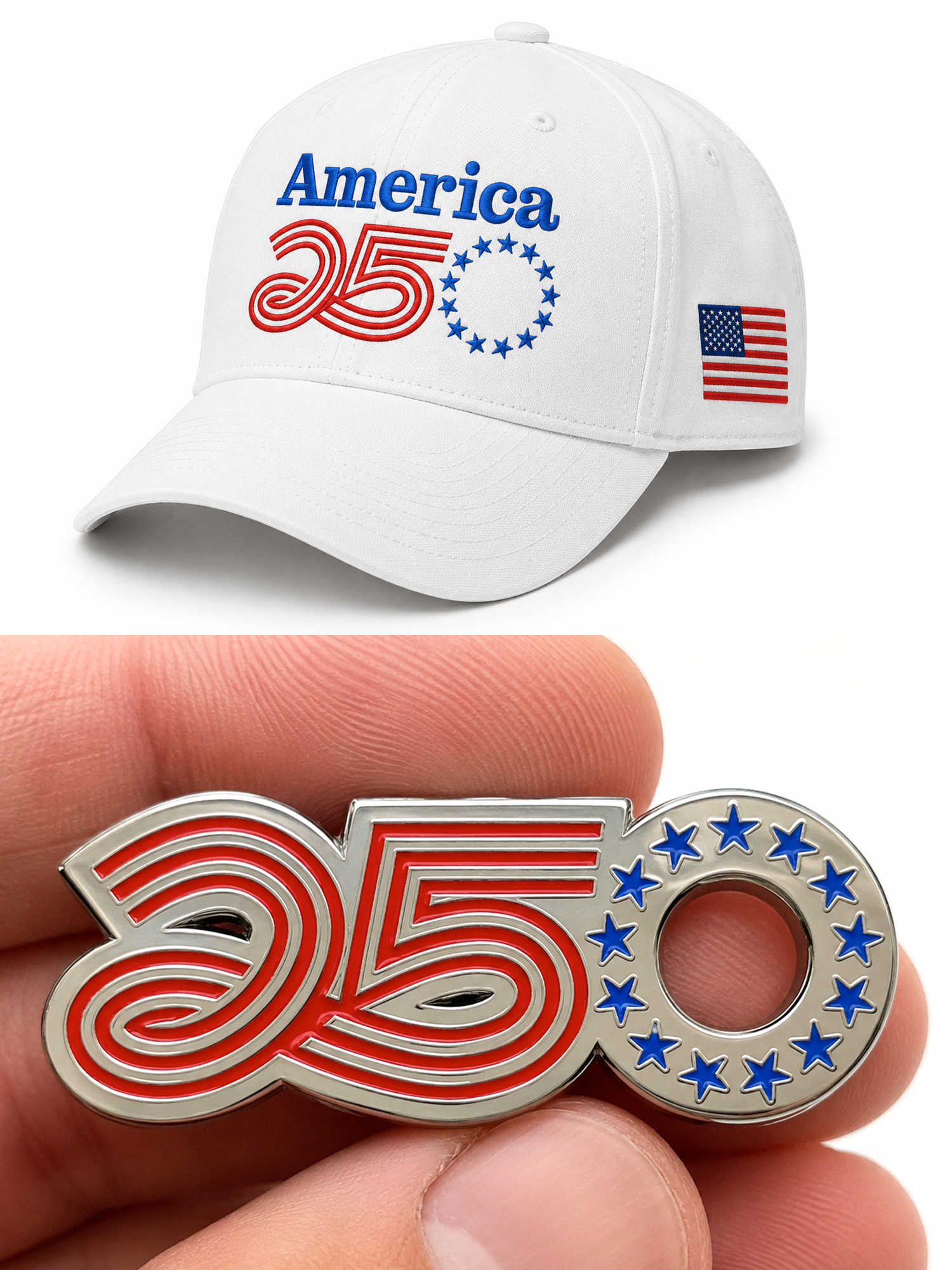
With those ideas in mind, I decided to create my own interpretation of the America 250 logo. I hope you enjoy my take on it.