OUR BLOG

Here you will find our latest works, company news and more. We update it on a regular basis so be sure to come back soon. Please like, share, pin or tweet the post you enjoy.

Logo Designs for Marilyn Lou Boudoir & SoCal Headshots

Posted on June 19, 2016

One of my favorite photographers is Michael Anthony out of Los Angeles, California. He and his wife Jennifer are both extremely talented engagement and wedding photographers whose unique style is defined by what they do with natural light and off-camera flash. Michael’s signature shots look like magical movie posters or dramatic romance novel covers. They are truly pieces of art. Just take a look at a couple of his images below:

el-matador-beach-engagement-photography-1top-wedding-photographer-los-angeles beach-wedding-photos-california tm045z40kd2

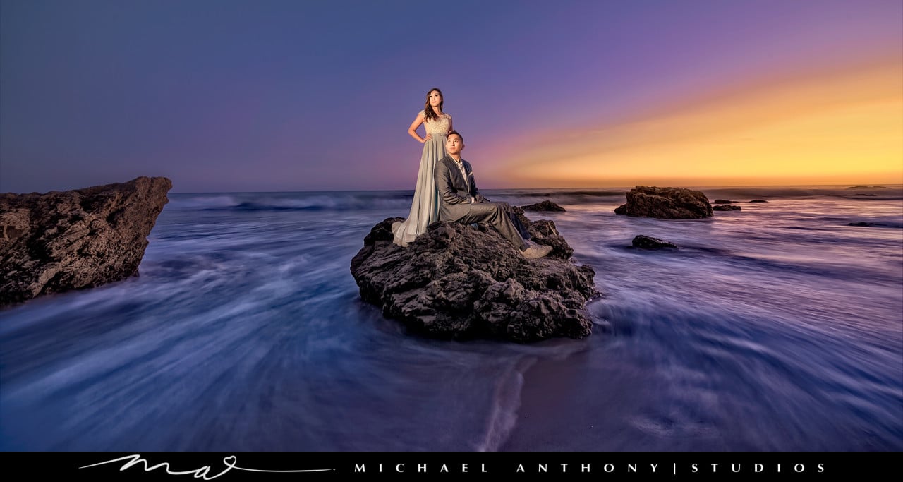
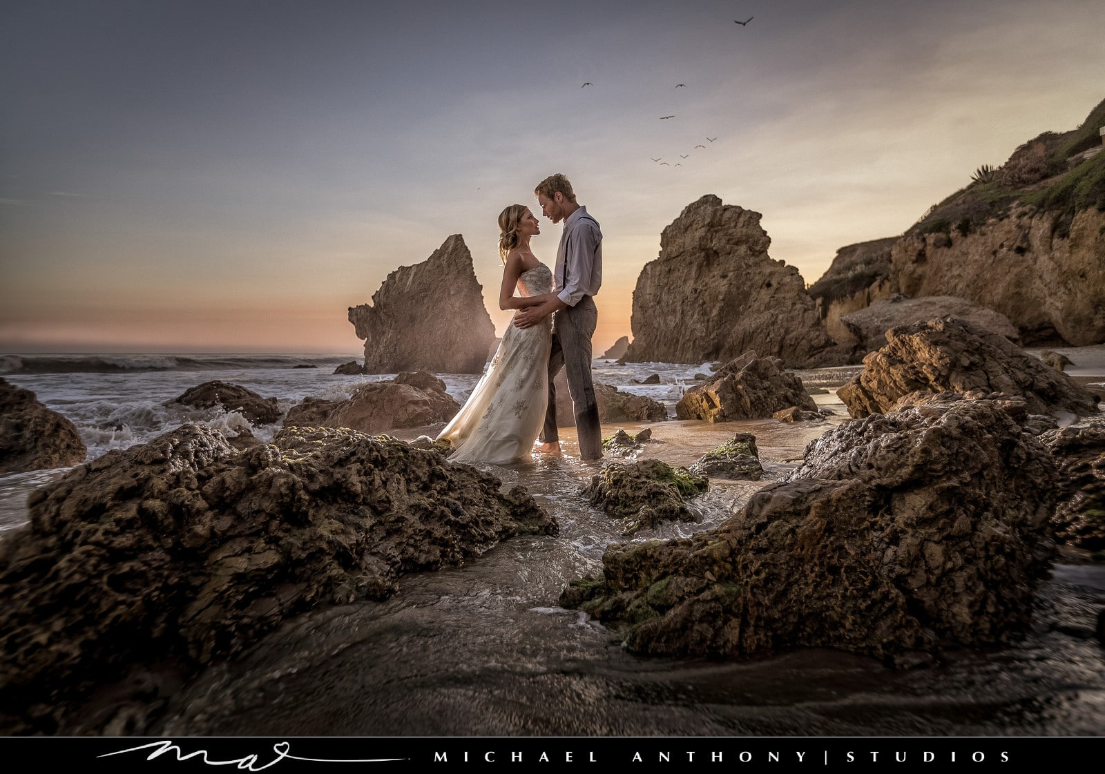
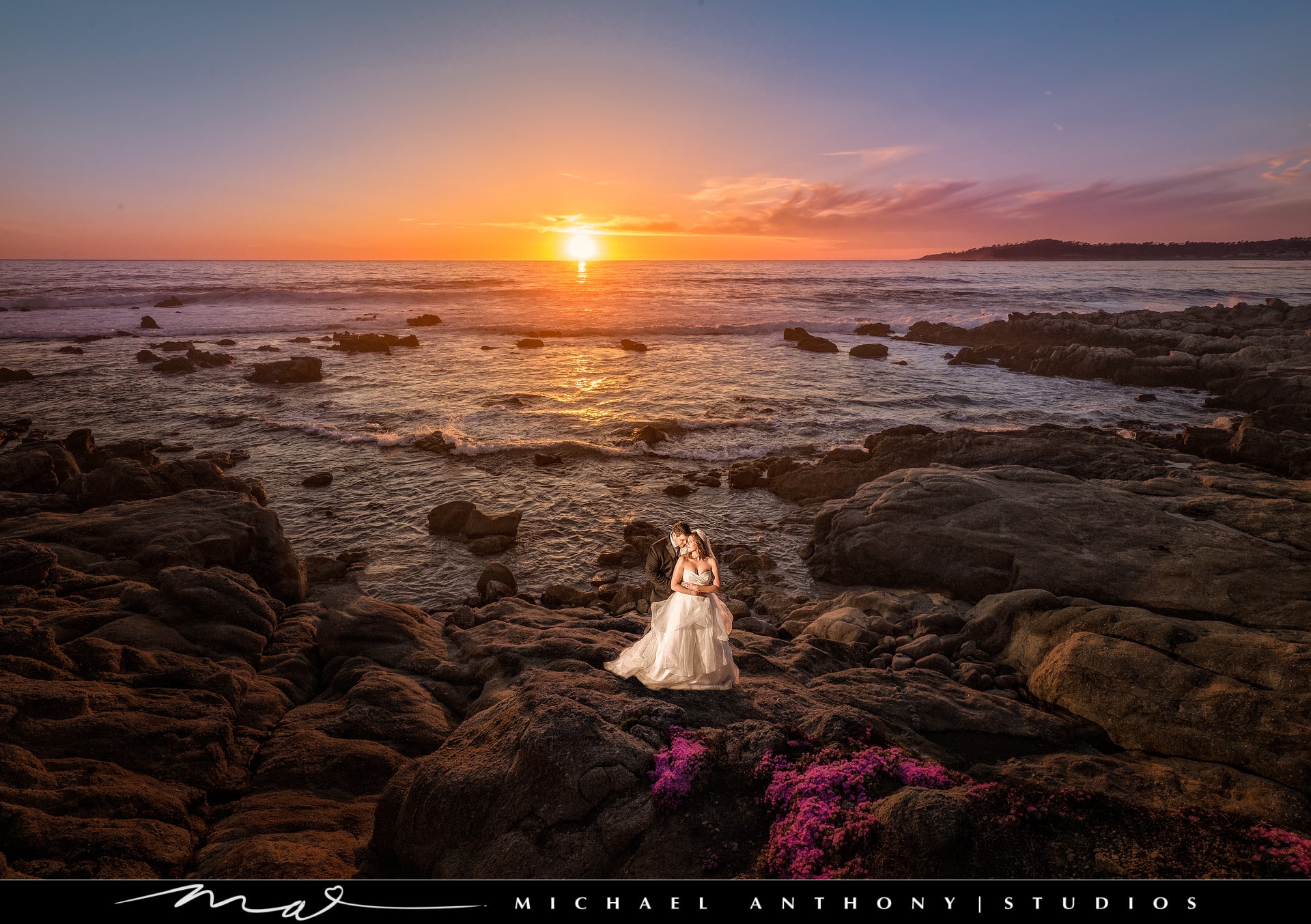
Visit michaelanthonyphotography.com to view more of Michael’s photography.

We were honored when they came to us to design logos for two of their new independent sub-brands, one for a new boudoir line, and the other for a new headshot company.

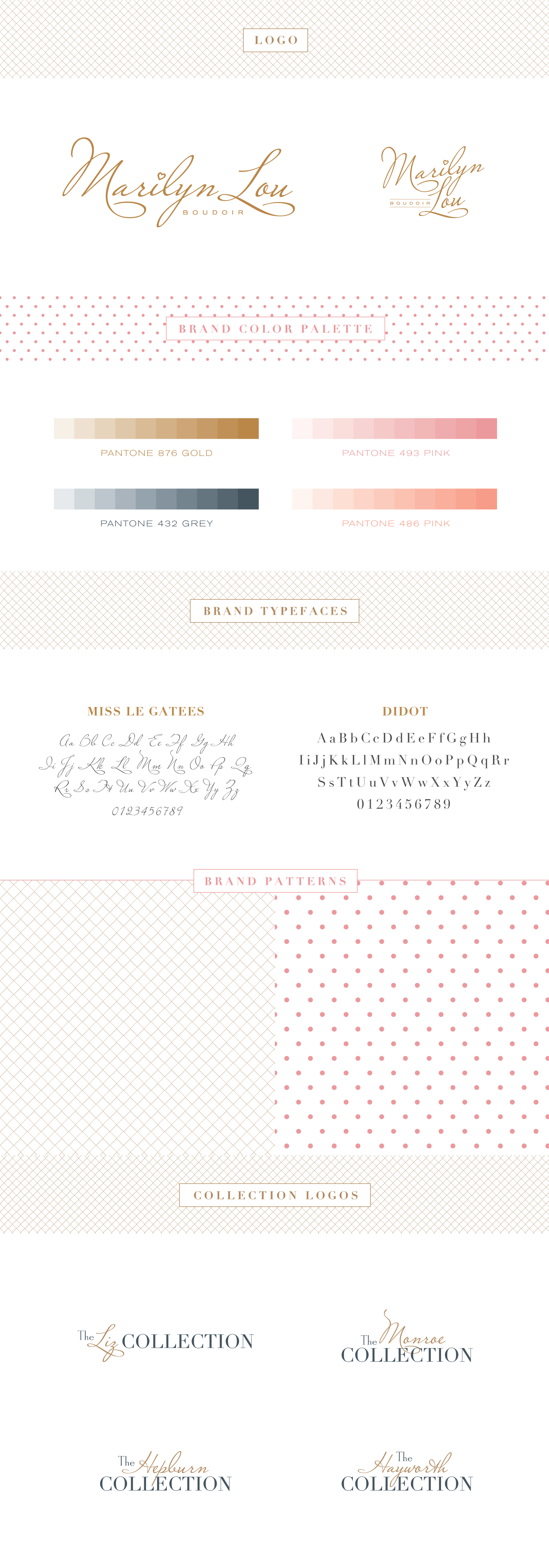
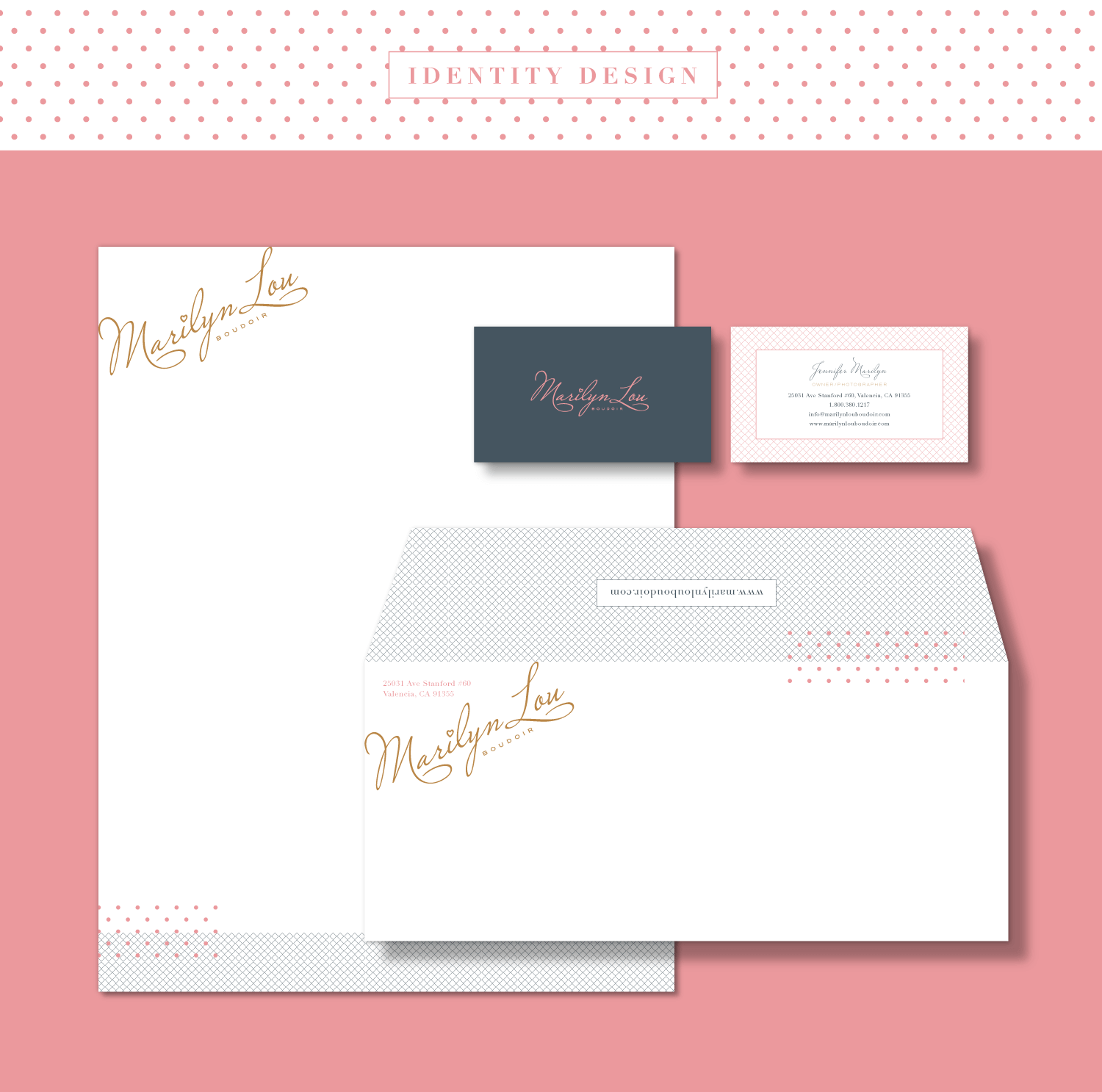
While Michael was in town speaking at Shutterfest ’16, we met up for lunch one day to discuss the new brands. When we got into the car to go to lunch, neither Michael nor Jen knew what they wanted to call their new boudoir company. We started brainstorming on the ride from Union Station to Anthony’s (maybe a mile or so), and by the time we arrived at the restaurant, Marilyn Lou Boudoir was born. The name is based off Jen’s middle name, and part of her maiden name, which we all liked because it had an old Hollywood sound to it. Perfect for a glamorous, upscale and classy boudoir brand in Los Angeles. On that short ride, we also came up with the idea of naming their photography collections after old Hollywood starlets. During lunch, we all agreed that the logo should use a script or handwritten typeface.

Below you can see the logo, along with a sample branding package including colors, typefaces, patterns and identity design. We really love how this color palette and identity design have a feminine and classic look, yet still feels modern. We also tied Michael’s brand to the new boudoir one by using his heart mark for the dot of the i in Marilyn.

Marilyn Lou Boudoir branding designMarilyn Lou Boudoir identity design

Marilyn Lou Boudoir watermark logo

Sample Watermark


Next we discussed the SoCal Headshots logo. Michael wanted the logo to feel fresh and hip, while having a friendly, approachable Southern California vibe to it. We feel the final logo is exactly that. Check out the logo and brand samplings below:
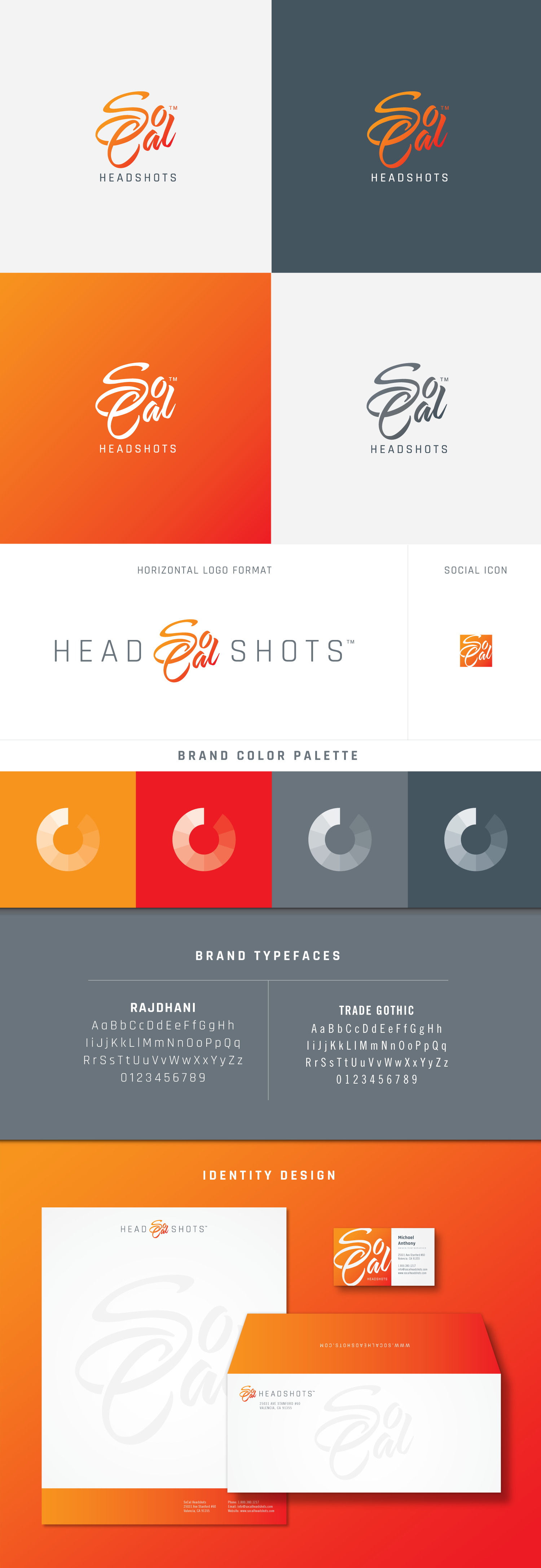
branding & logo design SoCal Headshots

SAMPLE WATERMARKS:

SoCal-watermark-logo2

SoCal-watermark-logo

Click here to view more of our Photography Branding work ยป

Branding Package for a Tampa, Florida Photography Studio

Posted on June 4, 2016

Donnie Jones Photography is a Tampa, Florida photography studio that specializes in weddings, engagements, high school senior portraits and maternity photography. Donnie is a very talented photographer and someone who understands the importance of building a brand and doing everything right the first time around. He is pretty much our ideal client and we can’t wait to see his success.

Donnie Jones Photography came to Visual Lure wanting a luxury, high-end looking branding package, and we’re confident that we delivered. It started with the logo which features an integrated DJ monogram along with a logo for his premier Gold Collection. We then designed an identity package which included business cards, letterhead and envelopes. We finished everything off with a fully-custom, responsive, fast-loading, easy to maintain WordPress website. The website features a large random loading image on the home page, a fully integrated blog, a sticky header, masonry light box photo galleries and subtle CSS animation effect that give the site a sense of elegance and sophistication.


DJP-logo-branding

Tampa, Florida wedding photographer Donnie Jones

DJP-wordpress-web-design


Learn more about Visual Lure’s logo design & branding or web design services ยป


Professional Photographer Logo Designs Catch Up

Posted on October 26, 2015

Visual Lure designs a ton of logos for professional photographers. Why? For a couple reasons:

1.Because we truly understand the photography business.

How? Well it all started out with our good friend Salvatore Cincotta. We’ve known Sal since he was working at Microsoft and just starting his home-based photography business.ย We’ve always shared contacts, resources and we have done whatever we could to help each others companies succeed. In the very beginning, we would talk with Sal about his branding, promotion strategies and all aspects of the business almost on a daily basis. It was during this time that Sal was developing and refining his current business system which he now teaches to other professional photographers. We know this system first hand and have actually had the pleasure of watching it transform over the years. Today Sal is a world-class photographer, educator, author and entrepreneur with multiple award winning companies. Just this year his umbrella company was on the list of Inc. 5000’s fastest growing companies.

2. Because we write about branding for one of the top professional photography resources and publication in the market: Behind the Shutter and Shutter Magazine.

Justen Hong of Visual Lure writes articles about branding and marketing for Behind the Shutter and Shutter Magazine. Topics include articles about logo design, website design, package design and search engine optimization (SEO). We also speak every year at Shutterfest (Behind the Shutter’s annual photography conference held in St. Louis, MO). This leads to a lot of photographers contacting us for help in defining their brand (which usually starts with a new logo).

3. Because of photographer referrals.

When you combine the referrals from Sal, all the Shutter entities along with all our happy photographer clients, it leads to more photography logos. Which leads us to the true purpose of this post. We simply do not have the time to write up a blog post for every photography logo we design, so we decided to pack a bunch into one post. Below you can see a small collection of logos we’ve designed for photographers from all over the United States, and one from Austria. The collection features monogram logos, a couple crest/seal logos, and a few typography-based logos.

If you’re looking for a new photography logo that will stand out and last the test of time, contact Visual Lure today. We would love to help.

photographers logo designs

View more of our photography logos & branding projects ยป


Logo & Branding Package for Quebec Photography Studio

Posted on September 1, 2015

Studios Elysium Photographie is a Rigaud, Quebec based wedding and portrait studio offering wedding, family and glamour photography in the Vaudreuil, Montreal and eastern Ontario area. They recently came to Visual Lure to create a new visual identity. They requested that we incorporate a dragonfly into the logo as it has a special meaning to this husband and wife photography team. We did so by making it form the letter ‘t” in Studios.

Below you can see the vertical and horizontal logo formats, the sample identity/letterhead system, proposed packaging and a sample watermark. At the very bottom are two unselected logos that we really liked. The bottom right logo was a fleur de lis that also created a dragonfly. We thought this one was genius, but after speaking to the clients, they informed me that it would be controversial using a French symbol in their logo. I guess there is a dispute whether Quebec should be politically aligned and influenced by France. They didn’t tell me which they preferred, simply that they didn’t want their business logo to be controversial.

Studios Elysium logo design branding

Niche Photography Website Launch, Branding Package Update & Brochure Design

Posted on January 21, 2015

Visual Lure recently launched a new website for Niche Photography. Niche Photography is a St. Louis area wedding photographer specializing in portrait, baby and high school senior photography. They are located in Mascoutah, IL and service the entire St. Louis and St. Louis metro east area. In addition to their new website, we updated their identity package and designed a new pricing brochure for them.

The new website was built using a fully custom designed, search engine friendly, responsive WordPress theme with aย multitude of cool effects. The new site features a “sticky” menu that always stays at the top of the page. The logo mark elegantly fades away allowing the menu bar to use less vertical space. Other features include an easily maintainable home page slideshow, a unique rollover-effect for recent post on the home page, and masonry style responsive galleries. Click here to visit Niche’s new website.

We also updated Niche’s visual branding package by switching his logo to all grey (the logo mark was originally a Tiffany’s colored teal blue). Niche felt this switch made the brand more neutral or moreย appealing to the masses.

We wrapped up all these upgrades with an engagement and wedding pricing brochure. They will hand these out to potential bride and grooms at local bridal shows.

Niche Photography Branding & Website

Update: We recently received printed samples of the new brochure and had a chance to photograph them. They turned out fantastic!

niche-brochure-design1

niche-brochure-design2

View more of our photography logos and branding packages ยป


Complete Branding Package for a Pittsburgh Photography Studio

Posted on December 18, 2014

We recently wrapped up a complete visual branding package for Wright Image Photography, a Pittsburgh area family and wedding photography studio. We actually started with their logo and website last year and just completed the letterhead system, packaging and wedding brochure. The new pieces will utilize specialty printing with the logo being gold foil stamped on the letterhead, paper bags and wedding brochure.

Sticking with the white and gold color theme, we selected a crystal flash drive with a gold cap from photoflashdrive.com and we found brass metal business cards at mymetalbusinesscard.com (that look gold). These will we be used for the labels on their large prints and canvases – which will be wrapped in white craft paper and a white ribbon. As mentioned before, the bag will have a gold foil stamped logo, and patterned or solid metallic gold tissue paper will top it off.

Due to the custom search engine optimized WordPress website we created for them last year, they have more than doubled their weddings for next (all without any additional marketing). This bump in income has allowed them to reinvest in the company and they are now working on creating a solid marketing plan for next year. We are also currently converting their existing website to be responsive to improve traffic, lower the bounce rate and provide a better overall user experience.

It is always a pleasure to work with clients that understand and value the power of good design and cohesive visual branding. If you are one of those people, give us a call today, we would love to help take your business to the next level.

wright photography branding package

Update: Printed samples of the new brochure and identity design package just came in. They printed beautifully!

wright-identity-design2

wright-identity-design1

wright-brochure-design2

wright-brochure-design1

View more of our photography logos and branding packages ยป


New Logo for a Chicago Glamour/Fashion Photographer

Posted on November 26, 2014

Jeremy Cheshareck is a portrait and glamour photographer located in Joliet, Illinois, just south of Chicago. His photography is edgy with a high-end fashion aesthetic. After meeting with Jeremy, he had just decided to break his current brand into two entities: Jeremy Cheshareck Photography and J. Chez Photography. Jeremy Cheshareck Photography will focus on high school seniors and portraiture, and J. Chez will focus on glamour and fashion. He chose to split the two because he didn’t want to alienate seniors and their parents with his more risque fashion work. We, along with the Salvatore Cincotta team, helped him come up with J. Chez Photography. This name keeps his new brand personal but allows him to market to a completely different audience.

Jeremy didn’t want his new logo to feel like a photography logo and he really wanted to incorporate lions into the design somehow. Below is the new logo along with a sample identity package, including business cards, letterhead and envelopes. The new logo features a J.C. monogram sandwiched between two lions and topped with a crown.


J. Chez Photography branding/logo design

Update: Here is the logo with a new steel effect added to it.

J. Chez Photography Logo Steel effect

…and the new logo for his sister brand Jeremy Cheshareck Photography:

JC-photography-logo

View more of our photography logos and branding packages ยป