OUR BLOG
Here you will find our latest works, company news and more. We update it on a regular basis so be sure to come back soon. Please like, share, pin or tweet the post you enjoy.
Here you will find our latest works, company news and more. We update it on a regular basis so be sure to come back soon. Please like, share, pin or tweet the post you enjoy.
![]()
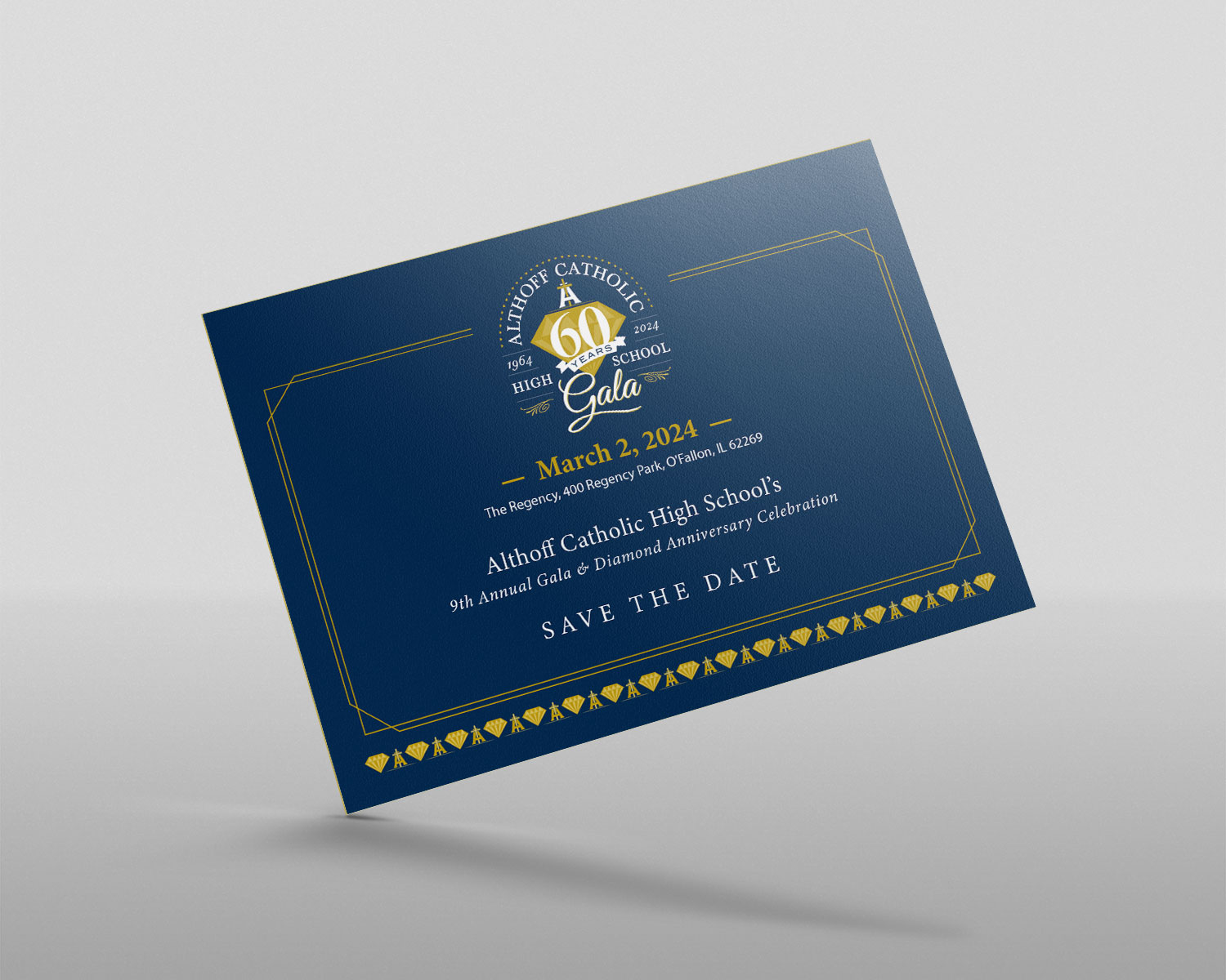
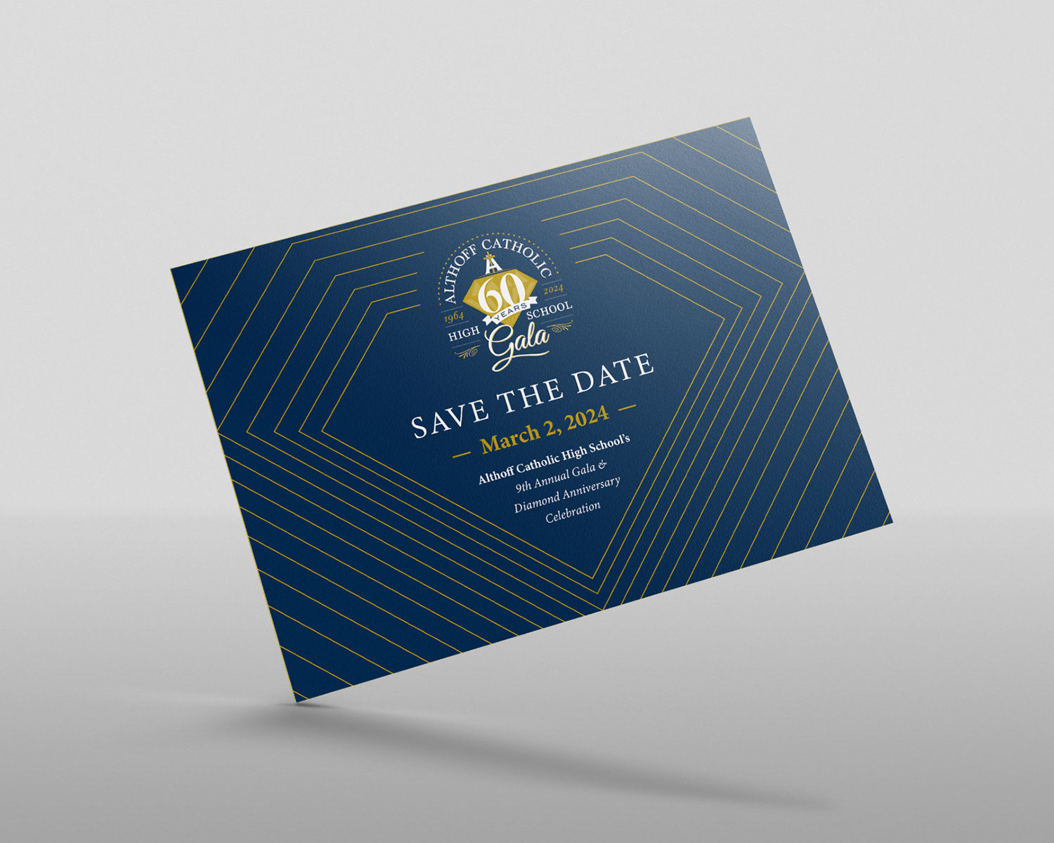
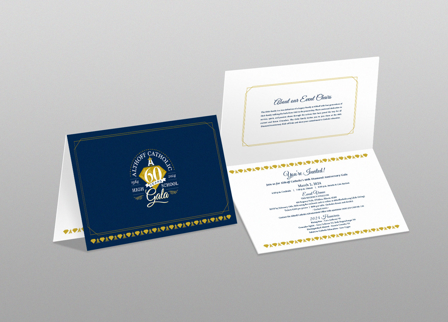
Once the logo was complete, we proceeded to design the Save the Dates for the Gala. Here is the selected design, and below that is one of the options — which was our favorite:
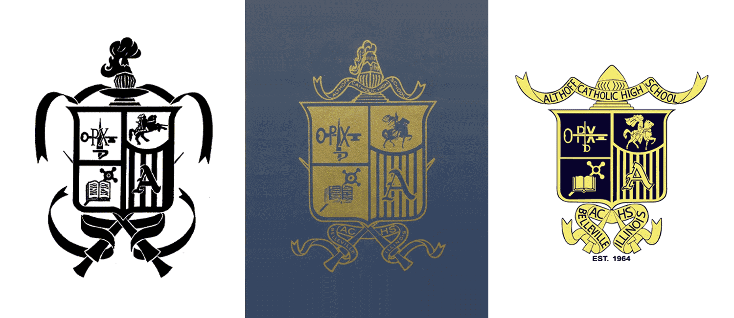
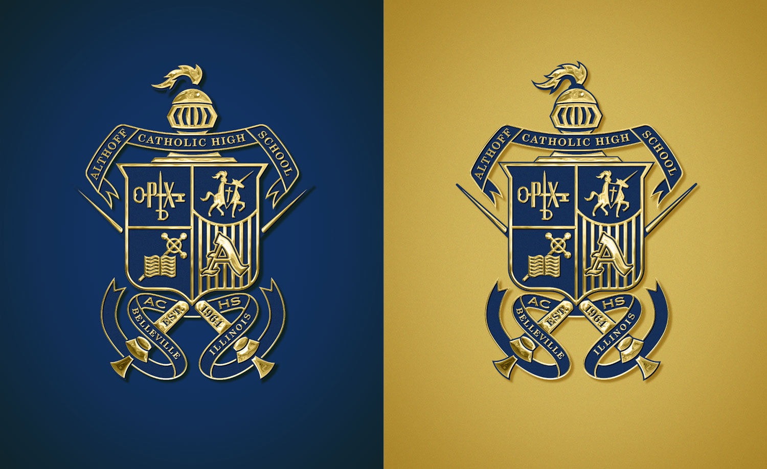
Presenting our updated and refined crest design, meticulously crafted to address spacing, proportions, and clarity concerns. All elements have been redrawn by hand, ensuring a fresh and polished appearance. The helmet is now easily identifiable, the illustrations in each quadrant of the shield are fixed and fit perfectly, the proportion of the shield and lances has been harmonized, and all text is now legible.
…and with some added effects/bling:
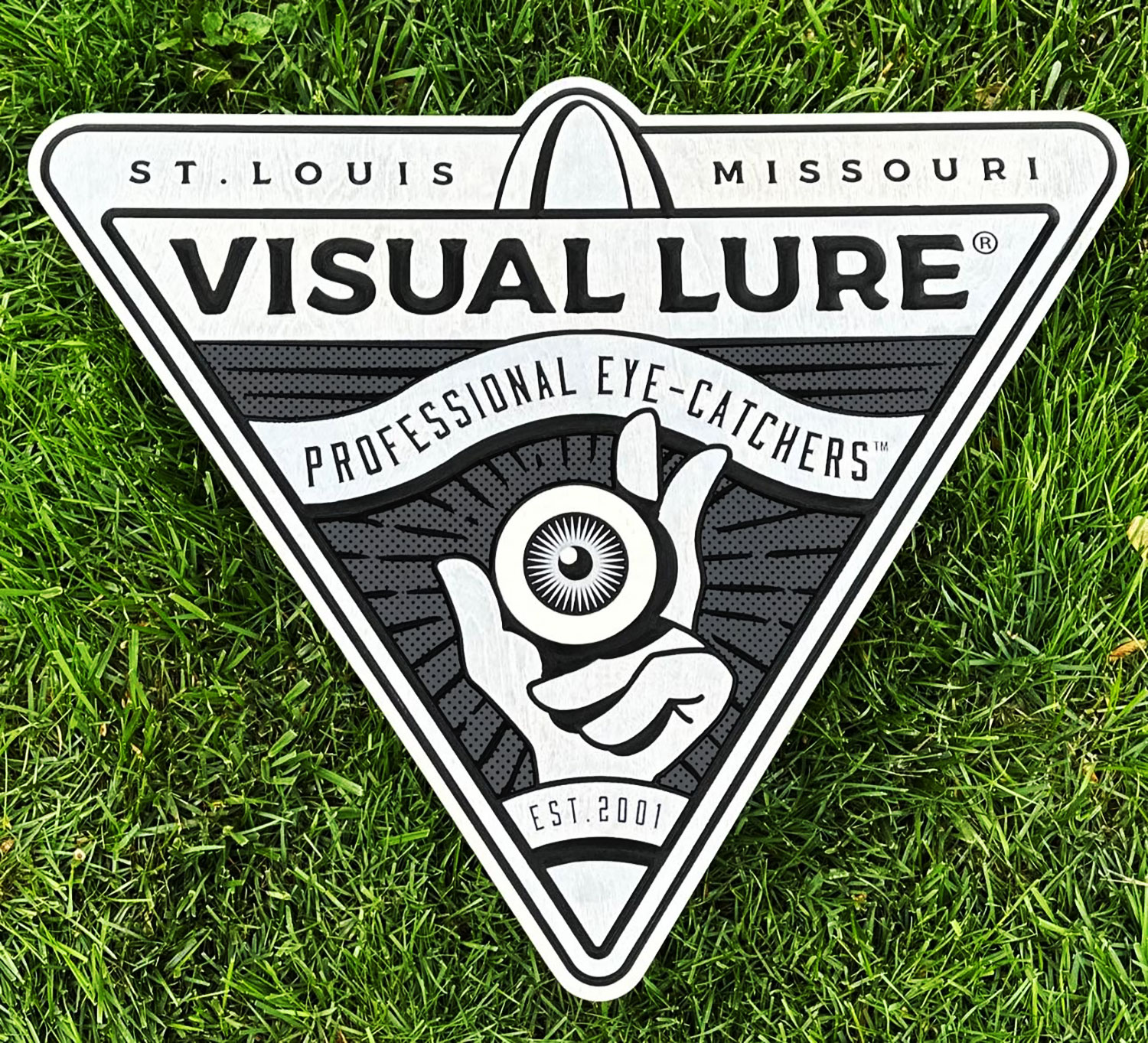
While recently scrolling through Instagram, I stumbled upon an incredible handcrafted wooden sign that immediately caught my attention. Its intricate details and carefully placed colors impressed me, compelling me to click the profile. Upon visiting, I discovered a huge selection of remarkable signs and was immediately convinced that I needed to have one made for myself. To my pleasant surprise, the cost was very affordable, and the level of craftsmanship was truly exceptional. The sign I requested was two feet wide and cost approximately $250.
The process was seamless and efficient. I provided my logo design in vector format, and within a day, I received a CAD drawing/rendering of the sign for my approval. Once I gave the green light, the sign was promptly created and shipped within 14 days. It now proudly hangs above my office computer.
![]()
If you’re in search of an exquisitely crafted wooden sign for interior purposes, I wholeheartedly recommend Cornbread Customs. These two talented individuals (Han & Tony), based in Nebraska, create stunning signs with utmost skill and precision. They have truly mastered the art of sign making. You can find their exceptional work at CornbreadCustoms.com or on Instagram here: instagram.com/cornbread_custom_signs.
The Design Rush Awards Program issues monthly recognition of the best designs across categories, providing expert analysis and commentary on the recognized designs to inspire further creation and innovation.
![]()
Logo & branding projects account for a large portion of our work, and logos – without a doubt – are one of our favorite types of projects to work on. It is not uncommon for us to design hundreds of logos in a year. This year we submitted around 700 logos into LogoLounge, one of the world’s largest logo databases and BEST logo books available.
Below is a handful of our favorite logos we submitted for LogoLounge Book 12. All showcase our belief that logos should be concept-based, visually pleasing, memorable, clever if possible, and reflect the audience it is intended for.
We can’t wait to see if any of them make the book, and good luck to all fellow designer who also submitted.
![]()
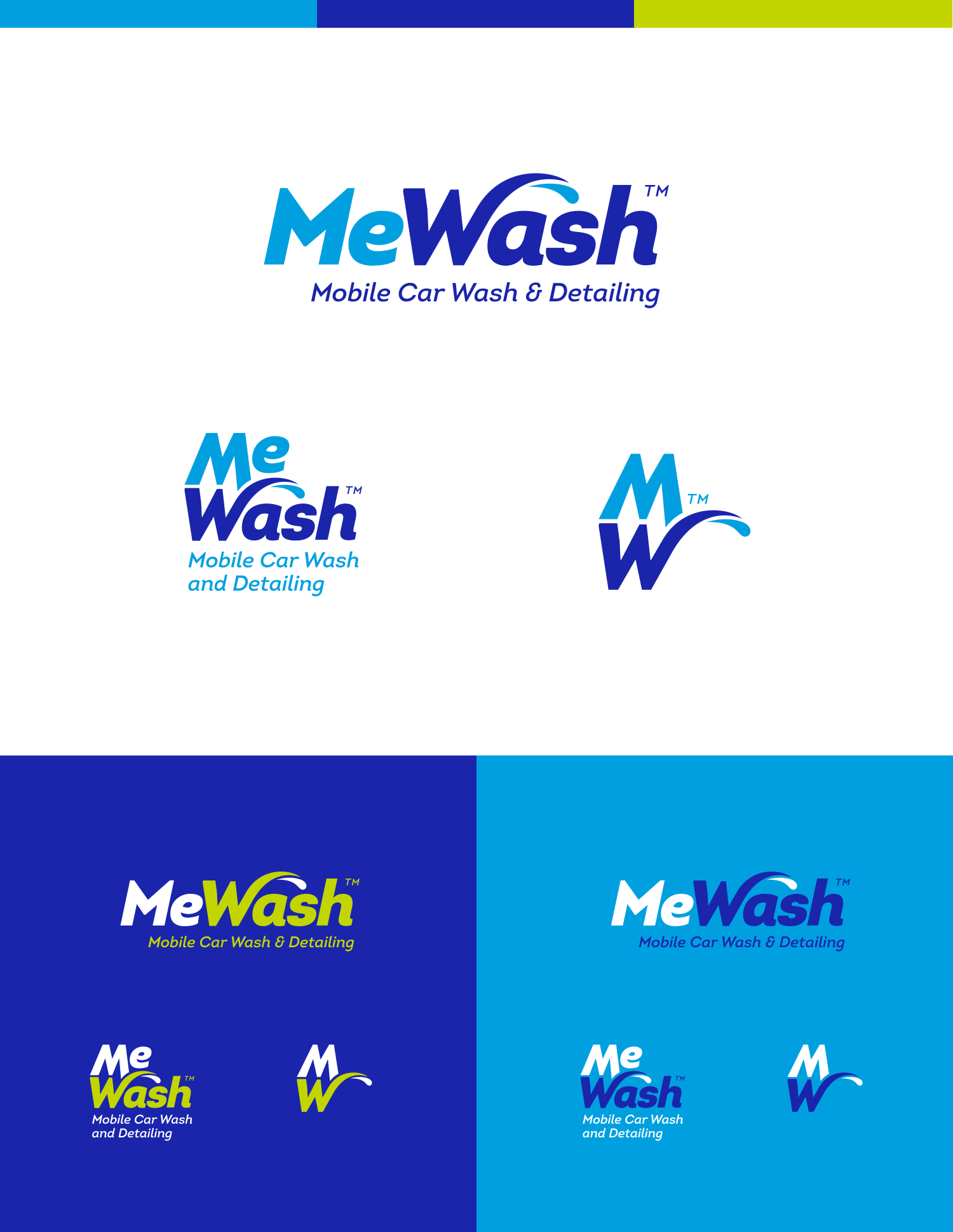
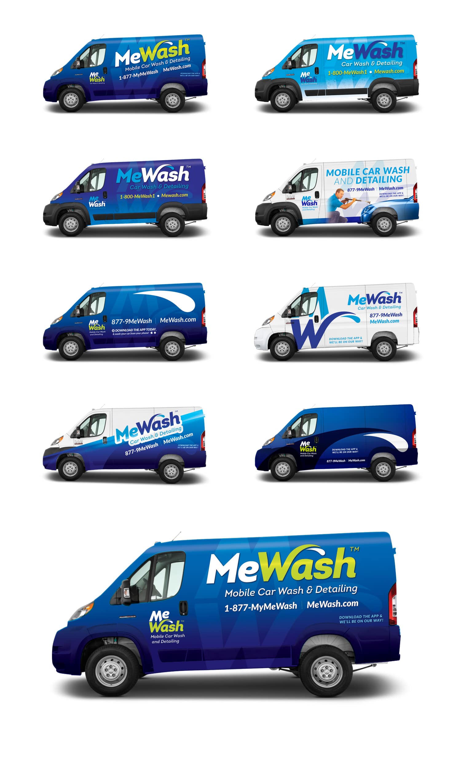
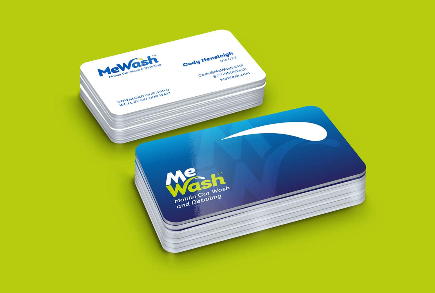
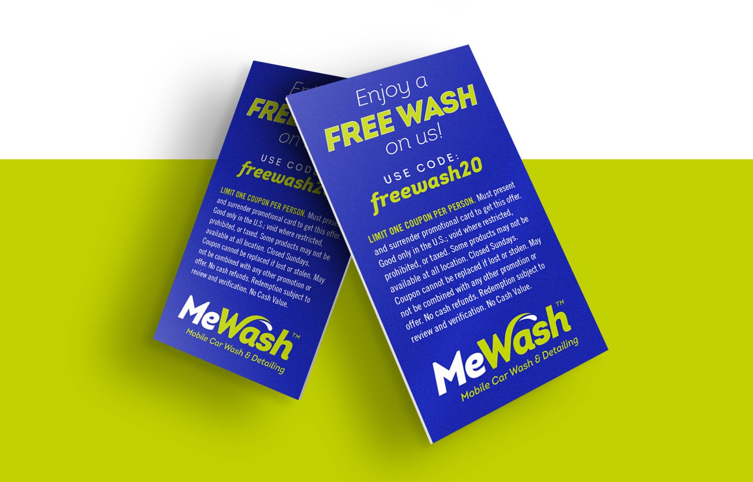
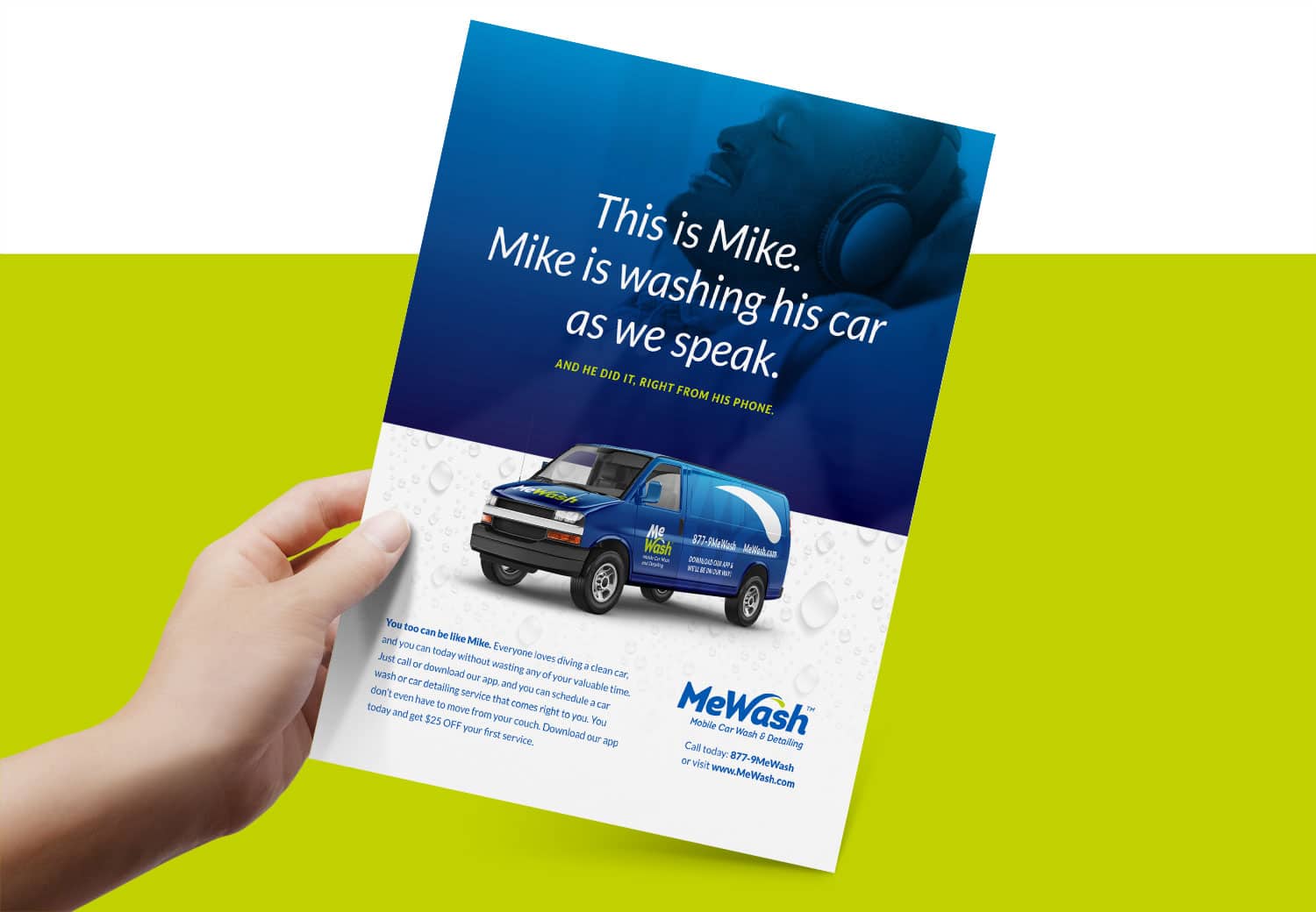
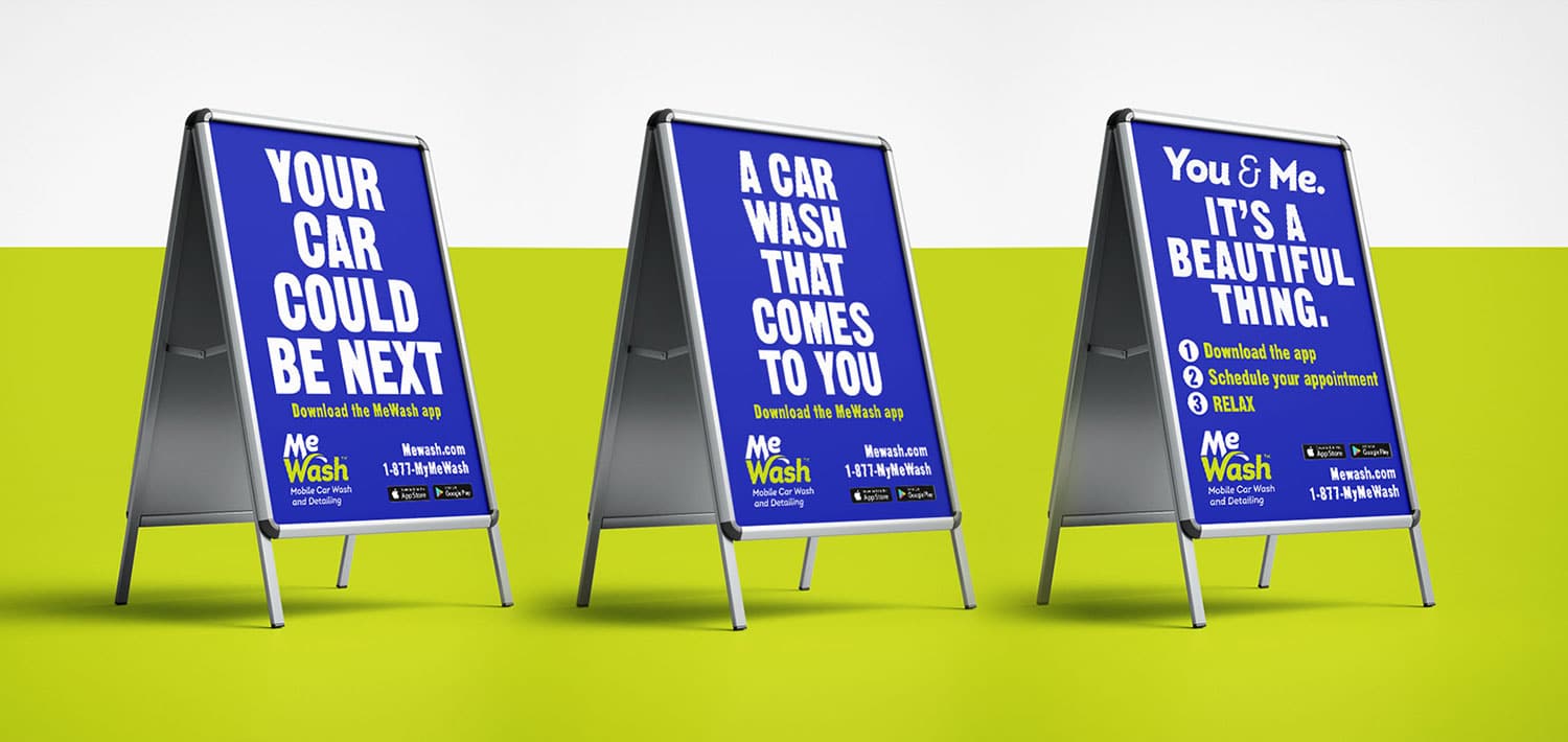
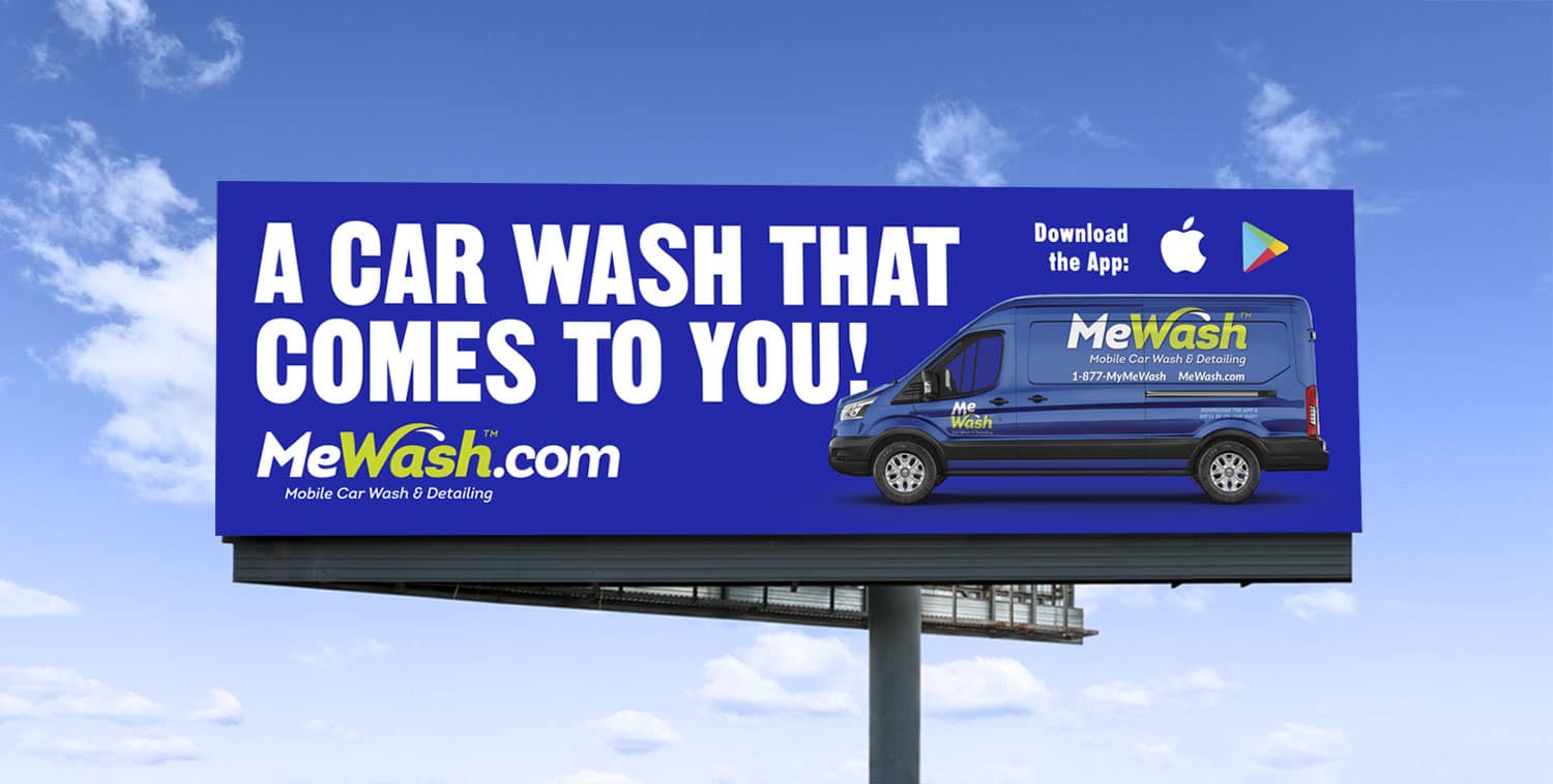
MeWash is a mobile car wash company based out of Anniston, Alabama. They came to Visual Lure for everything from their logo and branding – to signage, vehicles wraps and marketing collateral. Below is a collection of most of the work we completed.
![]()
 Postcards
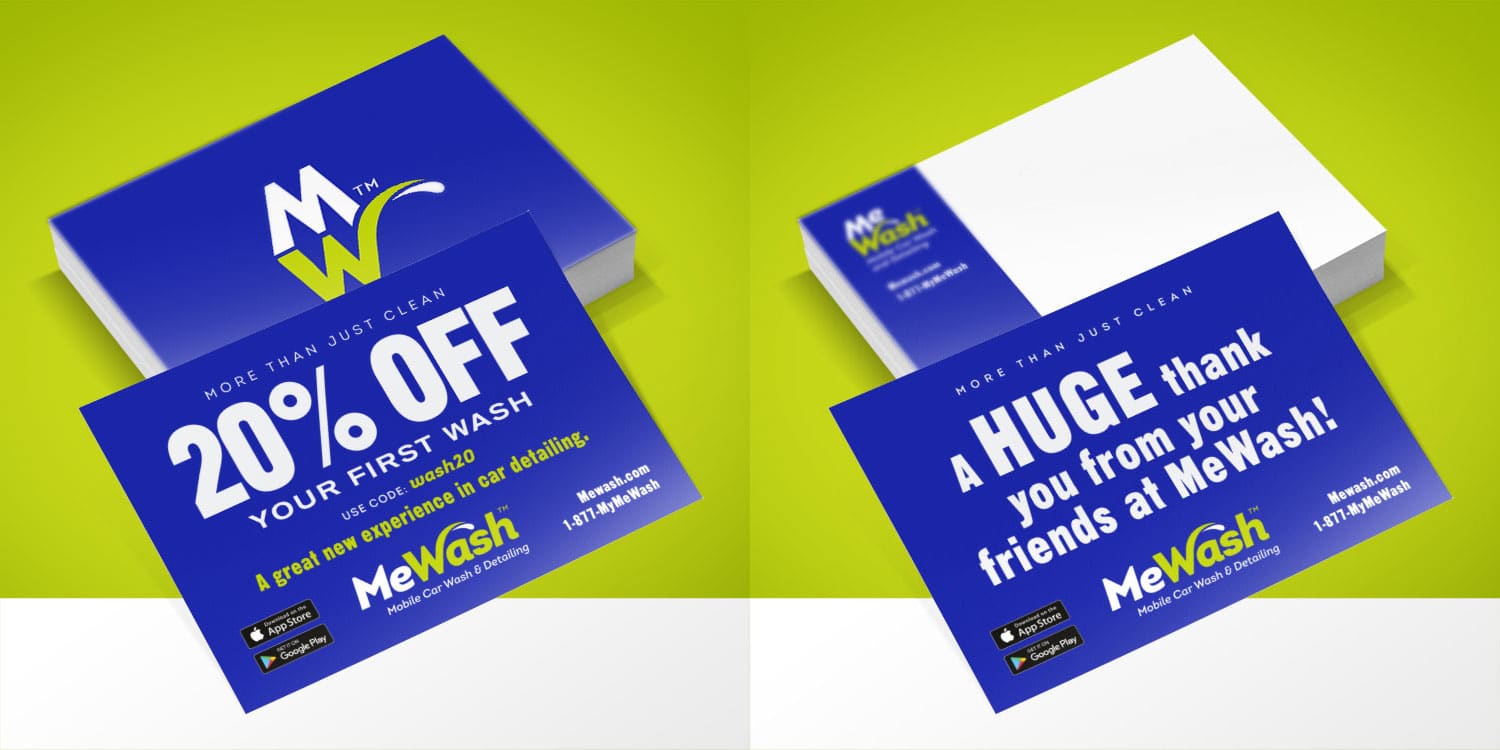
Want to see more? Click here to check out our branding portfolio and see all the different types of companies and organizations we’ve worked with. If you’d like to see more of our work, click one of the following: logo design portfolio | graphic design portfolio | package design portfolio | website design portfolio – Better yet, give us a call or shoot us an email and we can discuss what we can do for you.
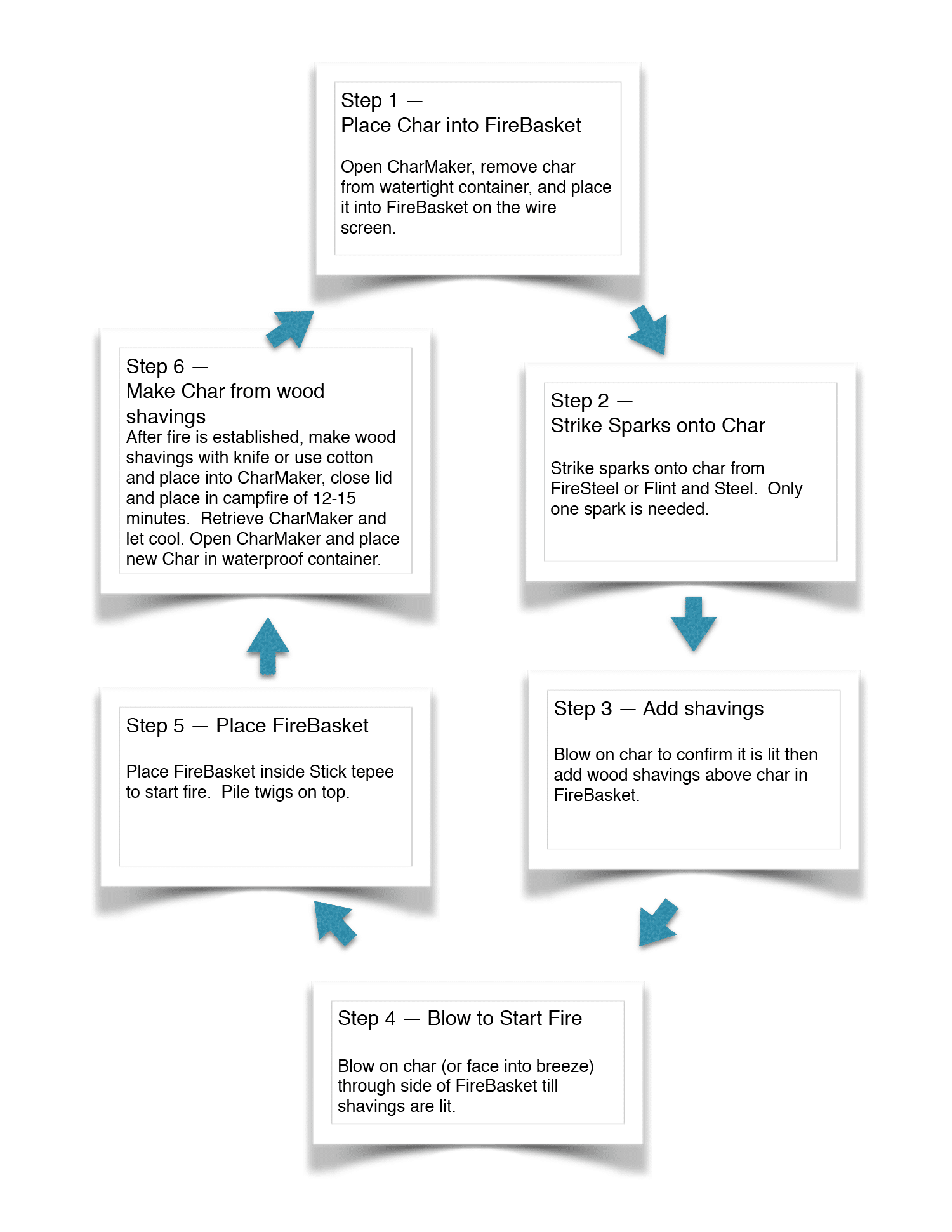
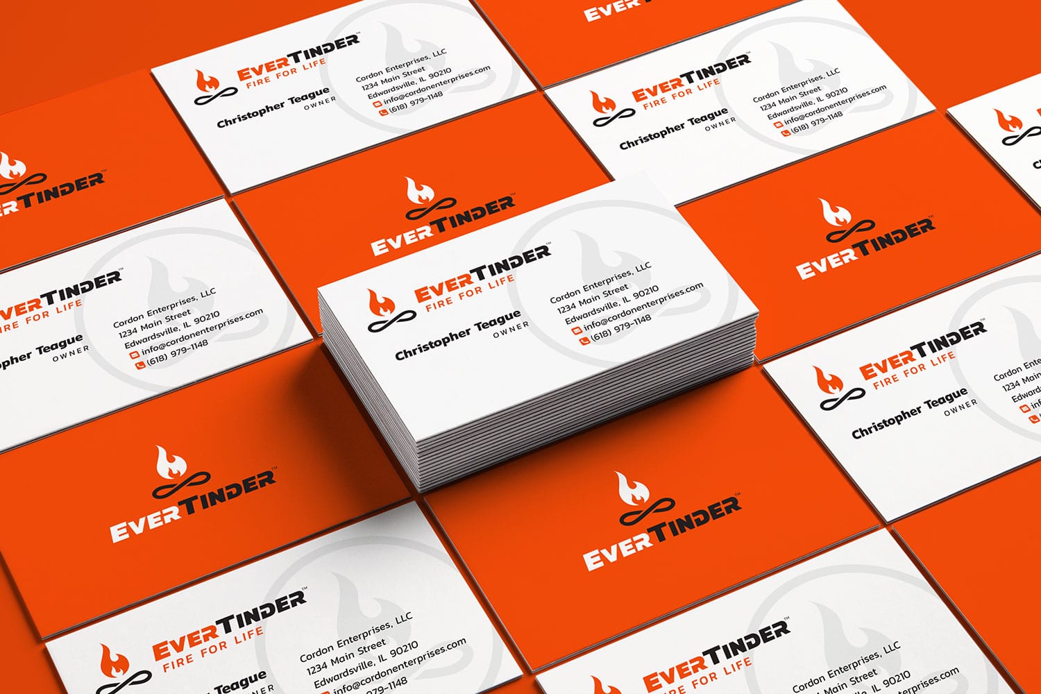
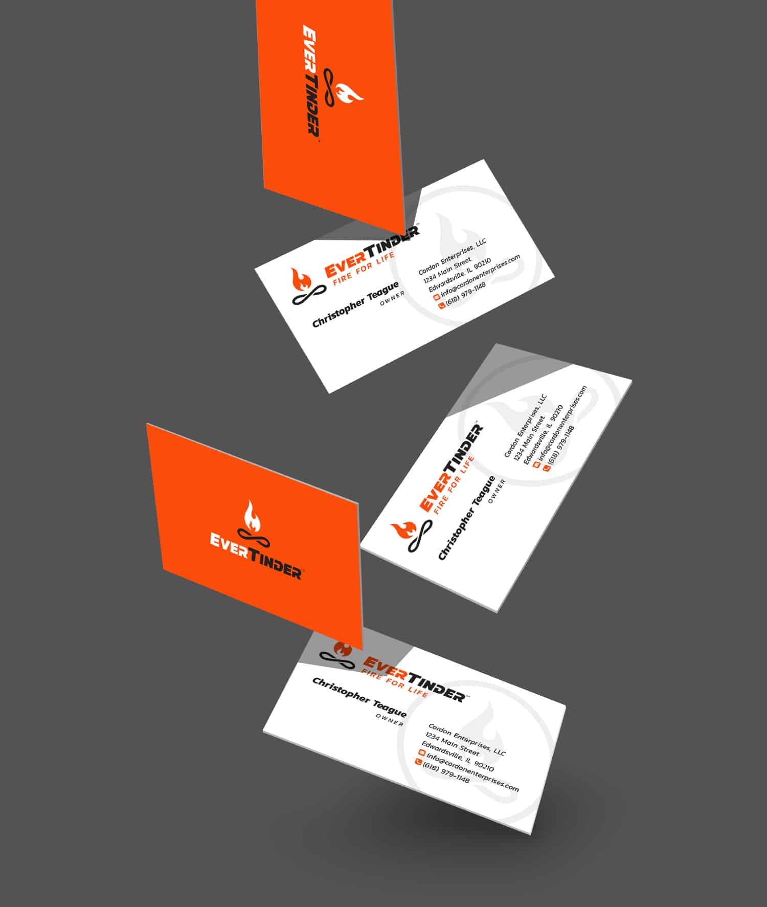
Visual Lure recently completed a new logo for EverTinder, a fire starting kit that easily makes fire without a lighter, match or any combustible materials (It can even be taken on a plane as none of the materials are banned). Once the initial fire is started, it then creates the char needed to make the next fire in an endless cycle. Therefor it makes infinite fire, hence the dual-meaning tagline “Fire for Life”.
We prefer to do our creative briefs for logos in a conversation as you never know where it will lead. It also tends to be more fun and free flowing than filling out some type of brief questioner.
During our initial meeting, Chris – the owner of EverTinder, demonstrated the product outside our office and I was blown away. I remember as a kid trying to start a fire with one of those Boy Scout fire kits with flint and steel or a couple of sticks. It’s almost impossible. Chris opened his little kit, placed some charcoal looking material in a stainless steel cup with a little steel net. Using a flint and stone he shot one tiny spark into the charcoal material and it instantly created a tiny ember. He then blew on it a couple times and the little ember started to grow. He placed some wood shaving on top of that and in less than a minute or two he had made a fire. We were impressed at how easy it was.
During our creative brief, Chris mentioned that he wanted the logo to have some type of icon or mark that possibly used circling arrows or the recycle symbol. Even though the product is universal, he wanted it to have a more masculine or “outdoorsy” feel. Lastly he wanted to use a yellow and black color palette.
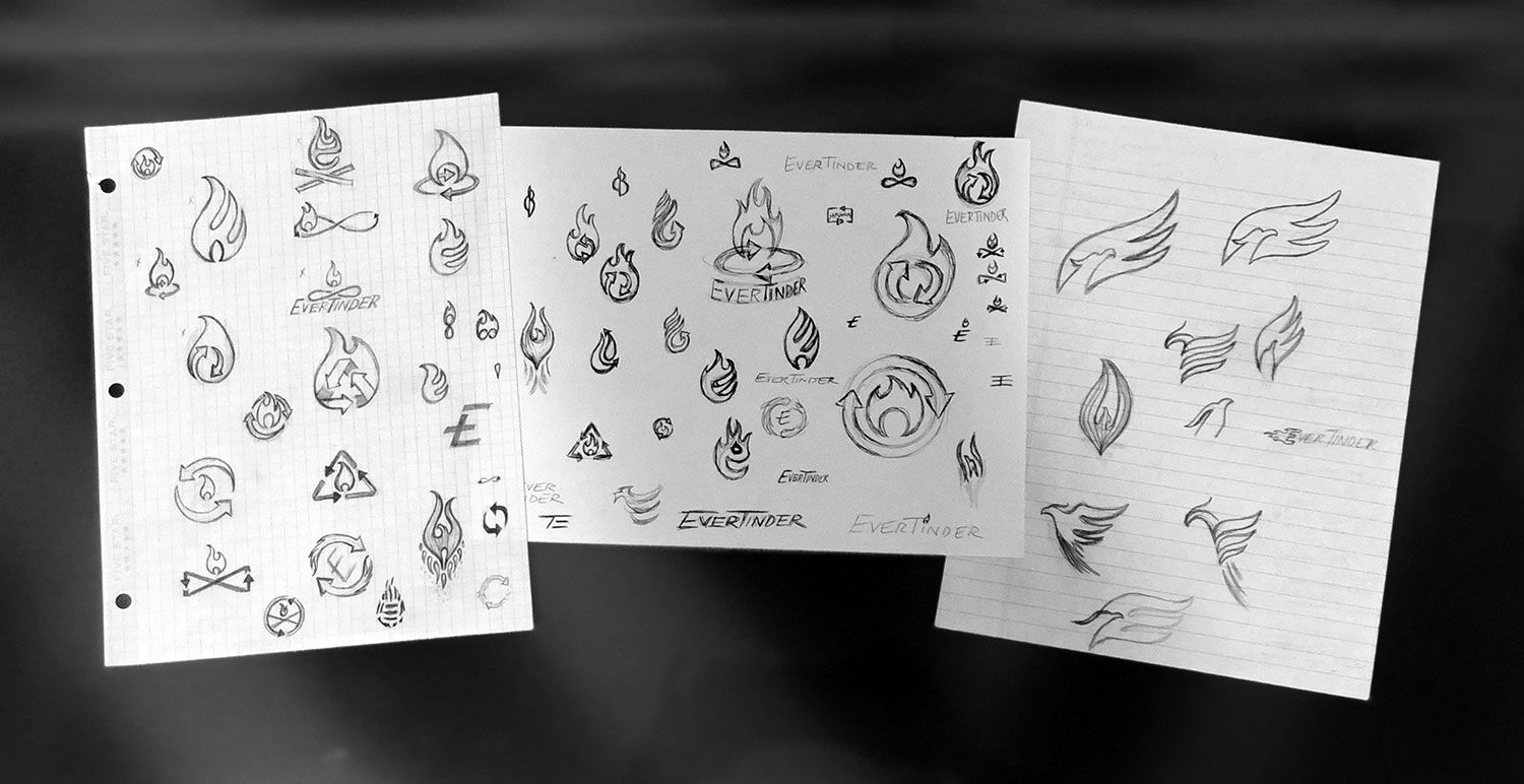
The first thing we do with any new logo project is write down any words that come to mind when thinking of the product or company. For EverTinder our list included: fire, flame, wood, logs, outdoors, survival, endless, infinite, arrows, recycle, ash, and charcoal. We then brainstormed for ideals on how we can tie at least two of these together in some type of clever way, as we find witty logos tend to be memorable, an extremely import feature you want a logo to have.
From there we ALWAYS start with sketches. We never jump right into the computer as we feel the concept is just as important as the art itself.
Initially all our sketches were playing with fire and flames. Our first idea that we though had potential was having the logs of the fire be an infinity symbol to represent the endless supply of fires. Our last BIG idea, which we LOVED, was to incorporate a Phoenix. The fire bird that raises from the ashes, almost exactly what this product does (it creates fire from the ashes it makes). As we always try to create logos with a dual meaning or a clever concept, we had the wings of the Phoenix also create the letter “E” for EverTinder.
Here are our initial logo options we presented to the client:
![]()
After receiving feedback from the client, he wanted the logotype to be in a stencil format so that the entire logo could be cut out of steel. He also changed his mind on the color palette once he saw some additional options. After a couple minor rounds of revisions to the one he liked best, here is the final logo. We also created a couple secondary marks.
![]()
…and here are renderings of it engraved and cut out of metal:
![]()
…along with a couple sample mock ups to show how the logo could be implemented:
Want to see more of our logo design work? Click here to view our logo design portfolio, or click here to view some of our branding projects.
