Visual Lure recently completed a new logo for EverTinder, a fire starting kit that easily makes fire without a lighter, match or any combustible materials (It can even be taken on a plane as none of the materials are banned). Once the initial fire is started, it then creates the char needed to make the next fire in an endless cycle. Therefor it makes infinite fire, hence the dual-meaning tagline “Fire for Life”.
We prefer to do our creative briefs for logos in a conversation as you never know where it will lead. It also tends to be more fun and free flowing than filling out some type of brief questioner.
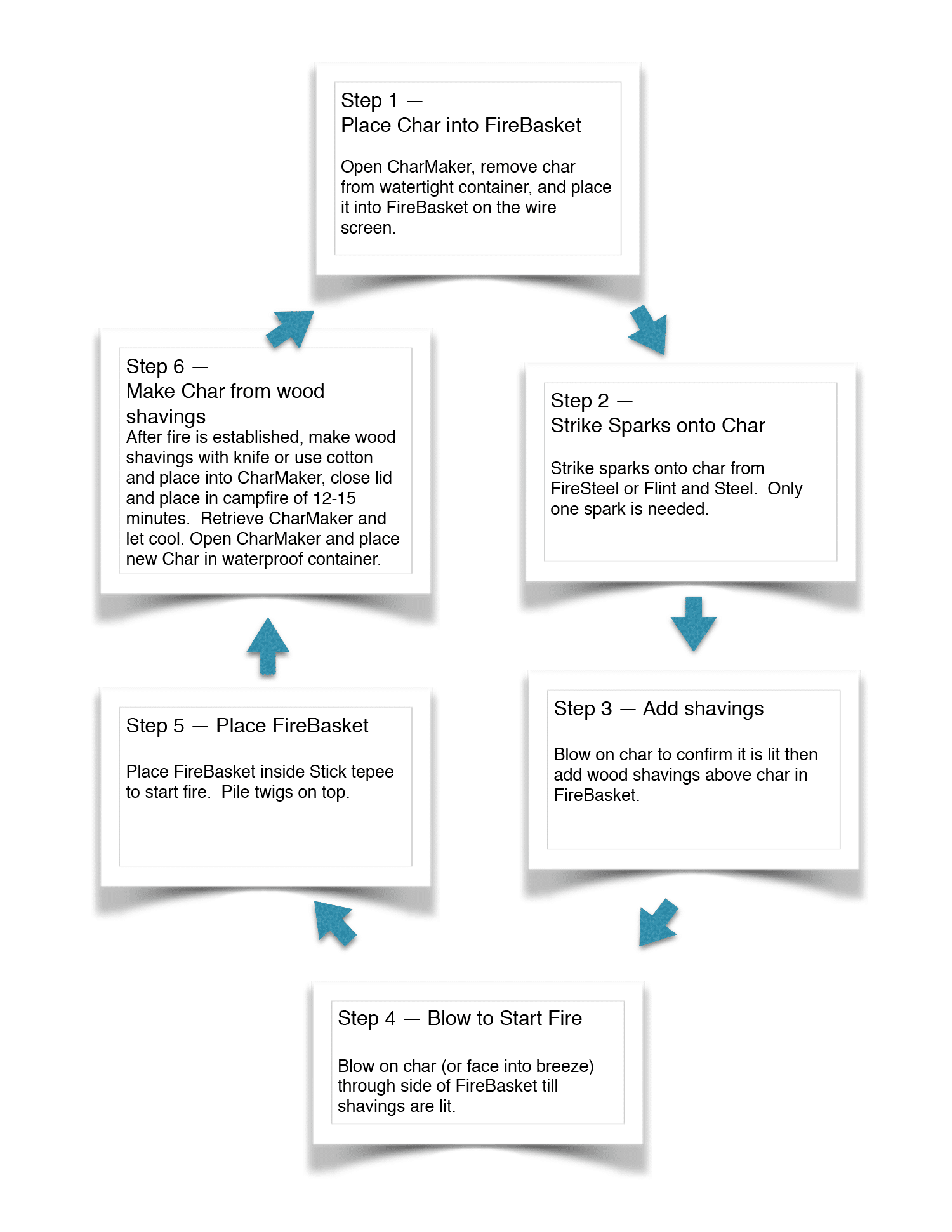
During our initial meeting, Chris – the owner of EverTinder, demonstrated the product outside our office and I was blown away. I remember as a kid trying to start a fire with one of those Boy Scout fire kits with flint and steel or a couple of sticks. It’s almost impossible. Chris opened his little kit, placed some charcoal looking material in a stainless steel cup with a little steel net. Using a flint and stone he shot one tiny spark into the charcoal material and it instantly created a tiny ember. He then blew on it a couple times and the little ember started to grow. He placed some wood shaving on top of that and in less than a minute or two he had made a fire. We were impressed at how easy it was.
Process EverTinder Uses to Make Fire
During our creative brief, Chris mentioned that he wanted the logo to have some type of icon or mark that possibly used circling arrows or the recycle symbol. Even though the product is universal, he wanted it to have a more masculine or “outdoorsy” feel. Lastly he wanted to use a yellow and black color palette.
Getting Started
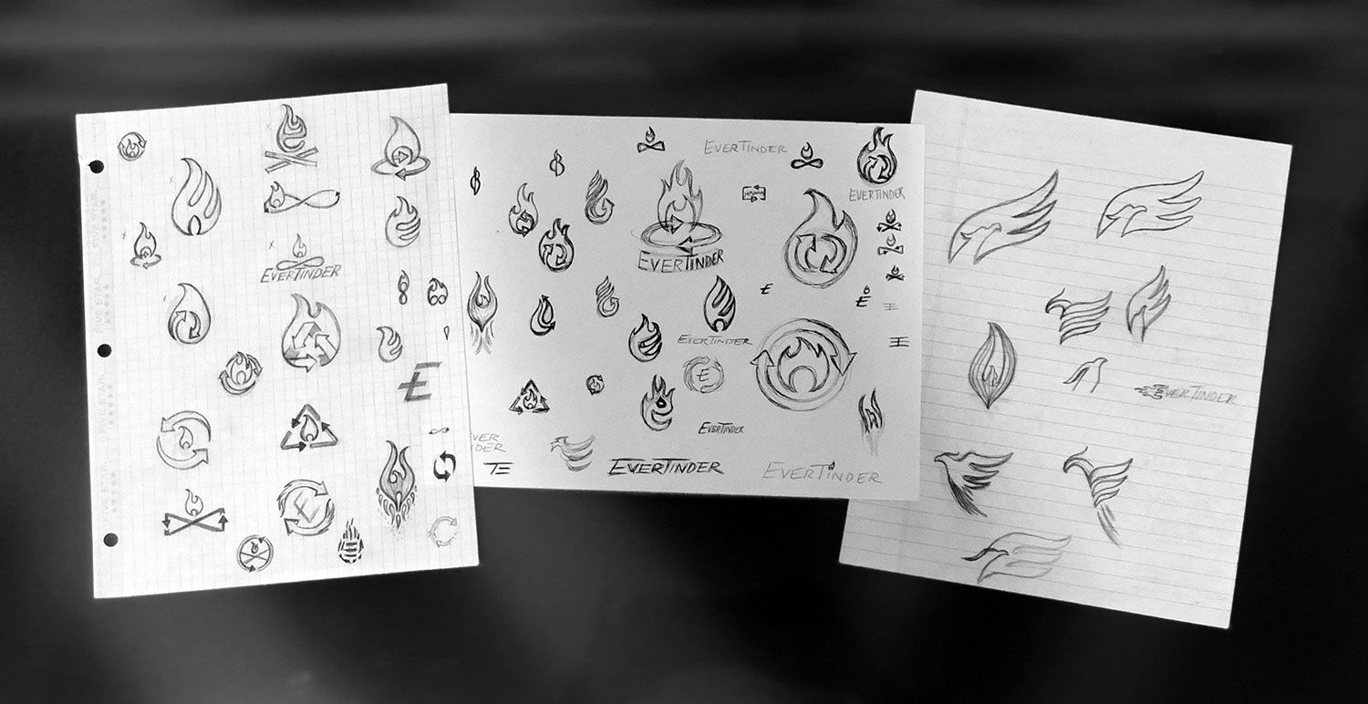
The first thing we do with any new logo project is write down any words that come to mind when thinking of the product or company. For EverTinder our list included: fire, flame, wood, logs, outdoors, survival, endless, infinite, arrows, recycle, ash, and charcoal. We then brainstormed for ideals on how we can tie at least two of these together in some type of clever way, as we find witty logos tend to be memorable, an extremely import feature you want a logo to have.
From there we ALWAYS start with sketches. We never jump right into the computer as we feel the concept is just as important as the art itself.
Our Initial Sketches
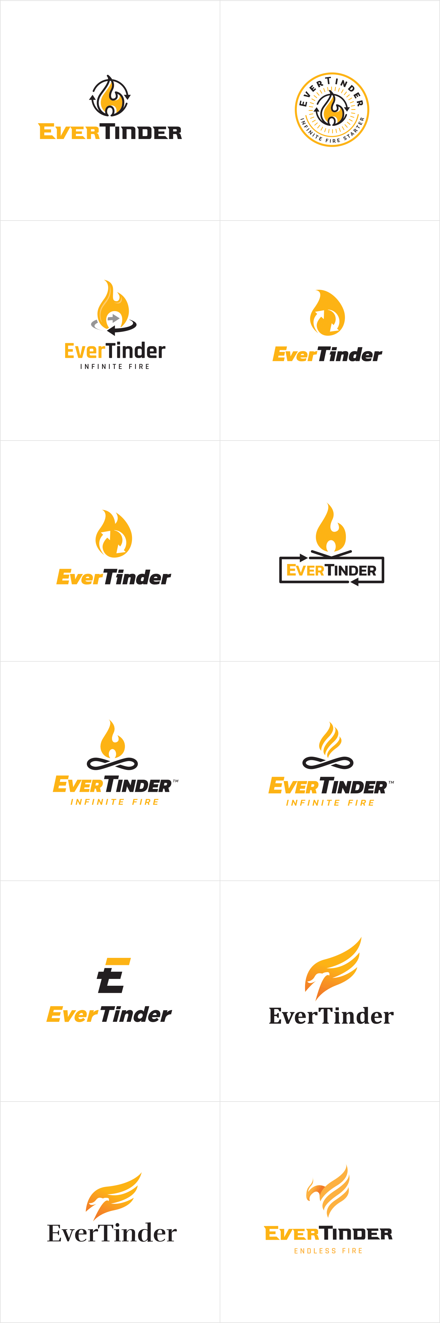
Initially all our sketches were playing with fire and flames. Our first idea that we though had potential was having the logs of the fire be an infinity symbol to represent the endless supply of fires. Our last BIG idea, which we LOVED, was to incorporate a Phoenix. The fire bird that raises from the ashes, almost exactly what this product does (it creates fire from the ashes it makes). As we always try to create logos with a dual meaning or a clever concept, we had the wings of the Phoenix also create the letter “E” for EverTinder.
Initial Designs
Here are our initial logo options we presented to the client:
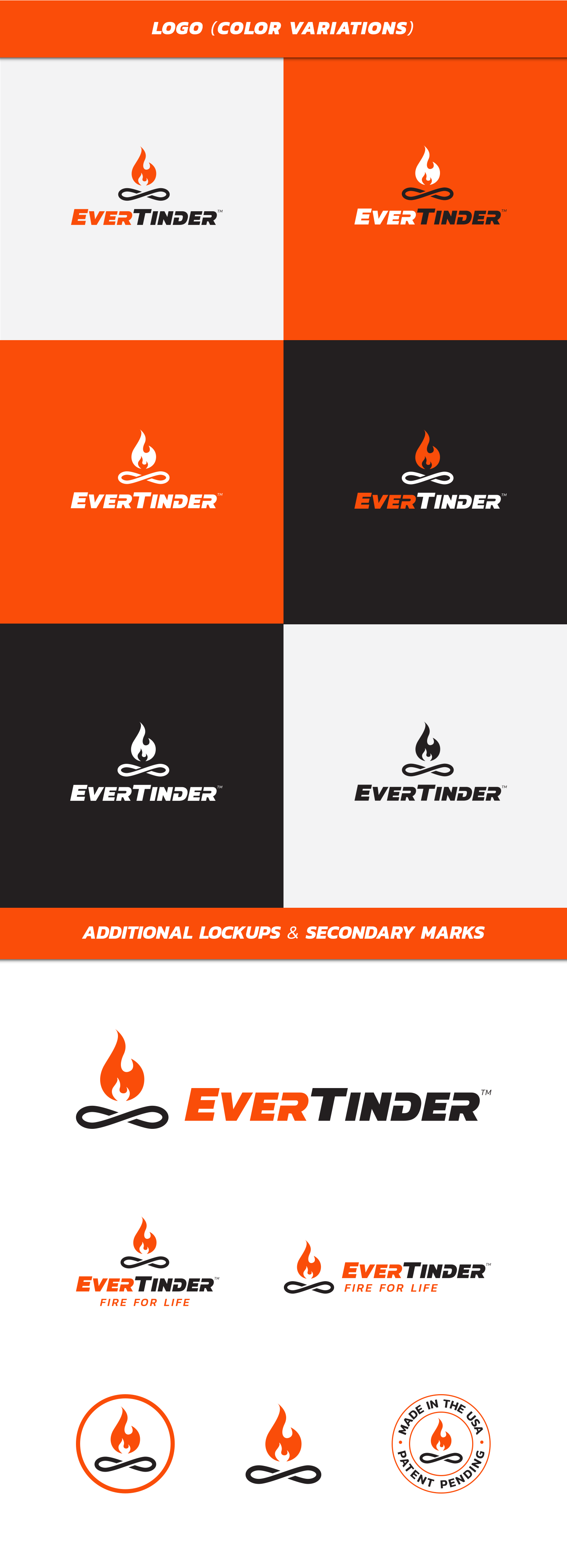
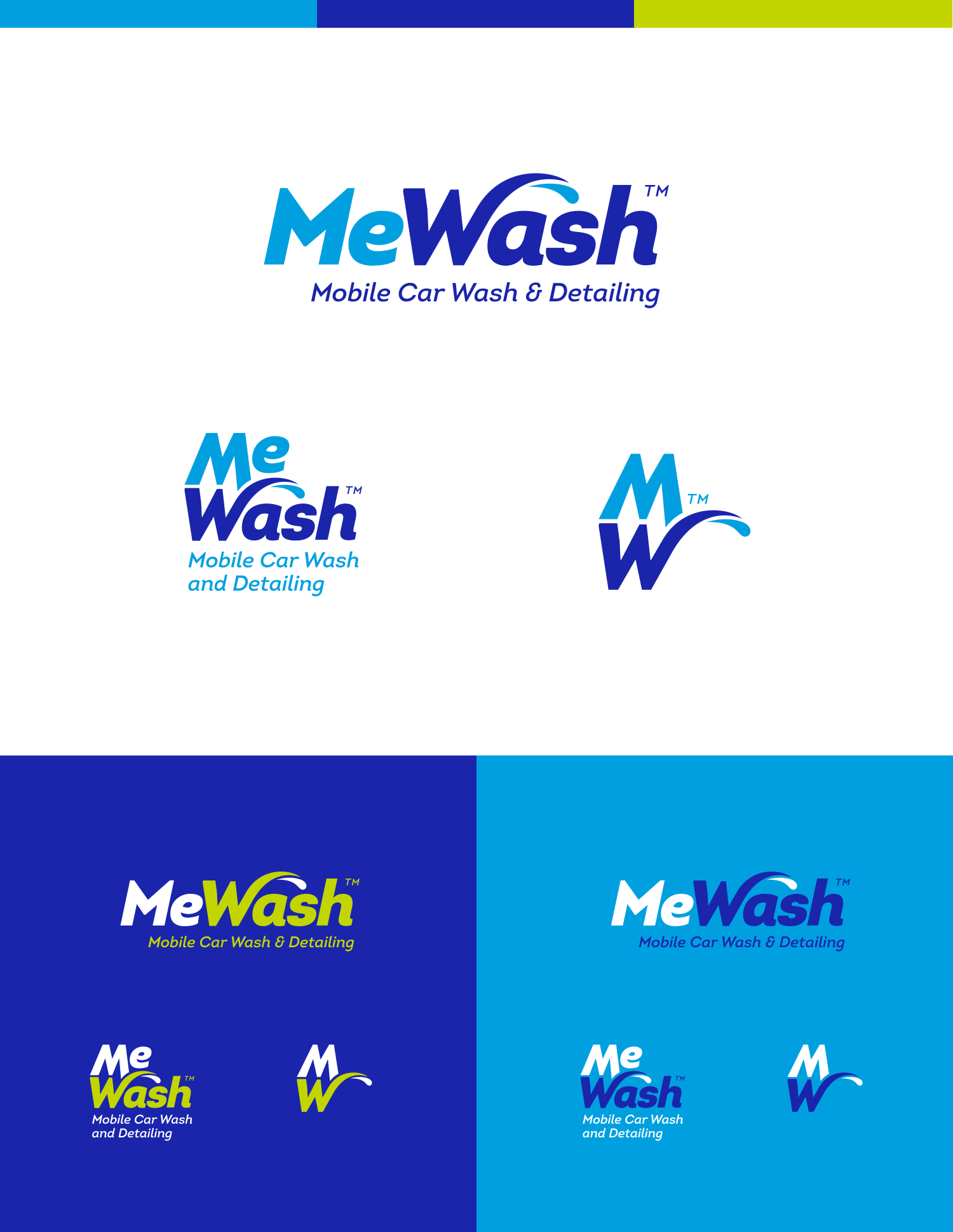
The Final Logo
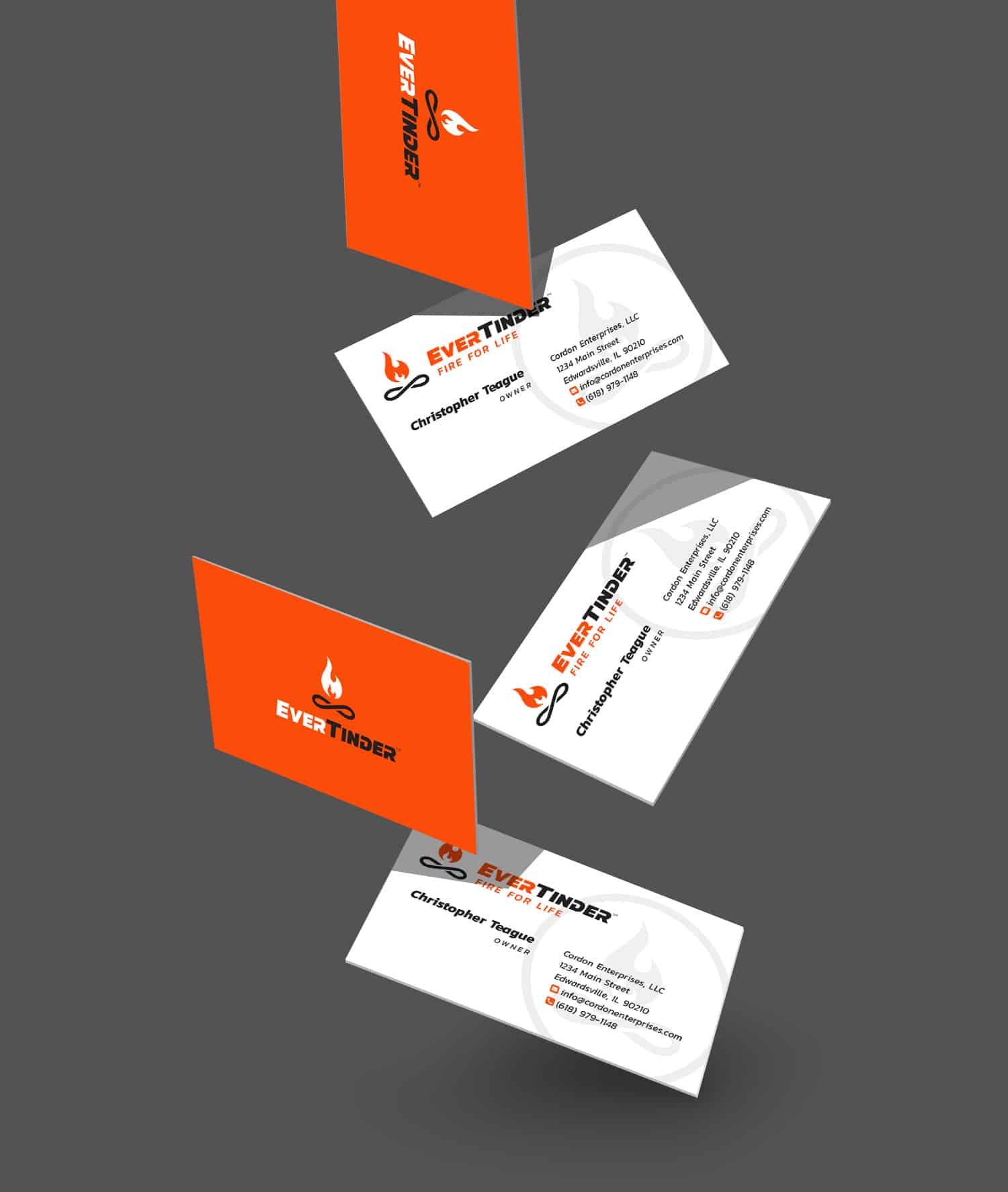
After receiving feedback from the client, he wanted the logotype to be in a stencil format so that the entire logo could be cut out of steel. He also changed his mind on the color palette once he saw some additional options. After a couple minor rounds of revisions to the one he liked best, here is the final logo. We also created a couple secondary marks.
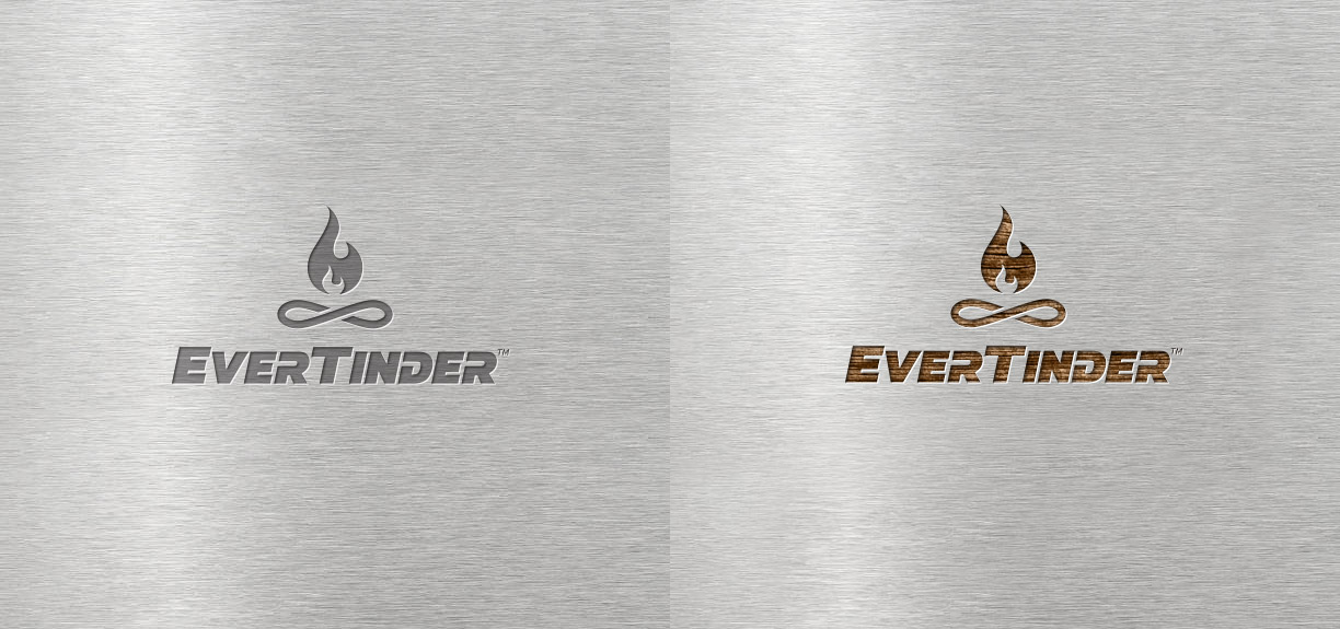
…and here are renderings of it engraved and cut out of metal:
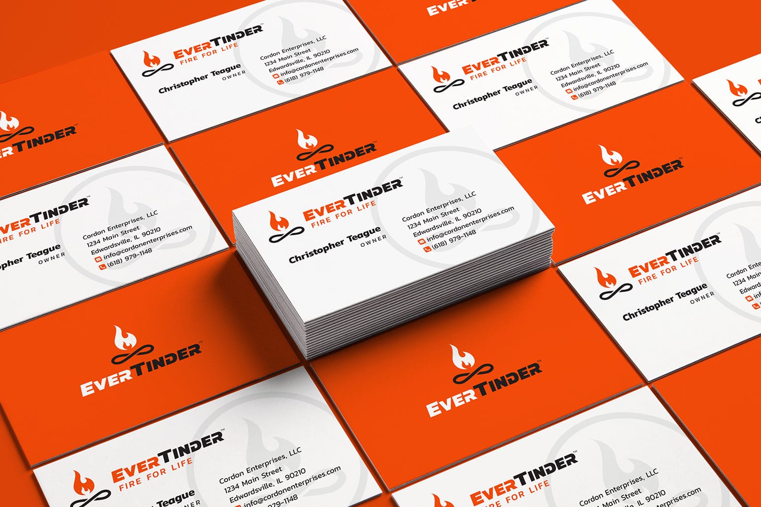
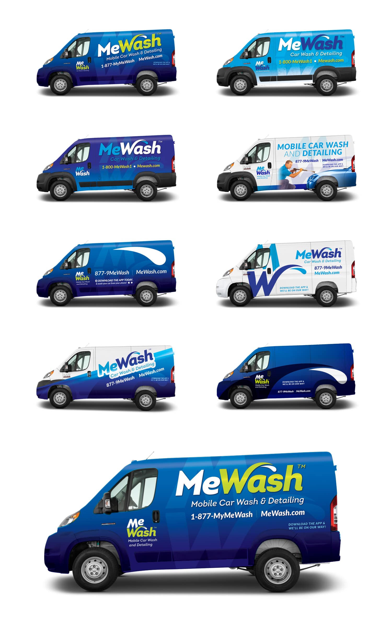
…along with a couple sample mock ups to show how the logo could be implemented:
Want to see more of our logo design work? Click here to view our logo design portfolio, or click here to view some of our branding projects.
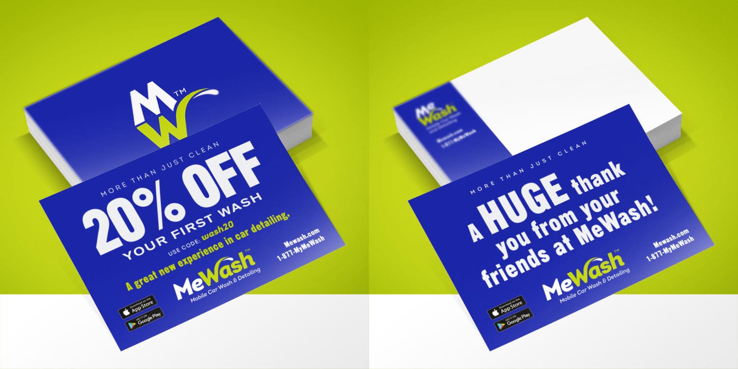
 Postcards