OUR BLOG

Here you will find our latest works, company news and more. We update it on a regular basis so be sure to come back soon. Please like, share, pin or tweet the post you enjoy.

Rebranding a Local O’Fallon, IL Orthodontics Practice

Posted on March 6, 2026

Visual Lure recently worked with a local orthodontic practice to refresh their logo and implement a subtle rebrand in preparation for their upcoming move to a new location. Because the practice is already well established and widely recognized in the area, it had built strong brand equity over the years. With that in mind, our initial approach was to preserve the familiarity of the existing brand while giving it a more refined and contemporary feel. Rather than reinventing the identity, we proposed a thoughtful logo update that would modernize the look while maintaining the elements patients already associate with the practice.


Here was our initial proposal:

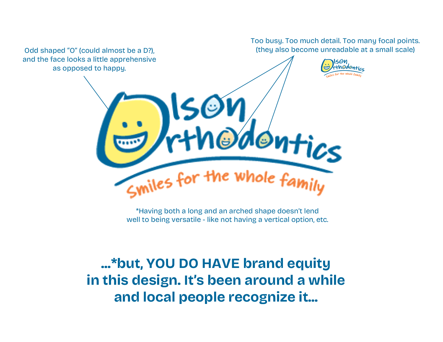
OUR ASSESSMENT of THEIR EXISTING LOGO:

Updated/refined proposed logo:
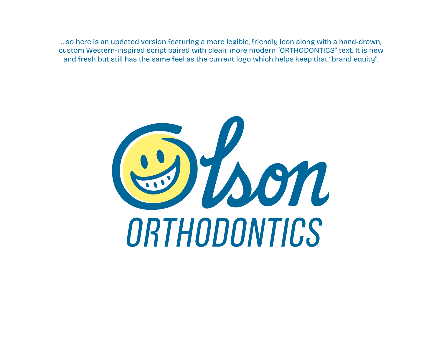
Sample of usage:


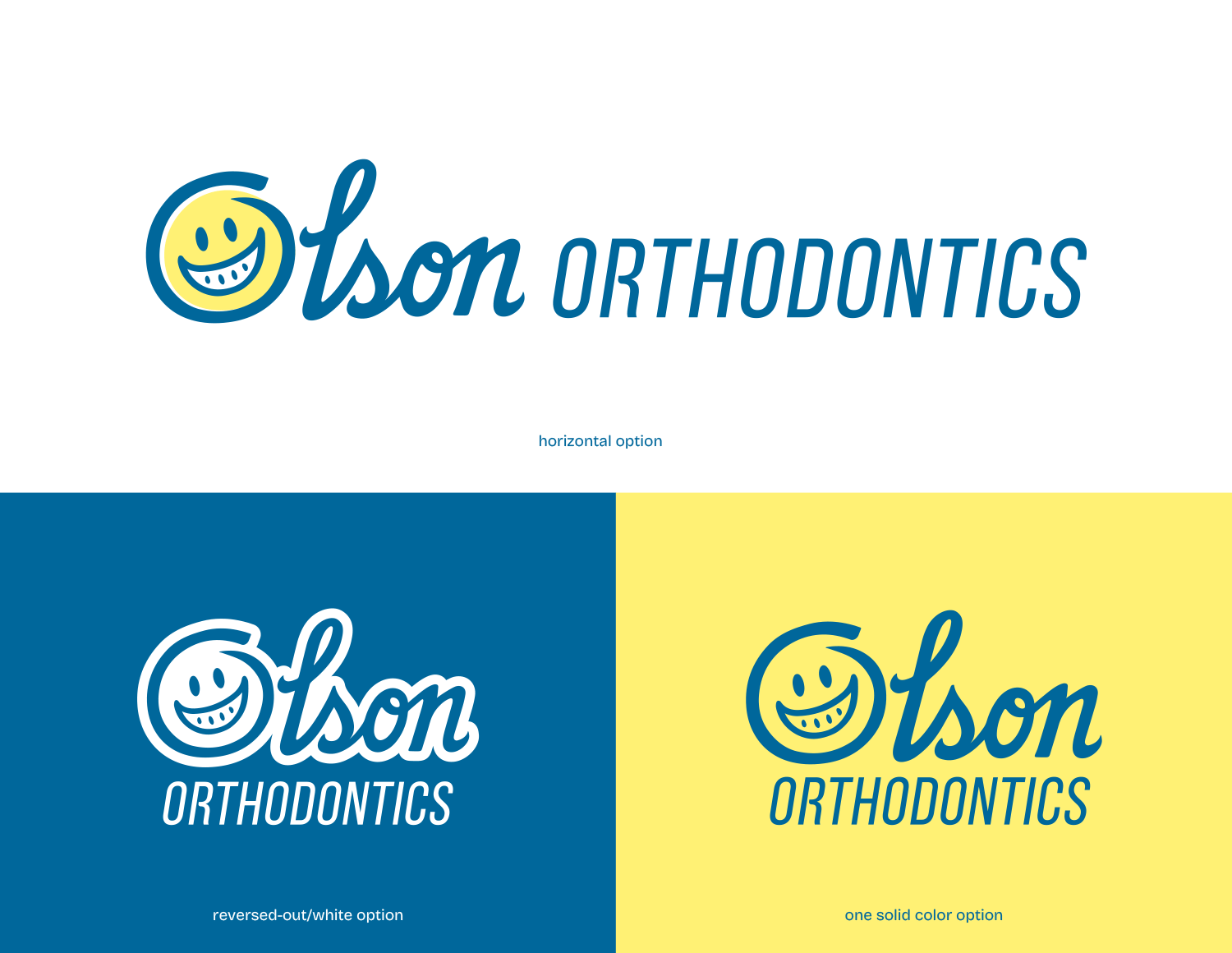
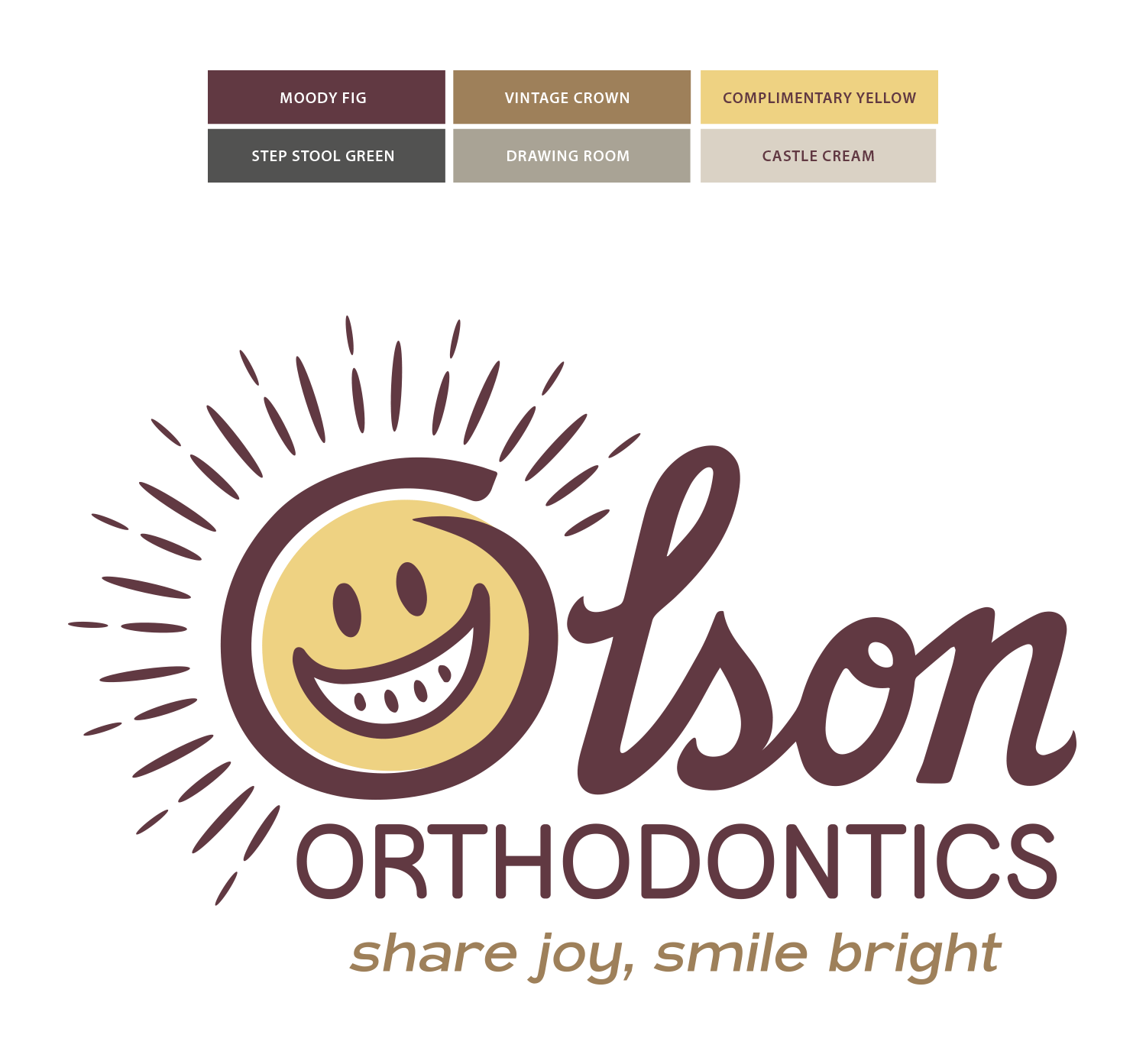
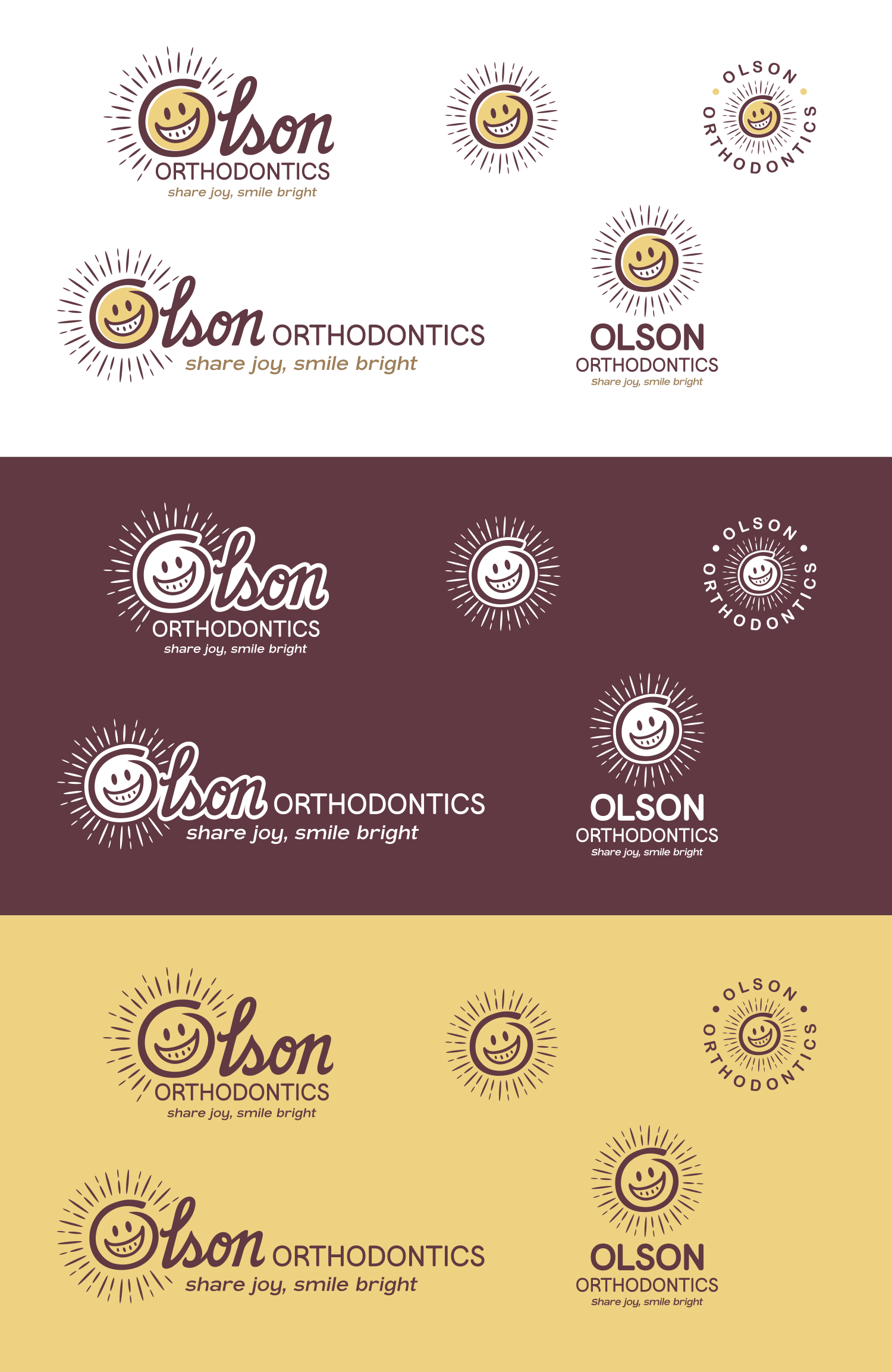
After reviewing the initial concept, they asked if we could incorporate a sun element to reflect their new tagline, “Share Joy, Smile Bright”. They had also selected a new color palette inspired by the colors chosen for their upcoming location, which they wanted the refreshed identity to reflect. In addition, they felt the typeface we selected for ORTHODONTICS wasn’t quite the right fit, so we explored alternative font options that better aligned with the updated direction.


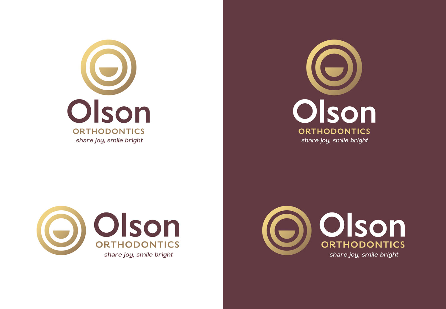
New color palette and final approved logo:

New logo and color palette

…and the final logo lockups:

Final OO logo lockups

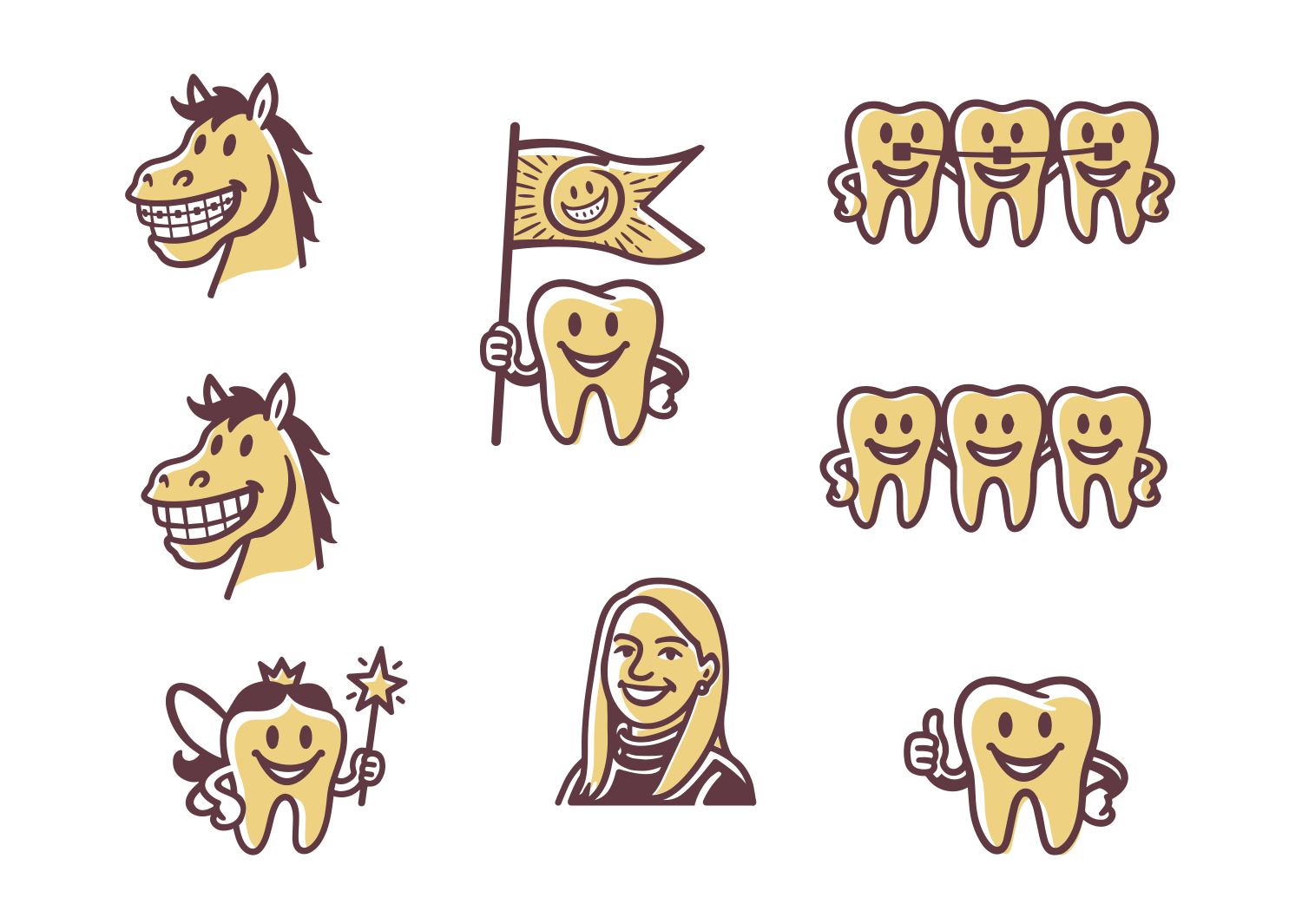
…we also knocked out some additional brand elements / spot illustrations using the same style as the logo:
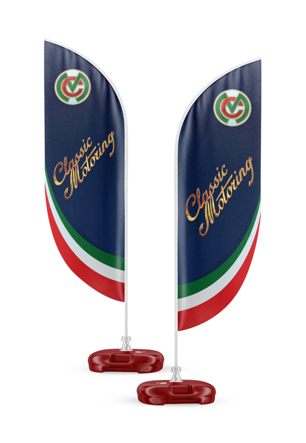
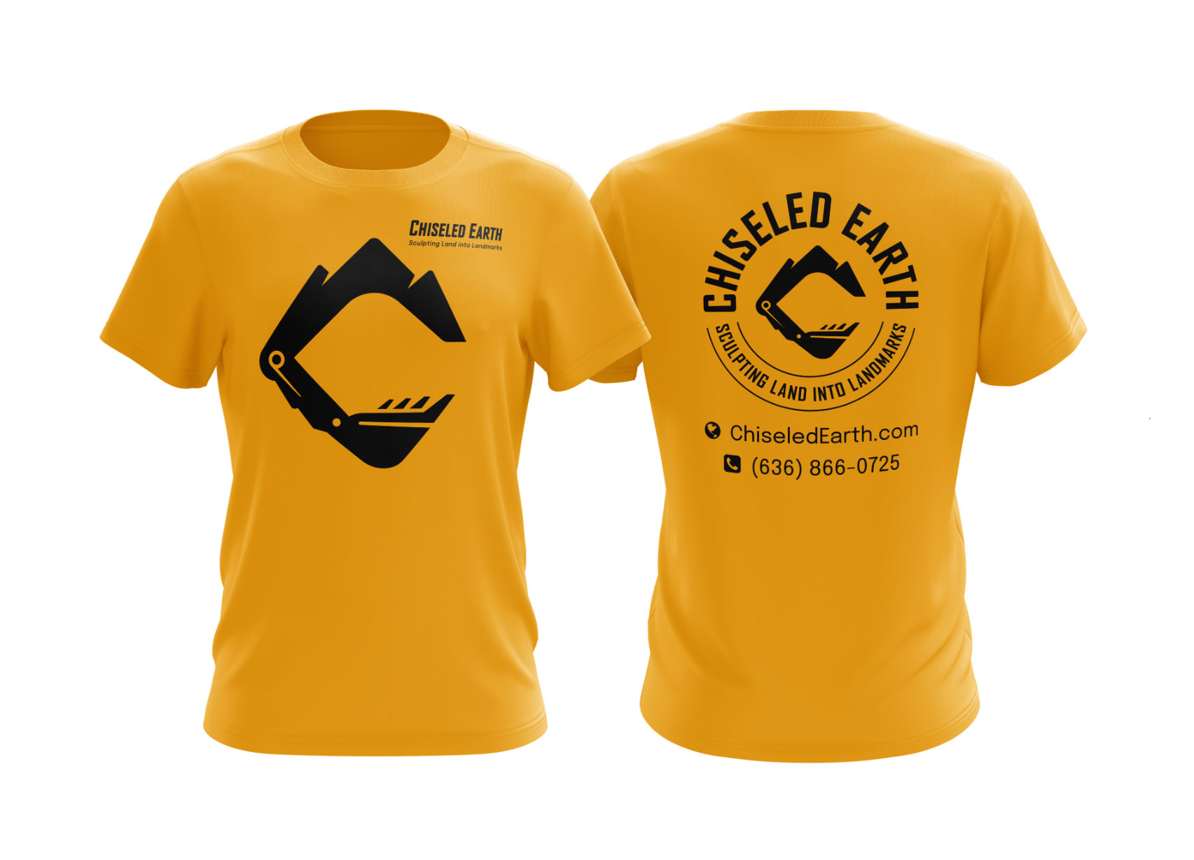
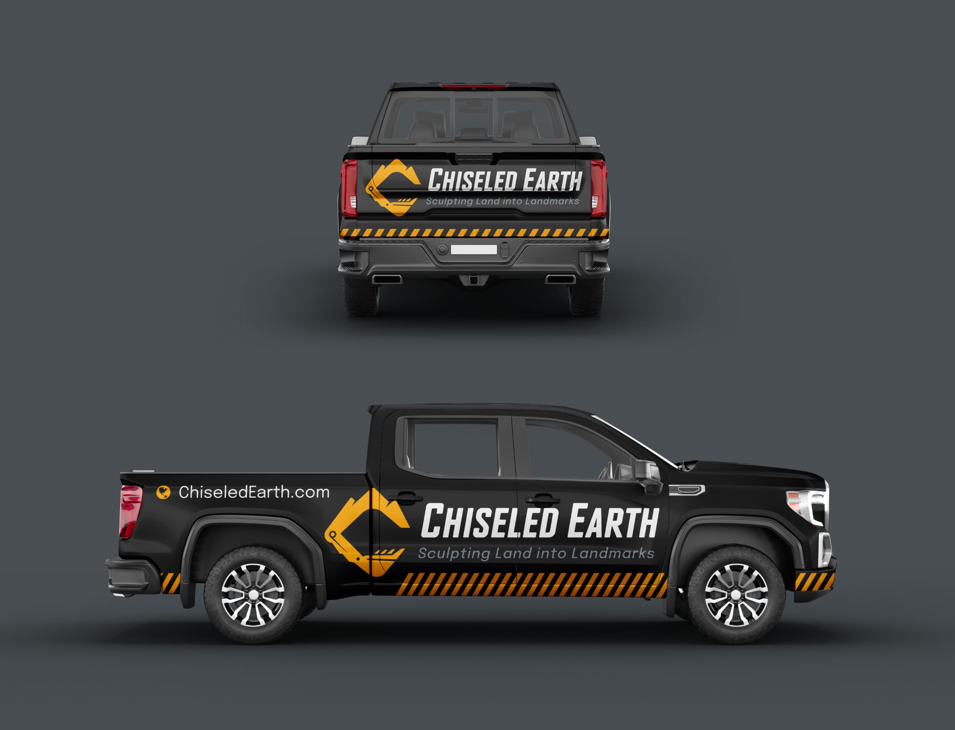
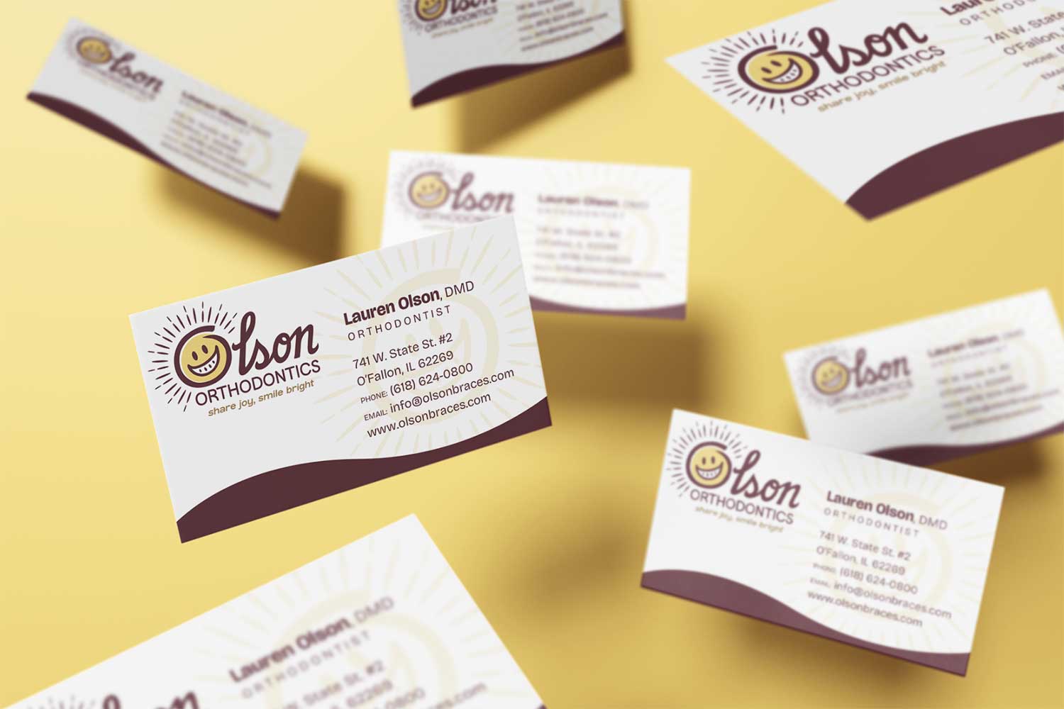
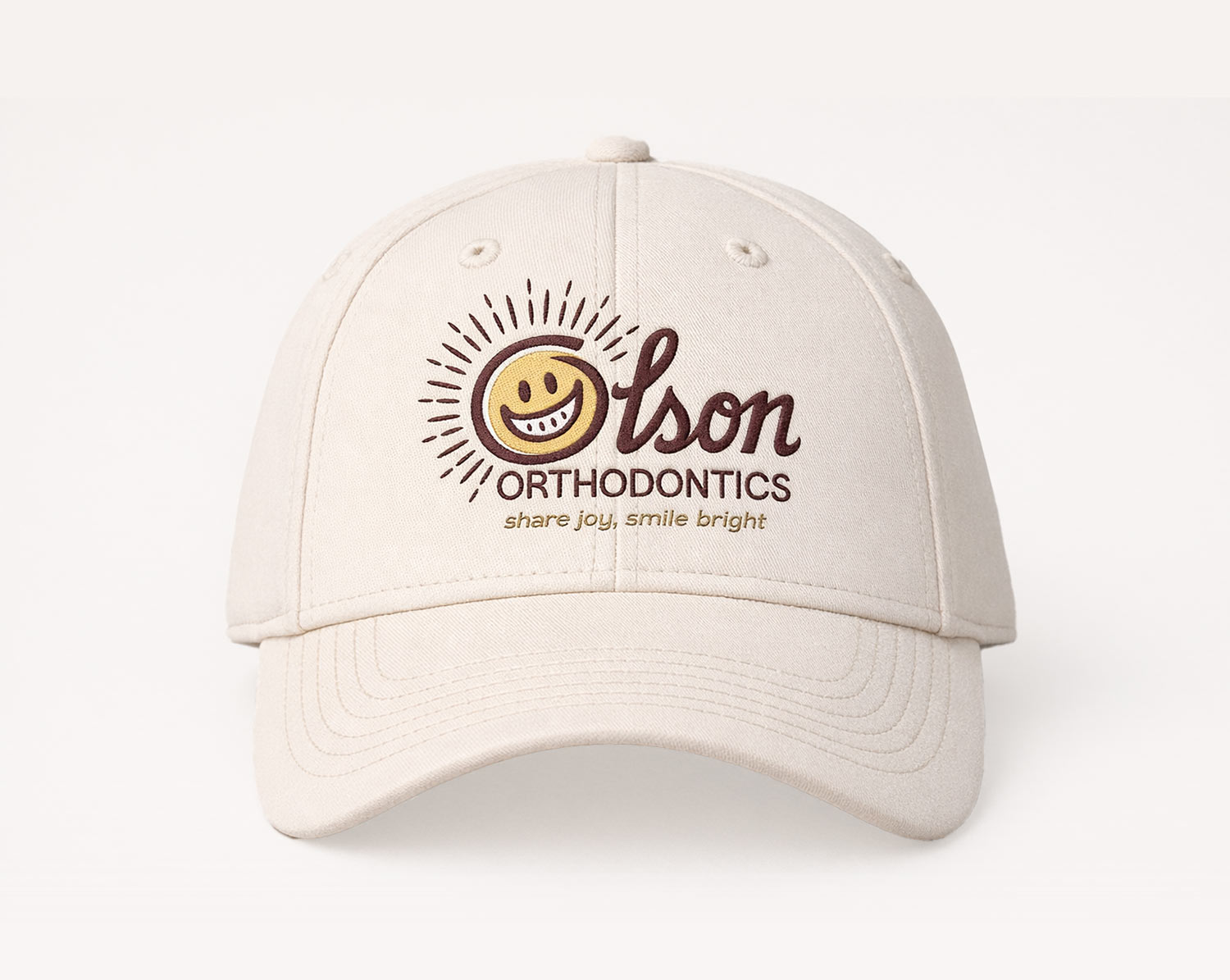
brand elements/spot illustrations

…and last but not least a business card:

olson business card design


BEHIND THE SCENES WORK

We also presented an additional concept to ensure the updated logo was truly what they wanted. This option explored a cleaner, more modern approach, giving them the opportunity to consider a bolder evolution of the brand before committing to the initial direction.

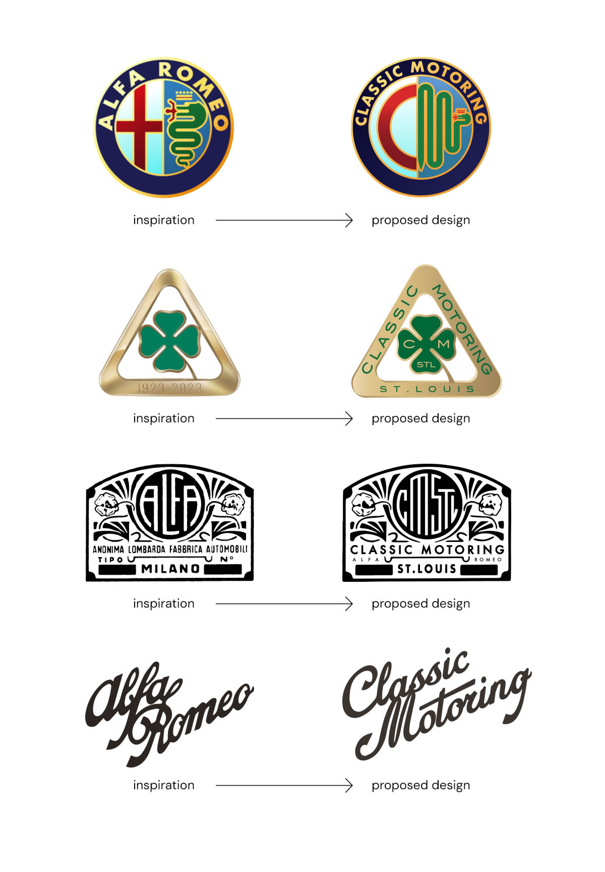
This proposed logo explained:


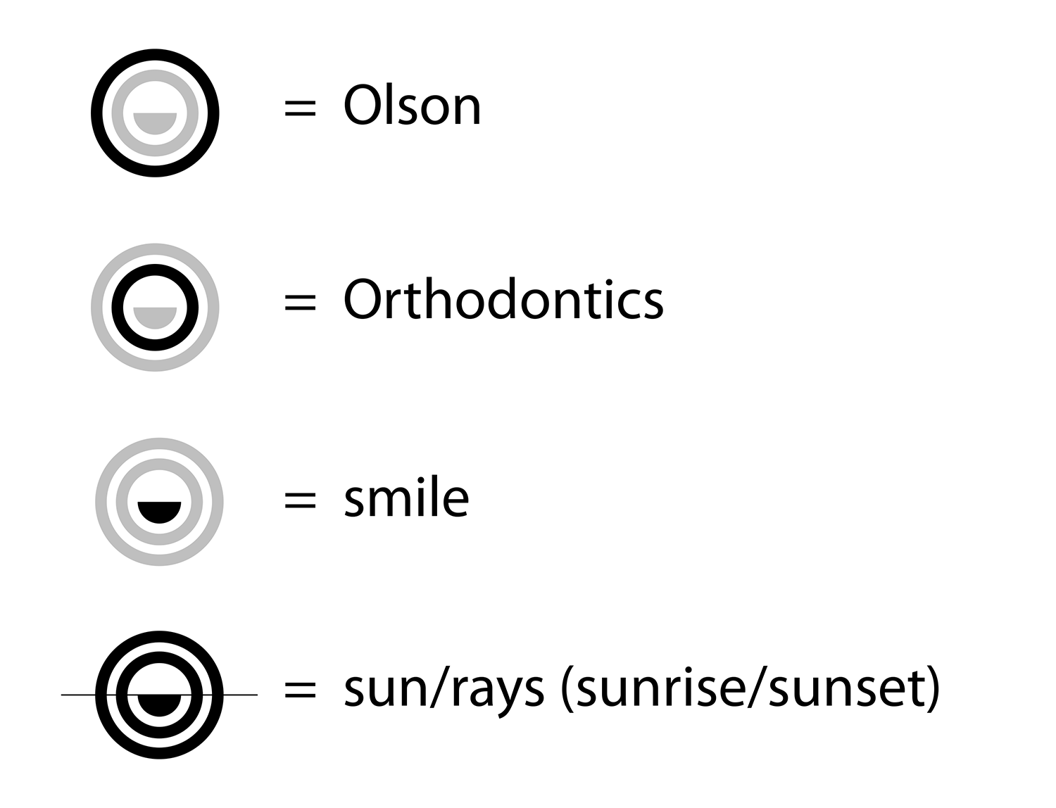
Is you brand ready to evolve?

Every brand reaches a point where it needs to evolve. Sometimes that means a subtle logo refinement to modernize the look while preserving hard-earned brand recognition. Other times, it calls for a more significant rebrand that reflects growth, new services, or a new direction. The key is finding the right balance between honoring the past and positioning the brand for the future.

In this case, the goal was to maintain the strong brand equity the practice had built in the community while introducing thoughtful updates that aligned with their new location, new color palette, and uplifting new message: “Share Joy, Smile Bright.” By exploring multiple directions—from a refined update to a more modern interpretation—we were able to help guide the process and ensure the final result felt both fresh and familiar.

If your business is starting to feel visually outdated, preparing for growth, or simply looking to strengthen how your brand is perceived, a logo refresh or full rebrand can make a powerful impact.

At Visual Lure, we specialize in creating professional eye-catching designs that help businesses stand out and make lasting impressions. Whether you need a completely new logo, a strategic brand refresh, or a thoughtful evolution of your existing identity, we’d love to help bring your vision to life.

Ready to elevate your brand? Contact Visual Lure today to start the conversation.

Logo Designs for a St. Louis Alfa Romeo Restoration Company

Posted on October 13, 2025

We recently had the opportunity to design an entire logo collection for Classic Motoring STL, a St. Louis–based company that specializes in the restoration and repair of vintage Alfa Romeos. Founded by Harden Ervin and Brandon Benack, the shop combines more than 40 years of experience and a shared passion for classic automobiles. Our goal was to create a brand identity that reflects their expertise, craftsmanship, and appreciation for timeless automotive design — something that feels both authentic to the Alfa Romeo legacy and distinctly their own.

Our initial round of explorations took inspiration from vintage Alfa Romeo logos, which we adapted into various Classic Motoring STL logo options. Below are the initial proposed designs:

Classic Motoring Logo Designs (proposed)

…and after multiple rounds of revisions, here is a sampling of the final collection. The designs were inspired by classic Alfa Romeo badges, featuring a custom CM monogram, bespoke typography wrapped within traditional Alfa-style grille shapes, and a reimagined logotype inspired by the original script.Classic Motoring Logo Designs

…we also had the privilege of designing two-sided banners for their appearance at the 2025 Alfa Romeo Owners Club USA National Convention in Chicago:

CMSTL-banner-designs

…a couple t-shirt design options:

CMSTL shirt designs

…and lastly, a proposed vehicle wrap for their shop van:

CMSTL-van-wrap-design

Want to see more of our logo design work?

Click here to view our logo design portfolio, or click here to view some of our branding projects.

Visual Lure Honored with 6 Logos in LogoLounge 11

Posted on November 6, 2019

LogoLounge 11 Book Art

It is with great honor that we announce six of our logos were selected for the LogoLounge 11 book.  No matter how many times it happens, there is nothing better than getting that “CONGRATULATIONS, YOU’VE MADE IT INTO LOGOLOUNGE BOOK” email.

This year, nearly 35,000 logos were submitted for this edition, making this one of LogoLounge’s largest competitions yet. Out of those, the incredible jurors chose 2,500 winning logos. Six of those logos were ours (shown below).

Visual Lure's LogoLounge 11 winners

Our Winning Logos:

The Visual Crave: A logo designed for a social media platform. The logo features three dimensional candy letters integrated into a VC monogram.

A&B Farm: A crest for a Farmington, Missouri farm. Logo features the owner’s Brittany Spaniel, ornate lettering, and a pair of antlers.

Bear River Brewing Icon: Logo icon for a craft beer brewer – featuring a silhouette of a grizzly bear standing in a river. Visual Lure was also responsible for naming.

Especially Me: An ornate seal/crest for a professional photography studio.

Bear River Brewing Seal: Logo seal featuring a bear rowing a canoe down a river with his huge bottle of beer – hence bear river brewing. Also features a palm tree representing the location of the brewer – Tampa, Florida.

Mightier Copywriting: Proposed name and logo for a professional copywriter. Logomark features a pen breaking a sword inspired by the famous quote “the pen in mightier than the sword”.


More About LogoLounge 11:

This 11th edition of the bestselling LogoLounge book series features the leading edge of identity design created by highly accomplished and noteworthy up-and-coming designers from around the world. Carefully curated by an expert panel made up of some of the most revered names in the industry, this volume offers up endless opportunity for insight and delight. Discover 2,500 amazingly crafted logos organized into unique visual categories for easy reference. Throughout the book, bonus case studies from respected firms including Stefan Sagmeister, Pentagram London, Hoodzpah, Focus Lab and Tad Carpenter provide a deeper look at design genius at work. This is the definitive identity resource for designers, creative directors, brand managers, and more. LogoLounge.com is the most comprehensive and searchable logo database available today. Members enjoy a wide range of benefits, including unlimited uploads that become entries for consideration in the LogoLounge book series. Join our community and make your mark on logo history.

Click here to get the book »

Check out their website: LogoLounge.com