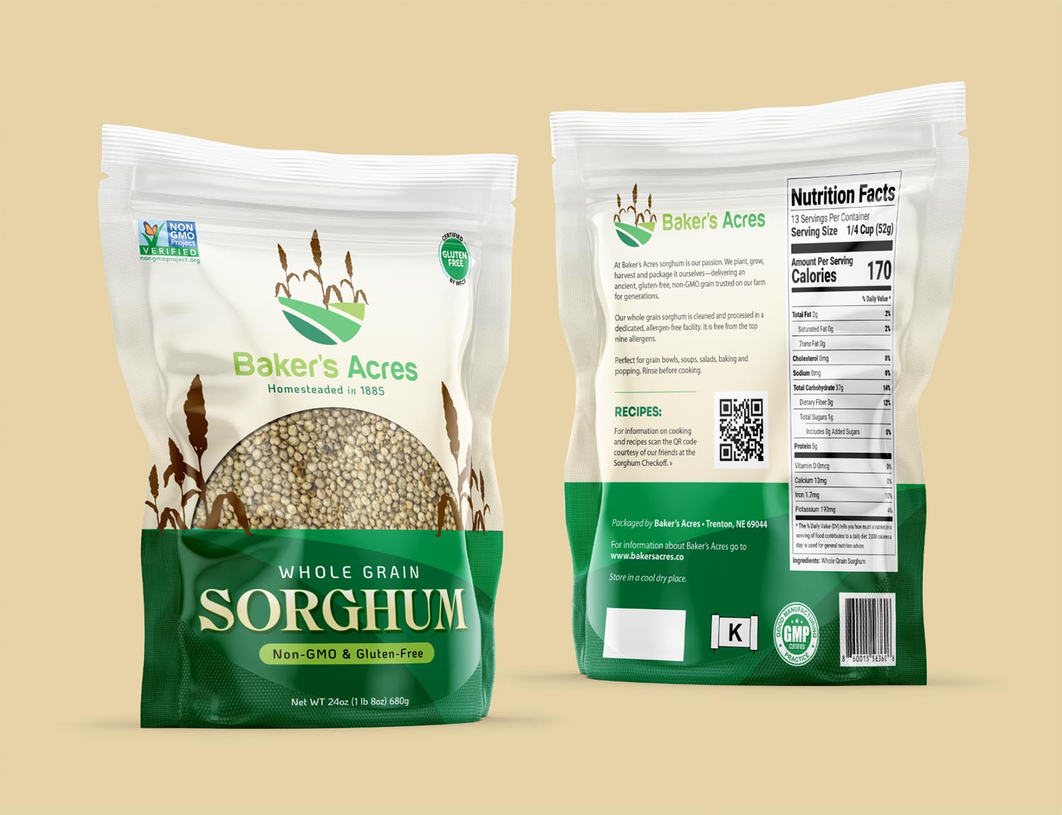
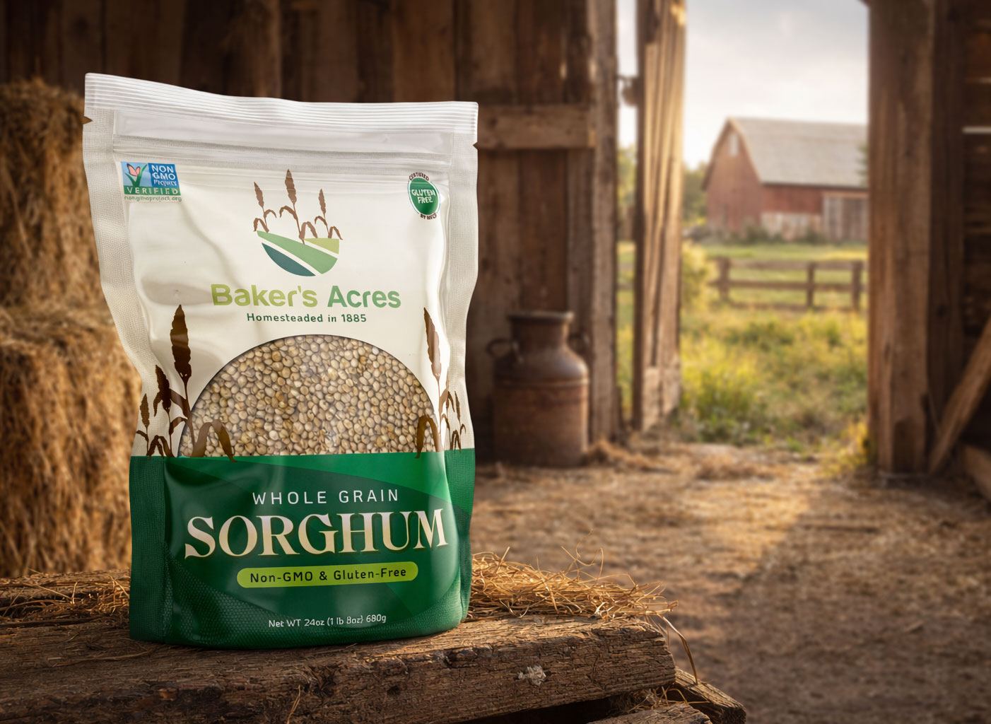
Custom Packaging for a Nebraska Sorghum Farmer
Baker’s Acres recently partnered with Visual Lure to design a custom stand-up pouch tailored to hold 1.5 lbs of their sorghum. A fifth-generation farm, Baker’s Acres continues to cultivate the same land their family originally homesteaded in 1885. Today, the Southwest Nebraska operation is proudly run by Mike Baker and his family, carrying on a long-standing agricultural legacy.
With only their logo provided, we used it as the foundation and inspiration for the entire packaging design. Elements from the logo were thoughtfully extended into the layout, including incorporating the field as a grounding base along the bottom of the pouch. At their request, we integrated a product window to showcase the sorghum, shaping it as a sunrise/sunset form and flanking it with stylized sorghum plants inspired by the logo. The branding is prominently centered at the top, creating a clean, balanced composition that highlights both the product and the heritage behind it.
The final packaging will be printed and produced by Roastar using a custom template, as none of their standard sizes properly accommodated 1.5 lbs of Baker’s sorghum. With a diverse lineup that includes stand-up pouches, gusseted bags, flat-bottom styles, flat pouches, and fill-and-ship mailers, Roastar provides packaging solutions that combine product protection with standout shelf appeal.
Do you need Eye-Catching Package Design?
From concept to shelf-ready design, we help bring products to life through thoughtful packaging. Serving clients from St. Louis to Nebraska—call or email us, we’d love to help you with your project.


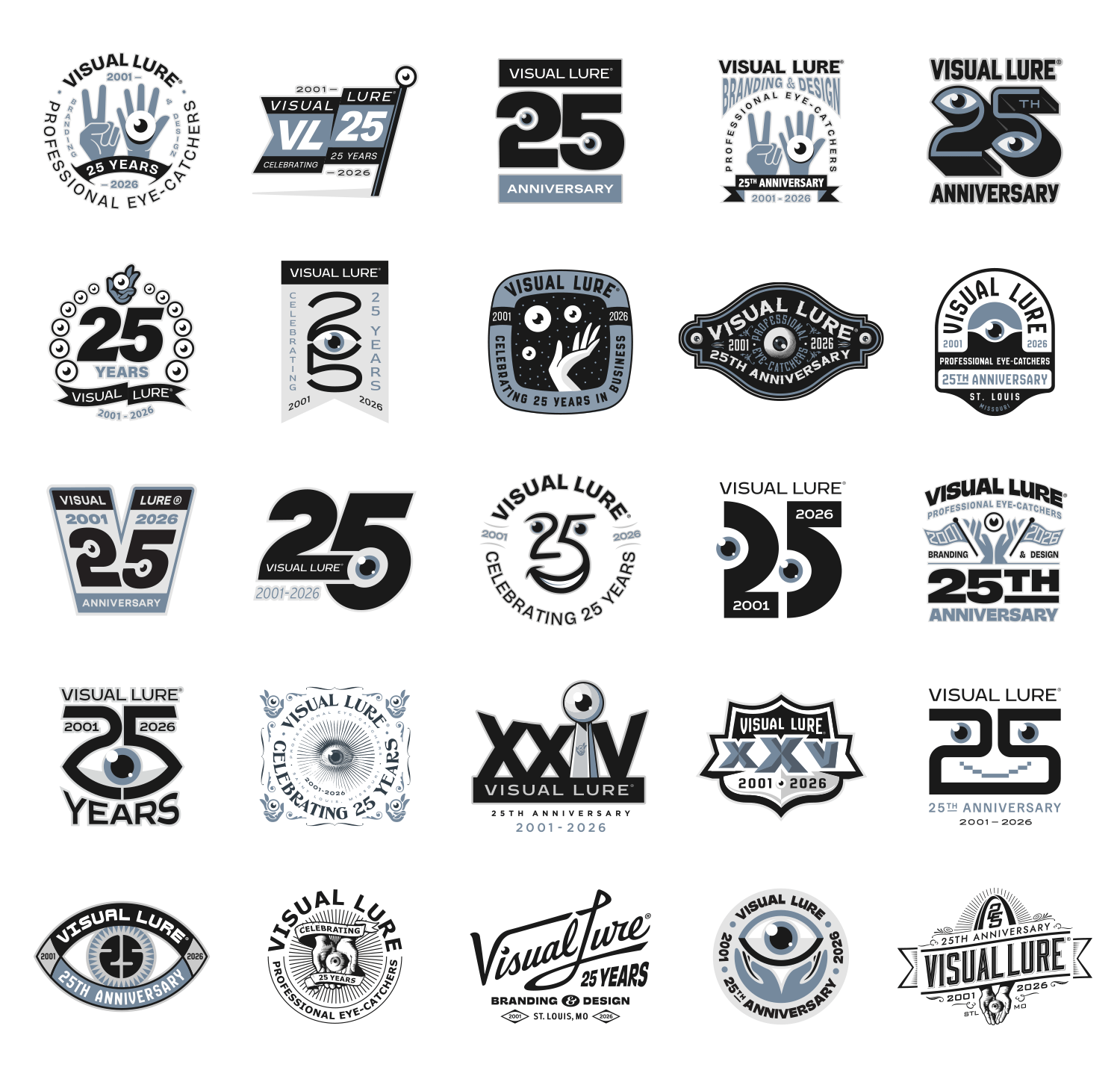
 As I started running out of ideas, I looked for more out-of-the-box ways to represent 25 and thought of Roman numerals. What better approach than to parody some classic Super Bowl logos—just had to sneak an eyeball in there. (The graphics shown here are unofficial, fan-created parody designs. They are not authorized, endorsed, or sponsored by the National Football League, the Super Bowl, or any related entities. No commercial use is intended and these designs will not be sold or distributed.)