Logo Designs for a St. Louis Alfa Romeo Restoration Company
We recently had the opportunity to design an entire logo collection for Classic Motoring STL, a St. Louis–based company that specializes in the restoration and repair of vintage Alfa Romeos. Founded by Harden Ervin and Brandon Benack, the shop combines more than 40 years of experience and a shared passion for classic automobiles. Our goal was to create a brand identity that reflects their expertise, craftsmanship, and appreciation for timeless automotive design — something that feels both authentic to the Alfa Romeo legacy and distinctly their own.
Our initial round of explorations took inspiration from vintage Alfa Romeo logos, which we adapted into various Classic Motoring STL logo options. Below are the initial proposed designs:
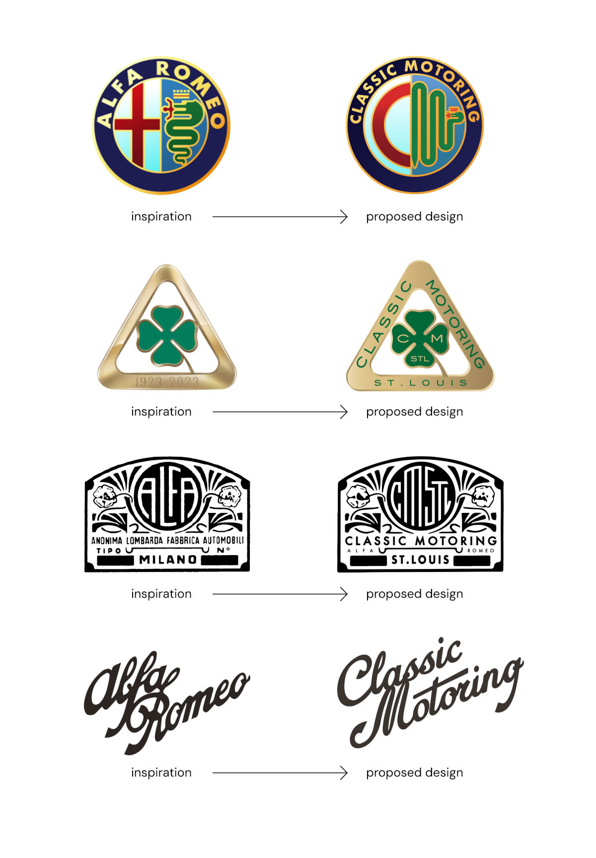
…and after multiple rounds of revisions, here is a sampling of the final collection. The designs were inspired by classic Alfa Romeo badges, featuring a custom CM monogram, bespoke typography wrapped within traditional Alfa-style grille shapes, and a reimagined logotype inspired by the original script.![]()
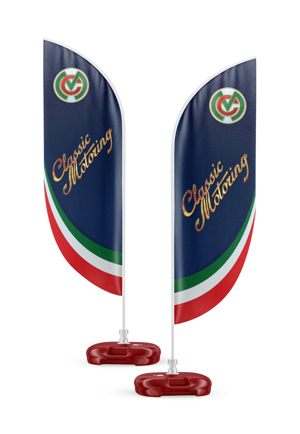
…we also had the privilege of designing two-sided banners for their appearance at the 2025 Alfa Romeo Owners Club USA National Convention in Chicago:
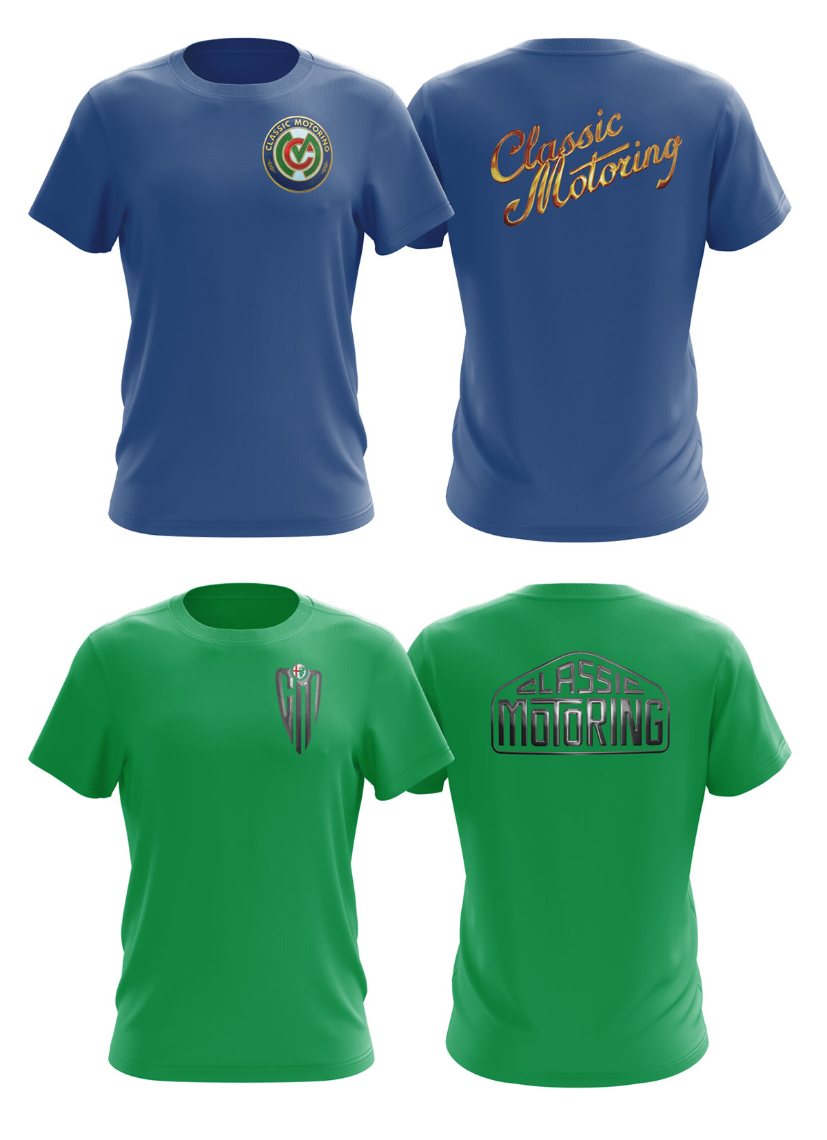
…a couple t-shirt design options:
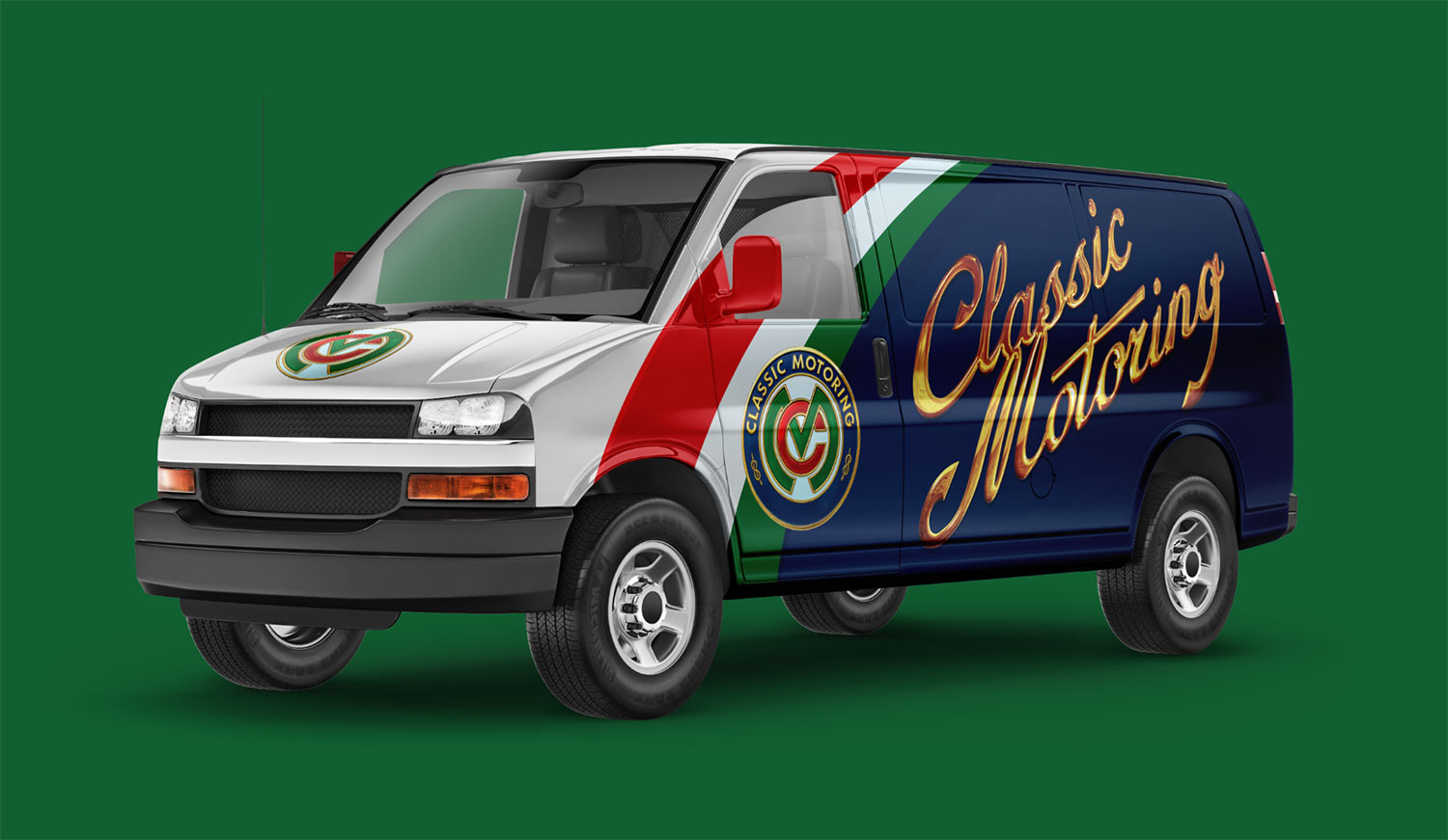
…and lastly, a proposed vehicle wrap for their shop van:
Want to see more of our logo design work?
Click here to view our logo design portfolio, or click here to view some of our branding projects.