Label Designs for Award Winning Meat Rubs
Visual Lure recently helped redesign labels for King Louie’s Meat Apostles, a St. Louis area award-winning seasoning company with meat rubs for almost every protein – including some for vegetables.
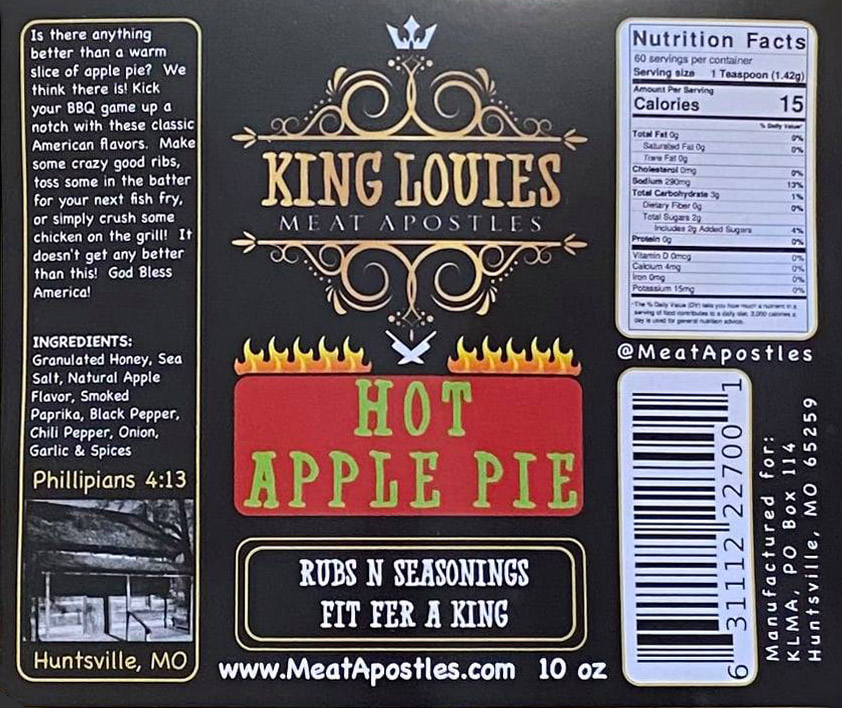
Before:
Their previous labels did not look or feel like award-winning rubs. The fonts used felt inappropriate, and the craftsmanship was lacking to say the least.
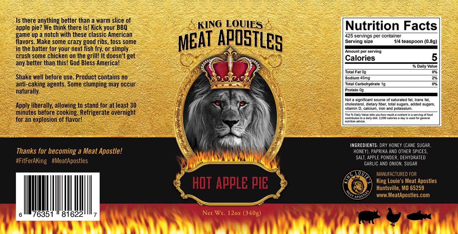
After:
The owner wanted the new labels to leap off the shelves and feel more luxurious. He also wanted to use a metallic paper that would make the gold elements on the label really stand out and pop! White was printed on the labels to hide the metallic effect on certain areas, such as the nutrition facts, the black bar, and the bar code. All the gold – along with the eyes, the metal in the crown, and the gold leaf – shimmer on the final product. We couldn’t be happier with how these turned out.
Below is an entire sample label, and below that is the entire product line.
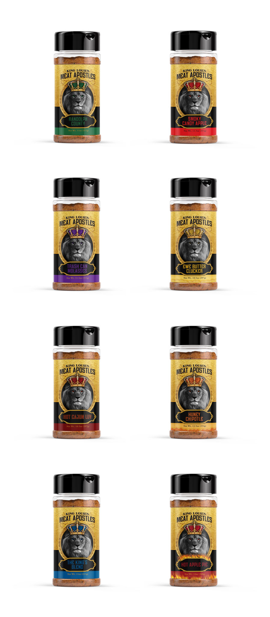
…and the Full Line of Rubs:
You can learn more about King Louie’s and purchases their amazing rubs at MeatApostles.com.
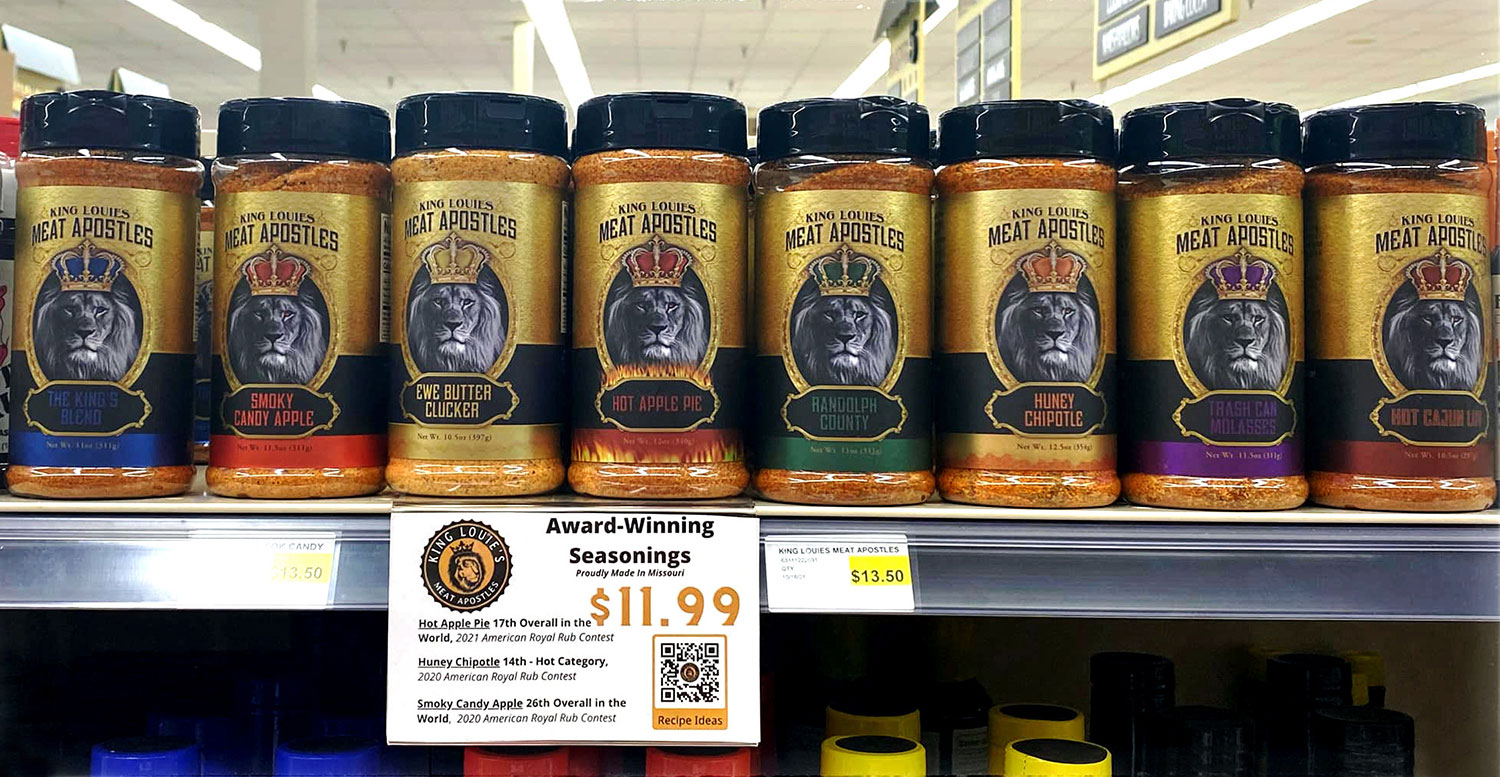
UPDATE:
Hot off the press, and on the shelves! So cool to see the labels we designed for King Louie’s Meat Apostles in stores.
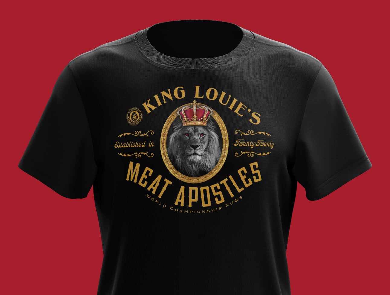
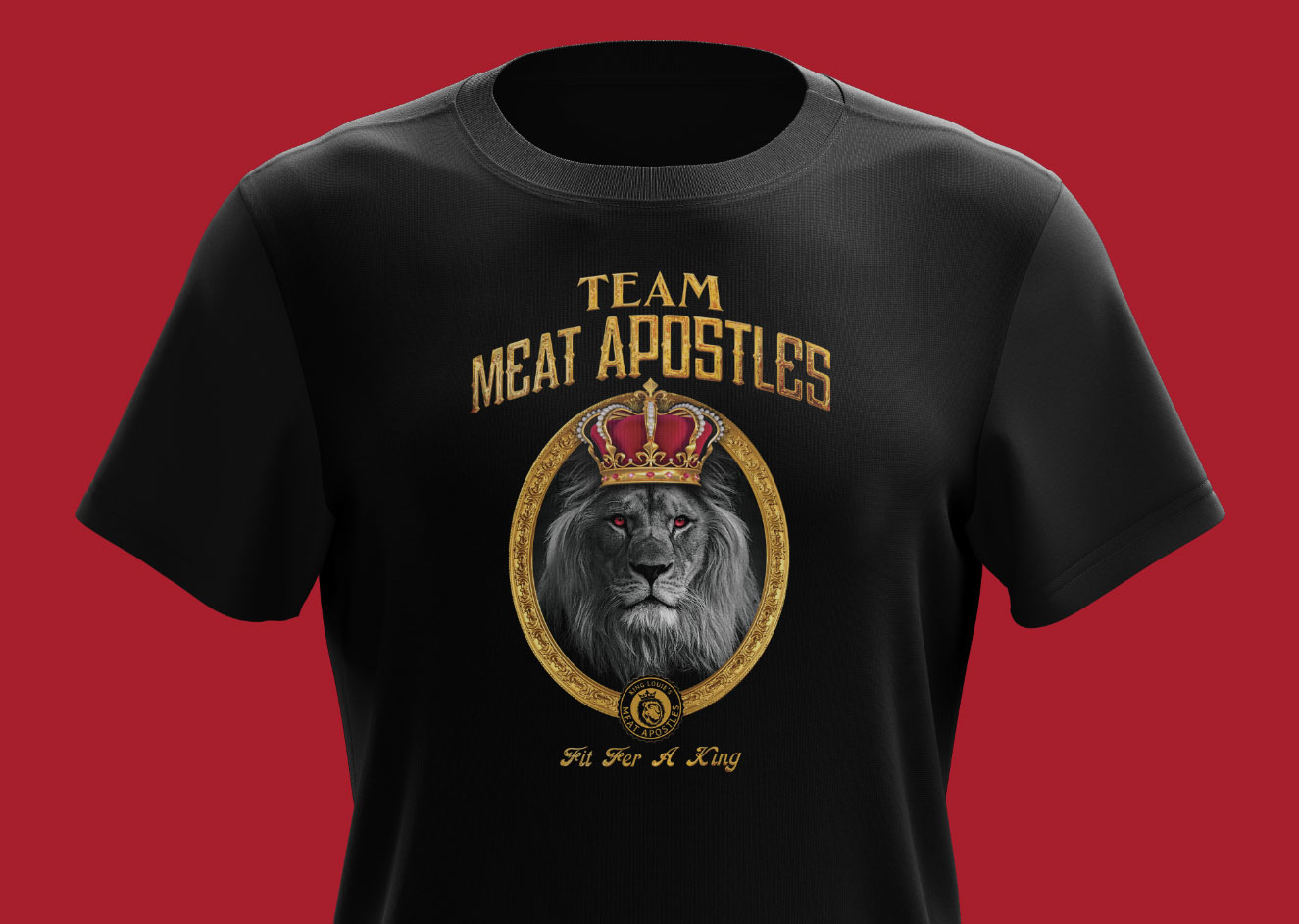
…and taking the label design to inspire some shirts:
Are you about to launch a new product?
If you are about to bring a new product to market and need help with professional branding and package design, contact Visual Lure today for a FREE quote. Don’t waste time and money hiring sub-par or entry-level designers. Get it done right the first time, and make sure buyers won’t reject your product due to poor presentation. Looking for additional packaging information, this will help: Learn more about our package design services » | view more of our packaging portfolio » | contact us with for FREE design quote »