OUR BLOG

Here you will find our latest works, company news and more. We update it on a regular basis so be sure to come back soon. Please like, share, pin or tweet the post you enjoy.

Christmas Cards for a St. Louis Metro East Engineering Firm

Posted on November 6, 2014

It’s that time of year again. Time for companies to get their Christmas cards designed, printed and ordered in time for the holidays.

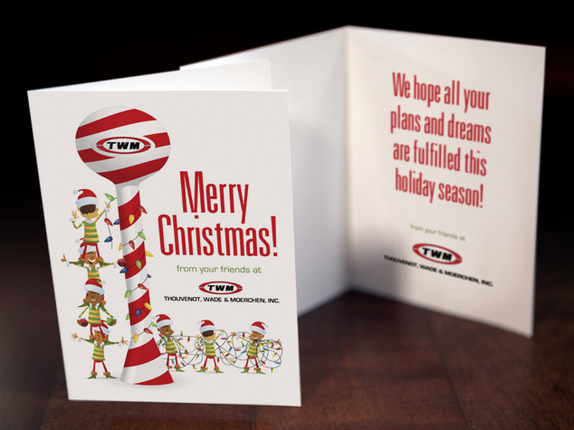
Once again Thouvenot, Wade & Moerchen (TWM) has contracted Visual Lure for a custom designed Christmas card. This year they wanted to incorporate a water tower into the design as every year they try to highlight one of their core services. One of their specialties is water and waste-water civil engineering which includes the design of water towers.

This years card features a candy cane water tower being decorated by elves. We custom illustrated the water tower, and customized two sets of stock illustrated elves to make them look like they were wrapping the tower in lights.


TWM Christmas card graphic design

If you are interested in a custom design Christmas card give us a call and be sure to check out our other graphic design services.

Package/Label Design for a St. Louis Metro East Glass Cleaner Manufacturer

Posted on

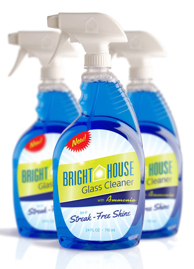
Visual Lure recently completed the following label/package design for Bright House Glass Cleaner. Bright House is a manufacturer of household cleaning products and is located in the St. Louis Metro East in Columbia, Illinois. Visual Lure has also designed packaging for other Bright House products including their dishwashing soap. Click here to view that design project.

We feel that the new packaging looks “fresh and clean” which are the characteristics you want a glass cleaner to have. We were able to achieve this look by using a subtle “shiny/gleaming” background, a bright green and blue color palette along with clean and modern typography. The fire engine red “new burst” will also help the label jump off the shelf and attract eye-balls which is what good package design does.

Bright House Glass Cleaner package design

What to see more?  Click here to view additional package design projects »

Need help with a package design project? Give us a call or shoot us an email, we would love to provide you with a FREE quote.

Rebranding a Montreal, Canada Photography & Videography Studio

Posted on September 30, 2014

Michel Ferland is a professional photographer and videographer based out of Lachine, Québec, a borough in the city of Montreal, Canada. He found us via CreativeLive after attending one of Salvatore Cincotta’s workshops. When he came to us, his company was called M1 Photo. He felt that the name was too corporate and industrial for such a personalized business. Michel wanted to use his full name, Michel Ferland, for his studio but there was another photographer in his market, with the exact same name, who was already using it. After bouncing a bunch of names around, we decided to just use his first name.

Michel’s old logo was corporate looking, generic and unoriginal. He wanted his new brand to feel rich, high-end and luxurious. After a couple rounds of options we were not where we needed to be in the process of narrowing down a final logo. While I was working on another project, I started messing around with a call to action burst and was inspired to create what you see before you.

Below is the complete branding collection including logos, identity package, typefaces and colors. If you think this is as sharp as we do, please like and share below.

Michel Photo et Film Logo & Branding

View more of our photography logos and branding packages »


Logo & Identity for New St. Louis Audiology Practice

Posted on September 19, 2014

Visual Lure recently completed this new logo and identity package for Advanced Audiology Associates, a new audiology practice opening soon in St. Louis, Missouri. The new logo features two types of audio waves that create the St. Louis Arch and the Mississippi River. They also create three letter A’s for Advanced Audiology Associates. We think that’s pretty clever and memorable; please like or share this post if you agree. The typeface is Centrale Sans Condensed with custom letter A’s designed to complement the logo mark.

Below you can see the new logo in both horizontal and vertical applications, underneath that are additional color variations and at the bottom is the identity package – which includes the company business card, letterhead and envelope design.

Advanced Audiology St. Louis logo branding

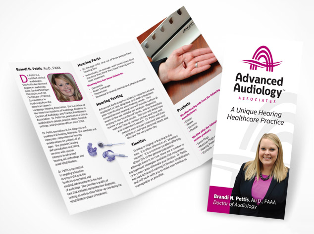
Update: Here is a trifold brochure we recently completed for AAA:

AAA trifold brochure design

Almost all the logos we design are heavily concept-driven because we feel logos with meaning tend to be more memorable. If you want a logo that people and customers will remember, one that stands the test of time, and catches people eyes, give Visual Lure a call today.

New Logo and Identity Design Package for a St. Louis Wealth Management Firm

Posted on September 18, 2014

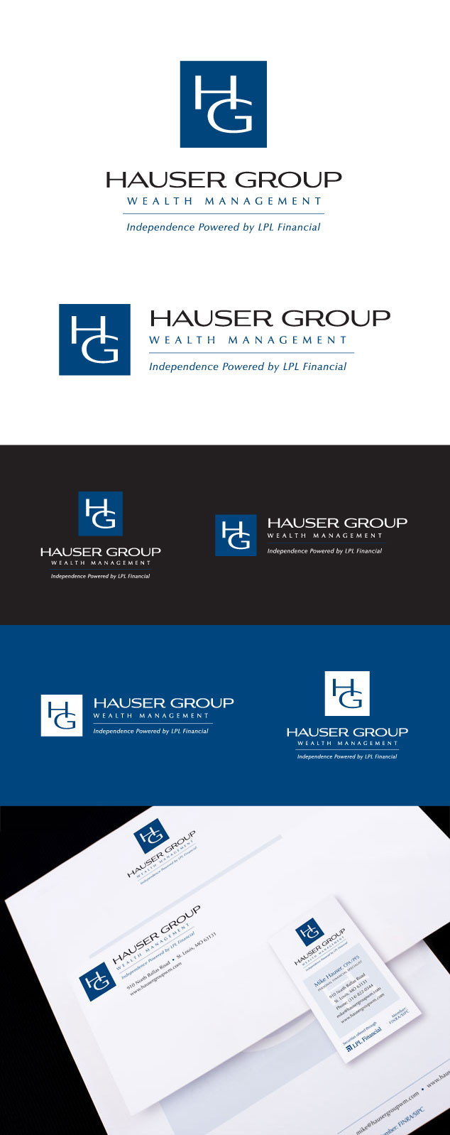
Visual Lure recently completed a new logo and identity package for Hauser Group Wealth Management, a St. Louis, MO based wealth management firm lead by Mike Hauser. Mike is a CPA and a personal financial specialist. He is a member of FINRA and the SIPC, and offers securities through LPL Financial. We feel the new clean and sharp logo feels trustworthy and reliable. The perfect traits for a financial management company.

Below you can see both the vertical and horizontal logo formats along with a couple color variations. Below the logos is the identity design package, including the business card, letterhead and a #10 envelope design.

If you are in need of a new logo, or looking to re-brand an existing company, give Visual Lure a call today. We would love to get your branding started in the right direction with our award wining, internationally published logo design solutions.

Hauser Group logo design and branding

Custom Illustrated T-Shirt Design for Visual Lure

Posted on

We were recently inspired by a design we found on Pinterest of some spectacularly crafted ornate playing cards. We decided to take that inspiration and use it to design a new t-shirt for Visual Lure®. The “eyeball in the palms” illustration was custom drawn by hand. It is based off our logo which reflects our tagline: Professional Eye-Catchers™. It was designed to look like an old woodcut print. Below the new design is an older shirt we had printed using the same illustration but different design.


Visual Lure graphic design tshirt

Visual Lure T-shirt Design 1