Package Design for Disposable Vaporizers
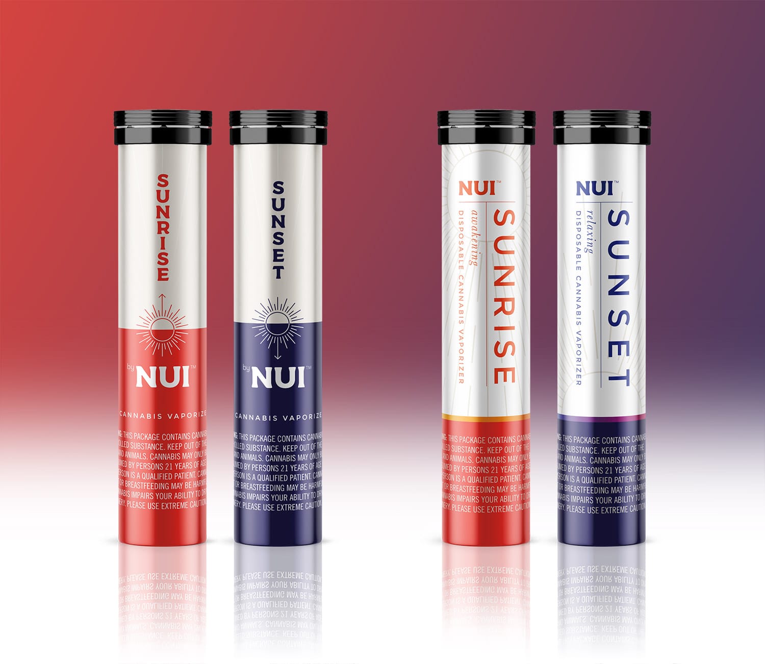
Nui is a California based cannabis company that will soon be launching two disposable vaporizer products. One called Sunrise – that has an uplifting feel, and Sunset with a more relaxing effect. Before coming to Visual Lure, they had worked with a handful of designers on multiple packaging options, but were unsatisfied with the results. During our initial conversation, they explained that they wanted the packaging to be “simple, upscale, classy and discrete”. They didn’t want it to look like a cannabis product. In one of the owner words: “if you saw it on someone’s desk, you wouldn’t know what it was”.
We approached the design in two ways, one simple and clean, and the other a little more eye-catching.
The Clean & Simple Design Options
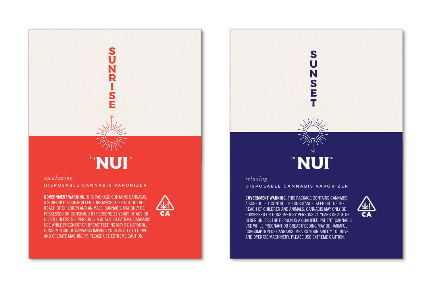
Below are the two ‘simple & clean’ options we presented. We used an orangish-red color to represent Sunrise, and a deep purplish-blue to represent Sunset. We incorporated sun illustrations in both – one with arrows on them to show the sun moving up and down, and the other with the sun in different locations on the label.
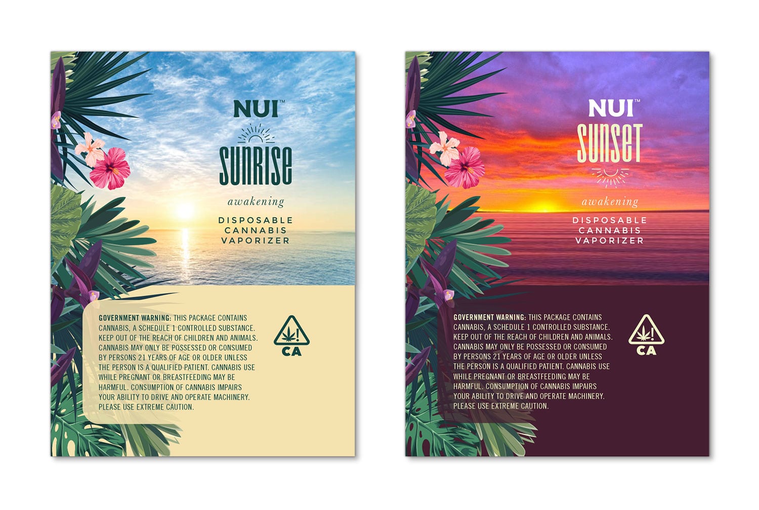
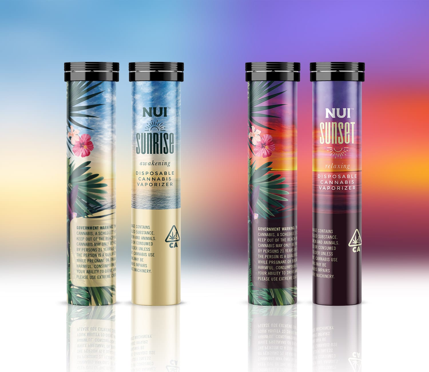
The ‘Eye-Catching” Design Option
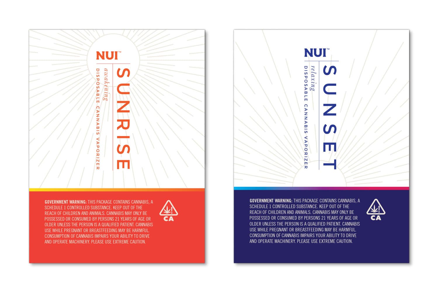
Even though the client wanted the design to be more subtle and discrete, it still needed to be eye-catching in order to stand out from its competitors. Below is our more eye-catching design we presented. We incorporated tropical flowers as the company name, Nui – means great in Hawaiian. We also used a simple illustration of a sun, one above Sunrise and one below Sunset.
Are you about to launch a new product?
If you are about to bring a new product to market and need help with professional branding and package design, contact Visual Lure today for a FREE quote. Don’t waste time and money hiring sub-par or entry-level designers. Get it done right the first time, and make sure buyers won’t reject your product due to poor presentation. Looking for additional packaging information, this will help: Learn more about our package design services » | view more of our packaging projects » | contact us with for FREE design quote »
How did you find us?
On a side note: Are you a business owner? If so, do you know where ALL your leads are coming from? If not, you NEED to know. How else can you measure the success of your marketing efforts and dollars. This client found us on Behance, an online platform that showcases creative work from around the world. The cost for this lead: zero dollars. Only the time it took to prepare and place projects on our Behance portfolio page.