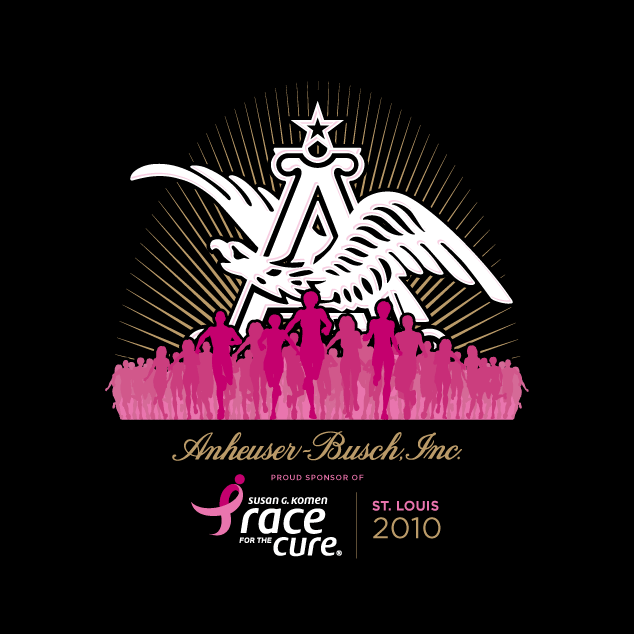
Visual Lure was recently contracted by Anheuser-Busch to design their t-shirts for the 2010 St. Louis Susan G. Komen Race for the Cure. We were honored to design this years shirts for such a great company and such a great cause.
On a personal note, my mother was recently diagnosed with breast cancer just before Thanksgiving last year. They caught it early so she will be one of the lucky ones. She is currently going though chemo and is in good spirits with minimal side effects. We have been both lucky and blessed. Without the support of my mother, I don’t know what I’d be doing. She was the one who encouraged me to pursue art. As a child, my mother would always carry pencils, a box of crayons and paper in her purse for me. She provided me with enough blocks to build cities in the living room, and she always signed me up for art classes. So thanks to her, I am doing what I love for a living. Thanks Mom!
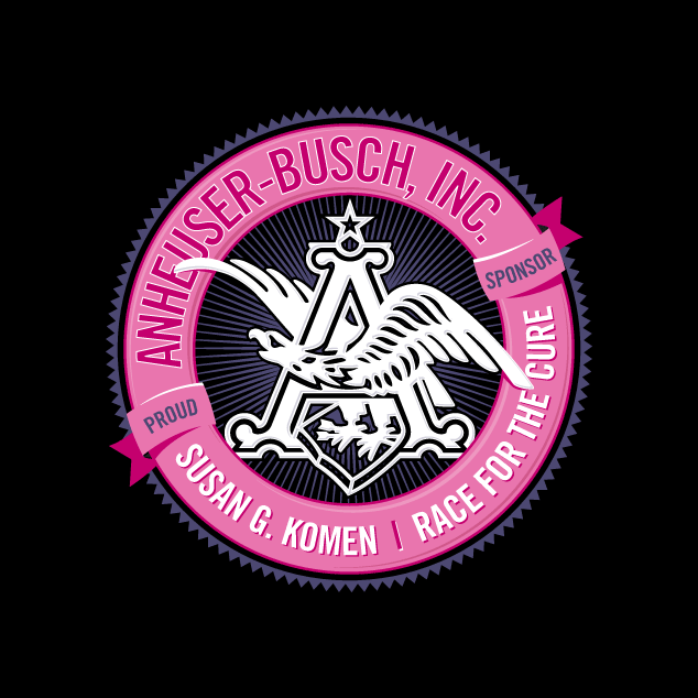
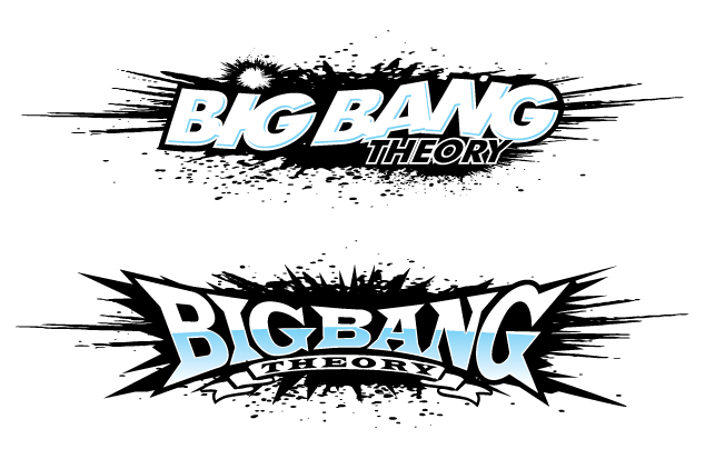
Here are the two initial design options we provided AB. I will post the final design once it has been approved. Oh ya, and please support Susan G. Komen for the Cure.

Anheuser-Busch Susan G. Komen Race for the Cure T-shirt design option 1

Anheuser-Busch Susan G. Komen Race for the Cure T-shirt design option 2
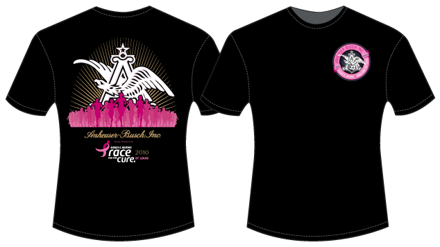
and the winner is:

Final AB/Komen T-shirt Design
Anheuser-Busch liked both designs so much, we ended up using both of them, one on each side. Be on the lookout for them Saturday, June 12, 2010 in St. Louis.



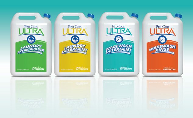
 We are both honored and privileged that a set of Visual Lure’s package designs were recently selected to be published in the upcoming book “The Big Book of Packaging”, published by Cresent Hill Books. Cresent Hill Books also publishes the popular “The Big Book of Logos” series. The package designs that will be featured are Intercon Chemical’s line of Pro-Con Ultra detergents and rinses. Intercon Chemical is a St. Louis, MO based company that manufactures industrial cleaning supplies. A special thanks to Projects PLUS and Jennifer Hojnacki for teaming up with Visual Lure on this project. Here are the original package designs (final colors were altered):