Logo Upgrade for Local Medical Aesthetics Office
Not all the logo and branding work we do starts from scratch. Sometimes we are brought in – to simply update, tweak, or adjust a logo – which was the case here.
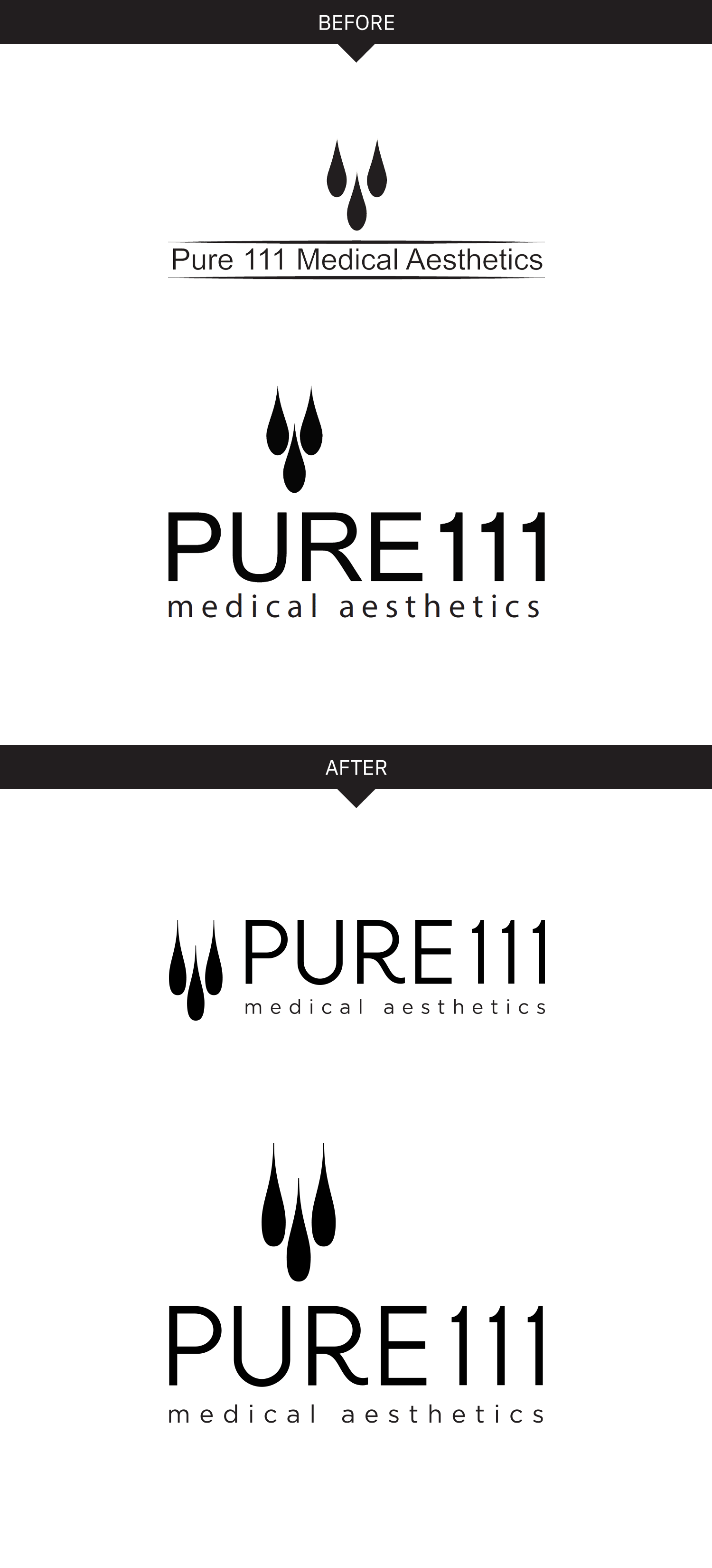
Pure 111 was moving offices and wanted to fine tune their logo for their new building signage. When we reviewed their existing logos we noticed there were different icons being used (see the “before” below), and their horizontal and vertical logo options felt disconnected – both because of the different icons, but also because of the different typefaces being used. The logotype also felt generic and unrefined.
Our solutions was to polish up the icon, and update the type. We created a custom R which still felt super modern, but gave the logotype a touch of femininity. It also made it look more custom, and not so “out of the box”. We slightly lightened the type too – which made it feel a little more refined and stylish. Their new offices and signage turned out great!

SIGNAGE
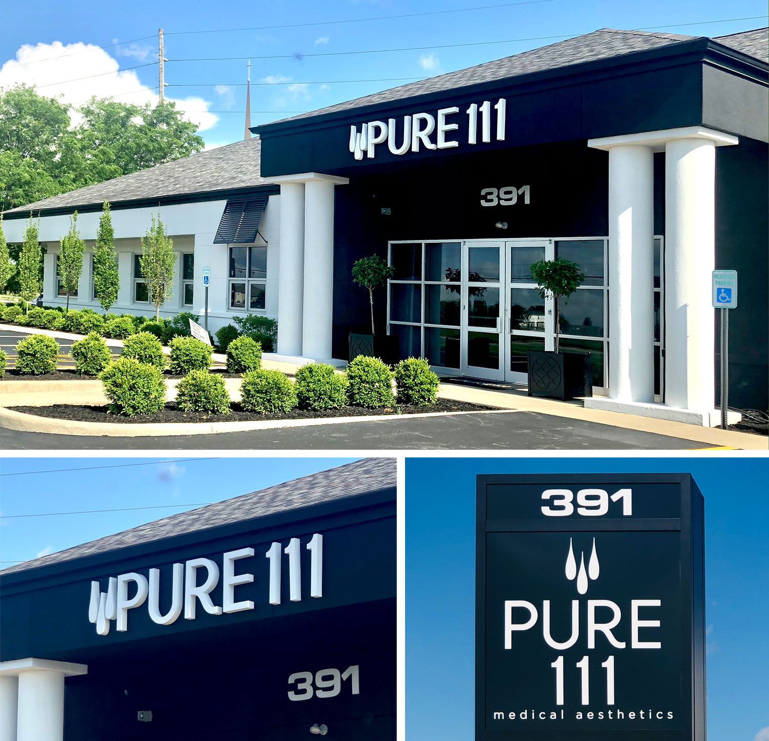
New signage looking sharp too:

Do you have an existing logo that looks dated or unrefined but you’re hesitant to explore a complete redesign because you feel it has too much brand equity or brand recognition? Or maybe you just need an existing logo converted into vector artwork with different formats. Either way, Visual Lure can help. Take a look at some of our sample logo refreshes and contact us today for a free logo upgrade quote!

