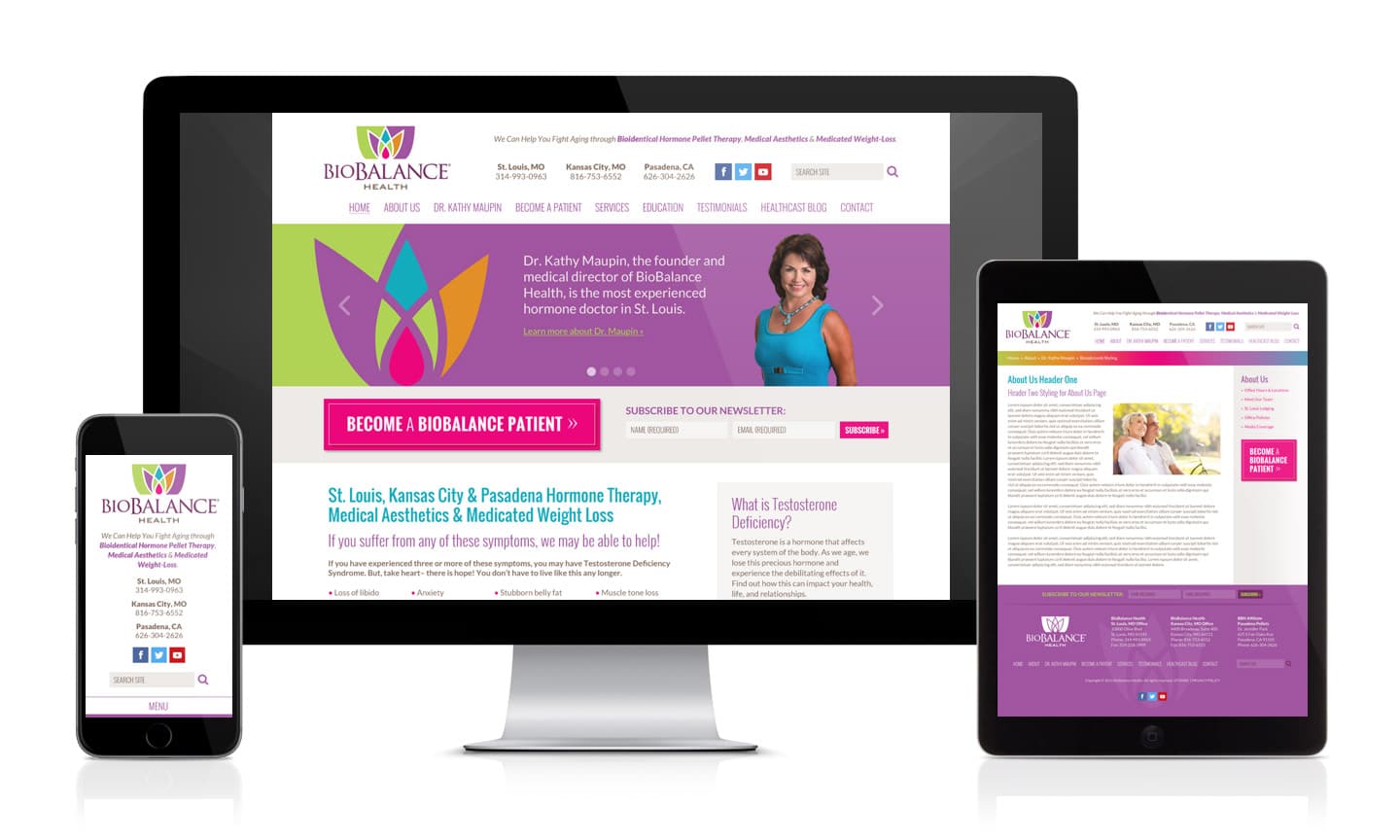
Dr. Kathy Maupin, the medical director and founder of BioBalance Health, is the most experienced hormone doctor in the greater St. Louis metropolitan area. She has locations in St. Louis, Kansas City, and an affiliate in Pasadena, CA. Kathy and her team specialize in bioidentical hormone replacement pellet therapy for both women and men.
A couple months ago, BioBalance contracted Visual Lure to help improve their online presence. Even though their old website was built responsively, and in WordPress, it wasn’t well organized or logically structured. The procedure to sign up as a new patient was daunting and there was a large drop off of web traffic on their sign up pages. We believed this was caused by potential patients giving up due to the arduous path of filling out forms to become a new patient.
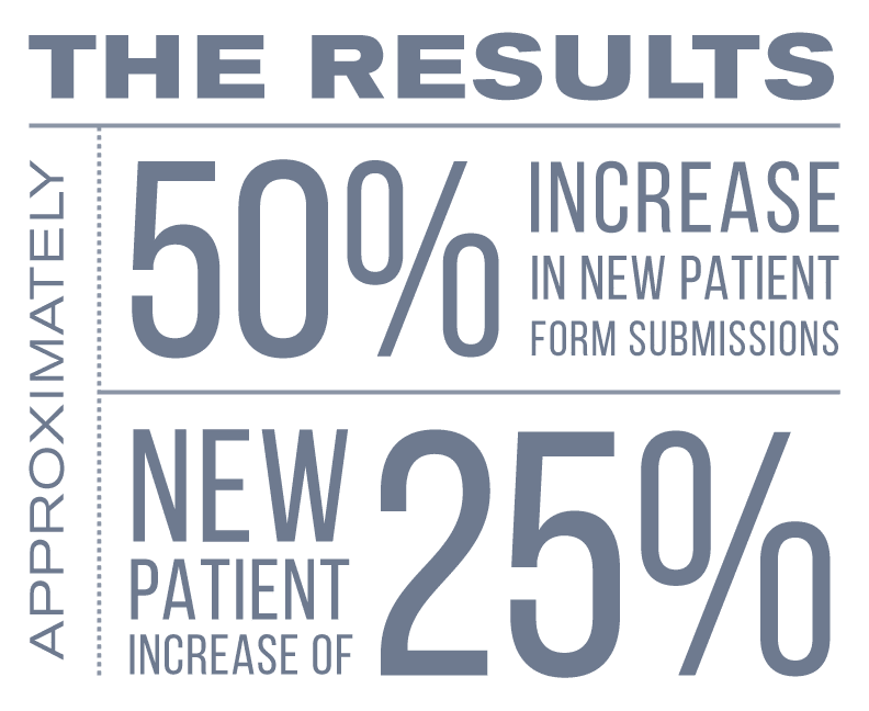 After a full analysis of their old website, we restructured the navigation and sitemap, reorganized a ton of information, and streamlined their new patient sign up flow. Our suspicions were confirmed the month after the new site went live as we saw double the amount of new patient forms being submitted. What’s even more impressive is that BioBalance Health has seen an approximate 25% increase in new patients since the site has gone live. Considering that some people are not even candidates for this type of therapy, these are outstanding results. It just goes to show how powerful of an impact a well-designed, user-friendly website can have.
The new responsive website was built in WordPress and features a sticky header, a fully integrated blog, multi-column shortcodes and smooth animation effects. In addition to the re-design, Visual Lure is also providing BioBalance with ongoing search engine optimization/SEO services. The site is now ranking in the top 1-3 positions on the first page of Google for all their primary targeted keyword terms. It was a pleasure working with BioBalance, and if you are looking for any type of hormone replacement therapy in the St. Louis or Kansas City area, look no further that BioBalance Health.
Increase in Web Traffic and Google Analytics
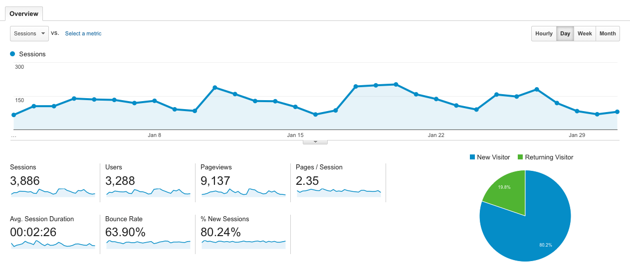
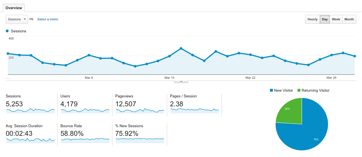
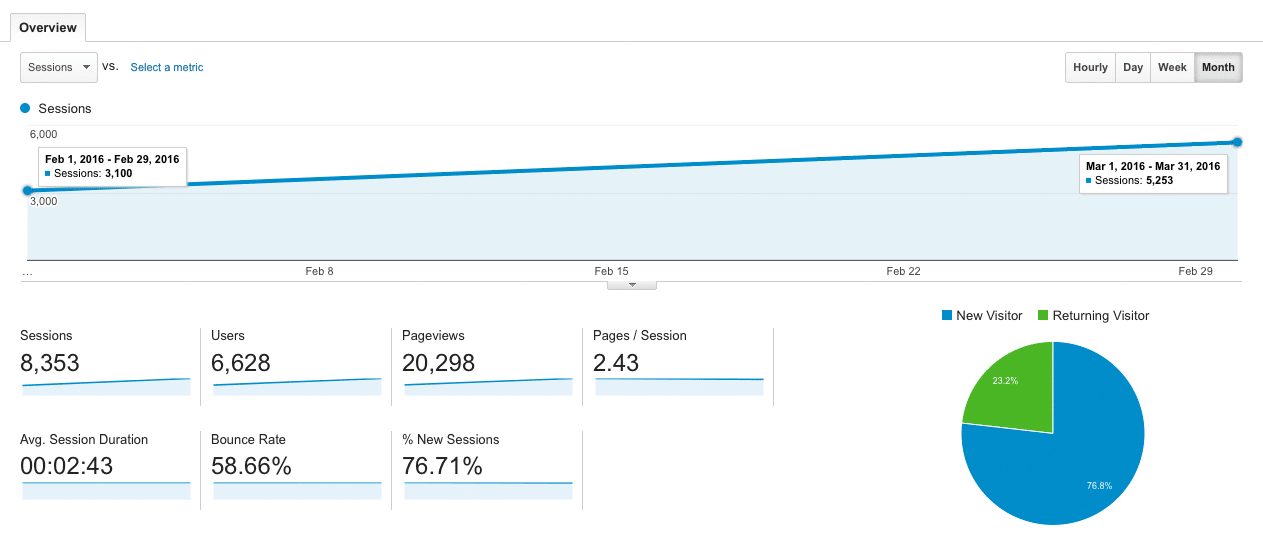
In addition to ranking better, receiving more submission forms and the increase in new patients, we also saw a huge improvement in web traffic. The new website launched in the middle of February and below you can see the Google Analytics from January and March (along with the Feb to Mar). The site went from 3,886 session, 3,288 users and 9,137 pageviews in January to 5,253 session, 4,179 users and 12,507 pageviews in March. The Bounce rate has also went from 63.9% to 58.8%, a 5% decrease which doesn’t seem like much, but is huge in the world of bounce rates. A bounce is when a user visits the site and then leaves after viewing only one page. Taking into account that a user may simply be looking for a phone number, or finding the information they were looking for on that one page, and a portion was from ghost spam referrals, this shows that users are visiting more pages per visit. Yet more proof that users are finding the site more user-friendly and better organized.
BioBalance Health’s Google Analytics from January:
BioBalance Health’s Google Analytics from March:
BioBalance Health’s Google Analytics from February to March:
“I highly recommend Visual Lure for web design and search engine optimization. Justen and the Visual Lure team truly listened to our needs and completely redesigned our website. Our website is our primary vehicle for new patients, and we have seen a new patient increase of 25% since the site went live. We now have a unique, professional, well organized, and efficient website, and we couldn’t be happier.”
— Joe Baalmann
COO, BioBalance Health
Visit BioBalanceHealth.com