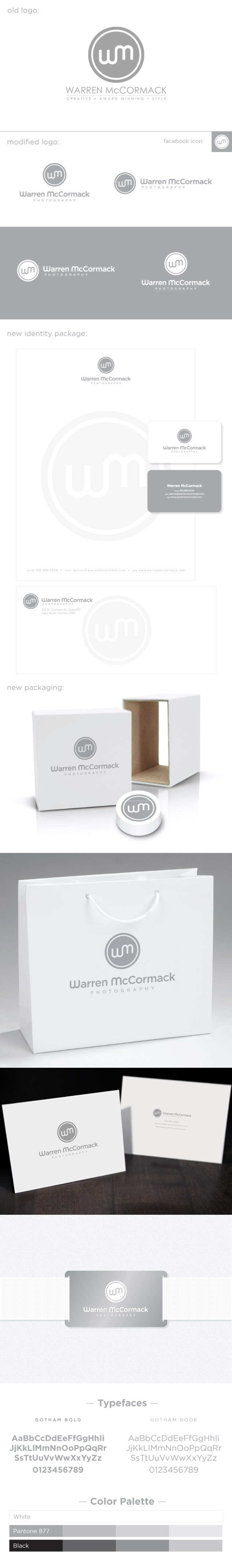
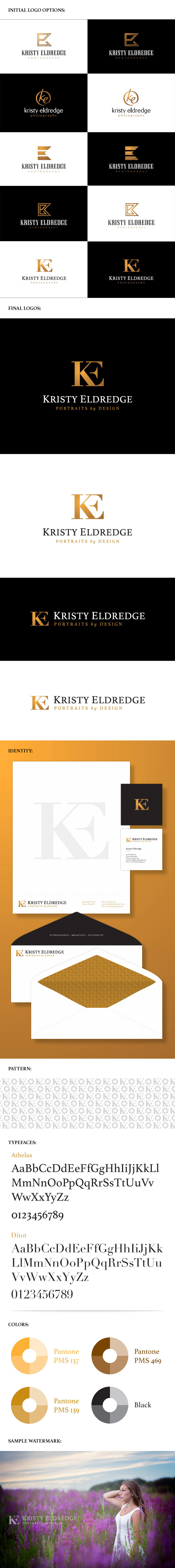
OUR BLOG

Here you will find our latest works, company news and more. We update it on a regular basis so be sure to come back soon. Please like, share, pin or tweet the post you enjoy.

Rebranding a Montreal, Canada Photography & Videography Studio

Posted on September 30, 2014

Michel Ferland is a professional photographer and videographer based out of Lachine, Quรฉbec, a borough in the city of Montreal, Canada. He found us via CreativeLive after attending one of Salvatore Cincotta’s workshops. When he came to us, his company was called M1 Photo. He felt that the name was too corporate and industrial for such a personalized business. Michel wanted to use his full name, Michel Ferland, for his studio but there was another photographer in his market, with the exact same name, who was already using it. After bouncing a bunch of names around, we decided to just use his first name.

Michel’s old logo was corporate looking, generic and unoriginal. He wanted his new brand to feel rich, high-end and luxurious. After a couple rounds of options we were not where we needed to be in the process of narrowing down a final logo. While I was working on another project, I started messing around with a call to action burst and was inspired to create what you see before you.

Below is the complete branding collection including logos, identity package, typefaces and colors. If you think this is as sharp as we do, please like and share below.

Michel Photo et Film Logo & Branding

View more of our photography logos and branding packages ยป


Web Design for a Denver, Colorado Chiropractor’s Office

Posted on September 29, 2014

Visual Lure recently completed this new website home page design for Chiropractic Solutions of Denver, a Colorado chiropractic practice that provides sports medicine, acupuncture, physical therapy and massage services. Their current website has an extremely high bounce rate and a very low click through rate due to its generic look and lack of call-to-actions. The new design features a strong message, “We can make you FEEL BETTER!”, which is essentially what all their services are focused towards. We also decided to showcase their Google Reviews because they have over 25 all of which have 5 star ratings. A new patient special was also added to entice users to schedule an appointment online.

Note: We were contracted to do the design only on this project as another company will be doing the development. The new website will be developed in WordPress by a Colorado based WordPress developer.

ย 

Denver web design Chiropractor

Swingforehope.org Launches New WordPress Website

Posted on September 24, 2014

SwingForeHope.org has officially launched!ย  The new website was suppose to launch before their tournament on June 16th of this year but the company that purchased and controlled their domain name was unresponsive until just yesterday. The lesson here is DO NOT have the web design company working on your website, or anyone else for that matter, purchase or control your domain name! Make sure you purchase it yourself. That way you always have complete control over it.

The new website was built in WordPress. It was developed using a custom designed theme. It is fully responsive, making it easy to view and read on any type of device including desktop computers, tablets and smart phones. The site allows users to make donations and pay for the golf tournament and sponsorships. All donations are directly deposited into their PayPal account through the website.

Swing Fore Hope is a non-for-profit organization based out of Edwardsville, IL with a vision to help end breast cancer. This non-for-profit has two missions. One, to raise money for breast cancer research, and two, to help support local families facing financial difficulties as a result of this horrible disease.

Below are screenshots of the home page design and a sample template page.

Please visit SwingForeHope.org to learn more about this great organization.


st-louis-web-design-s4h

Swing4Hope-web-design-2

Custom WordPress Website Design for a St. Louis Metro East Technology and Communications Contractor

Posted on September 23, 2014

C5T Corporation is a woman and service disabled-veteran owned small business based out of Scott Air Force Base, Illinois. C5T stands for Command & Control, Communications, Computers, and Capabilities Transformation. The majority of their work is government contracted in the fields of information technology and communications with a focus on Department of Defense, military and civil aviation. Most of their staff is made up of U.S. veterans with years of defense department and civil aviation experience as military, civilian, and contractors. C5T wanted the new website to emphasize their patriotism by using red, white and blue and the American flag in the design.

The new website was developed in WordPress with a custom designed theme. The new theme is responsive, rendering beautifully on desktop computers, tablets and smart phones. It also features an easy to update home page slideshow, multiple easy to maintain widgets including a sub menu widget that automatically populates the sub-page navigation into the sidebar. This makes the site easier to scale as they plan on adding most of the new content themselves. We also updated their logo, staying true to the original, but making it more usable and easier to reproduce. In addition to the website and logo upgrade; we designed C5T a new tri-fold brochure that complements the new site.

Visit www.c5t.com to learn more about C5T and click here to learn more about our WordPress design and development services.


St. Louis WordPress website design for C5T

Logo & Identity for New St. Louis Audiology Practice

Posted on September 19, 2014

Visual Lure recently completed this new logo and identity package for Advanced Audiology Associates, a new audiology practice opening soon in St. Louis, Missouri. The new logo features two types of audio waves that create the St. Louis Arch and the Mississippi River. They also create three letter A’s for Advanced Audiology Associates. We think that’s pretty clever and memorable; please like or share this post if you agree. The typeface is Centrale Sans Condensed with custom letter A’s designed to complement the logo mark.

Below you can see the new logo in both horizontal and vertical applications, underneath that are additional color variations and at the bottom is the identity package – which includes the company business card, letterhead and envelope design.

Advanced Audiology St. Louis logo branding

Update: Here is a trifold brochure weย recently completed for AAA:

AAA trifold brochure design

Almost all the logos we design are heavily concept-driven because we feel logos with meaning tend to be more memorable. If you want a logo that people and customers will remember, one that stands the test of time, and catches people eyes, give Visual Lure a call today.

New Logo and Identity Design Package for a St. Louis Wealth Management Firm

Posted on September 18, 2014

Visual Lure recently completed a new logo and identity package for Hauser Group Wealth Management, a St. Louis, MO based wealth management firm lead by Mike Hauser. Mike is a CPA and a personal financial specialist. He is a member of FINRA and the SIPC, and offers securities through LPL Financial. We feel the new clean and sharp logo feels trustworthy and reliable. The perfect traits for a financial management company.

Below you can see both the vertical and horizontal logo formats along with a couple color variations. Below the logos is the identity design package, including the business card, letterhead and a #10 envelope design.

If you are in need of a new logo, or looking to re-brand an existing company, give Visual Lure a call today. We would love to get your branding started in the right direction with our award wining, internationally published logo design solutions.

Hauser Group logo design and branding