Althoff, an esteemed Catholic high school located in Belleville, Illinois, has played a significant role in the local community since its inception in 1964. As the institution celebrates its 60th “diamond” anniversary, the school confidently placed the responsibility of crafting a commemorative logo, designing save-the-dates, and creating gala invitations in the capable hands of Visual Lure. Enclosed below are the deliverables we designed for their momentous celebration.
Anniversary Logo
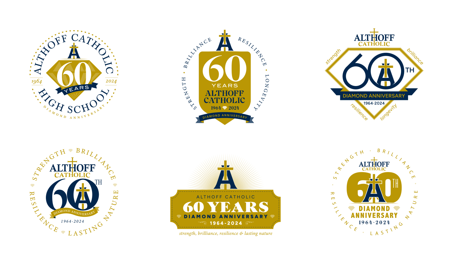
We started by crafting the anniversary logo design, aiming to integrate diamonds and their school monogram. Presented below are our initial explorations for the anniversary logo:

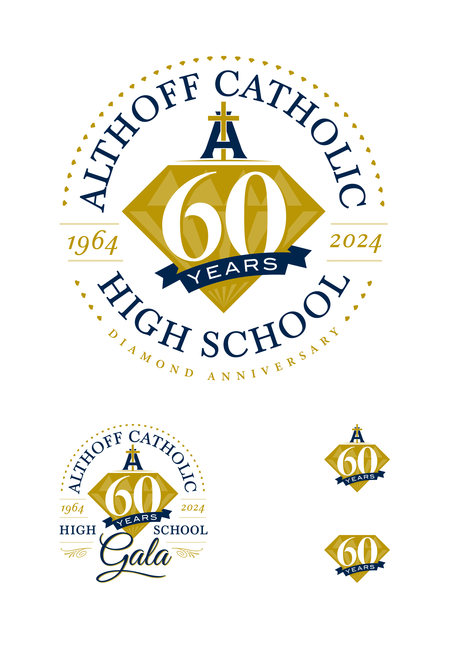
…and the final logo lockups:
Gala Save the Dates
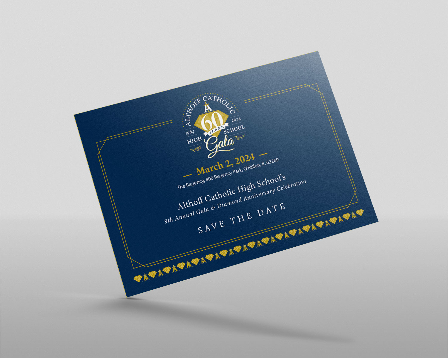
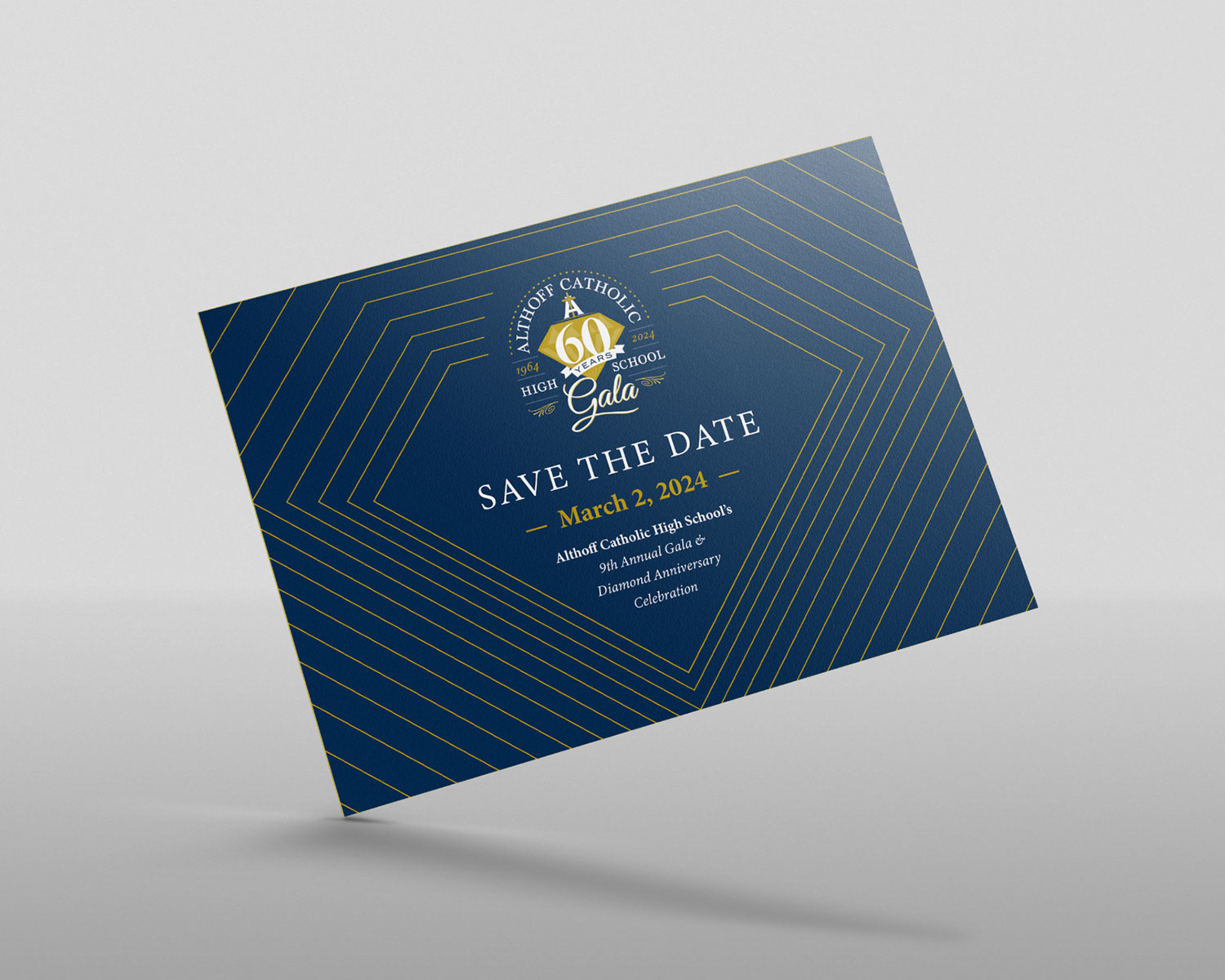
Once the logo was complete, we proceeded to design the Save the Dates for the Gala. Here is the selected design, and below that is one of the options — which was our favorite:


Gala Invitations
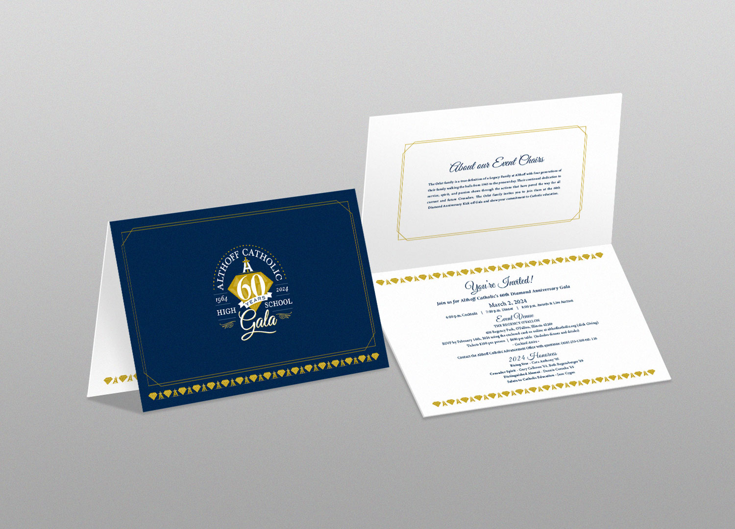
Once the Save the Dates were approved, we moved directly to completing the invitations for the gala.

The School Crest Updated
Following the successful completion of the initial scope, we were approached to assist in updating their school crest. Despite the existence of several outdated versions, the reproductions were subpar and lacking the necessary vector format essential for high-quality printing and the ability to enlarge the file without loss of clarity or pixelation.
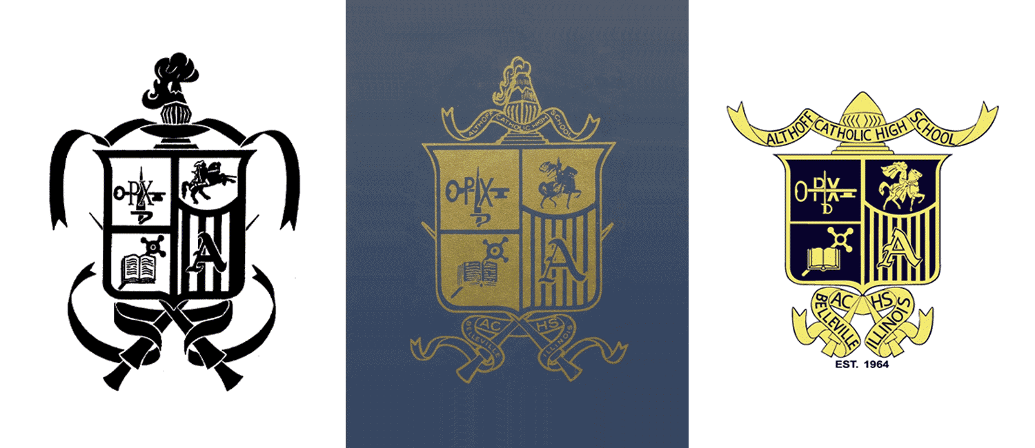
Here are some examples of their old crest, highlighting various issues. Quickly noticeable are spacing problems, size discrepancies, and an overall lack of clarity. Additionally, there are three distinct horses & knights that appear to be old clip art, resulting in a loss of detail and a somewhat blob-like appearance which occurred when they were shrunk down to fit inside the crest. In the first two samples, excessive detail in the helmet and plume made identification challenging – while in the last one, there was insufficient detail, rendering it totally unrecognizable.

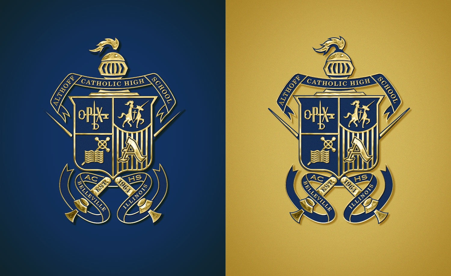
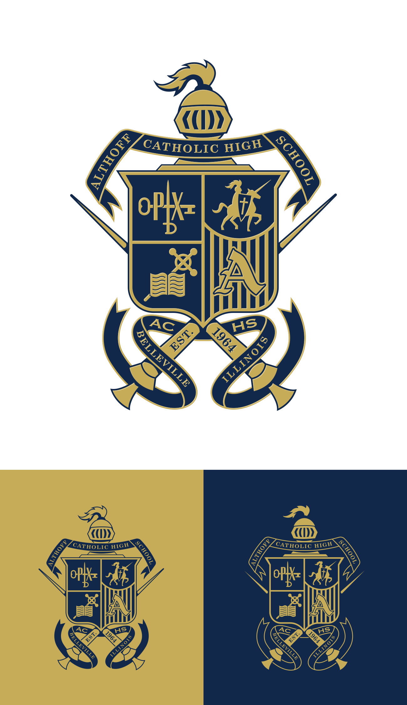
Presenting our updated and refined crest design, meticulously crafted to address spacing, proportions, and clarity concerns. All elements have been redrawn by hand, ensuring a fresh and polished appearance. The helmet is now easily identifiable, the illustrations in each quadrant of the shield are fixed and fit perfectly, the proportion of the shield and lances has been harmonized, and all text is now legible.

…and with some added effects/bling:

Need Design Help?
