OUR BLOG

Here you will find our latest works, company news and more. We update it on a regular basis so be sure to come back soon. Please like, share, pin or tweet the post you enjoy.

Branding for Revolutionary New Cleaning Scrub Gloves

Posted on October 8, 2018

The Heavyweight Scrub Gloves is a revolutionary new cleaning product that is about to disrupt the cleaning industry. These scrub gloves, using a patent pending design, allow users to control the range of abrasiveness โ€“ the harder you press, the more abrasive it becomes. When used properly, it will easily remove bugs/dirt/grime from surfaces without scratching, allowing you to effectively clean almost anything. It gets in all the nooks and crannies your hand can fit, doesn’t require the use of chemicals, and is long lasting.

Heavyweight came to Visual Lure early on in their development process and we’ve had the pleasure of helping them with their logo & branding, brand messaging & strategy, packaging, and website.

The Heavyweight Scrub Gloves Logo

HWSG professional product photos


Logo Design Options

Below are the initial logo options we presented to the client:

initial logo design options


Final Logo Lockups

After a couple rounds of minor revisions, below are the final logo lockups we delivered:

final logo design lockups


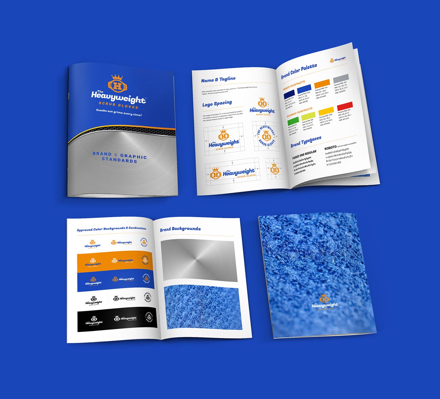
Brand & Graphic Standards Guidebook

Below are a couple pages from the brand and graphic standards guide. It provides guidelines on logo usage, brand color palette, brand typefaces, backgrounds and more – to ensure a seamless and consistent use of design elements.
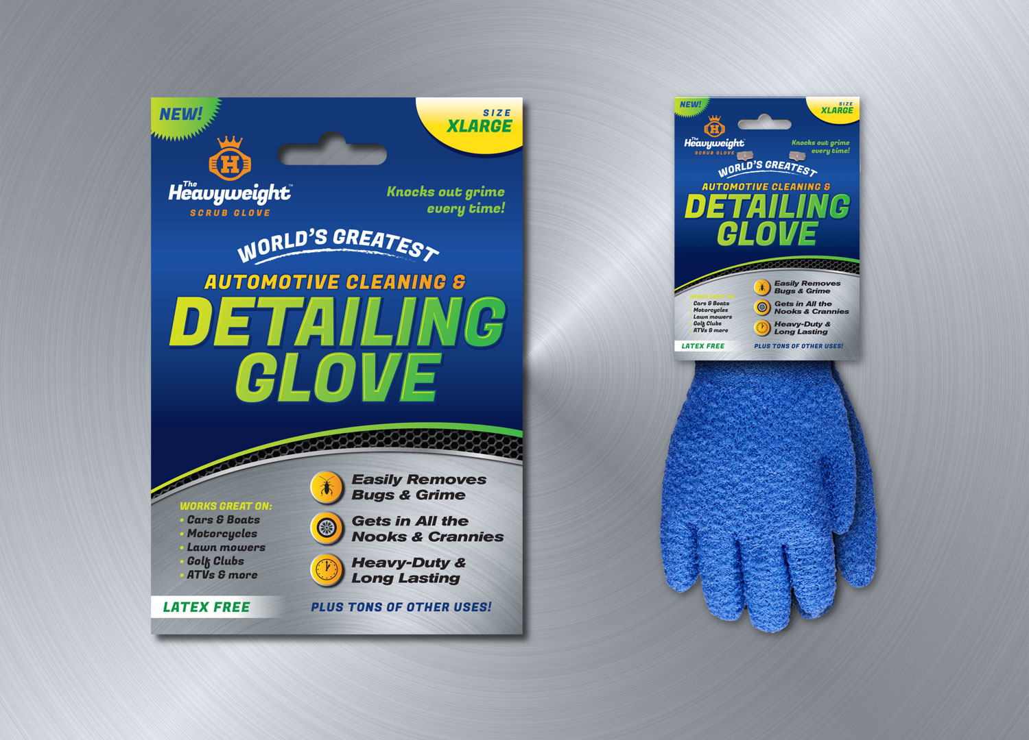
 

HWSG brand guideline book


Package Design


PACKAGE DESIGN OPTION

Below is one of the unused proposed package design options. It was designed to focus exclusively on automotive/motor vehicle detailing, as that is one of the best uses of the gloves.


HWSG packaging design option

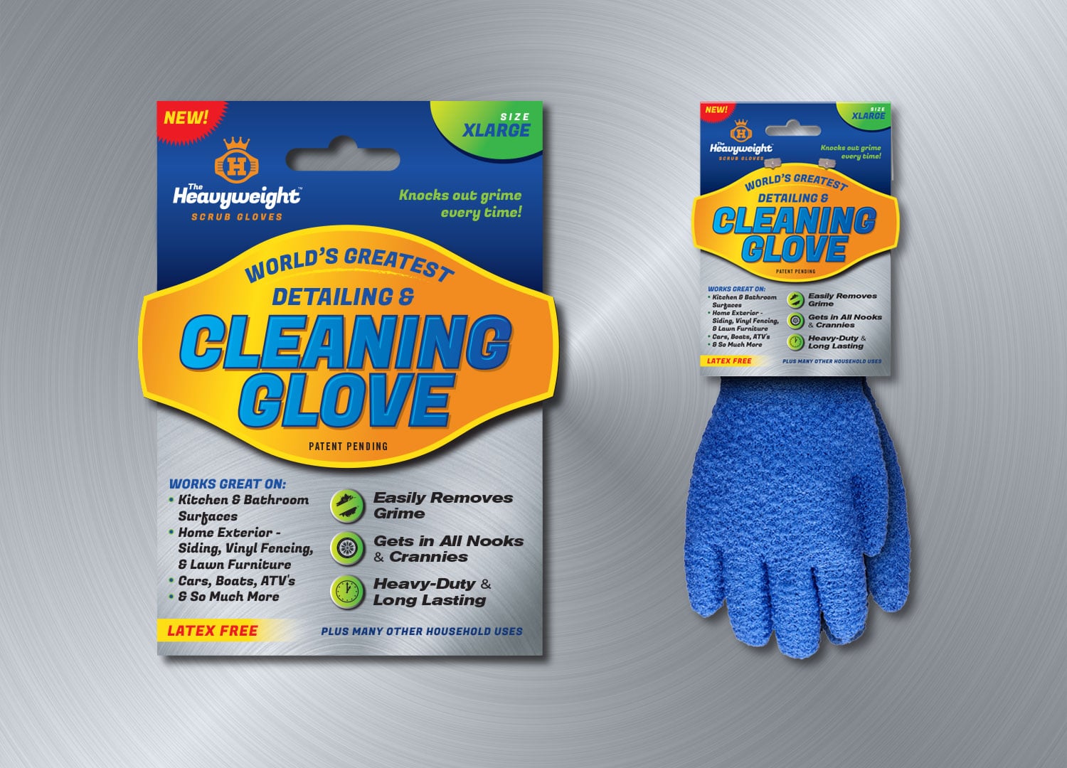
FINAL PACKAGE DESIGN

Below if the final label/package design:


final HWSG packaging design


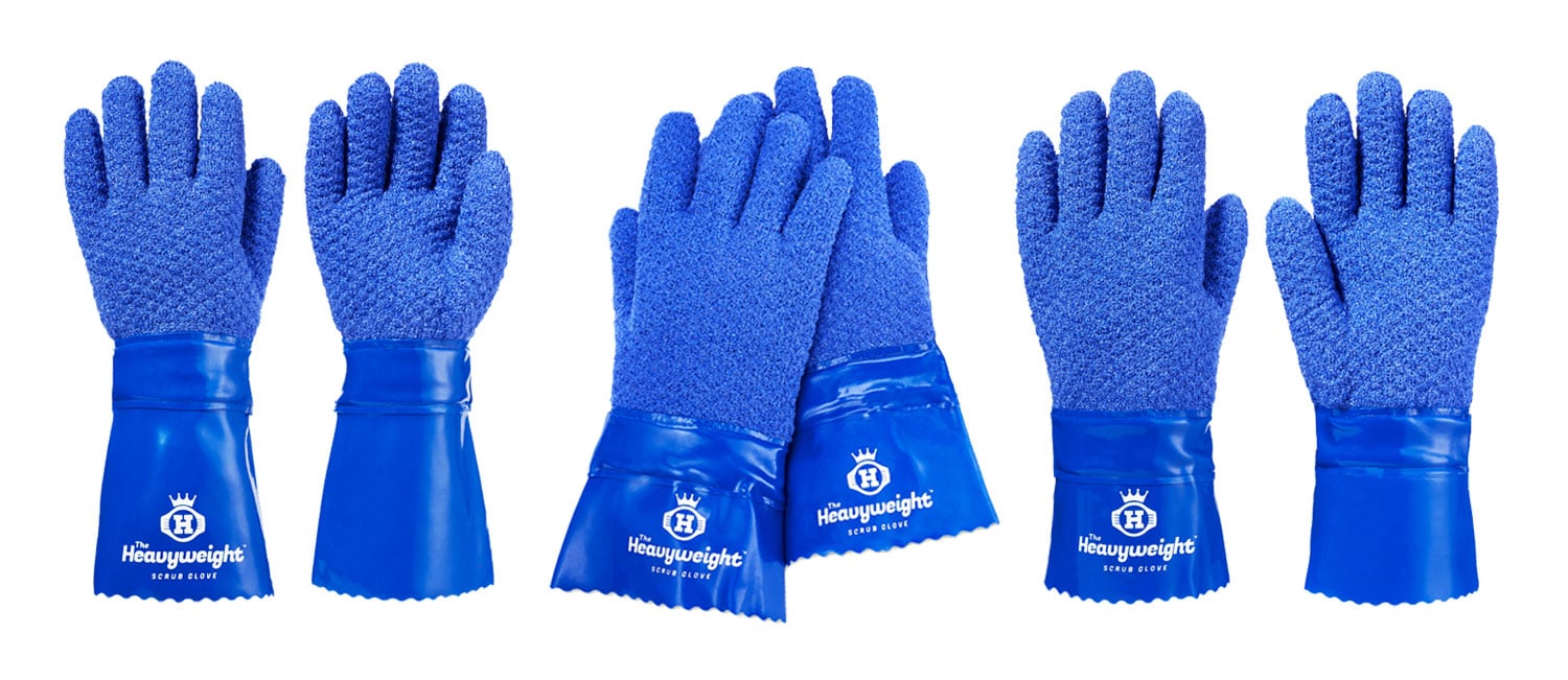
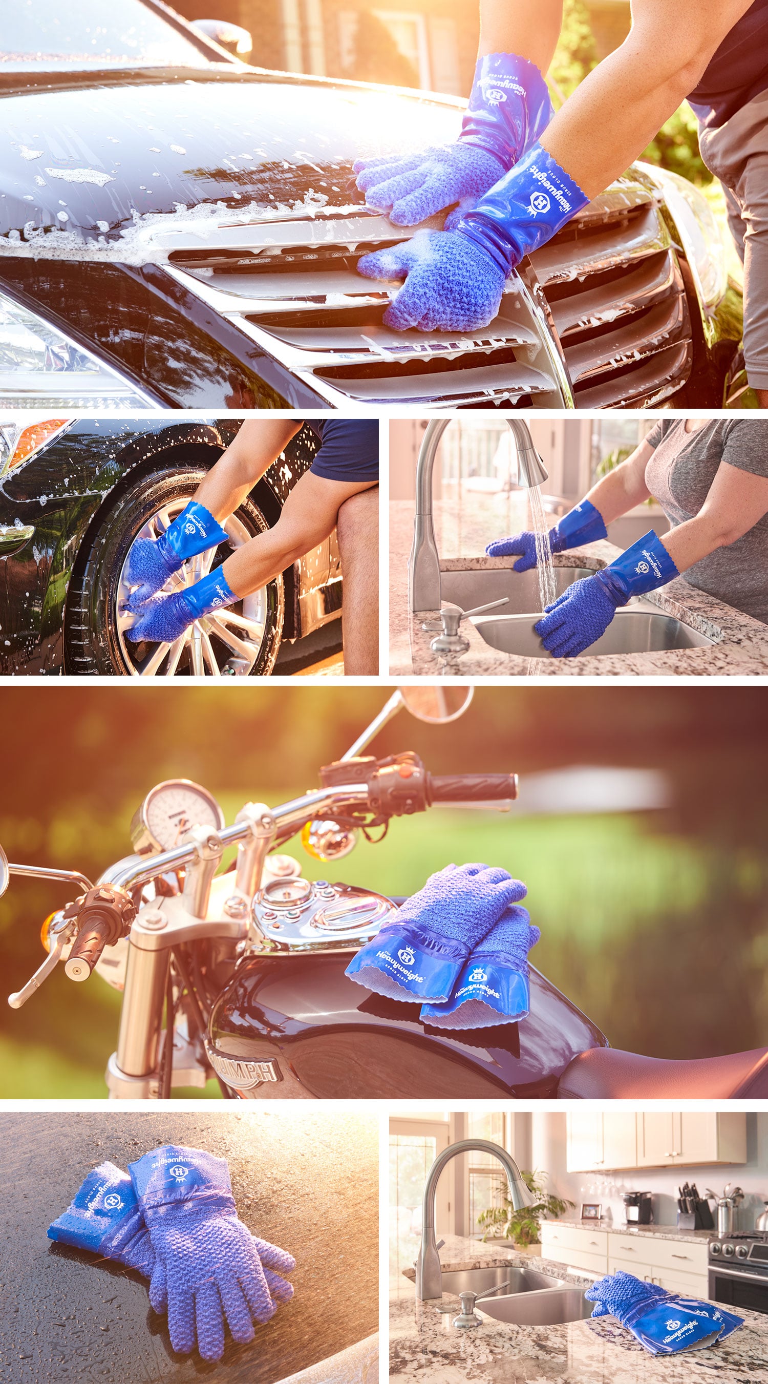
Professional Photography & Videography

Professional photography and videography provided by Chris Malacarne. Below are a handful of the deliverables he supplied.
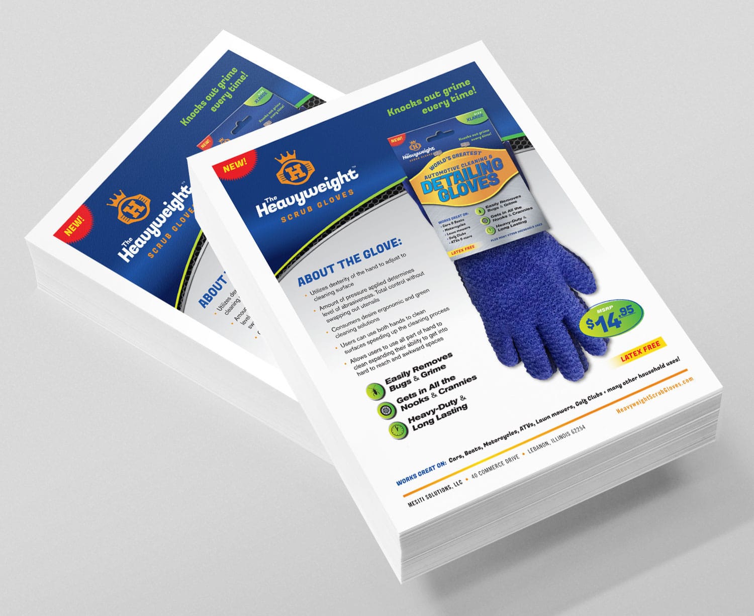
 

HWSG professional photos


Sell Sheet

Sell sheet design targeting the automotive cleaning and detailing market:


HWSG sell sheet design


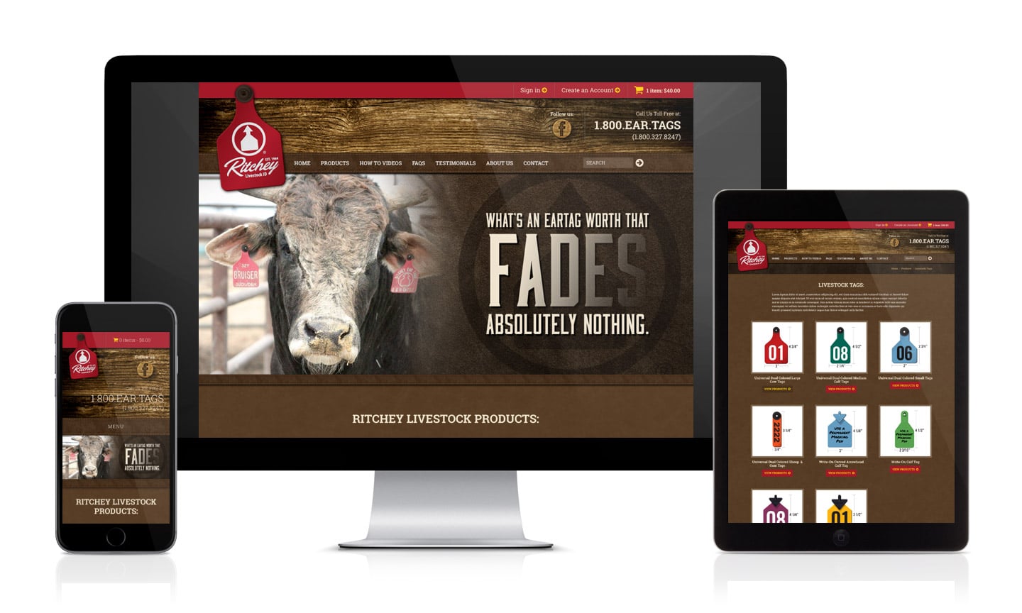
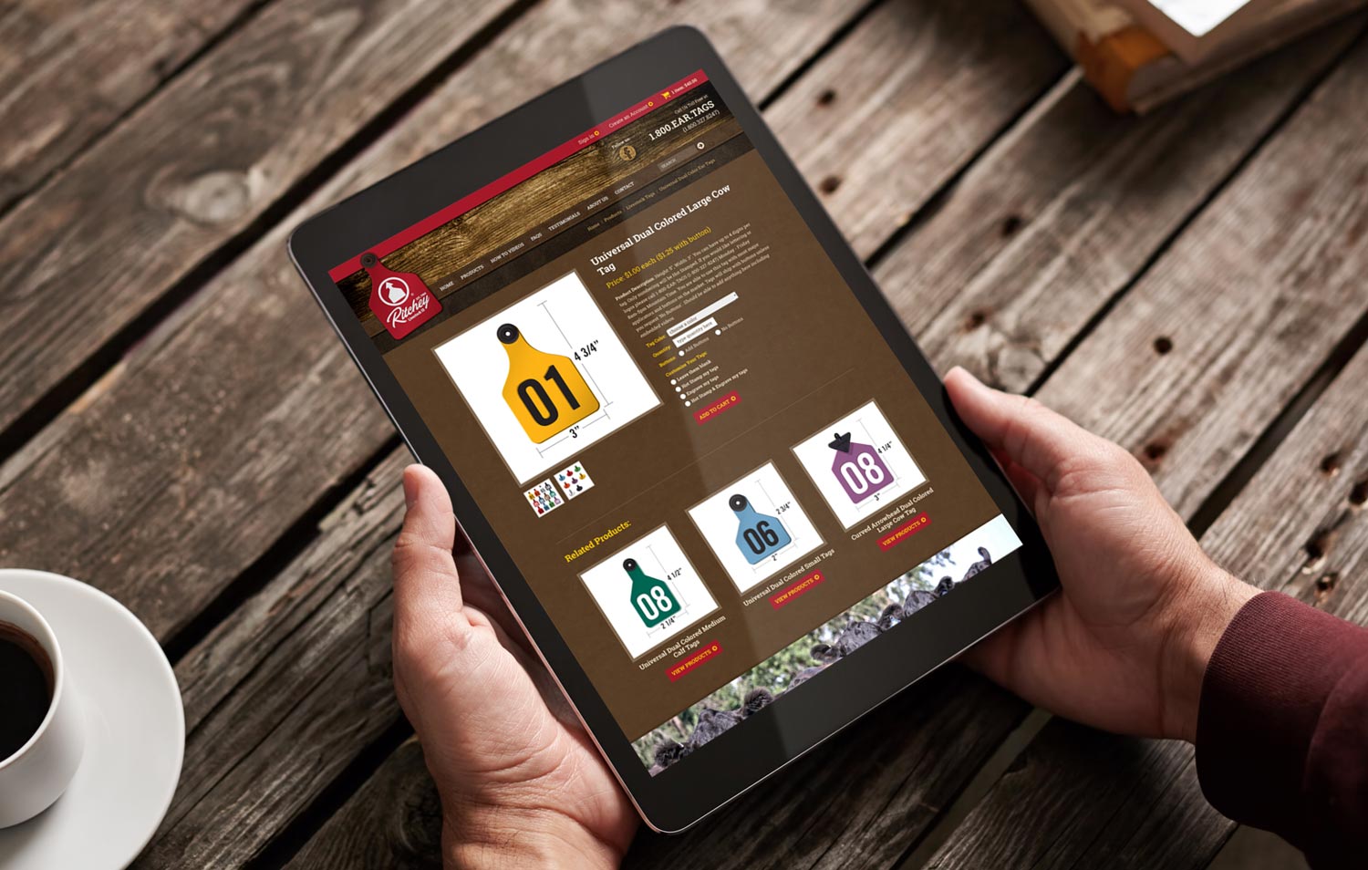
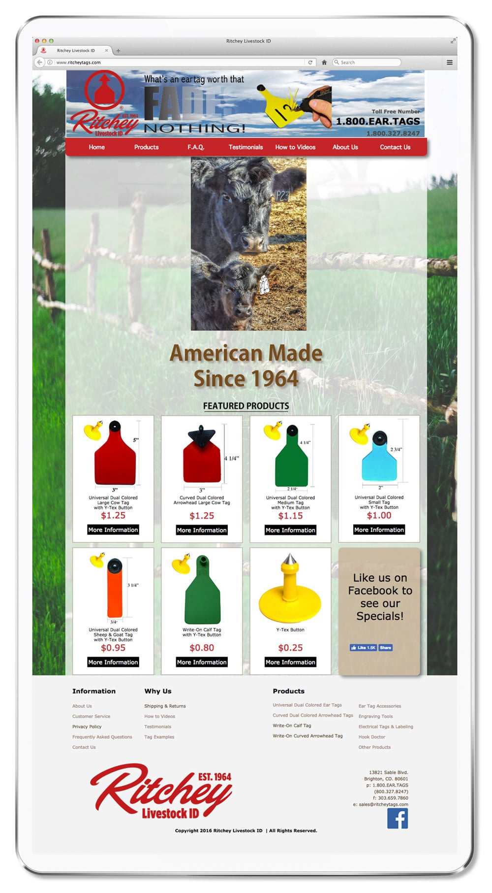
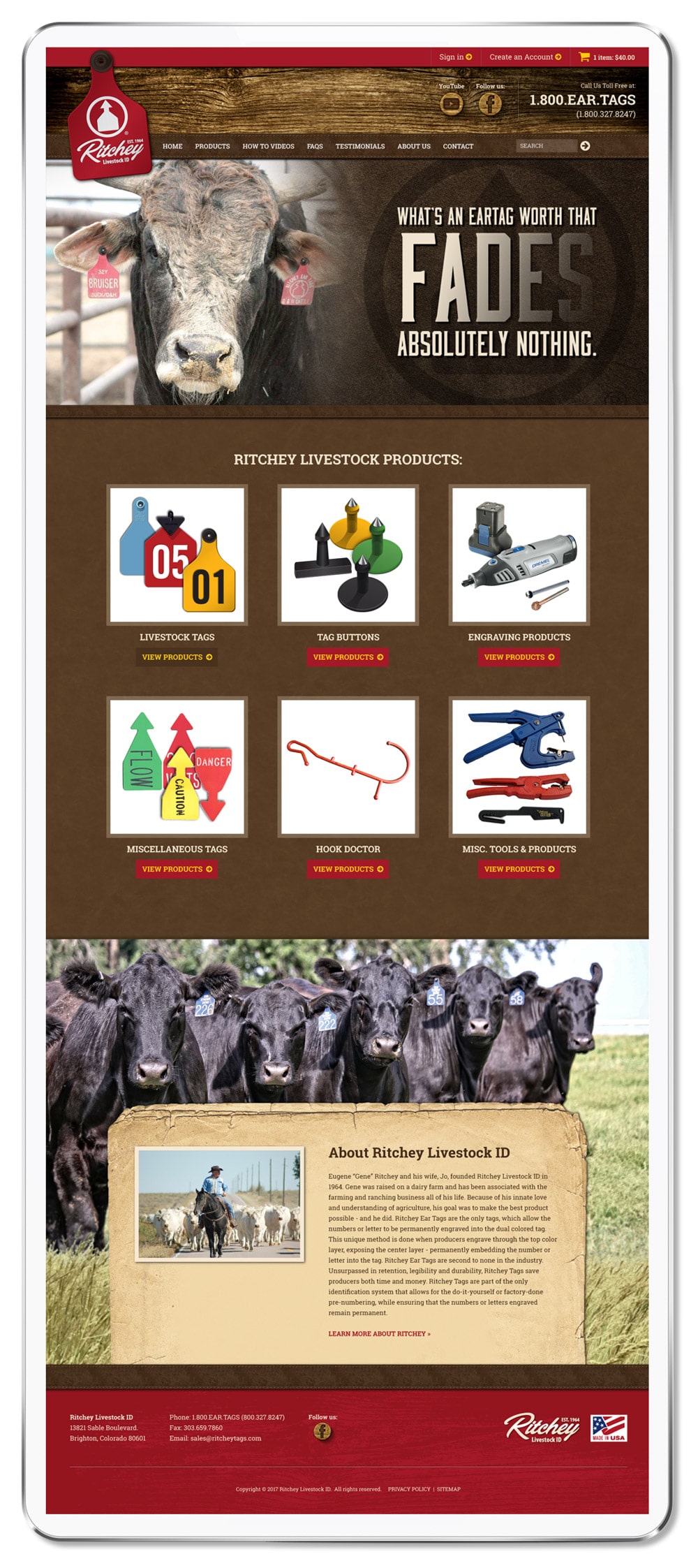
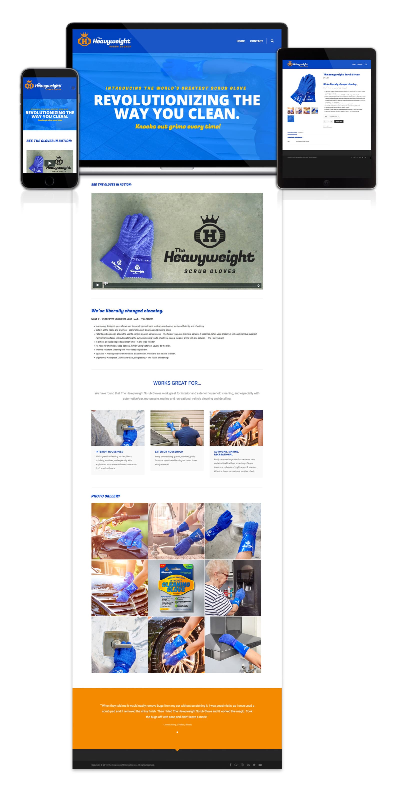
WordPress Website with E-commerce

Below is the new website we helped launch using the Unicon WordPress theme. We typically do not work with pre-designed themes, but since they were such good clients, we assisted them with the website. We also helped activate WooCommerce, implement their payment gateway, andย install their SSL certificate to make it an e-commerce website. You can visit the new website at hwscrubgloves.com.

HWSG responsive WordPress website design


Learn more about our services featured in this post:

Learn more about our
Logo & Branding Services ยป

Learn more about our
Graphic Design Services ยป

Learn more about our
Package Design Services ยป

Learn more about our
WordPress Websiteย  Services ยป


Branding a Global Amusement Operations Company

Posted on September 12, 2018

ICON Global Partners is an international amusement operations company that personally guides owners, investors and operators through the entire design, development, implementation, servicing and maintenance process. Their main focus is in developing markets, and they work with clients who aspire to be world-class in a time when service and safety expectations are continuously increasing.ย  The company is lead by two industry leaders, Chris Perry and Tim Mow.

ICON came to Visual Lure for branding guidance and logo development, graphic design services, and WordPress website design and development. Below is some of the work we completed for ICON:


Initial Brand Exploration

When we are creating a new brand from scratch, exploring and defining the brand is an important first step before any design work is completed. This can be done through conversations or by filling out a brand framework form.ย  Here is ICON’s brand positioning and messaging:


Brand Promise:

Proactive, transparent, personalized (hands-on) service from concept to opening, and beyond.


Brand Positioning:

  • Helping the leisure and amusement developer to success by listening and providing comprehensive support and technical assistance throughout the development process.
  • ICON wants to be the company of choice for those aspiring to achieve international standards of safety and service for their amusement facility in developing markets.
  • ICON is an operations speciality company for amusement facilities that aspire to be world-class in developing markets.

Master Positioning Statement:

  • What: The only amusement operations speciality company
  • How: that will hand hold (lead) through the entire process
  • Who: for owners/investors and operators
  • Where: in developing markets
  • Why: who aspire to be world-class
  • When: in a time where service and safety expectations are increasing globally

Target Audience:

  • Owners and investors of potential amusement facilities and mixed-use developments globally
  • Existing operators looking for assistance with a future redevelopment or looking to improve their operation
  • Amusement suppliers/manufacturers that are involved in projects which have not yet defined who the operator is
  • IP companies (Cartoon Network, Cirque du Soleil) that are involved in amusement operations that would like to have clearly defined design and operating standards for their brand
  • Hotels that are adding aquatic elements and want to ensure they are safe and operationally efficient

Brand Mission:

ICONโ€™s brand mission is to help others who (aspire, have a desire, have a drive, want, arenโ€™t afraid of the journey) to become (iconic, world class) in their market.


ICONโ€™s Thought Process:

  1. Where can we lead our customers (so that our competitors canโ€™t follow)?
    By developing strong relationships and partnerships that are built on trust, transparency and hard work. Personalized, client-centric commitment focusing on direct interaction and solving potential issues before they become problems
  2. How can our brand help customers help themselves?
    By working hand in hand, we are teaching people how to think differently
  3. What new forms of value can we deliver?
    Working hand in hand in partners in an economical way (by being based in the region) By being more than an operator and representing our clients in our own areas of expertise
  4. How can our brand become a platform for creating customer opportunities?
    Volume of key clients in region. Building brand awareness by the success of client base
  5. How can our brand become a richer context of living?
    Safer, more enjoyable facilities, with better service. Partner for future projects with an easier path of development/openings. By taking the stress burden off of the owner and/or driving higher profits through experience, knowledge and efficiency.

Brand tone of voice (Brandโ€™s personality):

  • Confident
  • Personal/Genuine
  • Local
  • Helpful (solution focused)
  • Passionate

What does ICON do better than their competition? What makes ICON different?

  • ICON is based in their target region (Southeast Asia, which reduces travel costs and makes us easier to communicate with vs. having to speak with someone in North America or Europe)
  • ICON is personally involved vs. passing the work to a project manager or hiring someone other than the leaders of the company
  • ICON’s operators have recent operating experience in some of the most recognized water parks in the world.
  • ICON is not afraid to get their hands dirty and work with clients onsite
  • ICON offers multiple solutions through their own resources (one-stop shop)
  • ICON prefers a client representative approach in which they will interact with other consultancies on the clientโ€™s behalf


Final Logo Design

Here is the final logo. It features a globe made from waves – as water parks represent the core of their business. We also added a swoosh/splash under the mark to give it a sense of playfulness and motion. The typography is heavy and arched from the bottom to give it an “iconic” feel, and gradients give it a sense of depth – making the mark more fun, which is what this company is all about.

ICON logo design

Logo Explorations

Below are a handful of logo design explorations we presented. The client requested that we use a globe, and they preferred the color blue – because a majority of their business is water park related.

ICON logo explorations

Business Card Design


ICON business card design ICON business card design


Website Design

Designed and developed in WordPress, the new ICON website is a fully custom, simple, clean, and easy to maintain theme. Even though itโ€™s a pretty simple layout, we added a wave to the sticky header so that it didn’t look like a cookie cutter theme. The site is of course fully responsive, rendering beautifully on any type of device or screen. Additional features include: easy to apply column short codes for layout flexibility, an RSS industry news feed automatically pulling from an industry news resource, and an accordion services section.

We also installed andย configured WordFence for added security, and WP Rocket for improved load-time speeds giving the site an A rating on both GTmetrix and Pingdom.

ICON responsive web design

ICON website design tablet

Visit the ICON Website ยป


Learn more about our services featured in this post:

Learn more about our
Logo Design & Branding Services ยป

Learn more about our
Print & Graphic Design Services ยป

Learn more about our
WordPress Web Design & Development Services ยป


New Website, Catalog & Print Ads for a Colorado Cattle Tag Company

Posted on September 28, 2017

Ritchey Livestock ID, based out ofย a Brighton, Colorado, is the creator and manufacture of the World’s greatest cattle tags! What makes theirs the best? Ritchey tags are 100% fade proof. How? Their tags have a core color with 2 outside colors. The colors are NOT layers, they can not peel apart or separate because they are made out of one solid piece of material. When engraved, or heat stamped, the core color is revealed – therefor the tag number, brand, or whatever information that has been applied never wear offs.

Visual Lure was recently contracted by Ritchey to redesign their e-commerce website. We were in charge of the design, while another company handled the development. The new responsive designed website was built in WordPress using WooCommerce for the online store. Immediately after completing the design of the website, Ritchey re-engaged us to design a new product catalog along with multiple print ads. See samples below:


WordPress/WooCommerce Website Redesign

Ritchey Responsive website design

Like so many other websites, their old site was not mobile friendly, and with Google’s new mobile first indexing and over 1/2 of all web browsing done on smart phones – this was an issue. The new site, now utilizing a responsive design, renders beautifully on all devices.

New Sample Product Website Page

The new e-commerce store, powered by WooCommerce, has been simplified and streamlined to help improve conversion rates. We also implemented conditional logic on many of the product order forms to make the checkout process fell less daunting.


Old Homepage Design:

Old Ritchey Website design

The old website, which looked like a generic template, had tons of issues. It was not responsive, the checkout process was confusing and not user-friendly, and the design was void of all character.


New Homepage Design:

New Ritchey Website Design

The new design now has a rustic aesthetic using weathered wood, old paper, leather and cow hide textures along with cattle photos to appeal more to ranchers, their core target market. In additional to the website, Visual Lure also digitally recreated all their cattle tags to ensure correct colors and product consistency.


Catalog Print Design

Immediately after completing the design of the website, Ritchey hired us to redesign their product catalog. Other than the website, this is their main marketing tool, and like the old site – it too lacked character. Here is the cover and a sample spread from their old catalog:

Old Ritchey Product Catalog

Building a Visually Cohesive Brand

Using the same rustic wood background, old paper and leather textures from the new website, the catalog now complements it, and becomes the first step in the development of creating a visually cohesive brand. Below you can see the new cover, a new ad for their Hook Doctor product, and a couple sample spreads (along with some of the new digitally rendered cattle tags).

New Ritchey Catalog Design


Print Ads

Lastly, Ritchey engaged us to design some of their print ads. Here is the first one we designed announcing the release of their new pink tags:

Ritchey Pink Tag Print Ad

Ad Redesign (Before)

Ritchey Bw Ad1


Ad Redesign (After)

Ritchey Bw Ad 2

Whether you need help with a new e-commerce website, print/graphic design, or assistance with creating a visually cohesive brand – contact Visual Lure today for a FREE quote.


Website Design for Chicago Suburb Pest Control Company

Posted on February 14, 2014

Visual Lure, in collaboration with Chicago’s Dragon Internet Marketing, is in the process of designing a new website for Fox Valley Environmental Pest Control.ย  Fox Valley Environmental Pest Control is an environmentally friendly, family owned and customer service oriented pest control company that services Kane, Du Page, Cook and numerous other Chicago counties.ย  They specialize in the extermination of ants, bees, wasp, rodents and any other bug or pest.

The new website will be developed using a fully custom, search engine optimized and responsive designed WordPress theme.ย  Below is our proposed home page design. Check back soon for updates and the official launch.


Chicago IL web design pest control

Learn more about our Word Press design, web design and Search Engine Optimization (SEO) services, and donโ€™t forget to check out our web design portfolio.

Website Design for New York Based Photography & Video Company

Posted on May 17, 2012

Visual Lure was recently contracted to design a new website for Jump Visual, a New York based photography and videography company specializing in architectural, real estate, event and business photography and video.ย  The new website was built in a custom WordPress theme with a blog feed, tons of slideshows and non-system based typefaces (not just the same old web fonts).ย  Their old blog was imported into the new one, along with plugins, for a seamless transition.ย  Check back soon for the official website launch.


New York photographer/photography WordPress web design

Learn more about our Word Press design and web design services.ย  Also, don’t forget to check out our web design portfolio.

Website Design for St. Louis Metro East Preschool

Posted on April 8, 2011

Visual Lure was recently contracted to design a website for a new preschool coming to O’Fallon, Illinois.ย  The new preschool will be called The Good Shephard Preschool and will be affiliated with O’Fallon’s St. Clare School.ย  It will be located in the new Fellowship Centers at St. Nicholas Roman Catholic Church. Below is our proposed home page design. Check back soon for the new website.ย  Update: The new website has gone live and can be viewed at www.gspreschoolofallon.com.

St. Louis web design for preschool

Learn more about our web design services and don’t forget to check out our web design portfolio.

Web Design for St. Louis Metro East Flood Prevention Council

Posted on February 4, 2011

Visual Lure is currently in the process of designing a website for an organization improving flood prevention in Southwestern Illinois.ย  The new website design will be built in a custom WordPress theme and include custom plug-ins to enhance the user experience and make it easier for the client to update.ย  Below is a sneak peek of the home page design.ย  We will add a post when the new website goes live.


St. Louis web design for SIFPDC

St. Louis web design | proposed home page


Learn more about our St. Louis web design services or check out our web design portfolio.