OUR BLOG

Here you will find our latest works, company news and more. We update it on a regular basis so be sure to come back soon. Please like, share, pin or tweet the post you enjoy.

Package/Label Design for a St. Louis Metro East Glass Cleaner Manufacturer

Posted on November 6, 2014

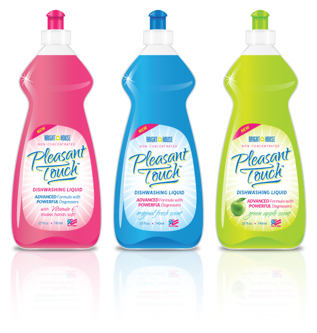
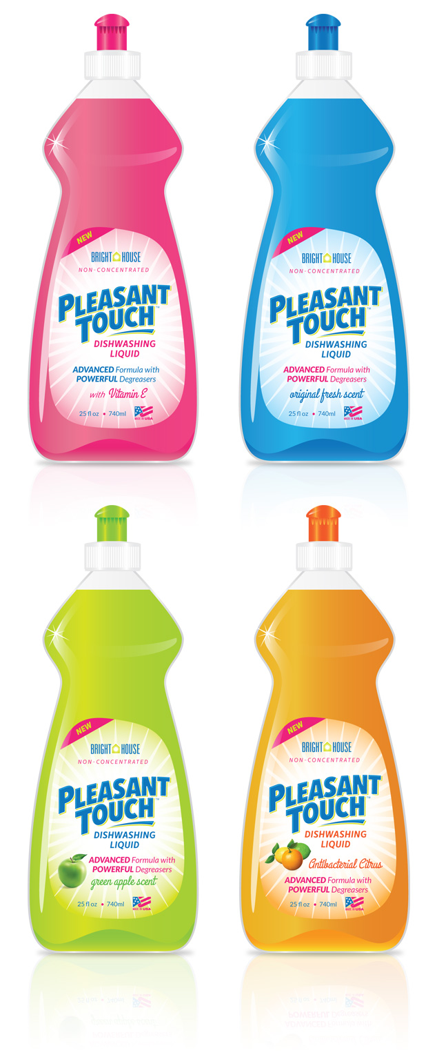
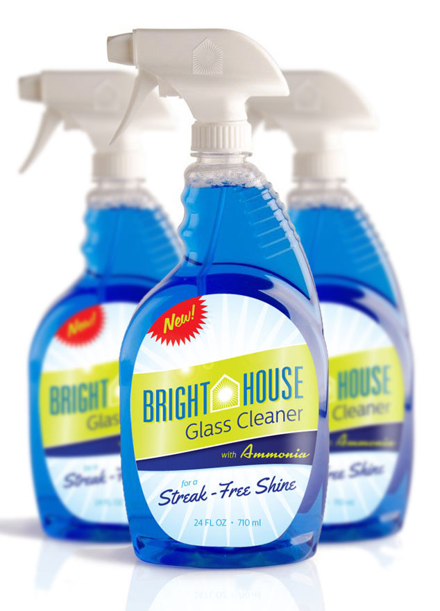
Visual Lure recently completed the following label/package design for Bright House Glass Cleaner. Bright House is a manufacturer of household cleaning products and is located in the St. Louis Metro East in Columbia, Illinois. Visual Lure has also designed packaging for other Bright House products including their dishwashing soap. Click here to view that design project.

We feel that the new packaging looks “fresh and clean” which are the characteristics you want a glass cleaner to have. We were able to achieve this look by using a subtle “shiny/gleaming” background, a bright green and blue color palette along with clean and modern typography. The fire engine red “new burst” will also help the label jump off the shelf and attract eye-balls which is what good package design does.

Bright House Glass Cleaner package design

What to see more?ย  Click here to view additional package design projects ยป

Need help with a package design project? Give us a call or shoot us an email, we would love to provide you with a FREE quote.

Package Design for Pleasant Touch Dishwashing Soap

Posted on July 28, 2014

A St. Louis metro east manufacturer recently contracted Visual Lure to design a logo and packaging label for a new dish soap they are currently developing called Pleasant Touch. There will be three different products at initial launch: original fresh scent, green apple scent, and one with Vitamin E (to keep customer’s hands soft).

Below is our proposed design for the new bottles. We are currently waiting for feedback and will share any updates related to this project.

package graphic design for Pleasant Touch Dish Soap

Check out our graphic design portfolio, click the following link to learn more about our graphic design services, or contact us today if you are in need of professionally designed packaging.

UPDATE: Our client decided to add one additional scent, switch out the logo to another one we designed and make a couple minor adjustments. Here are the final four designs:

pleasant-touch-packaging

Package Design for a Motor Oil Manufacturer

Posted on July 16, 2014

Visual Lure was recently contracted by a St. Louis metro east manufacturing company to design the bottle shape and label options for one of their prospective clients, Shaeffer’s Motor Oil. The project requirements were as follows: 1. to use a checkered flag, the client’s logo and the phrase “good people great products” embossed somewhere on the bottle, 2. use the colors yellow and red, and 3. to make sure the spout was off center.ย  Below are the initial three packaging design options we provided.

Check back soon to see what direction they decide to go, and if you are looking for professionally designed packaging for your products, call or email us today. We would love to help you have your product stand out amongst its competition.

motor oil package design

UPDATE: After review, the client decided to change the bottle color and shape. Below is the latest bottle design under review.

Schaeffer package design 2

Check out our graphic design portfolio, click the following link to learn more about our graphic design services, or contact us today if you are in need of professionally designed packaging.

Packaging Design for St. Louis Air Freshener Manufacturer

Posted on October 25, 2013

Our client asked that we remove this post. Please click here to view more of our packaging design work ยป

We can not stress enough the importance of quality packaging design. Having a quality product DOES NOT MATTER if the packaging doesn’t catch consumer’s eyes in a sea of its competition. If you are looking for professional packaging design, whether youโ€™re in the St. Louis, MO area or anywhere else in the country, contact Visual Lure for a FREE quote today.

Learn more about our graphic design services and donโ€™t forget to check out our graphic design portfolio.

CD Packaging Design for U.S. Air Force Band of Mid-America

Posted on June 19, 2013

A while back, Visual Lure was contracted by the United States Air Force Band of Mid-America (stationed at Scott Air Force Base) to design CD packaging for a new album dedicated to Clifton Williams, a famous composer and Air Force veteran.ย  The CDs turned out beautiful and we finally got around to photographing them.ย  They were printed on a nice textured uncoated card stock with Clifton’s signature embossed and foil stamped on the cover.

The cover design features Clifton’s signature, a collage made from three different images and a subtle classic border.ย  The inside covers have an additional photograph of Clifton along with some of his sketches and doodles.

The initial goal was to create packaging that felt vintage, and classy, and we think we succeeded at both.

U.S. Air Force Band of Mid-America CD packaging design 1

U.S. Air Force Band of Mid-America CD packaging design 2

If you are looking for quality packaging design, whether youโ€™re in the St. Louis, MO, the St. Louis Metro East or anywhere else in the country, contact us today!

Learn more about our graphic design services and donโ€™t forget to check out our graphic design portfolio.

St. Louis Packaging Design for Automatic Toilet Bowl Cleaners

Posted on June 13, 2013

A St. Louis Metro East manufacturer of automatic toilet bowl cleaners recently contracted Visual Lure to design its new packaging. They haven’t decided on whether to use the name Bright Bowl or Brite Bowl, and they wanted to have packaging design options for both.ย  However, once they reviewed our initial design options, they may utilize both.

Of their two main competitors, one uses blue packaging and the other uses green. They wanted their product to look completely different so they didn’t want to uses either of those colors. They also wanted their product to appeal to their main target audience, women, so we decided to use the color purple.ย  Color studies and research have shown that women like it.

Below are the two packaging design options we provided.ย  Check back soon to see if they use one design or both.

St. Louis package design for brite/bright bowl

If you are looking for professional packaging design, whether you’re in the St. Louis, MO area or anywhere else in the country, contact Visual Lure today.

Learn more about our graphic design services and donโ€™t forget to check out our graphic design portfolio.

Package Design for New USAF Band of Mid-America CD

Posted on May 6, 2011

Visual Lure was recently contracted to design the packaging for a new CD being released by the United States Air Force Band of Mid-America.ย  It will be featuring the sounds of Clifton Williams, a famous composer and Air Force veteran.ย  Here is a sneak peek at our proposed cover which will feature Clifton’s signature embossed and foil stamped on a nice textured paper.

CD packaging design