OUR BLOG

Here you will find our latest works, company news and more. We update it on a regular basis so be sure to come back soon. Please like, share, pin or tweet the post you enjoy.

New Logo and Identity Design Package for a St. Louis Wealth Management Firm

Posted on September 18, 2014

Visual Lure recently completed a new logo and identity package for Hauser Group Wealth Management, a St. Louis, MO based wealth management firm lead by Mike Hauser. Mike is a CPA and a personal financial specialist. He is a member of FINRA and the SIPC, and offers securities through LPL Financial. We feel the new clean and sharp logo feels trustworthy and reliable. The perfect traits for a financial management company.

Below you can see both the vertical and horizontal logo formats along with a couple color variations. Below the logos is the identity design package, including the business card, letterhead and a #10 envelope design.

If you are in need of a new logo, or looking to re-brand an existing company, give Visual Lure a call today. We would love to get your branding started in the right direction with our award wining, internationally published logo design solutions.
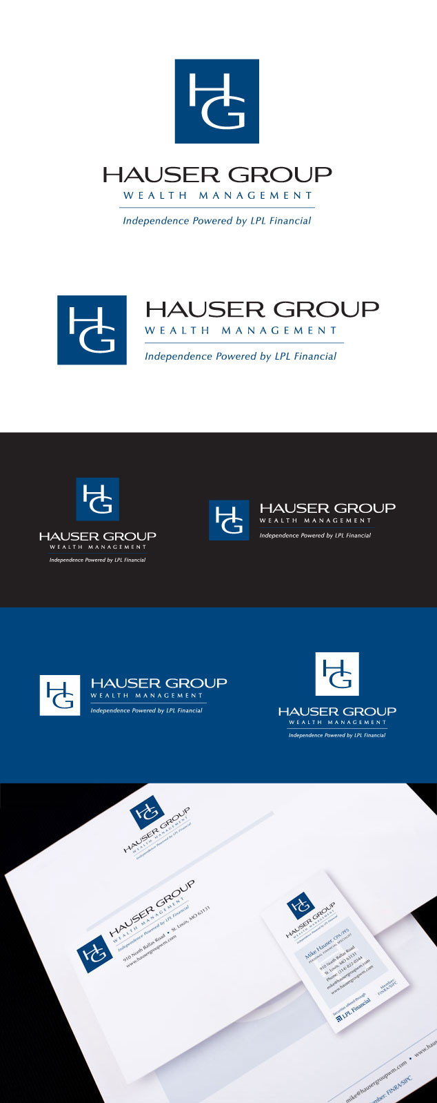
Hauser Group logo design and branding

Branding Package for an Edwardsville, IL / St. Louis, MO Wealth Management Firm

Posted on June 26, 2014

Visual Lure is currently wrapping up a complete branding package for Visionary Wealth Advisors. VWA is a full service wealth management firm headquartered in Edwardsville, IL with another office in St. Louis, MO. The package included a logo, identity design, print collateral, signage, posters and a fully custom WordPress website.

The new site is fully responsive, meaning it transforms to fit all devices such as tablets and smart phones. It is also search engine optimized and features a custom admin section making it easy for VWA to manage their employees, referred to as “Visionaries”.

Below you can view both the vertical and horizontal logo design formats, the identity package (business card, envelope and letterhead design), building signage, corporate folder and their new website. Visit VisionaryWealthAdvisors.com to learn more about the company.

Website copywriting by Renee Kennison of Concept Shop, and Visionary team photography by Darin Hartlieb.


branding package for Visionary Wealth Advisors

The only thing we enjoy more than designing logos in building a complete brand from the ground up.ย  If you are launching a new company or looking to completely re-brand an existing one, contact us today! We would love to learn more about you and your company.

Learn more about our logo design, graphic design,ย web design, Word Press design, and Search Engine Optimization (SEO) services and donโ€™t forget to check out ourย logo, graphic design or web design portfolio.

Logo Design for Comedy Club Coming to Fairview Heights, IL

Posted on May 28, 2014

Do you need a new logo designed or possibly a re-brand?ย  If so, GET IT DONE RIGHT THE FIRST TIME!ย  It always amazes us how companies don’t have the budget to get a quality logo designed up front, but they somehow have it for re-designs (because they aren’t happy with what they receive from less experienced designers).ย  Your logo is the cornerstone of your brand.ย  It directly reflects your business, so having a visually unappealing, amateur designed logo makes your company look unprofessional and amateurish.

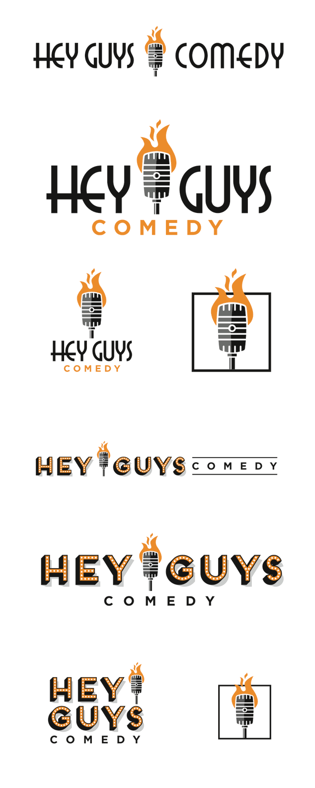
This brings us to Hey Guys Comedy, a new comedy club coming to Fairview Heights, IL, where the old Cupids Restaurant used to be located.ย  I believe the owners went through two to three designers/design firms before they contracted Visual Lure.ย  In an email from one of the owners, she stated “I have had a heck of a time with a few different companies and people have not been nice at all.”

That is where we came in.ย  After initial communications we found that they knew exactly what they wanted.ย  They wanted a logo with a vintage microphone that was on fire. Below are our initial logo design options of the burning microphone. The last option was an extra design that we sketched while we were on the initial phone call.ย  Check back soon to see which logo they select, and be sure to check out the comedy club when it opens.

comedy club logo design

Learn more about our logo design services and donโ€™t forget to check out our logo design portfolio.

UPDATE:ย  The logo has been narrowed down to these final two options:

Hey Guys Comedy final 2 logo design options

UPDATE:ย  The final logo has been selected and is the top option above that uses the Art Deco typeface.

Complete Branding Package for St. Louis Semi-Truck Leasing Company

Posted on May 5, 2014

Visual Lure recently completed a branding package for Profit Leasing, a St. Louis, MO semi-trailer truck leasing company.ย  The owners wanted the logo design to have an icon of some sort that represented money and profit.ย  The logo we designed consists of a wing that was inspired by a fan of hundred dollar bills.ย  The wing represents speed and motion for logistics and the fannedย hundred dollar bills represents money and profit.

Below you can see both the vertical and horizontal logos, the truck graphics, pocket folders, sample inserts and one of their new posters/ads.

ProfitLeasingBlog

Learn more about our logo design, graphic design and web design services and donโ€™t forget to check out our logo design portfolio, graphic design portfolio, and web design portfolio.

Visual Lure Rebrands a St. Louis, MO Hospital/Medical Center

Posted on March 20, 2014

Visual Lure, in collaboration with Cohesion, recently helped St. Anthony’s Medical Center with a new logo design and slight re-brand.

Cohesion is a strong strategy-based St. Louis, MO marketing and branding agency, and St. Anthonyโ€™s Medical Center is a faith-based hospital organization that serves the residents in south St. Louis County and several counties in southwest Illinois.

We initially started the project looking to completely re-brand the hospital with an all new logo, but in the process they decided they just wanted to update their existing logo.ย  Below is their old original logo and below that is the new one.ย  Staying true to the two-tone blue color palette, the cross and the “swoosh”, we modernized their old logo design bringing it up-to-date.

Below the logos, you can see the new identity package (business card, letterhead and envelope), a micro-site for their emergency room and a couple pages from their new graphic standards guide.

At the very bottom is our favorite unselected logo design that we initially proposed.ย  This logo features a medical cross combined with a religious cross representing both faith and medicine which is the core of who they are.

St Louis hospital logo design and branding

Learn more about our logo design, graphic design and web design services and donโ€™t forget to check out our logo design portfolio, graphic design portfolio, and web design portfolio.

Logo Design & Idenity Package for St. Louis Metro East Educational Company

Posted on August 29, 2013

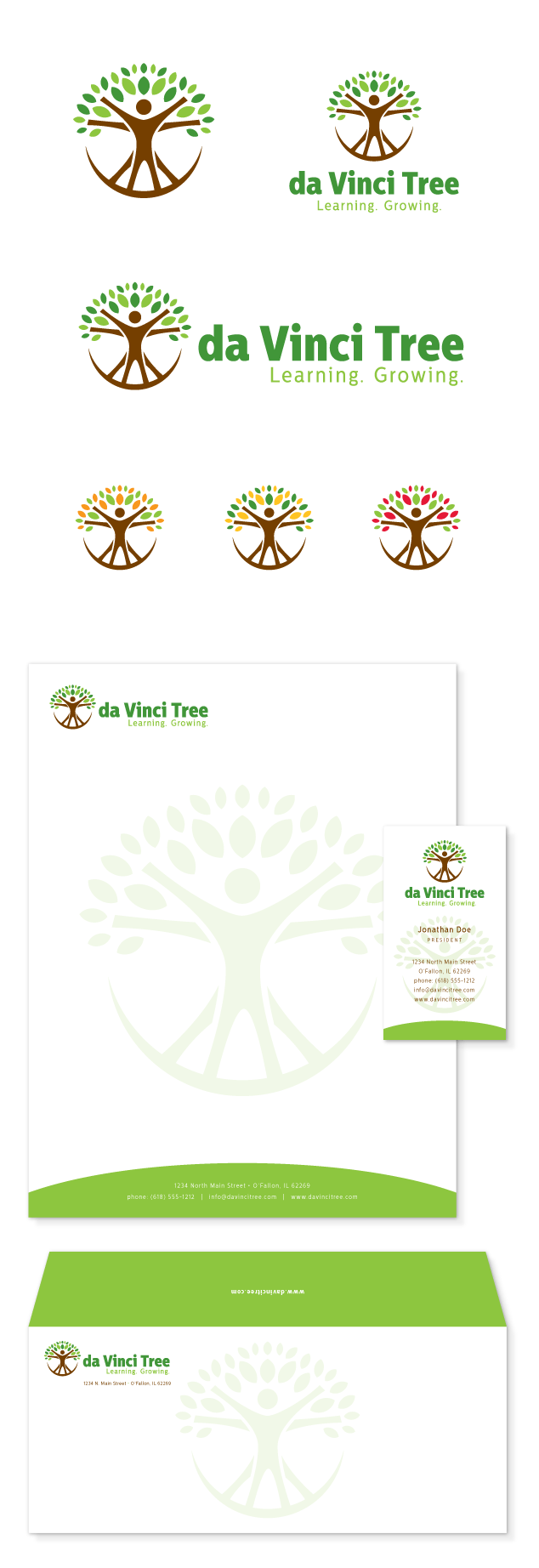
Visual Lure recently designed a new logo and identity package for the da Vinci Tree, an educational training company focused on teaching children a technology-based curriculum.ย  The company is currently in its development stages and plans to launch soon in the St. Louis Metro East, then St. Louis with the ideal goal of eventual going national.ย  The logo design we created for them features Da Vinci’s Vitruve Luc Viatour (Vitruvian Man), who’s arms create branches and who’s legs create roots in order to from a tree.ย  We had fun designing this logo and we believe it was the perfect solution; clean, clever, simple and memorable – everything a great logo should be.

logo design, branding & identity design for da Vinci Tree

Learn more about our logo design services and donโ€™t forget to check out our logo design portfolio.

10 Year Anniversary Logo Design for St. Louis Parks & Rec. Department

Posted on July 15, 2013

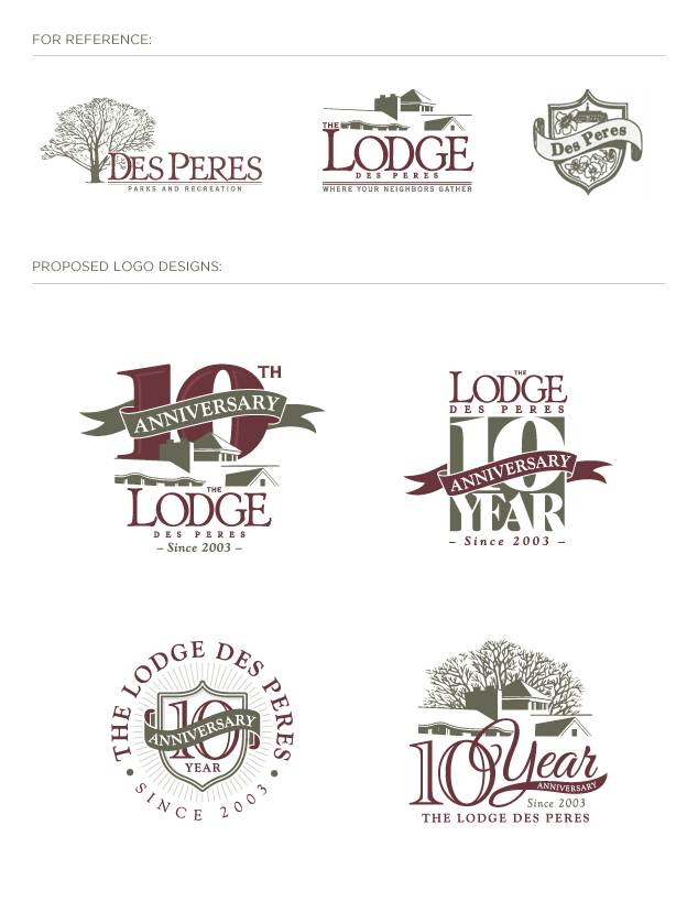
Visual Lure was recently contracted by the City of Des Peres’ Department of Parks & Recreation to design a new 10 year anniversary logo for The Lodge Des Peres.ย  The Lodge is an indoor and outdoor aquatic facility with a fitness center, gymnasium and meeting rooms.

The Lodge provided us with the Parks & Rec logo, and The Lodge logo as seen below. During our discovery stage, we found the Des Peres crest, also show below to the right of the other two logos.ย  The Department requested that we include some of the elements in those logos into a couple of our proposed designs.ย  Below, you can see how we incorporated some of those components into our initial options.ย  In the circular logo below, we used the Des Peres crest shape for the anniversary shield and in the bottom right logo we used the tree from the Parks & Rec logo along with the Lodge illustration.

Check back soon to see which logo they select, and in the meantime, check out their website at www.TheLodgeDesPeres.com.

UPDATE:ย  The Lodge Des Peres selected the bottom left logo design option show below.

St. Louis logo design for The Lodge Des Peres

Learn more about our logo design services and donโ€™t forget to check out our logo design portfolio.