Design Process for a Golf Coaching Logo
Visual Lure was recently contracted to design a logo for Coaching GOATS, a passionate St. Louis Metro East golf coach. This blog post is about our logo design process on this project.
The client initially asked for feedback on the logo he had (seen below). Our feedback was that the goat felt a little creepy and looked like clip art, and the typography came off as generic. There was also no reference to golf – which we felt was important.
![]()
Here were our initial options we presented to our client – along with a description of the concept and process.
LOGO OPTION 1:
This logo features a goat silhouette with little detail for simplicity and the ability to be used at small sizes. The goat is holding a golf flag with a CG monogram. The CG monogram also creates a circular motion with an arrow that represents a golf swing. The aesthetic of this logo was inspired by upscale country clubs. Sample lockups also shown below both on a white and dark background along with a golf ball mockup.
![]()
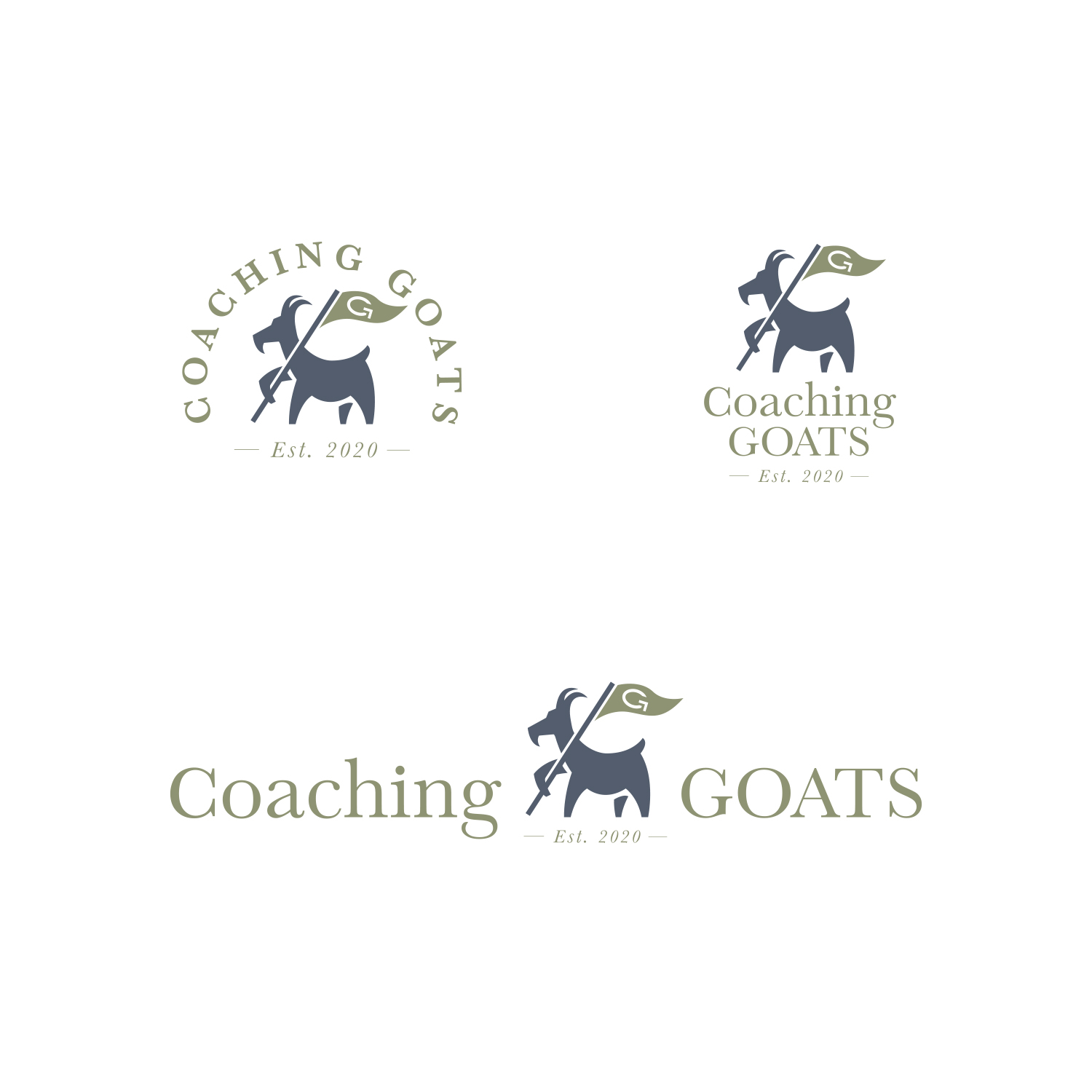
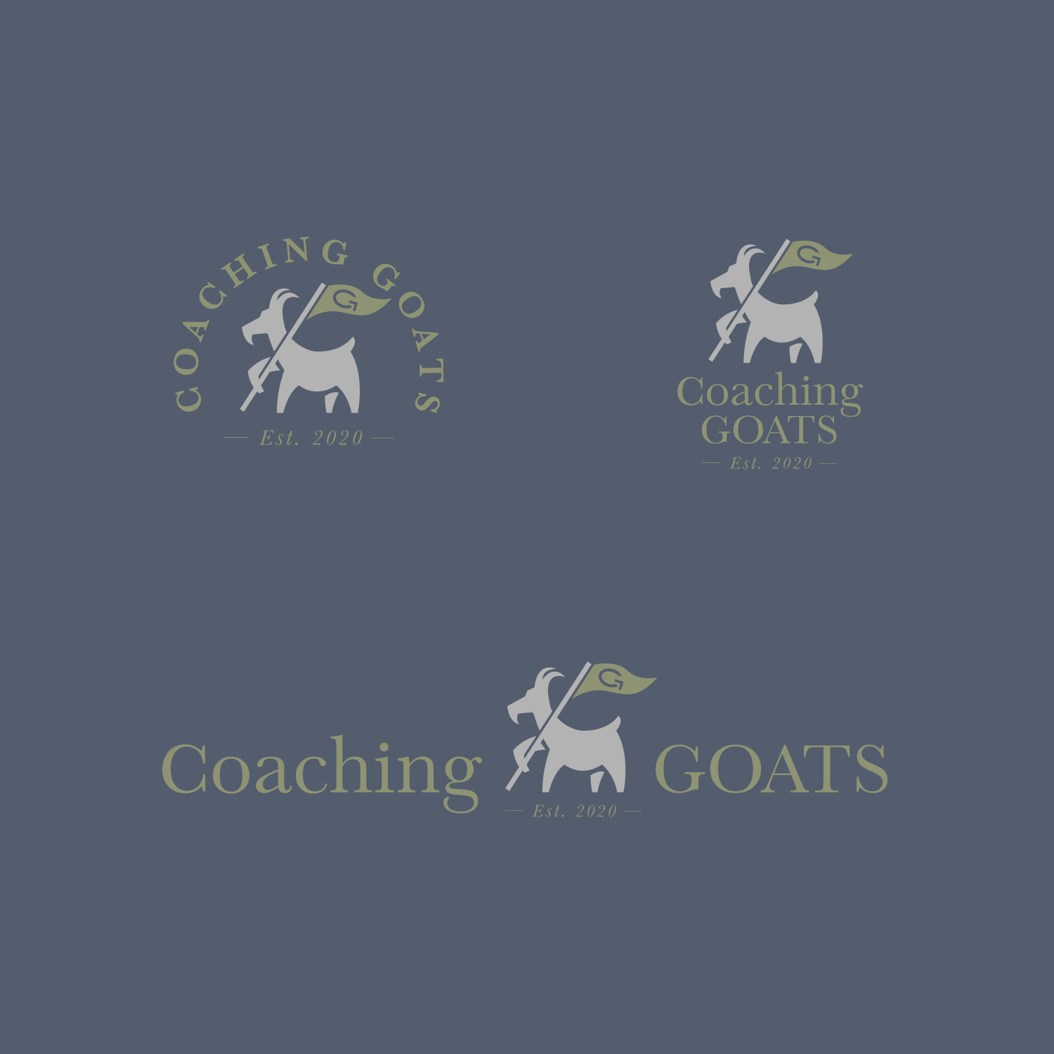
![]()
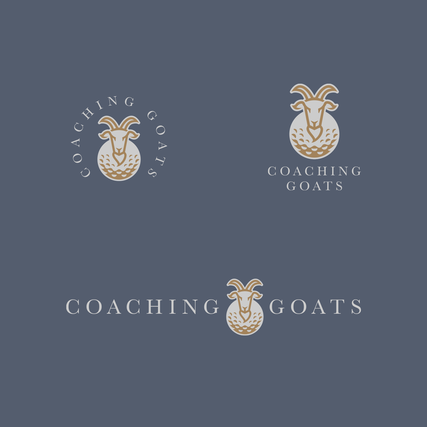
LOGO OPTION 2:
This logo features a simple line drawing of a goat head with a body that also make a golf ball. The look of this logo was inspired by premier golf course logos.
![]()
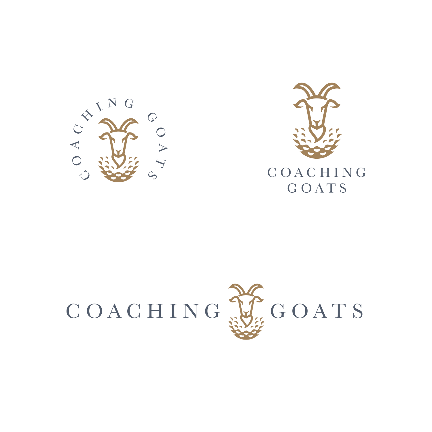
![]()
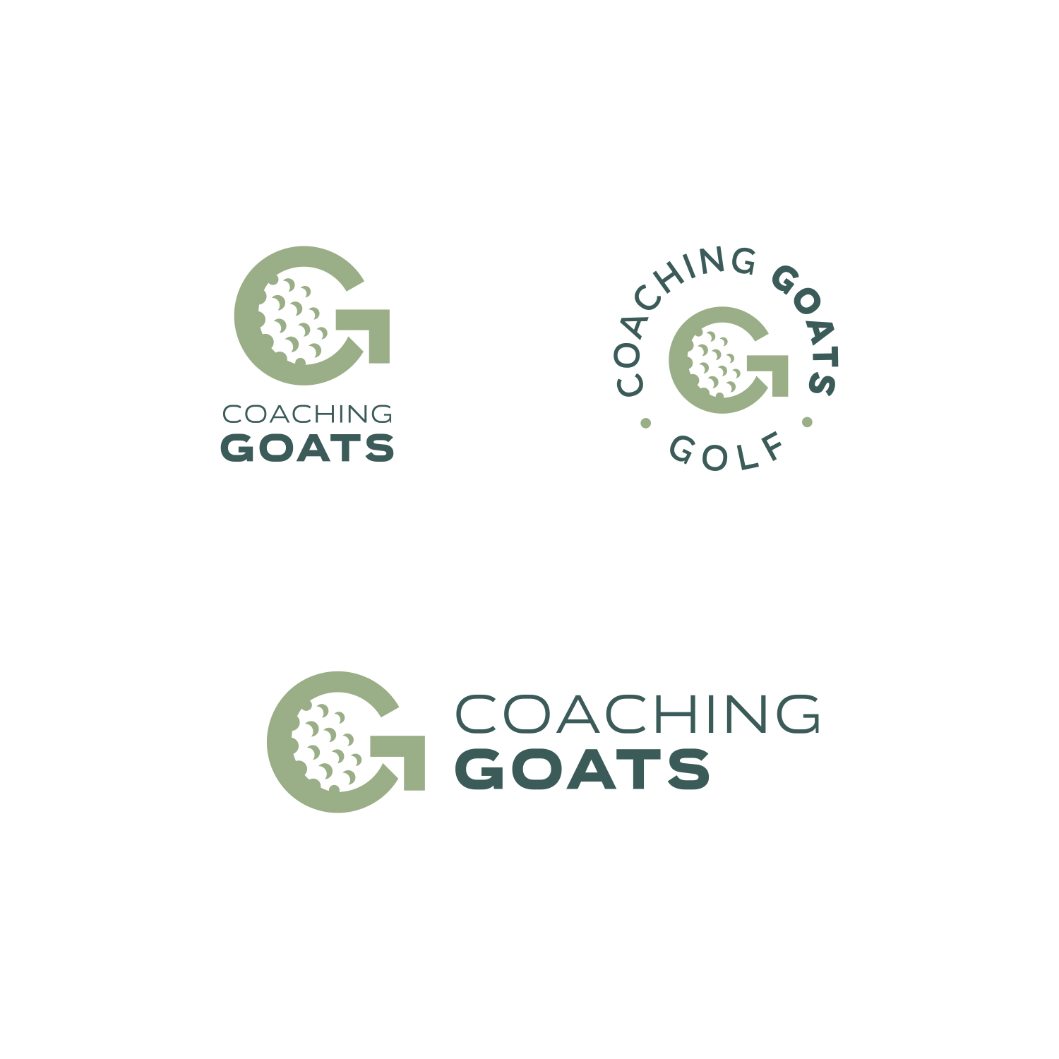
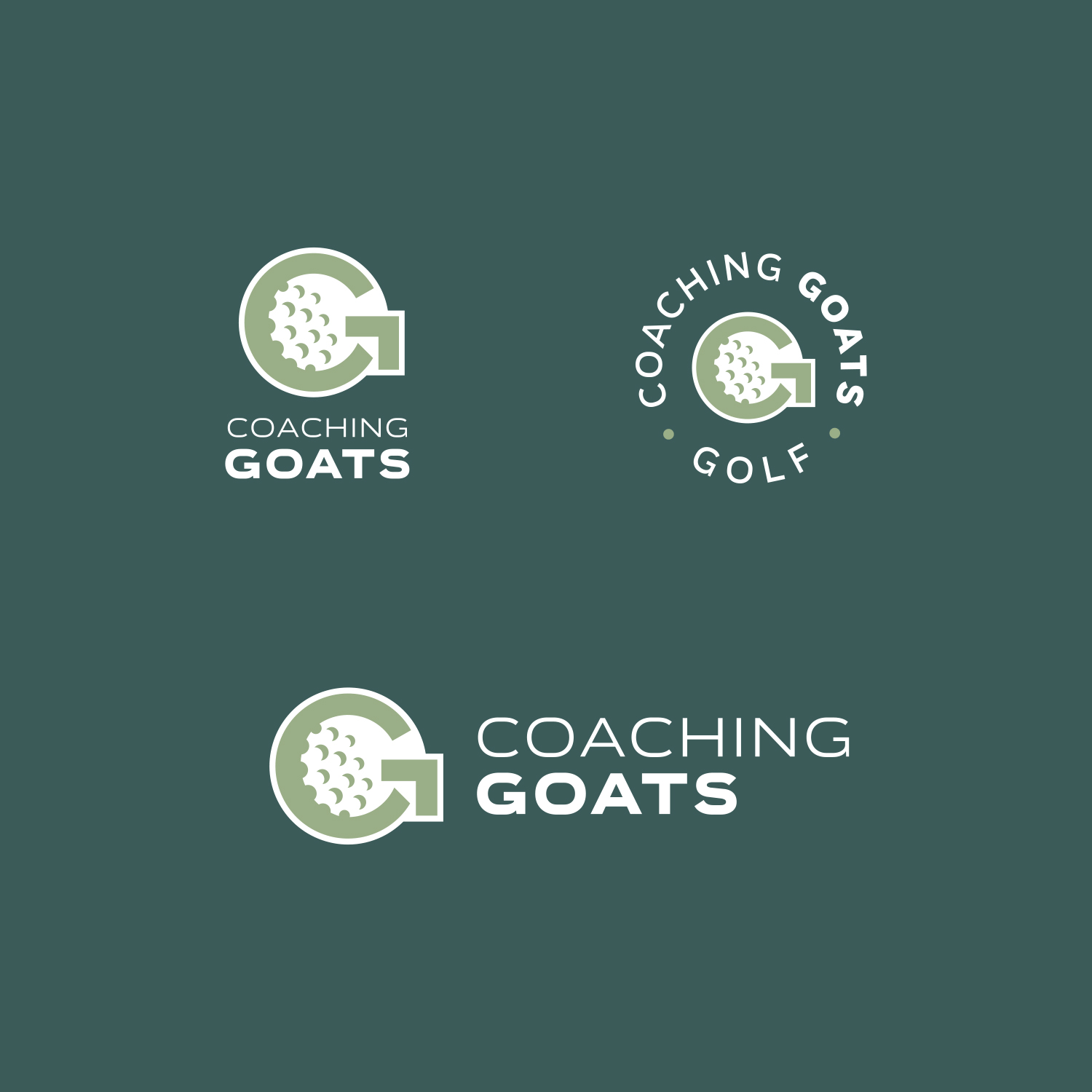
LOGO OPTION 3:
This logo features a “CG” monogram. Integrated into the logo is a C, a G, and a golf ball in the negative space. The “G” also creates a circular motion with an arrow that mimics a golf swing. This aesthetic was inspired by modern sports and golf club logos.
![]()
![]()
![]()
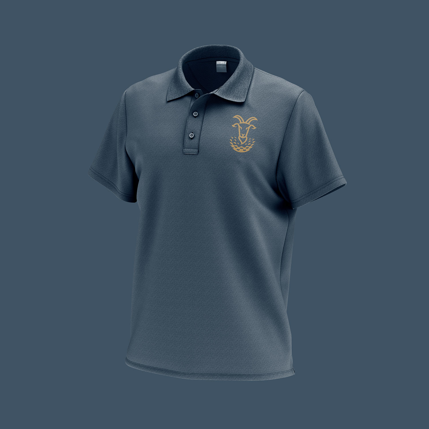
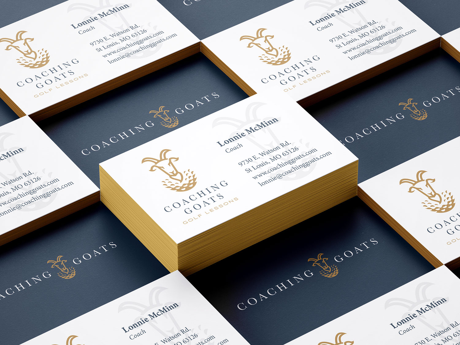
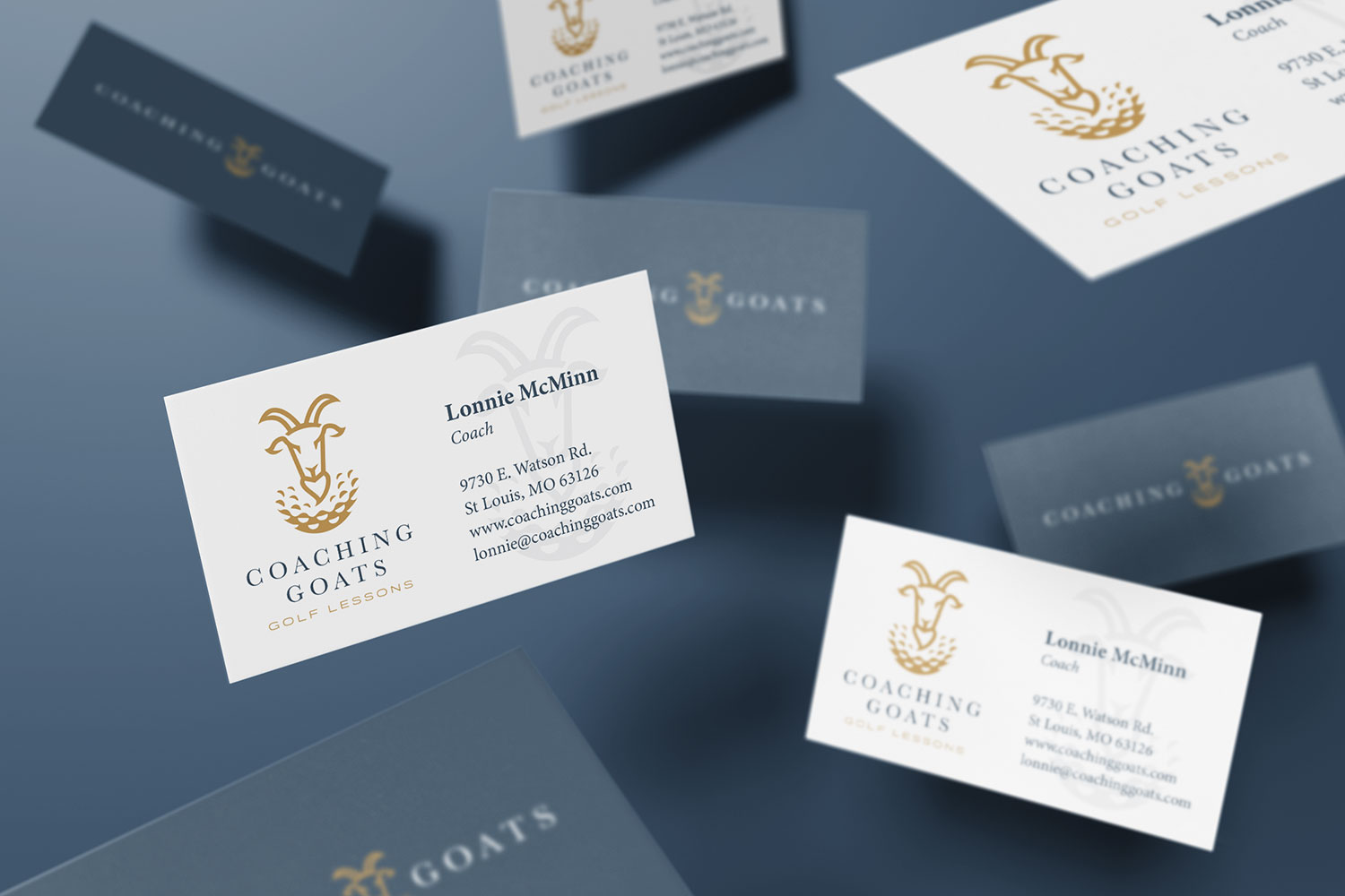
…And the Chosen Logo is:
![]()
Click here to see the entire branding package »
Want to see more of our logo design work? Click here to view our logo design portfolio, or click here to view some of our branding projects.