Logo Design for Marion, IL Chiropractic Office
Visual Lure was recently contracted to design a new logo for Galt Chiropractic, a Marion IL chiropractor. The client requested a modern, typography-based logo with some sort of graphic element/embellishment. We used a strong sans-serif typeface to make the logo feel modern and we added a wavy curve to soften it up and to fulfill the request for a graphic embellishment. Not only does the wavy accent soften the logo, it also mimics the spine’s curvature when an individual is lying down – as a patient would do in a chiropractor’s office. Below is the final logo design, in a vertical and horizontal format, along with a sample business card and letterhead.
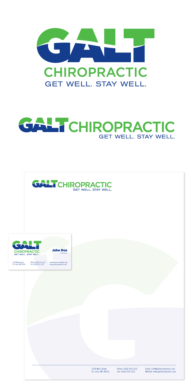
Learn more about our logo design services and don’t forget to check out our logo design portfolio.




 Visual Lure was recently contracted to design a logo for Midwest Terminals of Toledo Inc., a railroad company located in the Toledo, Ohio area. They had an existing company with its own logo and needed a new logo for a newly established one, both with the same name except one ended in International and the new one in Inc. They wanted the new logo design to complement the existing logo, but establish a clear division between the two companies. They did not want the two logos to resemble each other at all.