OUR BLOG

Here you will find our latest works, company news and more. We update it on a regular basis so be sure to come back soon. Please like, share, pin or tweet the post you enjoy.

Logo Design & Branding for a Pennsylvania Photographer

Posted on April 20, 2015

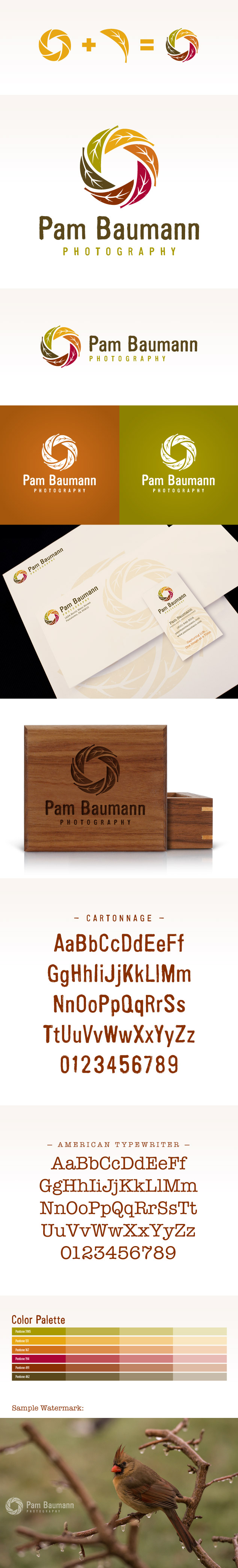
We had the pleasure of meeting Pam Baumann at this years Shutterfest. Pam is a professional photographer based out of Limerick, Pennsylvania. She originally started out as a nature photographer and is now focusing more on family and individual portraiture. When we met Pam she had no idea what she wanted her brand to look like. Since we were in the trade show area, I decided to start helping her define her brand by visiting the Photo Flash Drive booth. I asked her what style of zip drive or box was she drawn to. She walked right past the modern crystal drive, and the high-fashion alligator skinned boxes and went immediately towards the premium wood packaging. This was the start of defining her brand. We then discussed what large named brands have an aesthetic that she gravitates towards but she couldn’t think of any. As we walked through the trade show we were discussing the booth designs, that’s when she saw one she really loved. I can’t recall the name of the company, but the booth used worn corrugated metal, reclaimed wood, earth tones and had a very rustic look and feel, yet it still felt inviting and warm. She instantly said that was the direction she wanted to go. Once I saw that booth it reminded me of Timberland, the boot company, so I mentioned that brand to her and she agreed that it had elements she liked.

From there, we discussed what type of logo she wanted, a type-based logo, a monogram, a crest of some kind or one with an icon. Without hesitation Pam said she wanted an icon. We then talked about what the icon could be, as the best ones have some type of meaning behind them. The conversation started with Pam possibly wanting to use hills, a sunset with trees, etc. but I told her icons need to be simple. It then went into possibly using a camera aperture or shutter, which I hate to use unless it is incorporated in a clever and memorable way. We despise photography logos that use generic cameras or shutters, they feel so impersonal and cliche.

This led us to the discussion of possibly using a tree which is a great symbol for family. We talked about using a tree with her initials hidden in the branches, but she was not sold. The conversation then moved into using a leaf or leaves. By this time Pam’s visual brand was pretty well defined. It was natural, rustic and colorful yet warm. That is when it hit me, using leaves to create an camera aperture. I drew a quick sketch and Pam was instantly sold. My first concern was has it been done before, I searched a couple of the largest logo databases along with Google Images and found nothing. This made us both extremely happy.

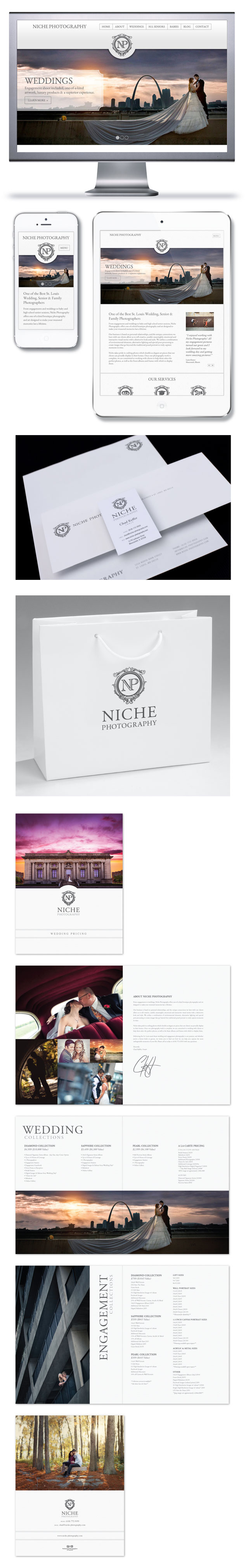
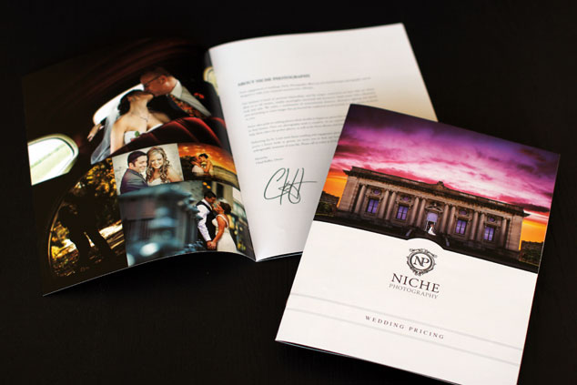
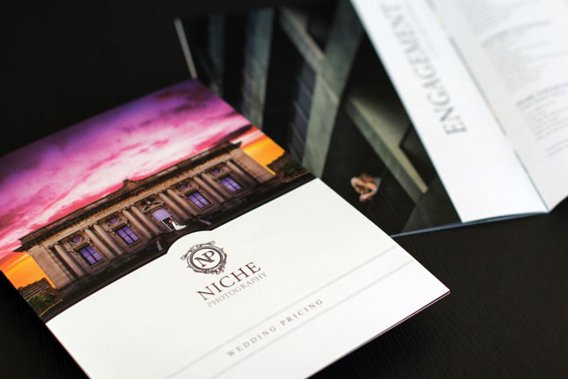
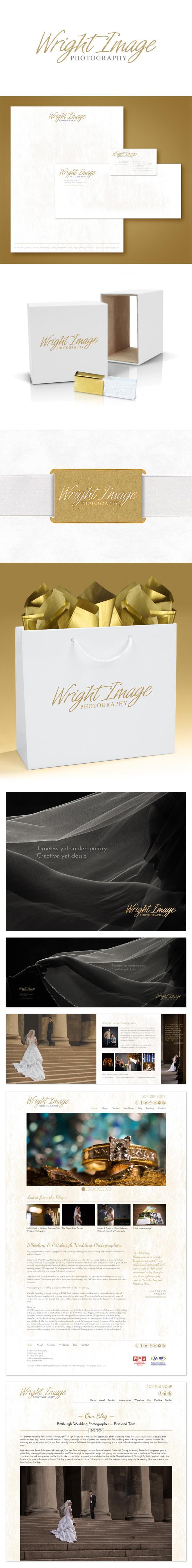
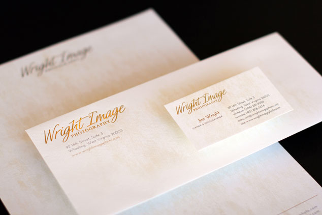
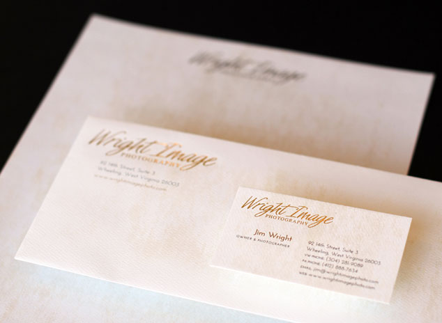
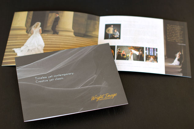
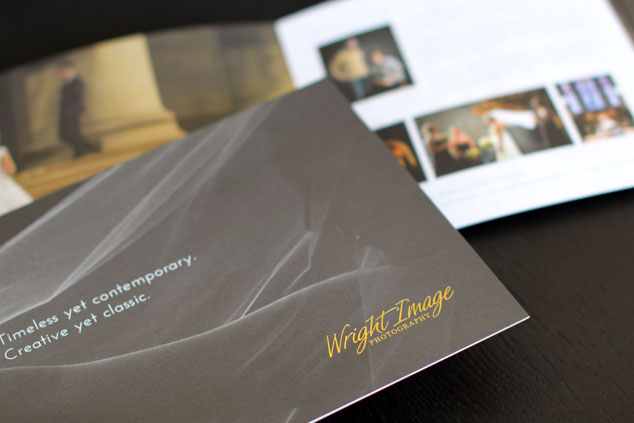
Below in Pam’s new logo along with the beginning stages of her visual branding package, including sample identity, flash drive packaging, typefaces and color palettes.

Pam-Baumann-logo-branding

Do you need help defining your brand and implementing a full identity package to match? Give Visual Lure a call today at 618-407-9231, we would love to help you find your brand.

Click here to view more of our photography logos and branding packages »


50th Wedding Anniversary Save the Dates & Invitations

Posted on January 21, 2015

My in-laws just celebrated their golden 50th wedding anniversary – and as a good son-in-law, who is also a graphic designer, I was in charge of designing the save-the-dates and the invitations.

Below you can see the save-the-dates. Underneath that is a card we placed in the save-the-dates for friends and family to write a special note or memory that they shared with the couple. We later placed them all in a book and gave it to them as a gift. Beneath the note card is the return envelope that features two frames, one of the couple when they were married and the other to place the stamp.

At the very bottom is the invitation. Everything was printed by Schwartzkopf Printing.

50th Wedding Anniversary Invitations

Niche Photography Website Launch, Branding Package Update & Brochure Design

Posted on

Visual Lure recently launched a new website for Niche Photography. Niche Photography is a St. Louis area wedding photographer specializing in portrait, baby and high school senior photography. They are located in Mascoutah, IL and service the entire St. Louis and St. Louis metro east area. In addition to their new website, we updated their identity package and designed a new pricing brochure for them.

The new website was built using a fully custom designed, search engine friendly, responsive WordPress theme with a multitude of cool effects. The new site features a “sticky” menu that always stays at the top of the page. The logo mark elegantly fades away allowing the menu bar to use less vertical space. Other features include an easily maintainable home page slideshow, a unique rollover-effect for recent post on the home page, and masonry style responsive galleries. Click here to visit Niche’s new website.

We also updated Niche’s visual branding package by switching his logo to all grey (the logo mark was originally a Tiffany’s colored teal blue). Niche felt this switch made the brand more neutral or more appealing to the masses.

We wrapped up all these upgrades with an engagement and wedding pricing brochure. They will hand these out to potential bride and grooms at local bridal shows.

Niche Photography Branding & Website

Update: We recently received printed samples of the new brochure and had a chance to photograph them. They turned out fantastic!

niche-brochure-design1

niche-brochure-design2

View more of our photography logos and branding packages »


Complete Branding Package for a Pittsburgh Photography Studio

Posted on December 18, 2014

We recently wrapped up a complete visual branding package for Wright Image Photography, a Pittsburgh area family and wedding photography studio. We actually started with their logo and website last year and just completed the letterhead system, packaging and wedding brochure. The new pieces will utilize specialty printing with the logo being gold foil stamped on the letterhead, paper bags and wedding brochure.

Sticking with the white and gold color theme, we selected a crystal flash drive with a gold cap from photoflashdrive.com and we found brass metal business cards at mymetalbusinesscard.com (that look gold). These will we be used for the labels on their large prints and canvases – which will be wrapped in white craft paper and a white ribbon. As mentioned before, the bag will have a gold foil stamped logo, and patterned or solid metallic gold tissue paper will top it off.

Due to the custom search engine optimized WordPress website we created for them last year, they have more than doubled their weddings for next (all without any additional marketing). This bump in income has allowed them to reinvest in the company and they are now working on creating a solid marketing plan for next year. We are also currently converting their existing website to be responsive to improve traffic, lower the bounce rate and provide a better overall user experience.

It is always a pleasure to work with clients that understand and value the power of good design and cohesive visual branding. If you are one of those people, give us a call today, we would love to help take your business to the next level.

wright photography branding package

Update: Printed samples of the new brochure and identity design package just came in. They printed beautifully!

wright-identity-design2

wright-identity-design1

wright-brochure-design2

wright-brochure-design1

View more of our photography logos and branding packages »


New Logo for a Chicago Glamour/Fashion Photographer

Posted on November 26, 2014

Jeremy Cheshareck is a portrait and glamour photographer located in Joliet, Illinois, just south of Chicago. His photography is edgy with a high-end fashion aesthetic. After meeting with Jeremy, he had just decided to break his current brand into two entities: Jeremy Cheshareck Photography and J. Chez Photography. Jeremy Cheshareck Photography will focus on high school seniors and portraiture, and J. Chez will focus on glamour and fashion. He chose to split the two because he didn’t want to alienate seniors and their parents with his more risque fashion work. We, along with the Salvatore Cincotta team, helped him come up with J. Chez Photography. This name keeps his new brand personal but allows him to market to a completely different audience.

Jeremy didn’t want his new logo to feel like a photography logo and he really wanted to incorporate lions into the design somehow. Below is the new logo along with a sample identity package, including business cards, letterhead and envelopes. The new logo features a J.C. monogram sandwiched between two lions and topped with a crown.


J. Chez Photography branding/logo design

Update: Here is the logo with a new steel effect added to it.

J. Chez Photography Logo Steel effect

…and the new logo for his sister brand Jeremy Cheshareck Photography:

JC-photography-logo

View more of our photography logos and branding packages »


Save the Dates, Invitations & Programs for Jackie Joyner-Kersee’s Gala

Posted on November 25, 2014

Visual Lure, in collaboration with The Hauser Group, had the honor of designing this year’s save the dates, invitations and programs for Jackie Joyner-Kersee’s Gala entitled Sequins, Suits & Sneakers. The event raises money to support the Jackie Joyner-Kersee Foundation & Center, who’s mission is to provide children, adults and families with the resources they need in order to improve their lives and to enhance communities world-wide, with special attention to East St. Louis, Illinois. This years event was held at the Hilton at the Ballpark in Downtown St. Louis.

graphic design for JJK

Branding Package for a North Carolina Photographer

Posted on November 19, 2014

Warren McCormack is a very talented photographer located in Cary, North Carolina. I had the pleasure of meeting Warren at last year’s Shutterfest as he assisted me with setting up my presentations on branding and search engine optimization (SEO). Warren recently contracted me to help him build a cohesive visual branding package.

Not all the branding and identity work we do starts from scratch. That is the case with this project. Before Warren came to us, he had a hodgepodge of branding materials. Much of his marketing and collaterals used different color logos and overall his pieces did not complement each other as a good visual brand should. That is where we came in.

Warren liked, and wanted to keep his existing icon. He just wanted to upgrade the typography in the logo. He also wanted us to help him tie everything together so that his brand had one cohesive look and feel. Other than that, his only request was to design using a SIMPLE and CLEAN aesthetic.

Below you can see our work to date (right underneath his old logo). The original logo was sometimes used in grey and other times in black. The icon was much too large for the type and the typography didn’t really complement the icon. The new modified logo is better balanced and the new custom designed W and M in his name help tie the icon and type together. In addition to the logo upgrade we helped Warren make sure that his new identity system and packaging all matched (which can all be seen below).

This is an open project, so check back soon for any updates, and contact us today if you need help with your branding, logo or packaging. We would love to help.

Warren McCormack Photography Branding