Visual Lure recently partnered with a local cleaning company to undergo a comprehensive rebranding. Our extensive package encompassed logo design, identity design, branding materials, advertisements, website development, and ongoing SEO services. The previous company name, “The Clean Queen,” was initially fitting when it was comprised of a small group of women. However, as the company expanded and welcomed both men and women into its team, it became necessary to update the name. Additionally, considering the client’s aspirations for possible future franchise expansions, a more versatile name was desired.
We embarked on the rebranding journey by focusing on the logo design. Presented below are the initial options we developed. The top option showcases a sun rising against a blue sky, symbolizing a “starting a new day”, complemented by two leaves representing “freshness”. The middle option features a simple yet elegant custom hand-drawn typeface – exuding cleanliness and freshness. Lastly, the bottom option incorporates clean sparkles to form a letter F monogram.
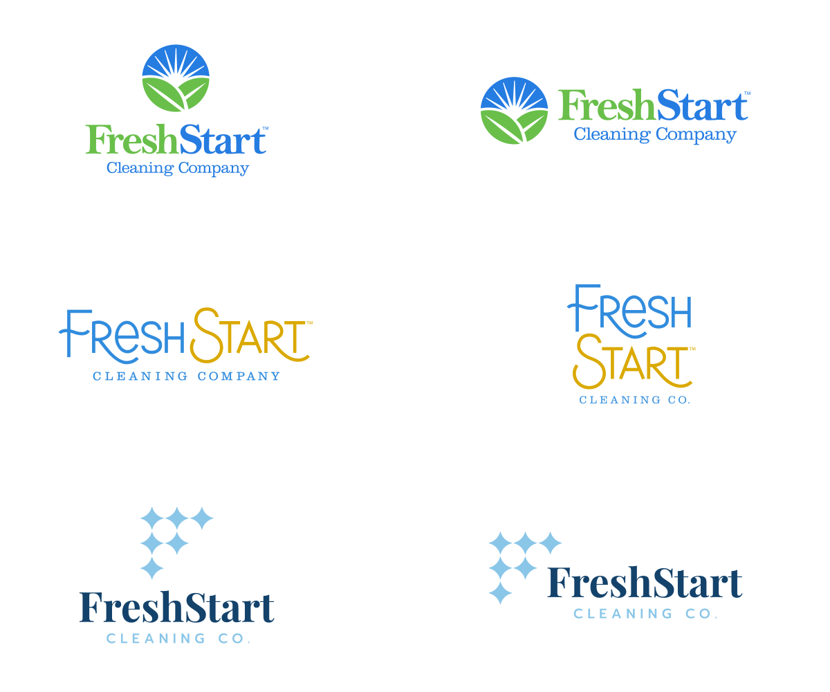
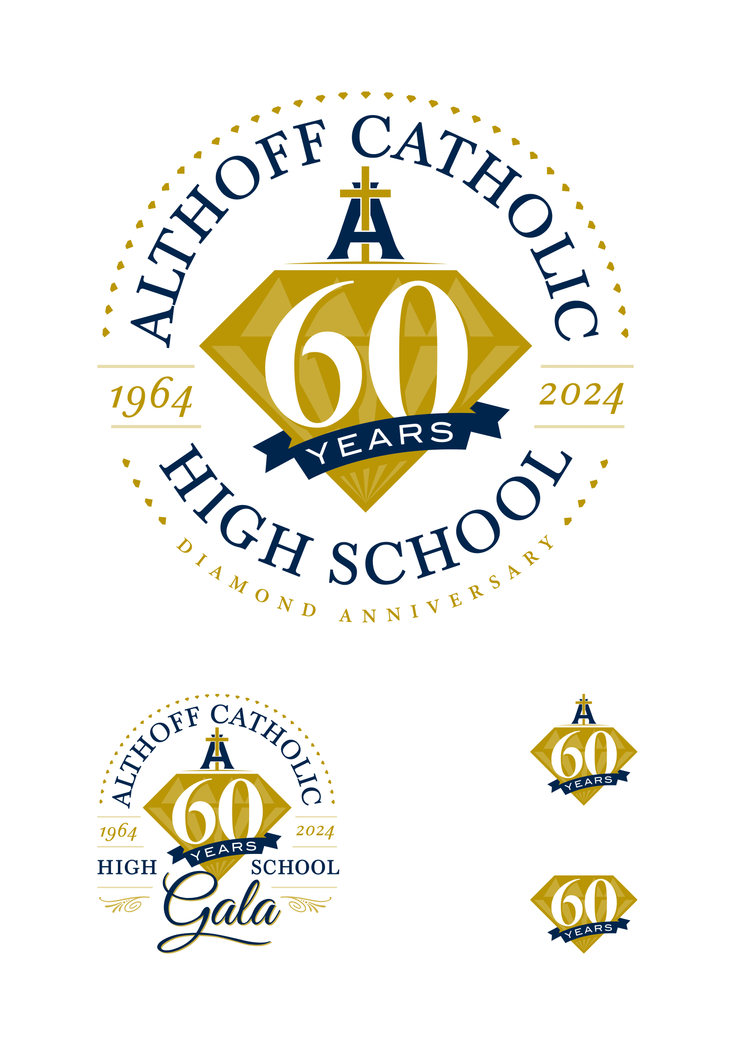
After careful consideration, the client selected the following option as their preferred logo. Here are all the final logo lockups we delivered: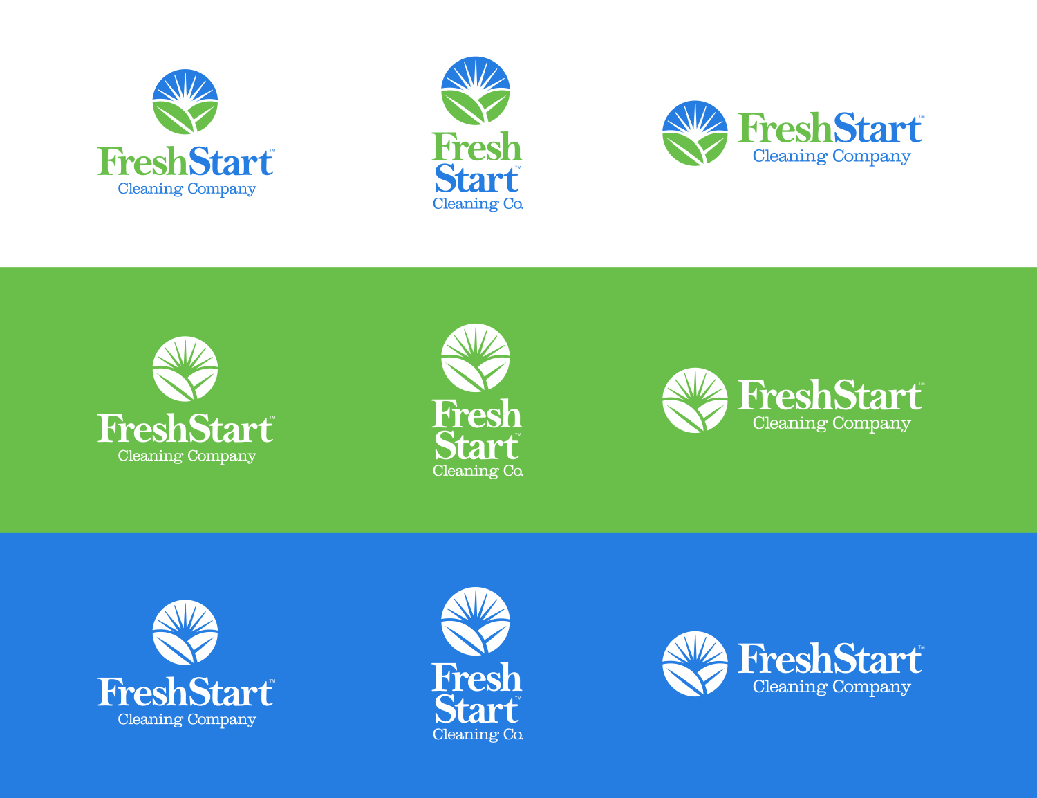
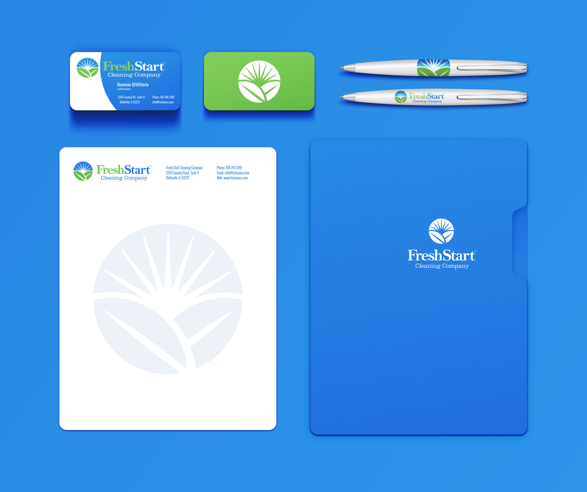
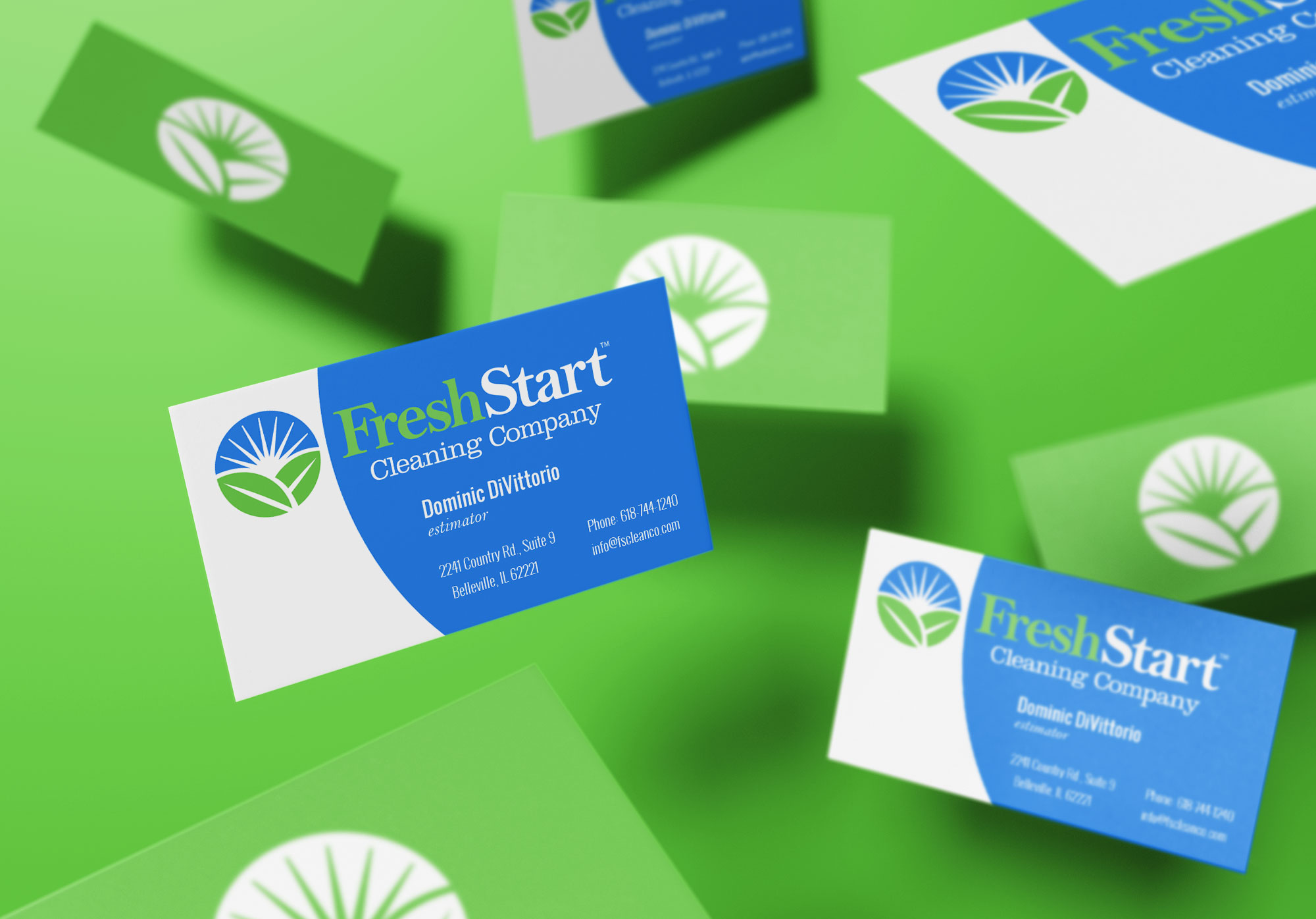
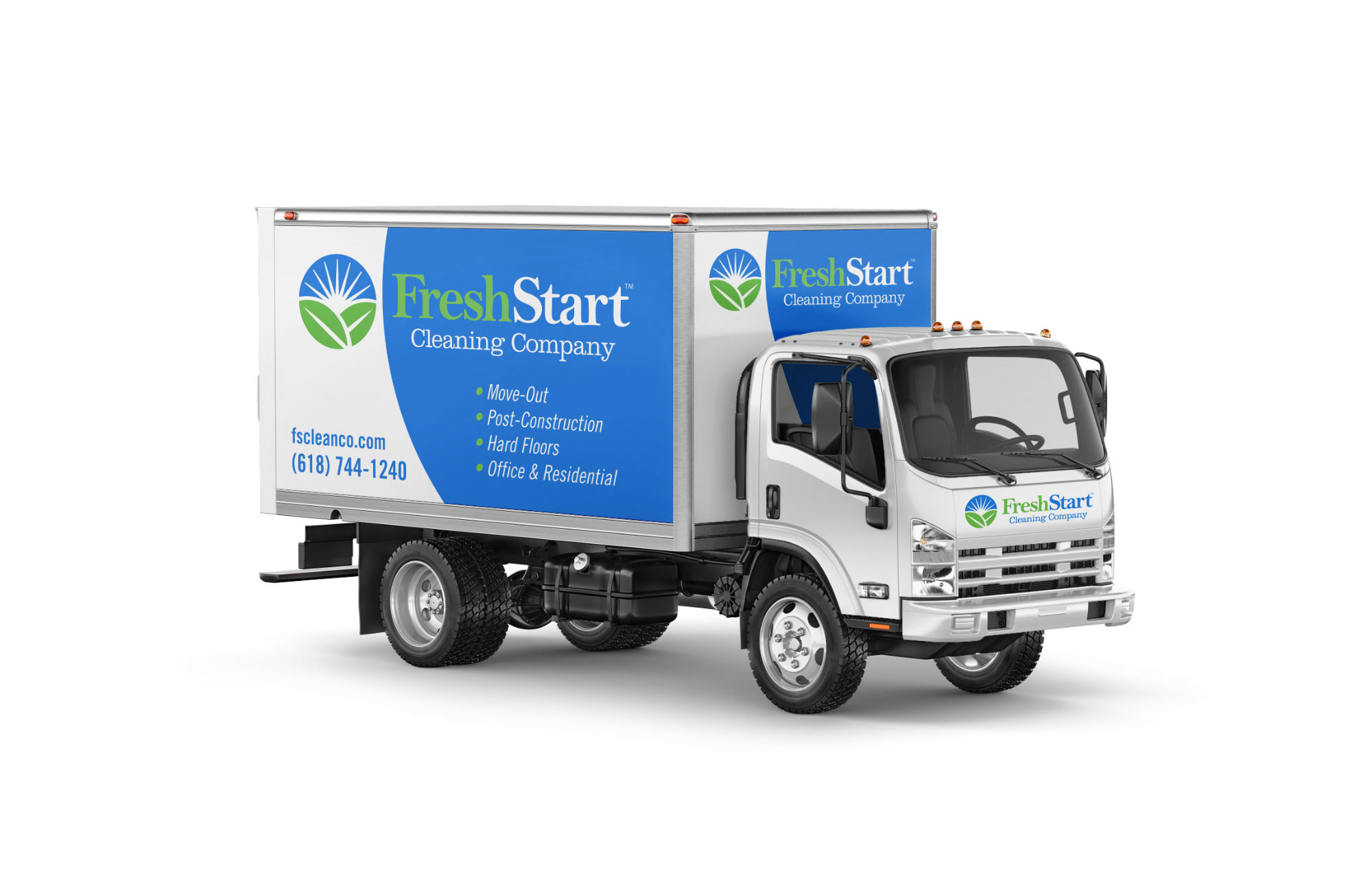
Building upon the logo, we proceeded to develop a comprehensive identity package for the client. This included a basic styling guide, business cards, letterheads, trailer, and additional supplementary materials.
We wrapped up the package with a fully custom, search engine optimized WordPress website.
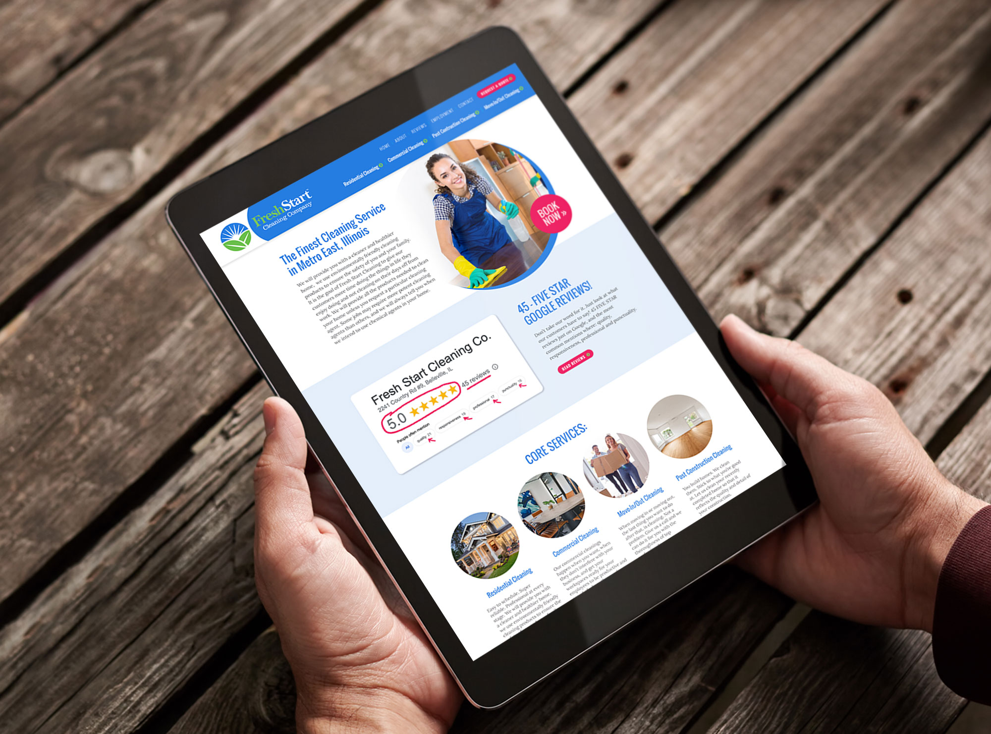
Furthermore, we are committed to providing ongoing SEO services and consulting to ensure the client’s website achieves high rankings and effectively converts visitors into loyal customers.
We are thrilled with the final outcome and firmly believe that the new brand exudes an exceptional sense of cleanliness and freshness.
Check out the new Fresh Start Cleaning website at www.fscleanco.com »
Click here to see the entire branding package »