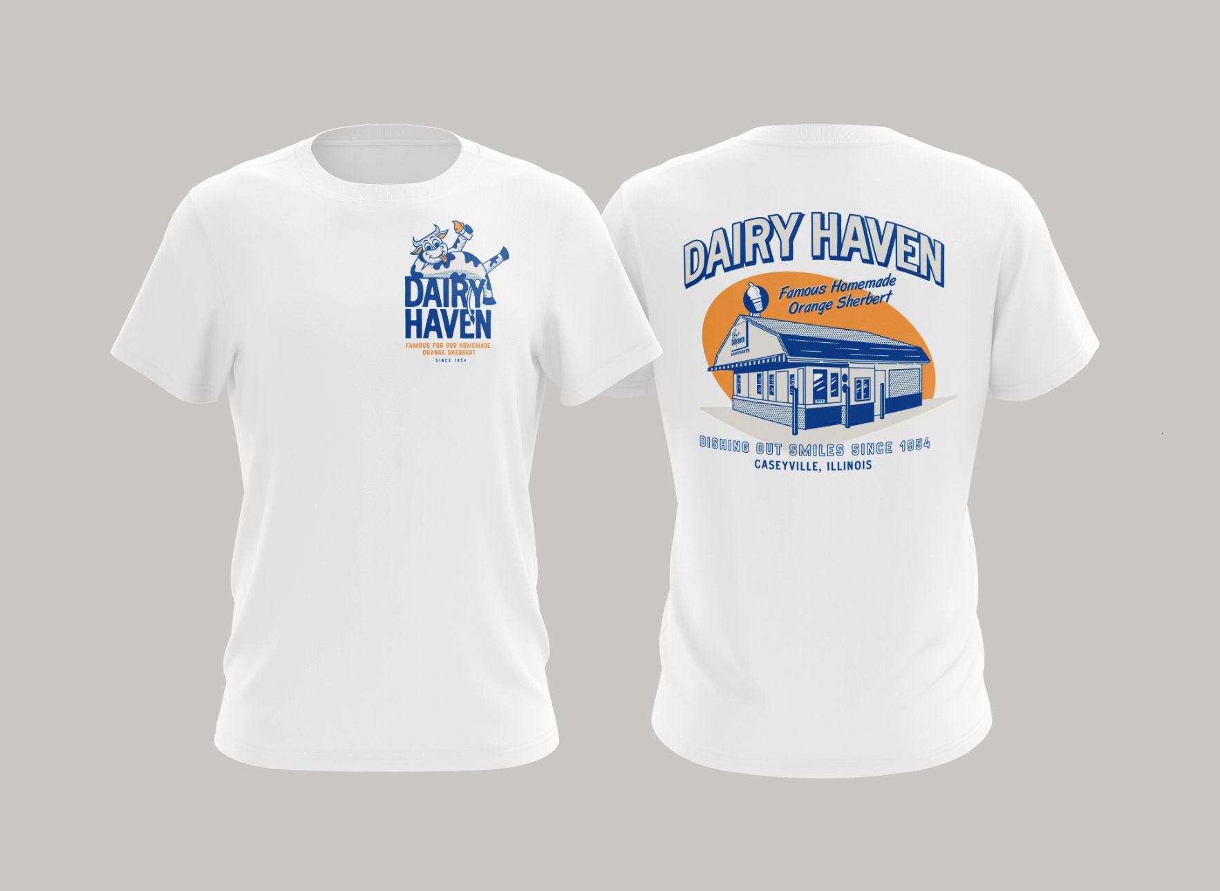
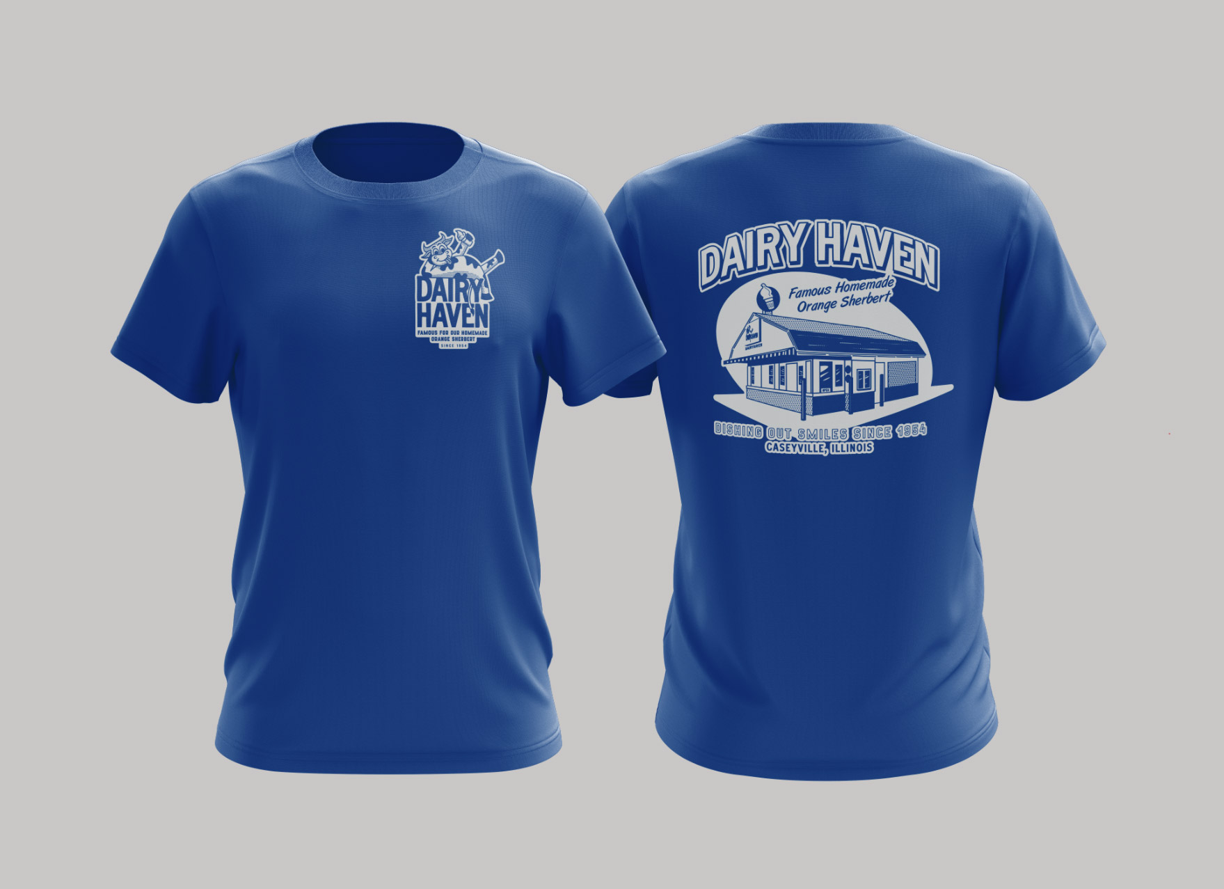
Cost Effective Coffee Packaging for Multiple Blends & Flavors
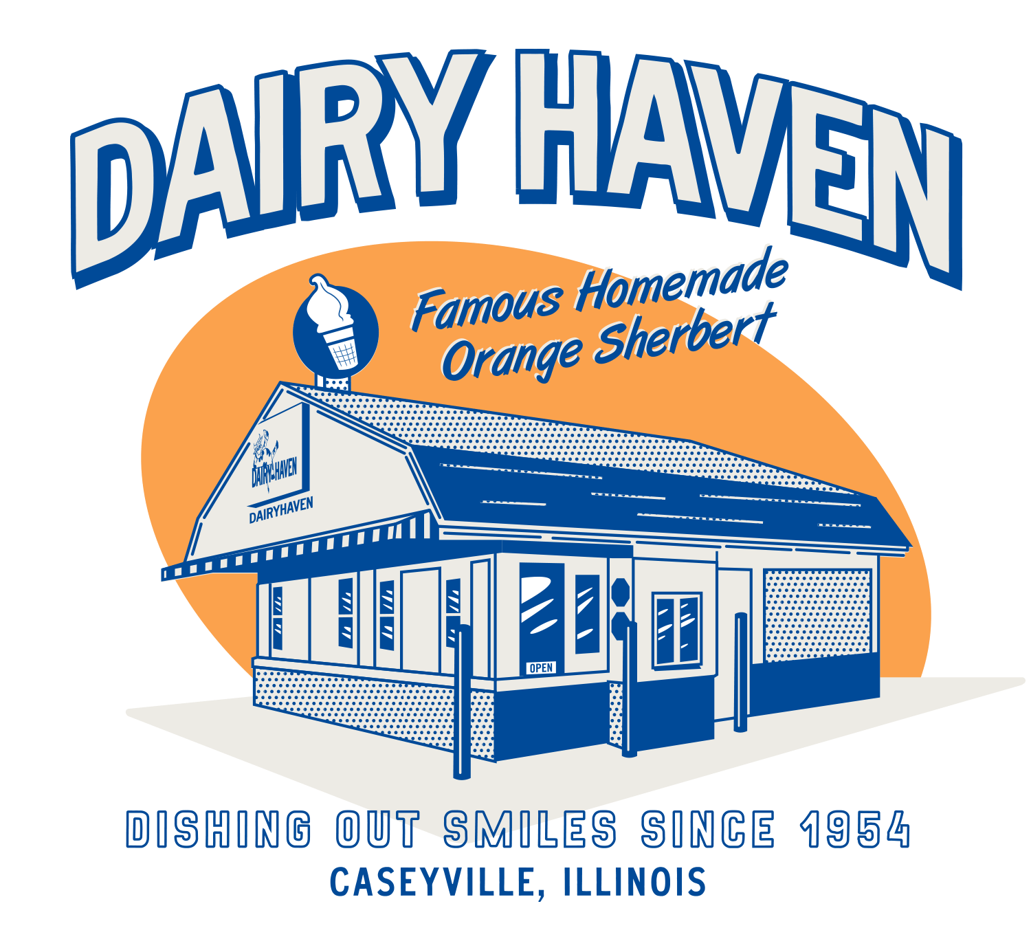
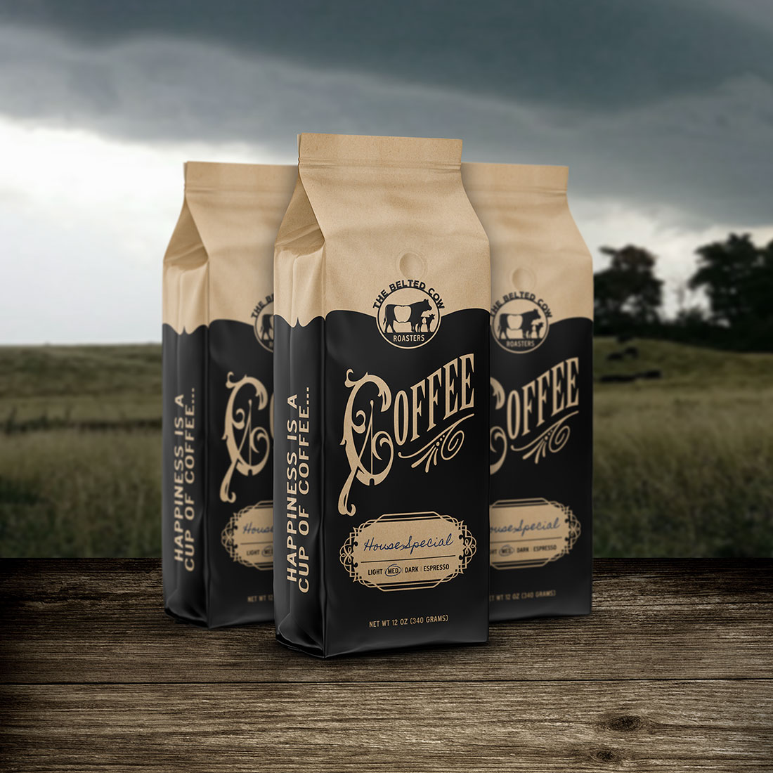
The Belted Cow approached Visual Lure seeking a cost-effective packaging solution for their in-house fresh-ground coffee, which featured multiple blends. Our team devised a creative and practical approach tailored to their needs.
We designed a single bag layout with a customizable section for the coffee name and a checklist of all their blends. The bags were printed by Roastar on an uncoated matte material, providing a premium yet understated look. To complete the customization, they simply use a pen or marker to write the coffee name and circle the appropriate blend.
This solution not only met their budget and functional requirements but also perfectly captured the essence of their small-town, personalized charm—reflecting exactly what The Belted Cow represents.
The design and aesthetic drew inspiration from the timeless charm of an old western supply store or trading post. This approach infuses the packaging with a sense of handcrafted authenticity and nostalgic appeal, evoking a connection to a bygone era.
Ready to Elevate Your Coffee Packaging?
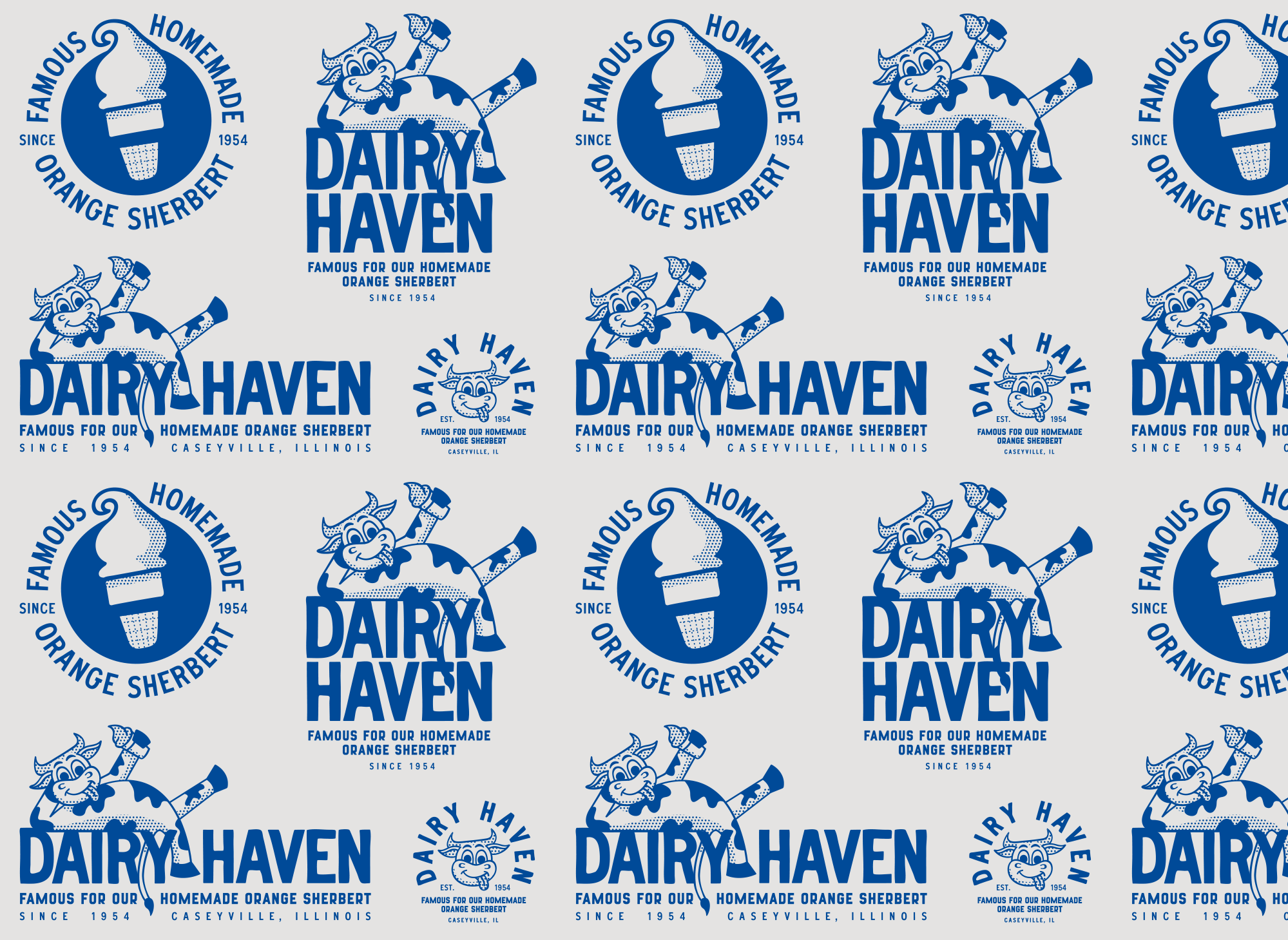
Visual Lure is a proud Certified Roastar Designer, partnering with the industry leader in custom coffee bag design. Roastar’s superior-quality bags offer unmatched versatility, perfect not only for coffee but also for a wide range of products—from food and snacks to health and beauty items.
Whether you’re crafting a personalized small-town vibe like The Belted Cow or need a standout design for your unique product line, Visual Lure delivers creative solutions that balance functionality, budget, and branding.
Let us help your packaging make an unforgettable impression. Contact us today to start your custom design journey!