OUR BLOG

Here you will find our latest works, company news and more. We update it on a regular basis so be sure to come back soon. Please like, share, pin or tweet the post you enjoy.

Christmas Card Design for St. Louis Metro East Engineering Firm

Posted on October 24, 2013

We are approaching “that time” of year again, the time to design Christmas cards so that there’s enough headway to get them printed, signed, addressed and mailed.

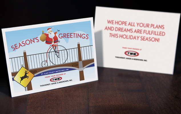
Here is Visual Lure’s first design of the year, a card for TWM, a St. Louis Metro East engineering firm. The card features Santa riding his bicycle on the St. Clair County Metro Bike Link, a bike trail designed by TWM that runs through Belleville and Swansea, IL. To make the card a little more festive, we added a Rudolph the Reindeer crossing sign.

graphic design christmas card TWM

Learn more about our graphic design services and donโ€™t forget to check out our graphic design portfolio.

Logo Design for San Francisco, CA Photographer

Posted on September 20, 2013

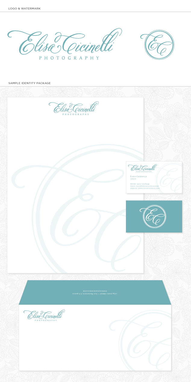
Visual Lure has been so busy that we’ve missed a couple projects we designed from a while back.ย  Months ago, we designed this logo for Elisa Cicinelli, a very talented photographer from San Francisco, California.ย  Elisa shoots everything from corporate and weddings, to high school seniors and families, and she services the greater San Francisco Bay Area, including Napa Valley, Sonoma, Peninsula & East Bay, Monterey and Carmel Valley. You can view her photography at www.elisacicinelli.com.

Below is the final logo and watermark we designed along with a sample identity package (letterhead, envelop and business card design).

san francisco photography logo Elisa Cicinelli

Learn more about our logo design services and donโ€™t forget to check out our logo design portfolio.

Brand Development for a Chicago, IL Construction Company

Posted on September 5, 2013

Visual Lure recently helped brand Sanardi Builders, a new Chicago, Illinois construction company.ย  Included in the branding package was a new logo, an identity package (business card, letterhead and envelope design) and some additional graphic design work. Below you can see all these pieces and how they work cohesively together.

The logo mark features the letter S that also creates the letter B.

chicago logo design for Sanardi Builders

Learn more about our logo design services and donโ€™t forget to check out our logo design portfolio.

Logo Design & Idenity Package for St. Louis Metro East Educational Company

Posted on August 29, 2013

Visual Lure recently designed a new logo and identity package for the da Vinci Tree, an educational training company focused on teaching children a technology-based curriculum.ย  The company is currently in its development stages and plans to launch soon in the St. Louis Metro East, then St. Louis with the ideal goal of eventual going national.ย  The logo design we created for them features Da Vinci’s Vitruve Luc Viatour (Vitruvian Man), who’s arms create branches and who’s legs create roots in order to from a tree.ย  We had fun designing this logo and we believe it was the perfect solution; clean, clever, simple and memorable – everything a great logo should be.

logo design, branding & identity design for da Vinci Tree

Learn more about our logo design services and donโ€™t forget to check out our logo design portfolio.

Complete Rebrand for Vancouver Photography Studio

Posted on August 28, 2013

Visual Lure is currently working on completely rebranding Konstantin Photography, a Vancouver British Columbia photography studio. Konstantin is a very talented photographer and his photography has a high-end fashion forward look so we came up with a simple and clean aesthetic to complement his work.

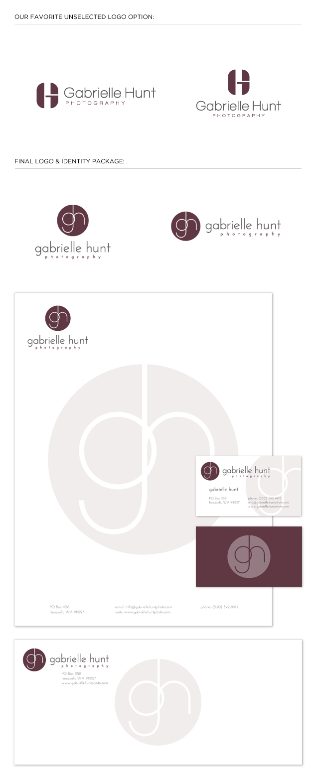
Pictured below is the final logo in two different formats, underneath that is the new identity package (business card, letterhead and envelope design) and the new homepage design for a fully custom search engine optimized WordPress website.


logo and website for konstantin photography

Learn more about our logo design services and donโ€™t forget to check out our logo design portfolio.

Learn more about our Word Press design and web design services, and donโ€™t forget to check out our web design portfolio.

Click here and like our facebook page to stay in touch and see all our latest work.

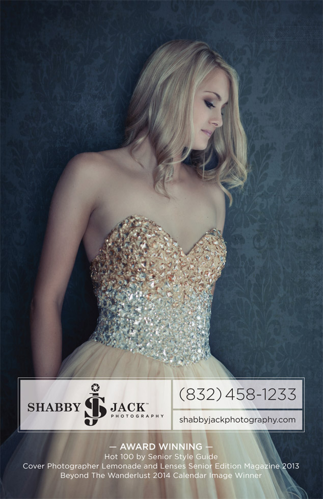
Update: Here is a print ad we designed for Konstantin to complement his new brand:

Konstantin Photography print ad design

Learn more about our graphic design services and donโ€™t forget to check out our graphic design portfolio.

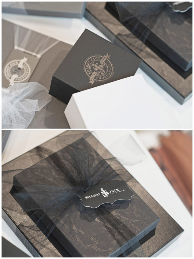
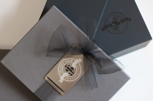
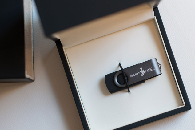
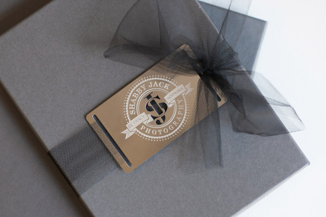
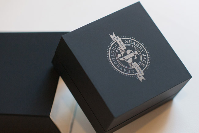
Update: Here is a mock-up of custom flash drives packaging that also complement his new brand:

flash drive package design

Check out more packaging design here ยป

CD Packaging Design for U.S. Air Force Band of Mid-America

Posted on June 19, 2013

A while back, Visual Lure was contracted by the United States Air Force Band of Mid-America (stationed at Scott Air Force Base) to design CD packaging for a new album dedicated to Clifton Williams, a famous composer and Air Force veteran.ย  The CDs turned out beautiful and we finally got around to photographing them.ย  They were printed on a nice textured uncoated card stock with Clifton’s signature embossed and foil stamped on the cover.

The cover design features Clifton’s signature, a collage made from three different images and a subtle classic border.ย  The inside covers have an additional photograph of Clifton along with some of his sketches and doodles.

The initial goal was to create packaging that felt vintage, and classy, and we think we succeeded at both.

U.S. Air Force Band of Mid-America CD packaging design 1

U.S. Air Force Band of Mid-America CD packaging design 2

If you are looking for quality packaging design, whether youโ€™re in the St. Louis, MO, the St. Louis Metro East or anywhere else in the country, contact us today!

Learn more about our graphic design services and donโ€™t forget to check out our graphic design portfolio.
St. Louis Packaging Design for Automatic Toilet Bowl Cleaners

Posted on June 13, 2013

A St. Louis Metro East manufacturer of automatic toilet bowl cleaners recently contracted Visual Lure to design its new packaging. They haven’t decided on whether to use the name Bright Bowl or Brite Bowl, and they wanted to have packaging design options for both.ย  However, once they reviewed our initial design options, they may utilize both.

Of their two main competitors, one uses blue packaging and the other uses green. They wanted their product to look completely different so they didn’t want to uses either of those colors. They also wanted their product to appeal to their main target audience, women, so we decided to use the color purple.ย  Color studies and research have shown that women like it.

Below are the two packaging design options we provided.ย  Check back soon to see if they use one design or both.

St. Louis package design for brite/bright bowl

If you are looking for professional packaging design, whether you’re in the St. Louis, MO area or anywhere else in the country, contact Visual Lure today.

Learn more about our graphic design services and donโ€™t forget to check out our graphic design portfolio.