OUR BLOG

Here you will find our latest works, company news and more. We update it on a regular basis so be sure to come back soon. Please like, share, pin or tweet the post you enjoy.

Logo Upgrade & Website for Riechers Truck Bodies

Posted on February 12, 2020

Visual Lure recently updated RIECHERS TRUCK BODIES’ logo and built them a new custom WordPress Website

Like so many companies, RIECHERS TRUCK BODIES was using multiple versions of a logo, each different. Different fonts, slightly different colors, etc. We cleaned up their existing logo – adjusting the spacing, making it easier to read, removed “& Equipment” allowing more room for “TRUCK BODIES”, and provided multiple options for one color uses.

In addition to the logo update, we also redesigned their mudflaps and the sticker that they add to every build. Everything now ties together better and looks more cohesive.
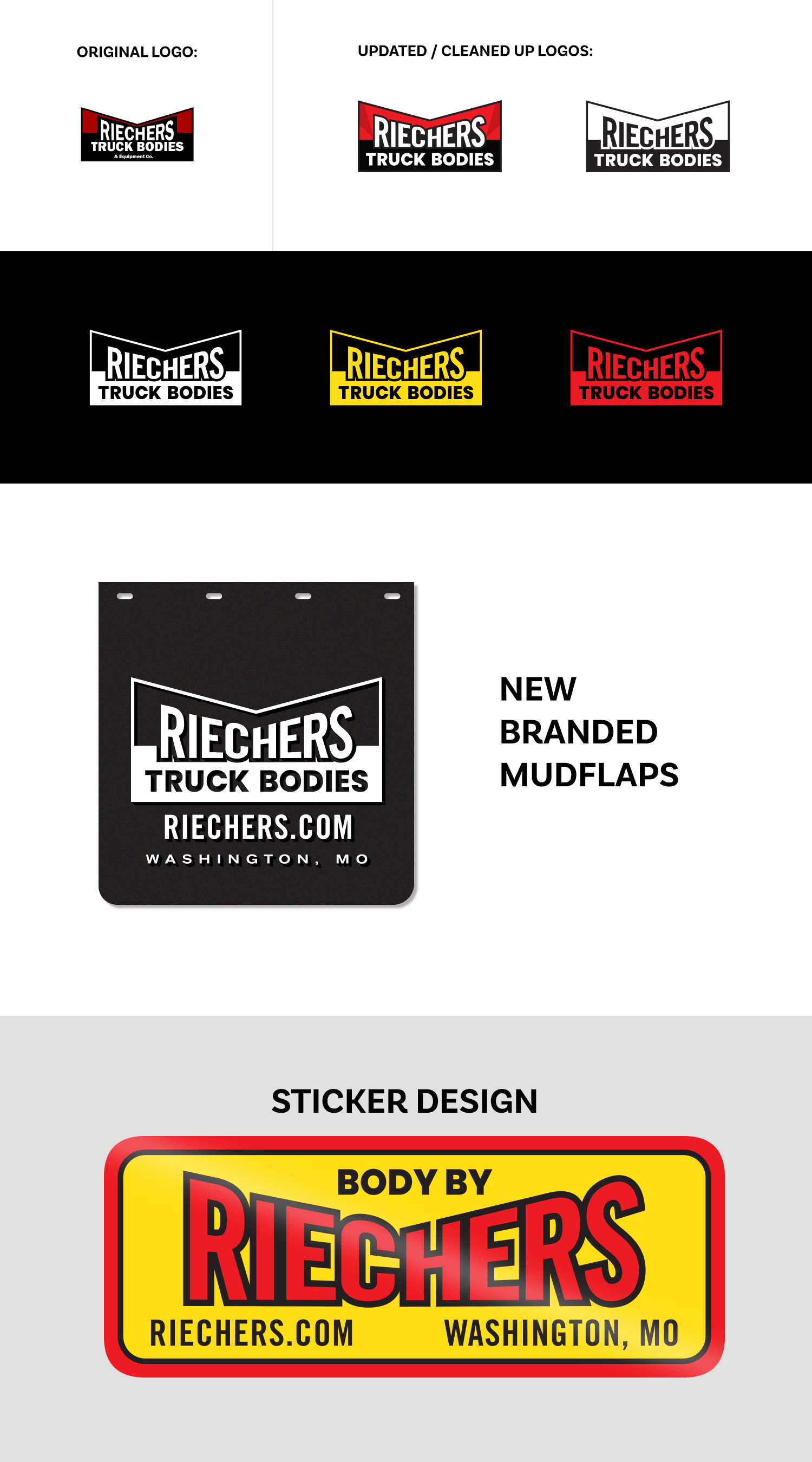
Riechers upgraded logo


Professional Photo Shoot

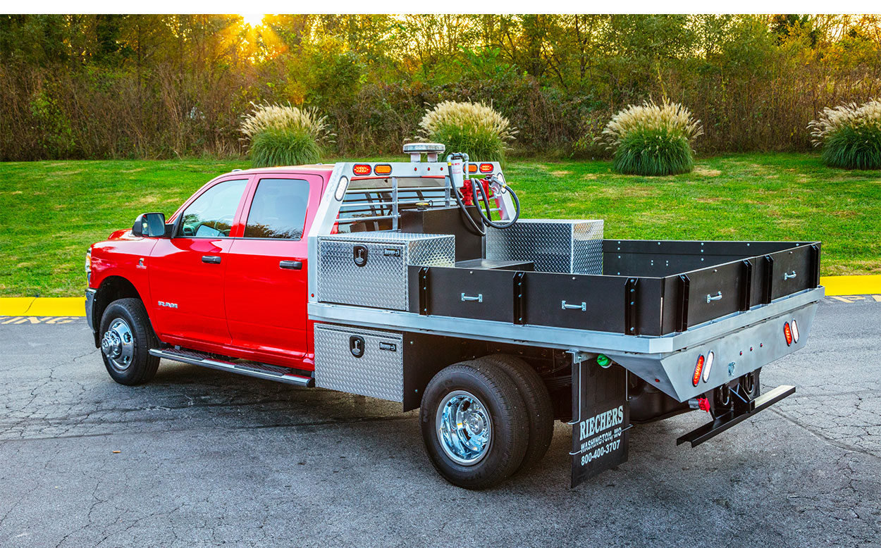
In addition to design, Visual Lure coordinated and art directed a professional photo shoot with the talented Matt Marcinkowski, a premier St. Louis metro east commercial photographer. Below are a handful of his deliverables.
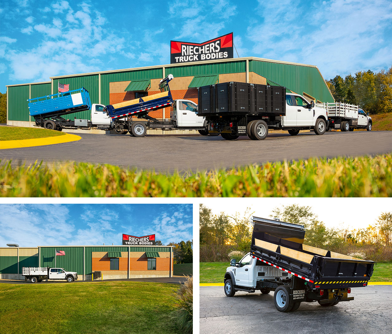
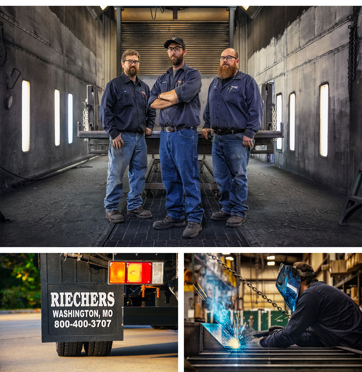
Riechers photoshoot 1Riechers photoshoot 2Riechers photoshoot 3


Custom WordPress Web Design & Development

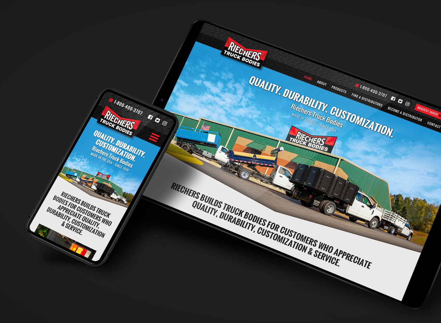
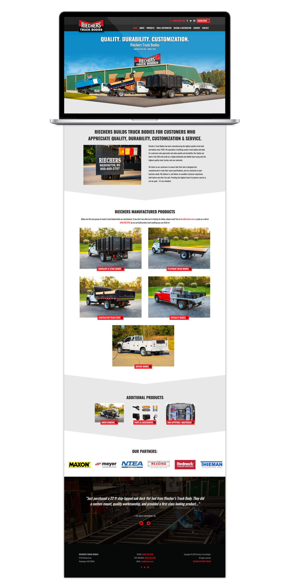
To finish this project, Visual Lure designed and developed RIECHERS a new custom WordPress website. The site is fully responsive rendering beautifully on any device, and features a sticky header for convenient navigation, custom post types for their product lines, and an easy to manage store locator.

CLICK HERE TO VIEW THE NEW WEBSITE ยป


Riecher new WordPress website design

Riechers full home page design

Want to see more?

Click here to check out our branding portfolio and see all the different types of companies and organizations weโ€™ve worked with. If youโ€™d like to see more of our work, click one of the following:ย  logo design portfolio |ย  graphic design portfolio |ย  package design portfolio |ย  website design portfolioย  โ€“ย  Better yet, give us a call or shoot us an email and we can discuss what we can do for you.


New Website & Brochure Design for St. Louis Metro East Apartment Complex

Posted on December 3, 2019

New Custom WordPress Website

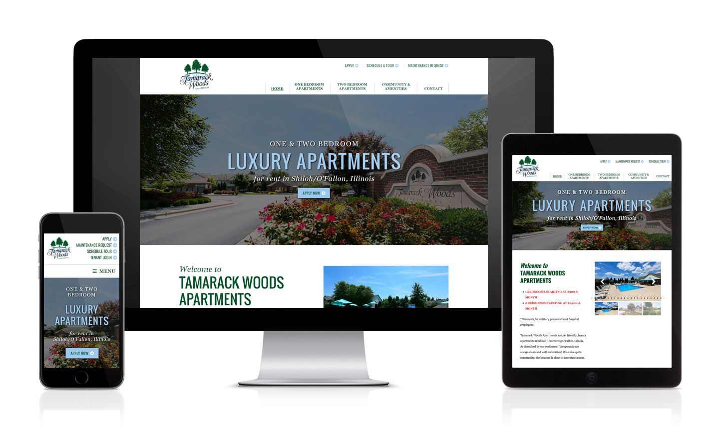
Visual Lure recently launched a new custom WordPress website for Tamarack Woods Apartments, a luxury apartment complex located in Shiloh, Illinois bordering O’Fallon. The complex is extremely well maintained and managed, and is located right next to Target, Dierbergs, tons of restaurants, and both new Memorial and St. Elizabeth’s hospitals. Interstate 64 access is a mile away, and its proximity to Scott Air Force Base make this a highly desired location – plus they offer military and hospital employee discounts.

Tamarack WordPress responsive Website

Visit Website ยป


New Accordion Brochure Design

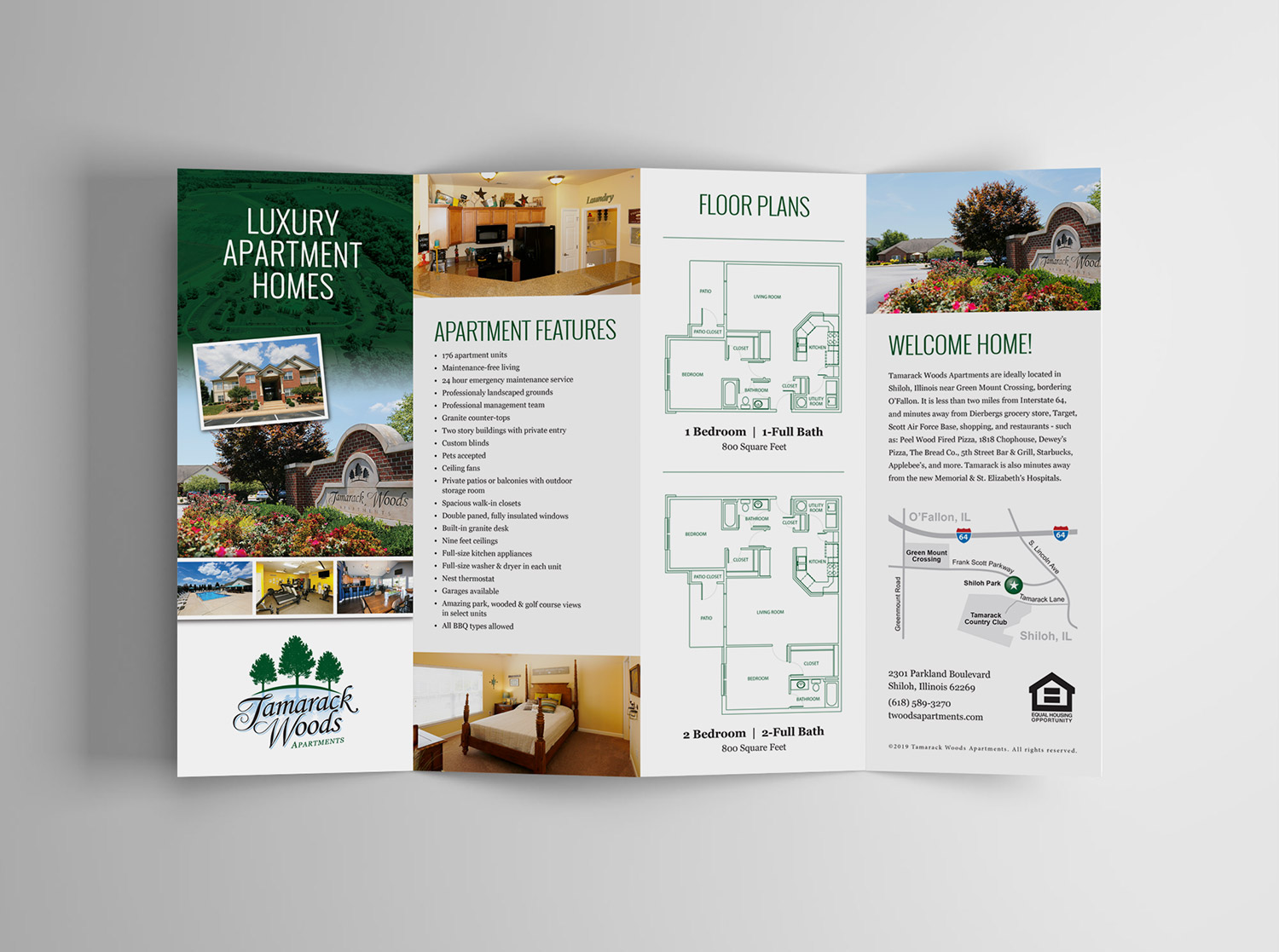
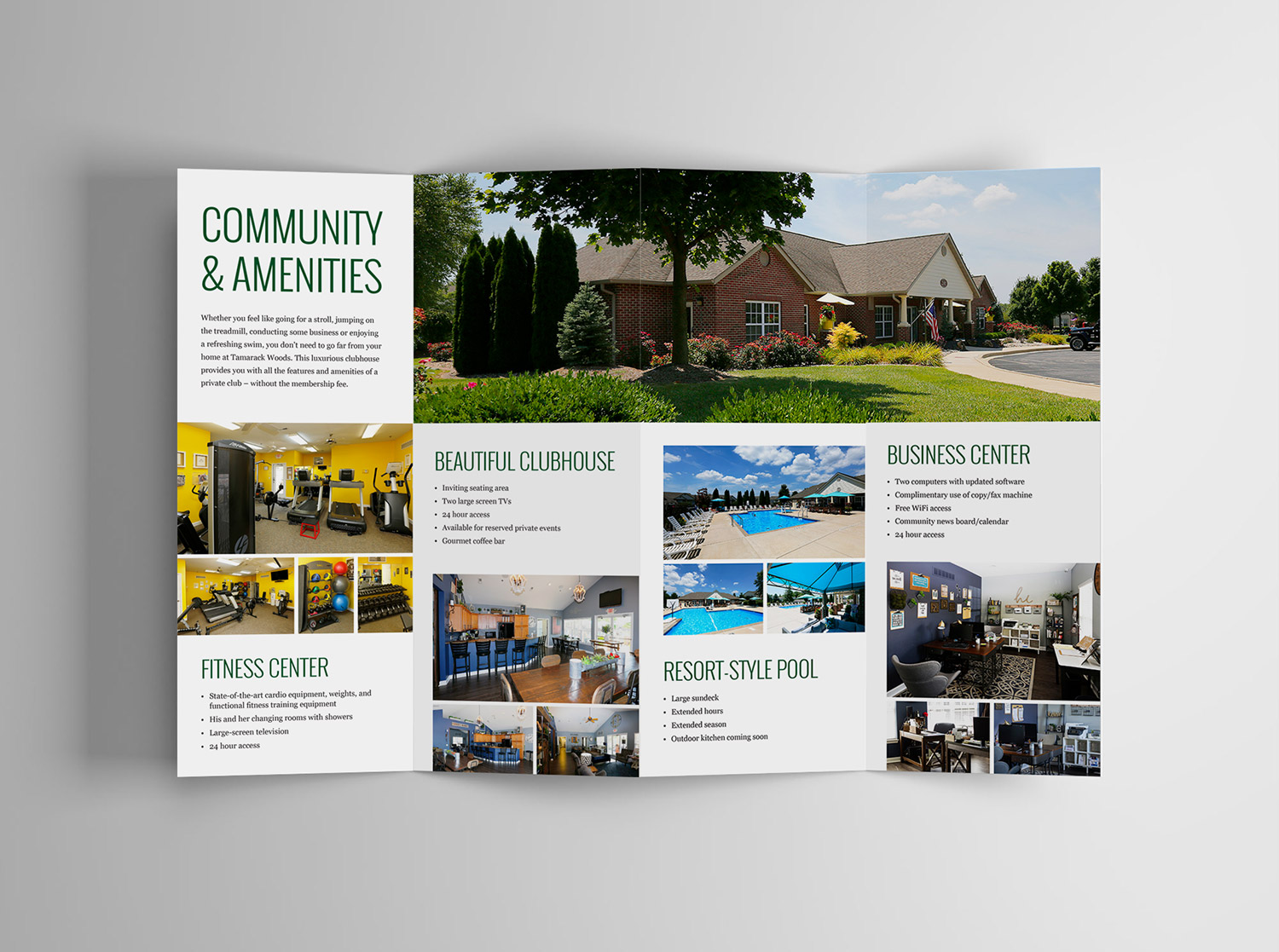
In addition to the design and development of the website, Visual Lure also designed a new accordion brochure for the apartments. The new brochure complements the design of the website and features photography captured by Visual Lure. We also designed the original logo.

Tamarack accordion brochure design frontTamarack accordion brochure design back

Logo, Identity & Website for a St. Louis Metro East Railroad Company

Posted on March 15, 2018

The Prairie Line is a St. Louis Metro East/Southern Illinois railroad, transportation and logistics company. Lead by a team of highly experienced partners, The Prairie Line prides itself on providing personalized service that often gets lost in the rail industry. Additionally, their ability to cut through red tape and deliver quick decisions (along with their cargo) sets this company apart.

Below you will find everything from the initial logo design options to their newly painted locomotives and custom WordPress website, all which Visual Lure designed.

The Logo:

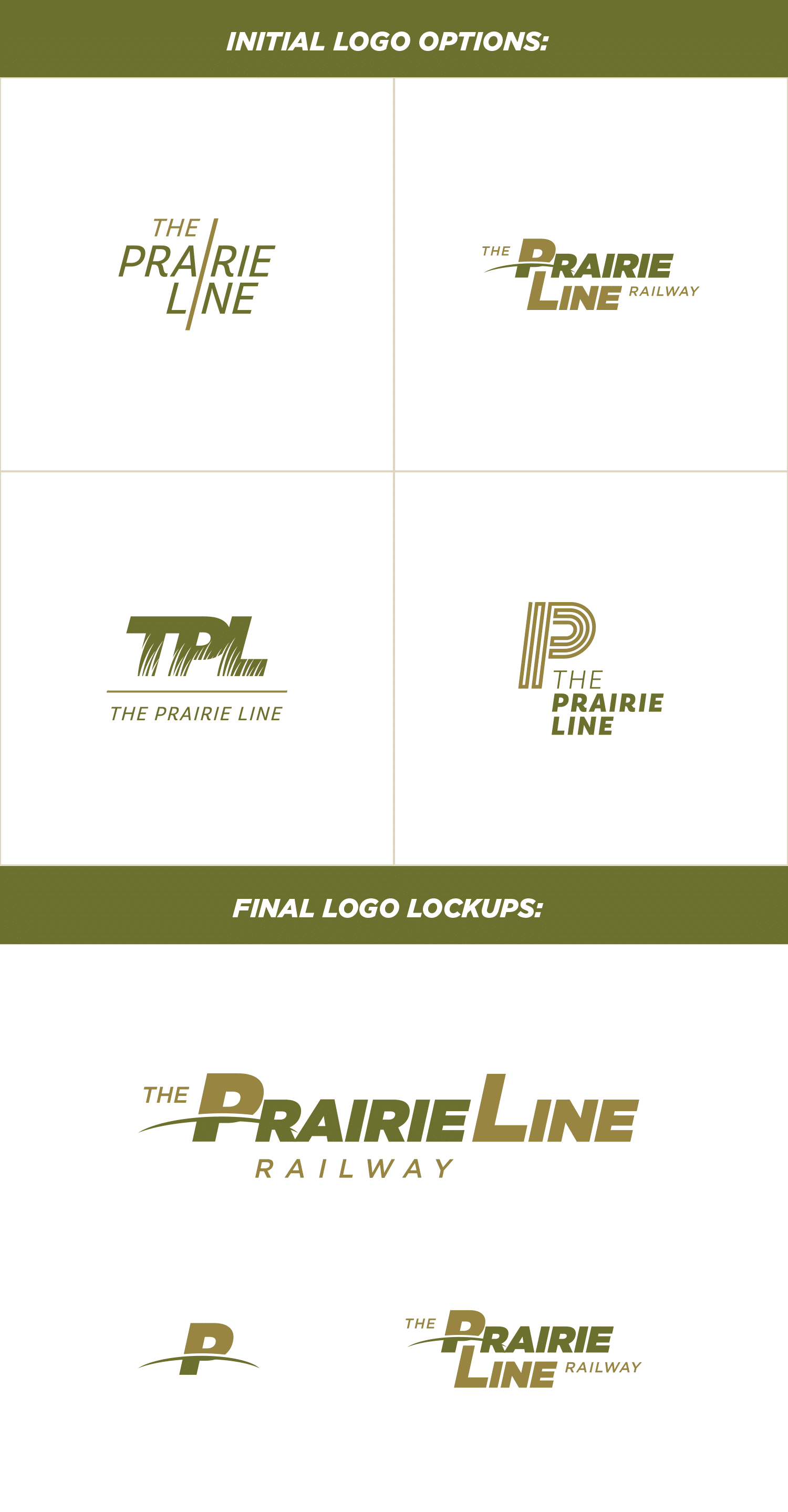
The top left logo option uses a single line to make two “i”s tying the two word marks together, the top right option (which ended up being the final logo) plays off a line dividing the “P”, the bottom left logo features prairie grasses that make negative space in the type, and the last logo is a P created with a single line that also mimics railroad tracks. Below the options are the final logo lockups.


TPL logo options & final logo

Color Palette, Typefaces & Paint Scheme:

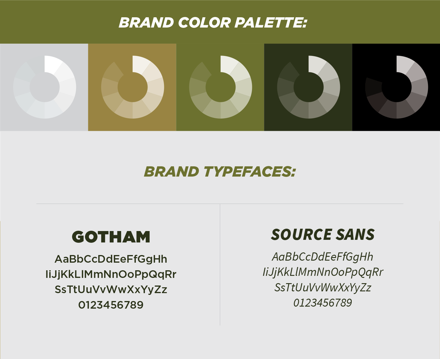
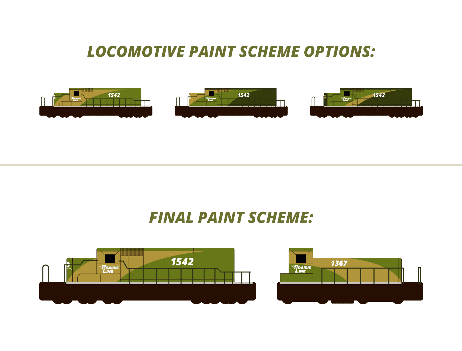
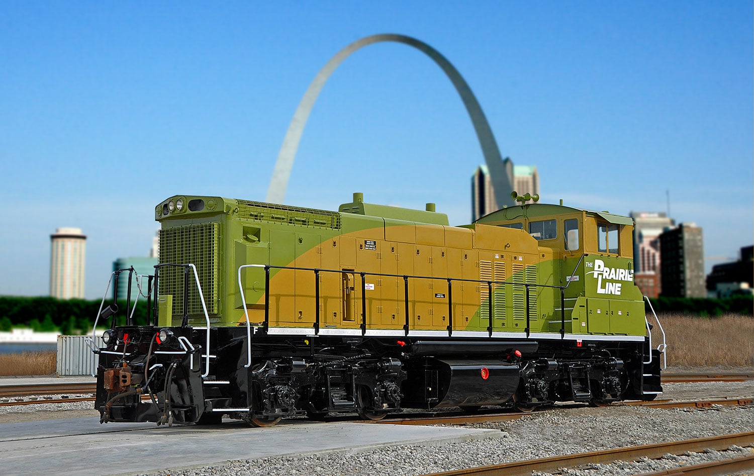
We selected a color palette inspired by colors of prairie grasses with clean, easy to read typefaces making sure signage and locomotive numbers are readable from a distance. The paint scheme was inspired by the curve in the logo and the placement gives the locomotives a sense of motion.


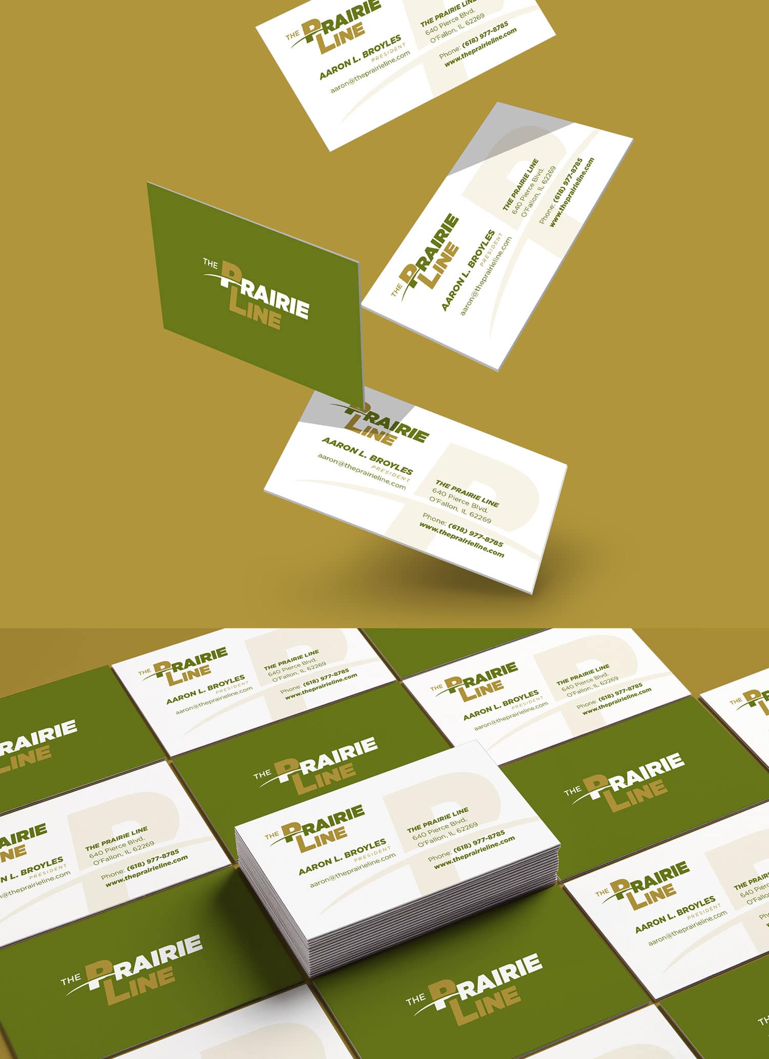
TPL color palette & typefaces TPL business cardsTPL locomotive paint schemeTPL painted locomotive


Custom WordPress Website:

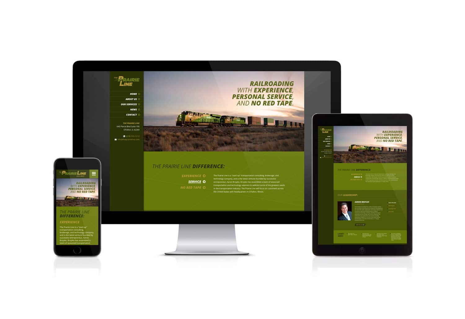
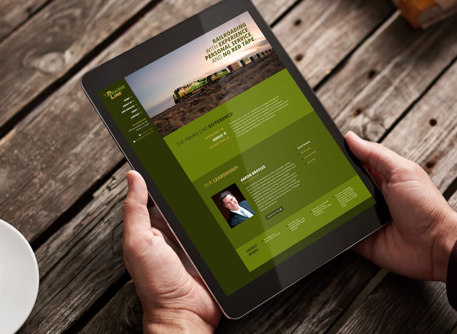
We wrapped up this branding project with a fully custom, responsive designed WordPress website. The site features a sticky header and menu bar for convenient navigation, a couple custom sliders for the “what makes us different” and the “leadership” sections, and an auto-populated news feed that is fed from the fully integrated blog.

TPL website design 2 TPL website design

CLICK HERE to view more of our branding projects ยป or CONTACT US today to learn more about any of our branding and design service!


New Website Design for Cricket’s Photo & Cinema

Posted on January 11, 2017

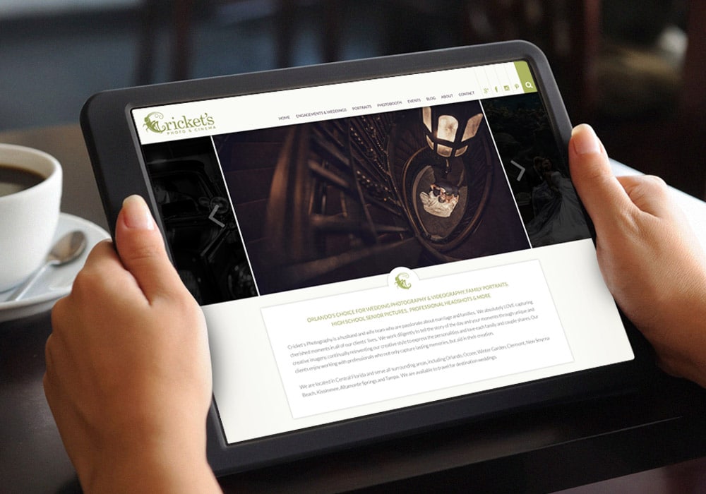
Visual Lure recently launched a new website for Cricket’s Photo & Cinema. Cricket’s is a premier photography studio serving the greater Orlando, Florida area with its studio located in Winter Garden. We originally designed Cricket’s logo a couple years ago, and they came back to us when they were ready to improve their online presence. The new website was built in WordPress utilizing a fully custom, search engine optimized, responsive (mobile, tablet and desktop friendly) design.

The new custom WordPress website features:

  • A sticky header for convenient navigation
  • An easy to maintain home page slideshow
  • A custom testimonials widget with smooth transitions
  • A featured image blog feed
  • Masonry style photo galleries that use WordPress’ native gallery for easy maintenance
  • A seamlessly integrated blog with featured image and excerpt landing page
  • Related blog post feed for improved click-through rate
  • Added column structures to expand layout options
  • Search engine optimized for multiple photography focuses

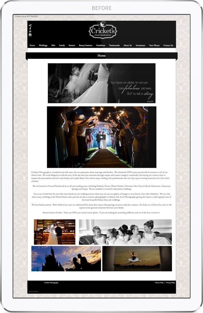
Old Homepage Design:

Cricket's Photo & Cinema's old website home page design

The old website (home page shown above) was not very user friendly. The blog was completely hidden, only to be found if you hovered over the four images towards the bottom of the home page. There were too many main navigation tabs, some links where the same color as the background, therefor completely hidden unless you accidentally hovered over them. The photo galleries and blog landing page took forever to load and the site wasn’t properly search engine optimized. Lastly the old template limited how content could be displayed and gave the site a generic cookie cutter feel.


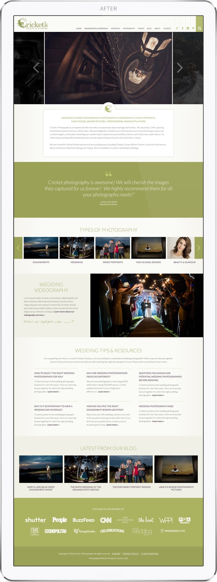
New Homepage Design:

Cricket's Photo & Cinema's new website home page design

The new home page design in much more content rich, which is great for search engine ranking, along with enticing users to click deeper into the site. The sticky header, as mentioned above, allows the user to navigate the entire site at all times – no matter how far down they scroll. Social media tabs are tied directly into the navigation bar, along with a slider search field. Below that is an easy to maintain slideshow and a custom testimonials section. Next we added a “Types of Photography” section allowing users to scroll/slide to any of their services. Following is a videography and wedding tips area, and the homepage is completed with a latest blog post and affiliation section.

Visit Cricket's Photo & Cinema ยป

Click here to learn more about our website design and development services ยป

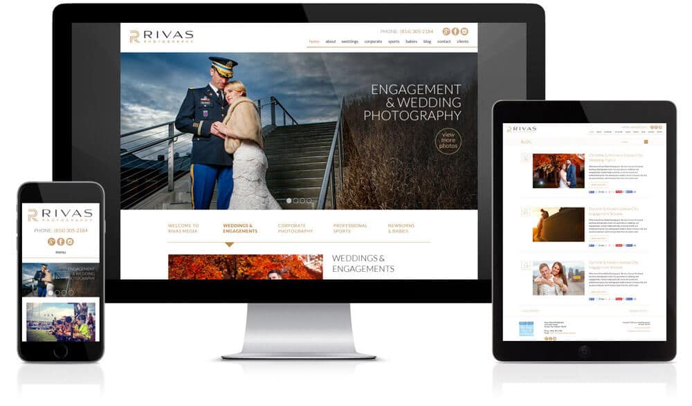
New Custom WordPress Website for Rivas Photography

Posted on April 2, 2016

Kansas City event & wedding photographers

Visual Lure recently completed a new website for Rivas Photography. Rivas is a soon-to-be husband and wife photography team based out of Kansas City, MO. They specialize in wedding, engagement, corporate event, professional sports and newborn baby photography. They are known for their clean, bright, vibrant and dramatic imagery. They also happen to be good people which is a pretty important characteristic you want your photographer to have.

I had the pleasure of meeting Kyle and Melissa (the owners) this year at Shutterfest 2016 – where I spoke to professional photographers about branding and search engine optimization (SEO). They took my SEO class which will help their already well ranking website climb even higher.

This brings us to Rivas’ search engine rankings. Before Visual Lure designed and developed Rivas Photography’s new website, they were using Square Space. While Square Space is super easy to setup, use and maintain, their websites tend to load very slowly. What’s the big deal with having a slow loading website? Having a slow site provides users with a bad user experience. This can effect bounce rates and cause users to “pogo-stick” back to their original search – both of which are proven to negatively effect a website’s search engine rankings. Before their new site, they were ranking somewhere beyond the first 15 pages of Google for most of their targeted search terms.

As of today, April 2nd 2016, on Google searches: they are on page 1 for “kansas city event photographer”, page 1 for “kansas city sports photographers”, page 2 for “kansas city engagement photographers”, page 4 for “kansas city newborn photographers” and page 4 for “kansas city wedding photographers” (climbing more than 10 pages in Google in one month). The website also ranks well for many variations of those keywords.

The Results

Within the first month of the new website going live, Rivas Photography acquired five new clients, all directly tied to Google search leads. This has lead to Rivas’ initial investment being paid back three times over. This, ladies and gentlemen, is why we do what we do. We love nothing more than helping other entrepreneurs find success. We couldn’t be happier with these results. We wish Kyle and Melissa future success in both their business and their upcoming nuptials.


Visit Rivas Photography


Learn more about our website design services or our fully custom WordPress designs.


Logo and Website Re-Design for Cleveland Photography Studio

Posted on September 4, 2014

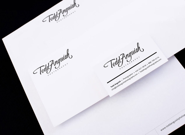
Visual Lure recently completed a new logo and custom WordPress website for Todd Anguish Photography. Todd is a talented wedding, high school senior portrait and family photographer based out of Cleveland, Ohio. We had the pleasure of meeting Todd at Shutterfest this year, where I spoke about logos & branding and websites & search engine optimization (SEO). At the time, we had just started working on Todd’s new logo.

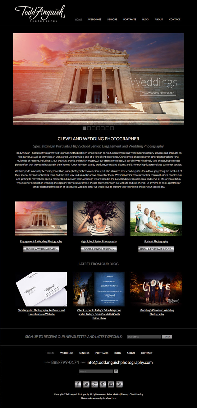
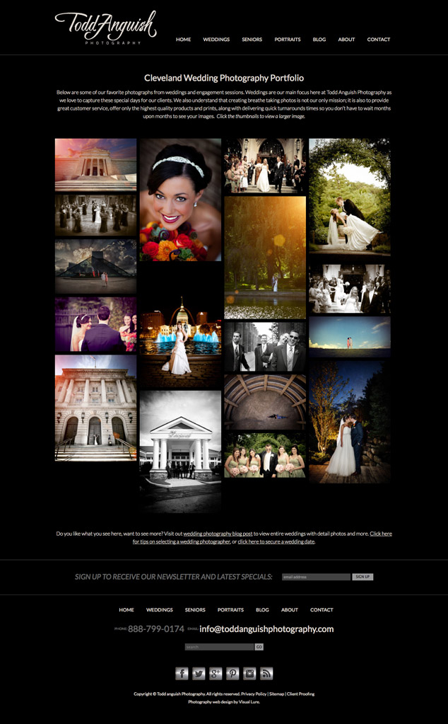
The new website was developed in WordPress and features a custom designed theme, masonry style portfolios and a responsive design. The responsive design makes the website render beautifully on all devices and is crucial for an overall great user experience. We also provided SEO services which helped the site rank very well right out of the gates. We are still working on it, but be on the lookout for www.toddanguishphotography.com on the first page of Google soon.

Below you can see Todd’s new logo on his business card and letterhead design, and below that are two screenshots of his new home page and wedding portfolio.


TAP logo and re-branding

Todd Anguish Photography wordpress website

TAP photography gallery webpage

New Website Design for a Colorado WordPress Web Developer

Posted on March 24, 2014

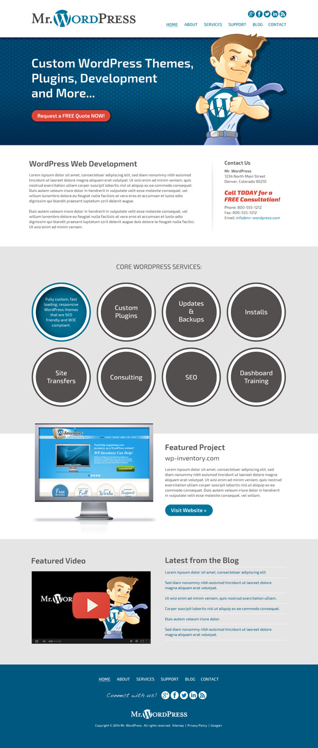
Visual Lure is currently in the process of designing a new website for Mr. WordPress, a Colorado based web developer that specializes in fast-loading, SEO friendly and W3C compliant custom WordPress themes and plugins.ย  We will be providing design-only services on this project as our client will develop the new website himself.

Mr. WordPress wanted his new website to be simple, clean and easily converted into a responsive design.ย  We feel our initial home page design (seen below) meets all of his requirements.

Check back for updates and the official launch of the new website design.


wordpress web design for colorado developer

Learn more about our logo design and web design services and donโ€™t forget to check out our logo design portfolio and web design portfolio.