OUR BLOG

Here you will find our latest works, company news and more. We update it on a regular basis so be sure to come back soon. Please like, share, pin or tweet the post you enjoy.

Logo Design & Idenity Package for St. Louis Metro East Educational Company

Posted on August 29, 2013

Visual Lure recently designed a new logo and identity package for the da Vinci Tree, an educational training company focused on teaching children a technology-based curriculum.ย  The company is currently in its development stages and plans to launch soon in the St. Louis Metro East, then St. Louis with the ideal goal of eventual going national.ย  The logo design we created for them features Da Vinci’s Vitruve Luc Viatour (Vitruvian Man), who’s arms create branches and who’s legs create roots in order to from a tree.ย  We had fun designing this logo and we believe it was the perfect solution; clean, clever, simple and memorable – everything a great logo should be.
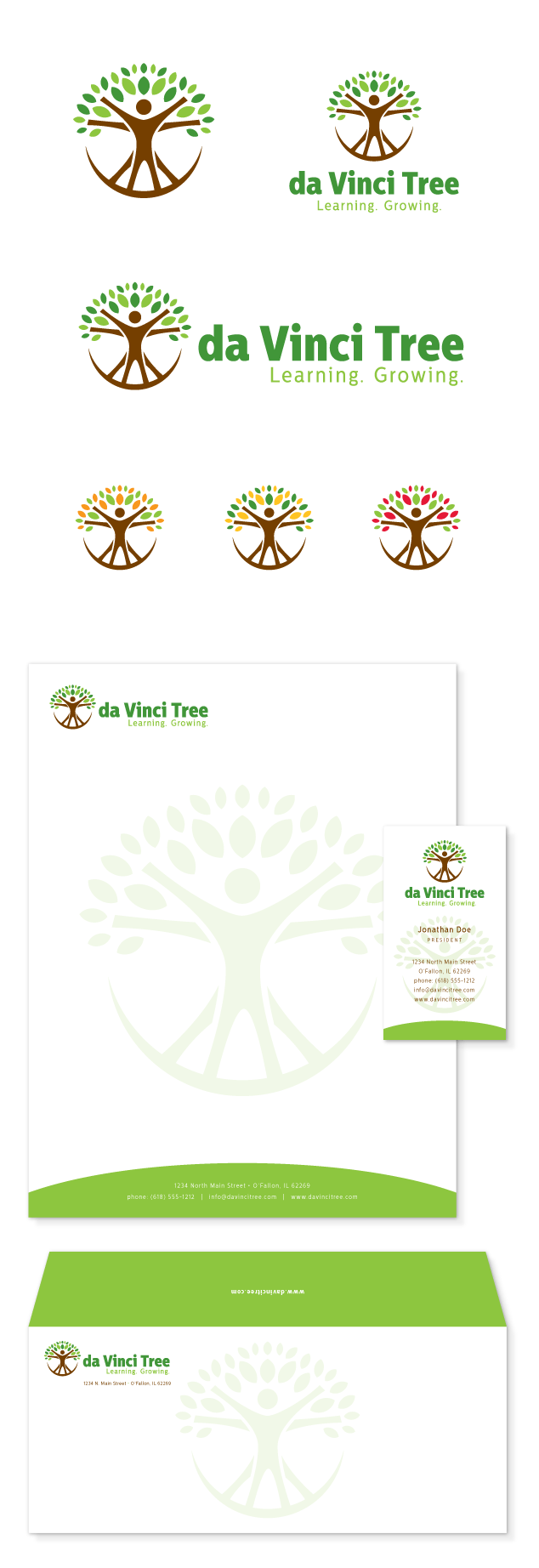
logo design, branding & identity design for da Vinci Tree

Learn more about our logo design services and donโ€™t forget to check out our logo design portfolio.

Logo & Identity Design for Ohio based Construction Company

Posted on March 14, 2013

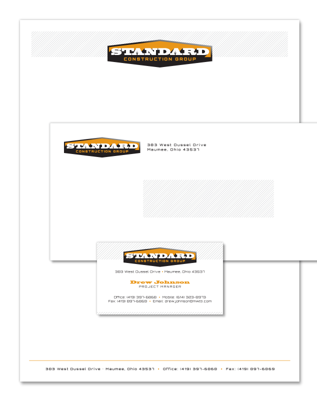
Visual Lure was recently contracted to design a logo and identity package for Standard Construction Group, an Ohio based construction company.ย  The identity package will include designs for business cards, letterhead and envelopes.ย  The only creative direction we received from the client was that the new logo design should be simple, masculine and strong.

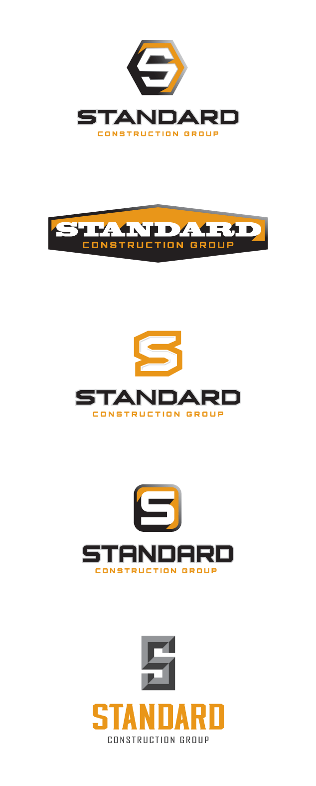
Below are the initial logo design options we provided our client. Check back soon to see the final logo and the finished identity package.

St. Louis logo design for Standard Construction Group

Proposed identity design:

Logo & Identity Design for Standard

Learn more about our logo design services and donโ€™t forget to check out our logo design portfolio.

Logo Design for St. Louis Recycling Company

Posted on January 25, 2013

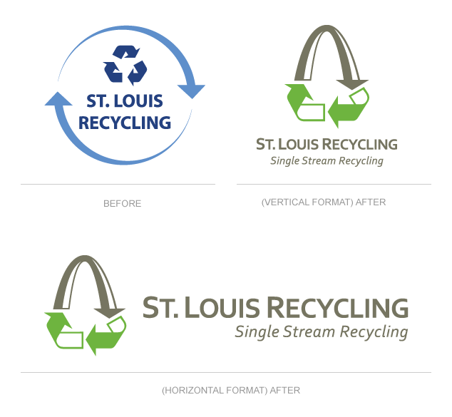
Visual Lure was recently contracted to redesign a logo for St. Louis Recycling, a St. Louis recycling company that offers single stream recycling. Single stream recycling refers to the system in which all paper, cardboard and plastic containers are mixed together in a collection truck, instead of having to be sorted into separate commodities by the business and handled separately throughout the collection process. This makes it easier, and more convenient, for companies to recycle.

We design a large amount of logos for companies in St. Louis, and we usually cringe when one of them request us to use the St. Louis Gateway Arch in the logo design. Why? Because the Arch tends to be overused in St. Louis logos, but sometimes it just makes sense, and this is one of those cases.ย  The new logo features the St. Louis arch integrated into the universal symbol for recycling. A clever, simple and memorable logo.

Learn more about St. Louis Recycling at www.StLouisRecycling.com.

St. Louis Recycling Logo design

Learn more about our logo design services and donโ€™t forget to check out our logo design portfolio.
Logo Design for St. Louis Based Railroad Company

Posted on July 12, 2011

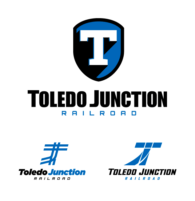
Visual Lure was recently contracted to design a logo for Toledo Junction Railroad, a St. Louis, MO based company.ย  Below are a couple of our proposed logo design options.ย  The top logo is a simple slab-serif T placed on a shield with a hard cast shadow and a slight bevel to give it some additional depth.ย  If feels industrial, strong and reliable which we feel is perfect for a railroad company.ย  The other two logos represent railway junctions, both creating the letters T and J, for Toledo and Junction.

Check back soon to see which logo our client chooses.

St. Louis logo design for railroad company

proposed logo design options