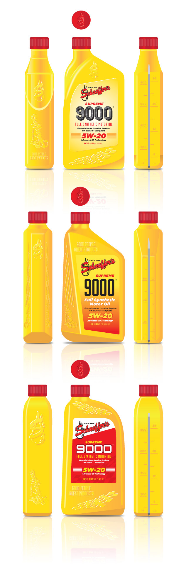
Package Design for a Motor Oil Manufacturer
Visual Lure was recently contracted by a St. Louis metro east manufacturing company to design the bottle shape and label options for one of their prospective clients, Shaeffer’s Motor Oil. The project requirements were as follows: 1. to use a checkered flag, the client’s logo and the phrase “good people great products” embossed somewhere on the bottle, 2. use the colors yellow and red, and 3. to make sure the spout was off center. Below are the initial three packaging design options we provided.
Check back soon to see what direction they decide to go, and if you are looking for professionally designed packaging for your products, call or email us today. We would love to help you have your product stand out amongst its competition.
UPDATE: After review, the client decided to change the bottle color and shape. Below is the latest bottle design under review.
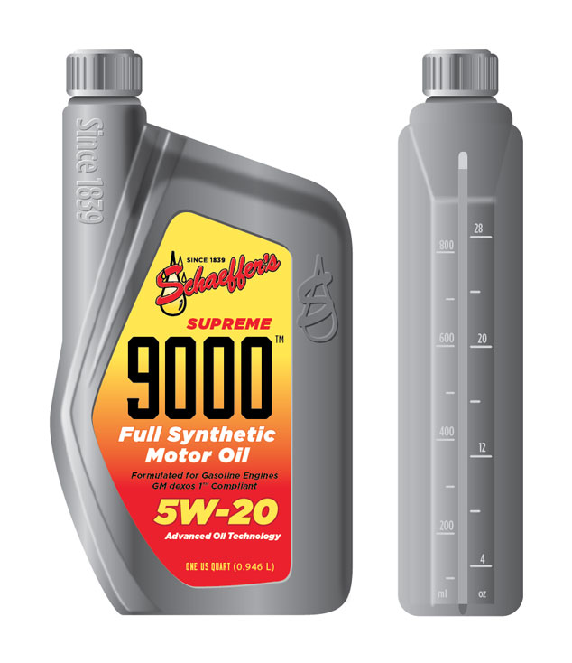
Check out our graphic design portfolio, click the following link to learn more about our graphic design services, or contact us today if you are in need of professionally designed packaging.