OUR BLOG

Here you will find our latest works, company news and more. We update it on a regular basis so be sure to come back soon. Please like, share, pin or tweet the post you enjoy.

Visual Lure Project Featured in St. Louis AIGA Design Show 23

Posted on June 19, 2018

Ever since I joined the St. Louis AIGA, while still studying Graphic Design at SIU Edwardsville, I would go to their Annual Design Show every year to see all the world-class design work coming out of Saint Louis. Eight years ago, I entered what I thought was one of my best logos, but it didn’t make the show. It discouraged me, and it wasn’t until this year that I decided to enter another piece. I am honored to share with you all that my project was selected, and one of my professional goals has been fulfilled.

When I received the email that read “Congratulations, your work has be selected to be in the AIGA St. Louis Design Show 23!” I was both excited and oddly relieved. I think the relieve came from a sense of accomplishment as I’ve had this goal for over 18 years. It also represents the second check mark off my “top three professional goal list”. While still in college, I used to dream of having a logo published in a book called LogoLounge, having a project in the AIGA Design Show, and lastly having work featured in Communication Arts.

To date, I’ve had 31 logos published in 7 different LogoLounge publications, and I can finally say that I’ve had a project in the St. Louis AIGA Design Show. I just have Communication Arts left. I share this not to brag, but to hopefully inspire other graphic designers as design really is a skill that is honed and crafted. You definitely need artistic skill and creativity, but everything else can be learned and improved upon with practice and dedication. A slight obsession with design, color, type and space helps, but if you have the foundation, you really can become a good designer. When I compare my portfolio coming out of college, to my work today, it really does confirm this statement.

This years judges included: Su Mathews Hale – a senior partner at Lippincott, Justin Ahrens – principal and creative director of Rule29, and Ilene Sandler – designer/owner of Treat Street Studios.

About the Project:

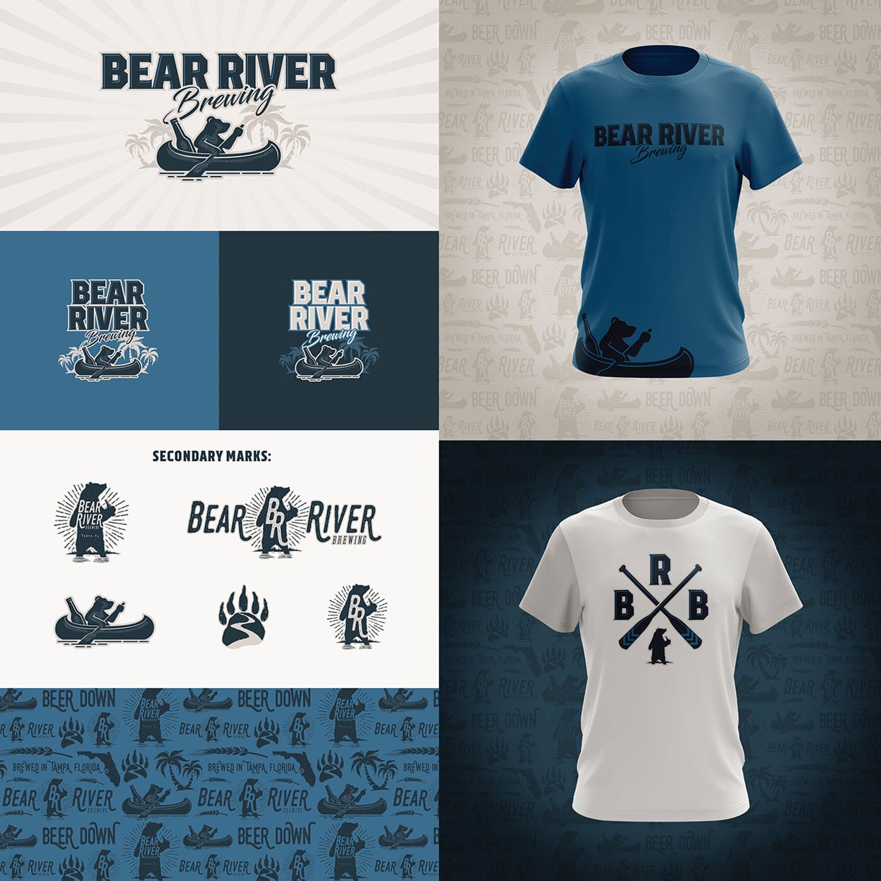
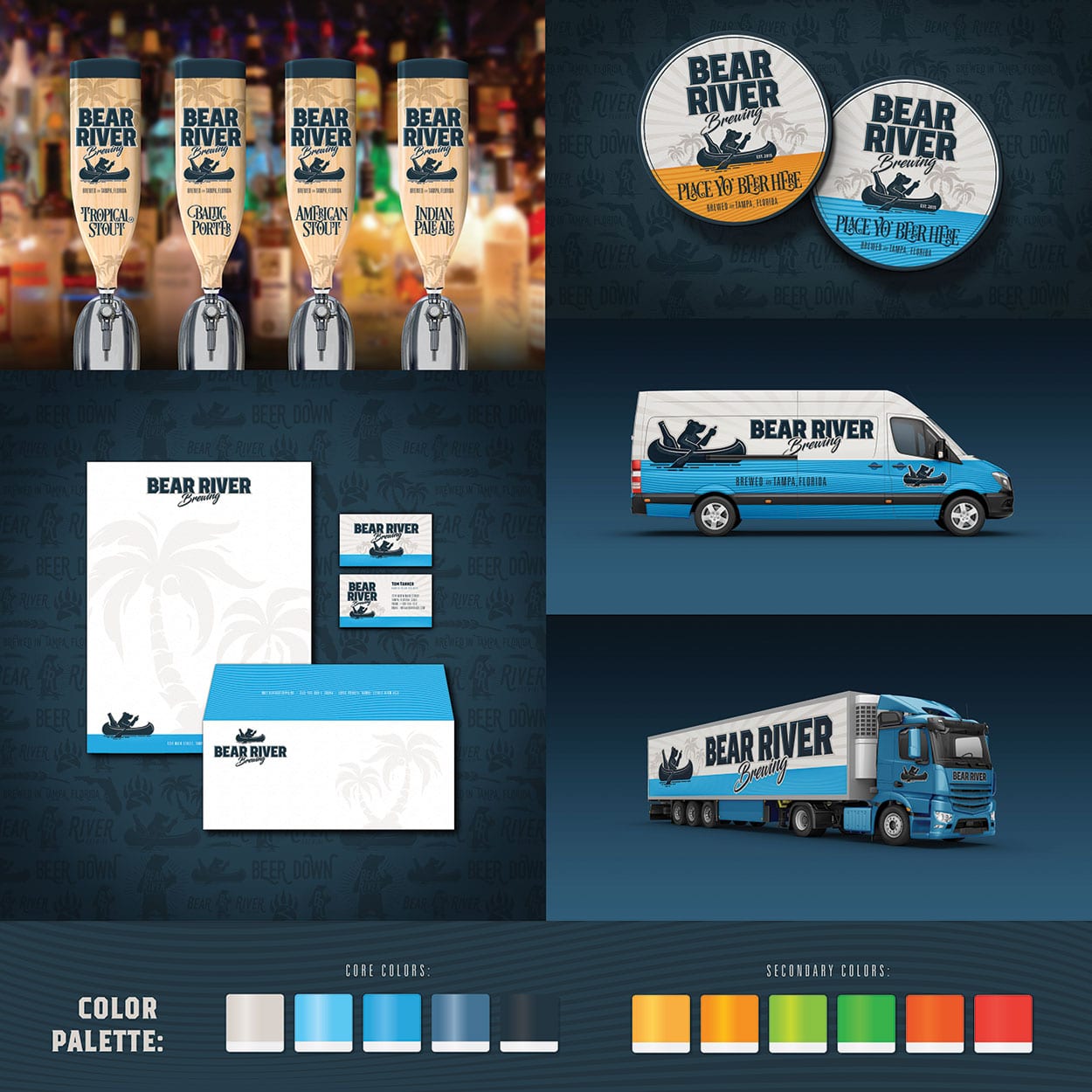
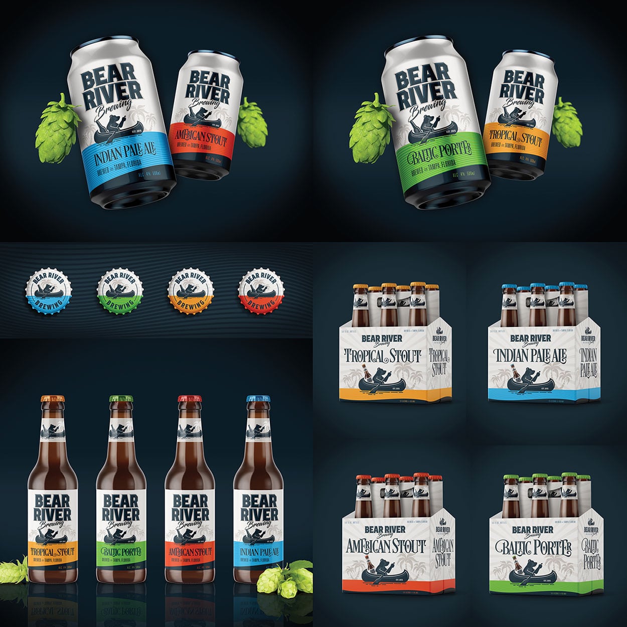
Bear River Brewing is a branding project we did for a Tampa, Florida craft beer brewer. Visual Lure actually came up with the name which is based on his son’s, Barrett (which they call Bear) and River, hence Bear River Brewing. The logo depicts a bear rowing a canoe down a river carrying a huge beer bottle with palm trees in the background as a nod to Tampa. One of our favorite pieces is the beer taps which are shaped like canoe paddles.

Bear River Brewing LogosBear River Brewing Identity DesignBear River Brewing Packaging Design

View the Entire Project ยป


Logo, Identity & Website for a St. Louis Metro East Railroad Company

Posted on March 15, 2018

The Prairie Line is a St. Louis Metro East/Southern Illinois railroad, transportation and logistics company. Lead by a team of highly experienced partners, The Prairie Line prides itself on providing personalized service that often gets lost in the rail industry. Additionally, their ability to cut through red tape and deliver quick decisions (along with their cargo) sets this company apart.

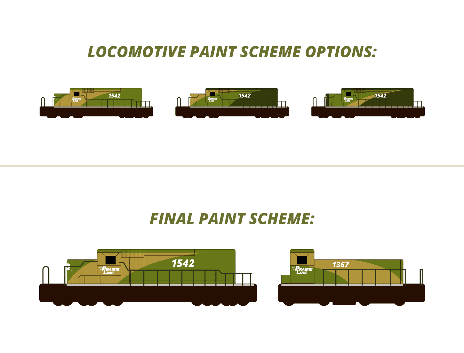
Below you will find everything from the initial logo design options to their newly painted locomotives and custom WordPress website, all which Visual Lure designed.

The Logo:

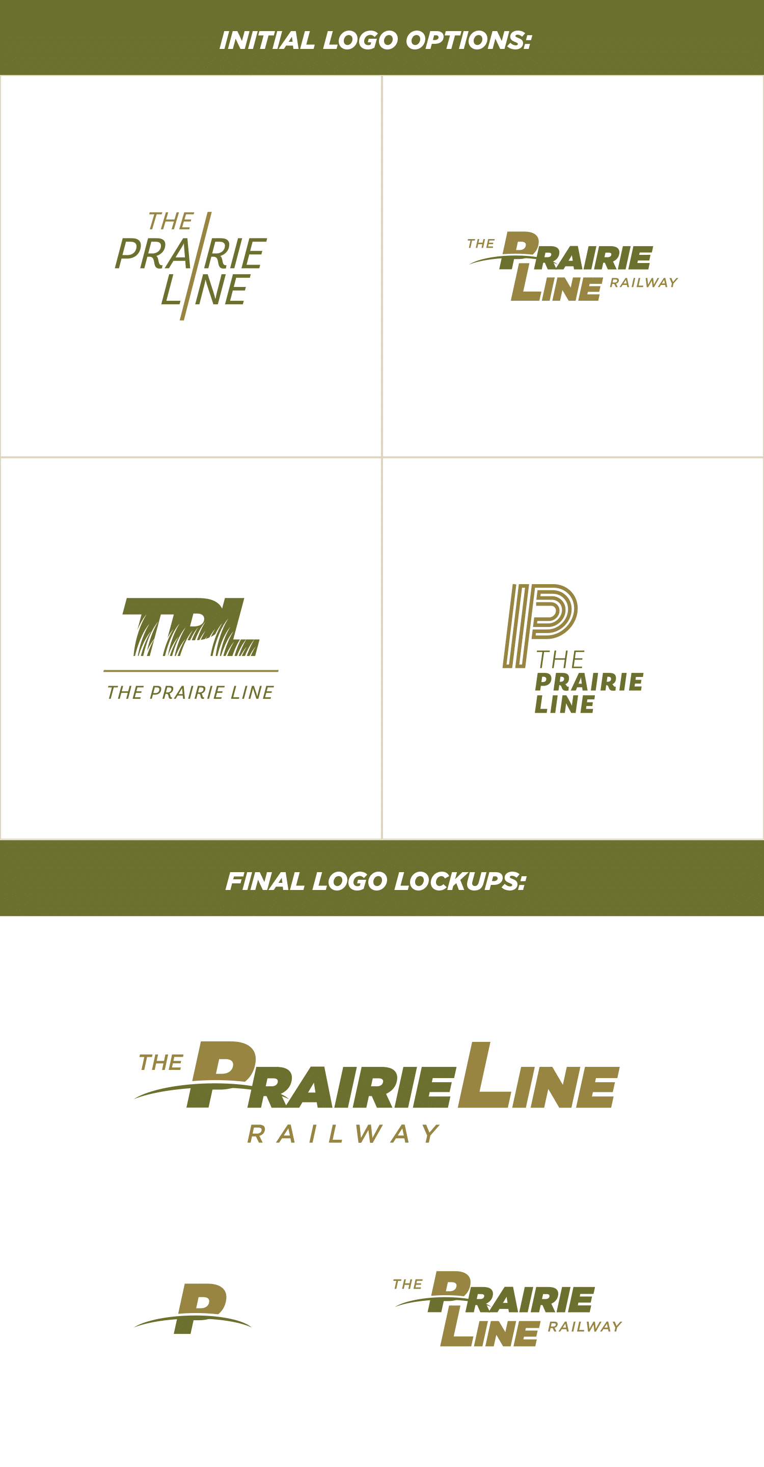
The top left logo option uses a single line to make two “i”s tying the two word marks together, the top right option (which ended up being the final logo) plays off a line dividing the “P”, the bottom left logo features prairie grasses that make negative space in the type, and the last logo is a P created with a single line that also mimics railroad tracks. Below the options are the final logo lockups.


TPL logo options & final logo

Color Palette, Typefaces & Paint Scheme:

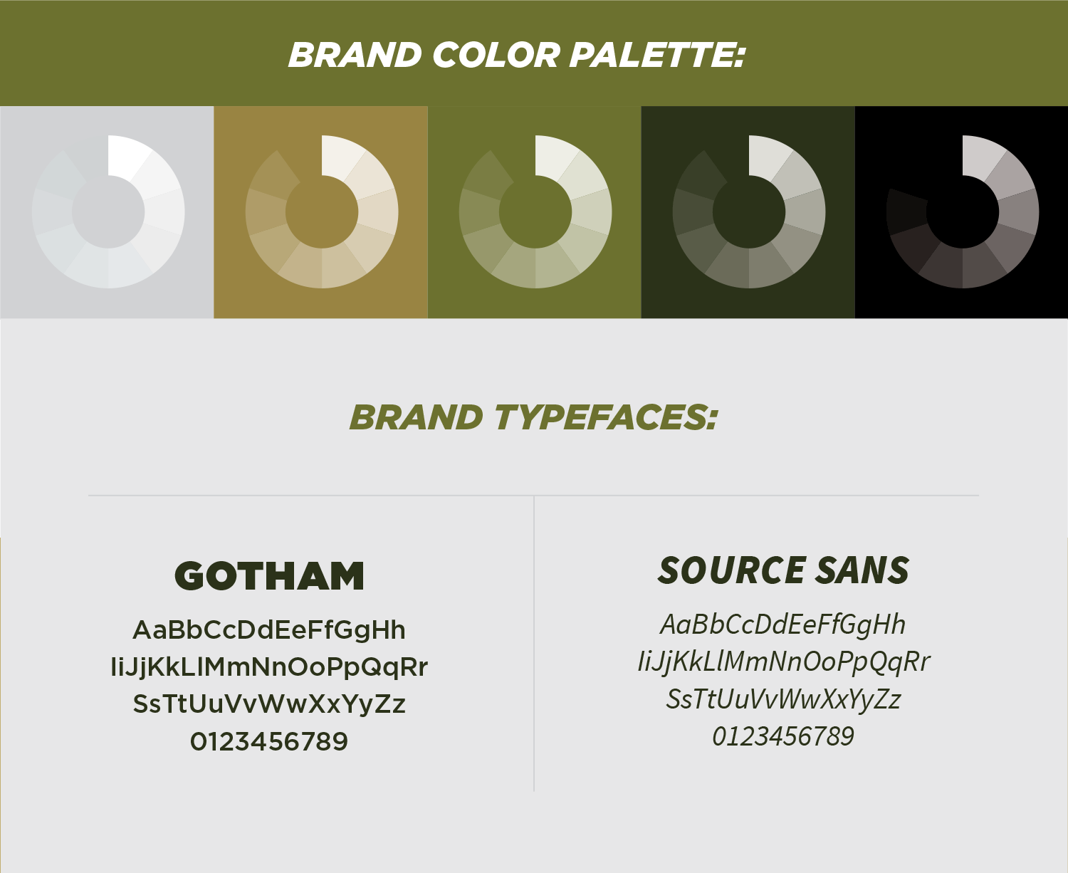
We selected a color palette inspired by colors of prairie grasses with clean, easy to read typefaces making sure signage and locomotive numbers are readable from a distance. The paint scheme was inspired by the curve in the logo and the placement gives the locomotives a sense of motion.


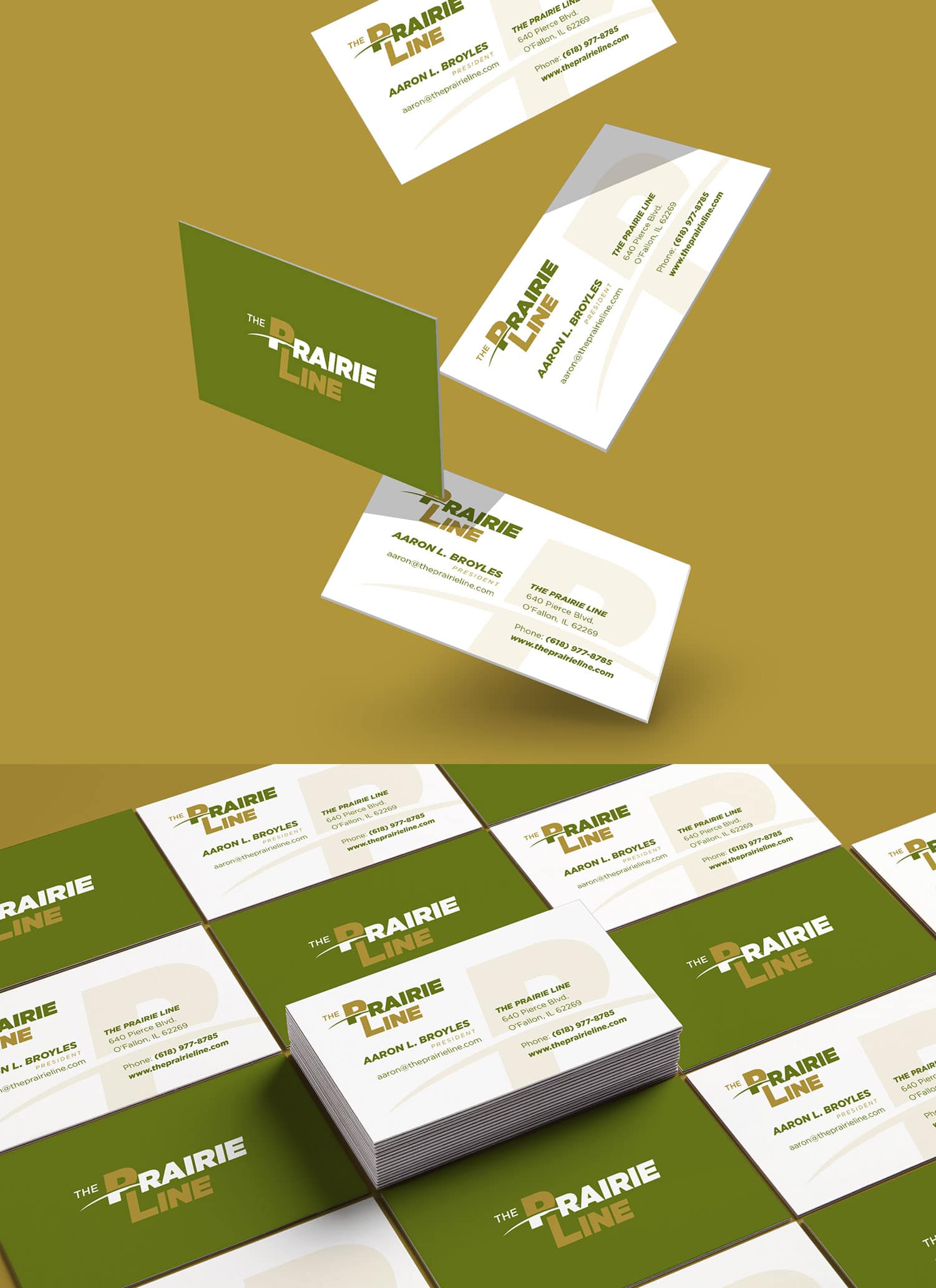
TPL color palette & typefaces TPL business cardsTPL locomotive paint schemeTPL painted locomotive


Custom WordPress Website:

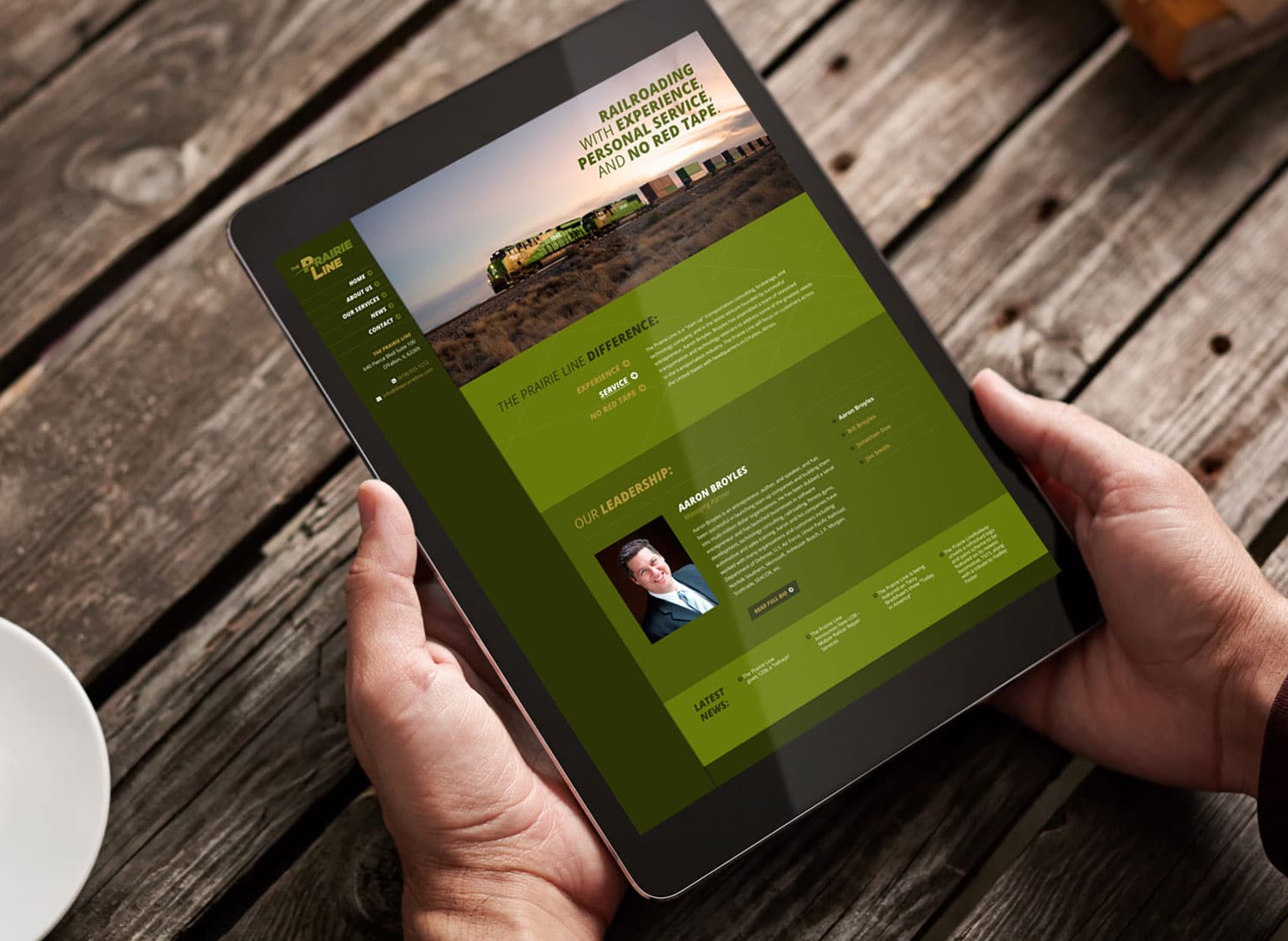
We wrapped up this branding project with a fully custom, responsive designed WordPress website. The site features a sticky header and menu bar for convenient navigation, a couple custom sliders for the “what makes us different” and the “leadership” sections, and an auto-populated news feed that is fed from the fully integrated blog.

TPL website design 2 TPL website design

CLICK HERE to view more of our branding projects ยป or CONTACT US today to learn more about any of our branding and design service!


Logo & Trifold Brochure Design for St. Louis Non-Profit

Posted on October 21, 2015

One Classroomโ„ข, a St. Louis, Missouri based 501c3 non-profit organization, hired Visual Lure to design a new logo along with a new trifold brochure. Their mission is to give children with special needs the opportunity to study and learn in normal Catholic school classrooms, side by side with their peers.

Below you can see the final logo both in color and black and white, the color palette, and brand typefaces along with a sample identity package. Underneath that is the new brochure design along with unselected logo explorations.

one-classroom-blog

Logo Design & Branding Package for St. Louis Grand Champion Grill Masters

Posted on February 18, 2015

A personal friend of ours is a member of a St. Louis Grand Champion barbecue crew, and a couple months ago we had the pleasure of tasting some of hisย scrumptious dishes. It was some of the best ribs, pork steaks, brats and chicken we’ve ever had. Last year his team won the title of Grand Champions at The 10th Annual Wildwood Barbecue Bash. The year before that they won for best chicken.

While we were feasting on his fine cuisine, we started to discuss the name of his team, Mr. Pink BBQ. The name was inspired by Steve Buscemi’s character in Reservoir Dogs.ย  I instantly saw a new logo in my head. Mr. Pink, dressed in his all black suit and skinny tie – riding a pig like a bull rider – holding on to some type of grilling utensil.

Below is that vision taken from conception to completion, including an alternative logo format, trailer graphics, sample patterns, color palette, typefaces and identity package.

mr-pink-logo-design-branding

If you are interested in our logo design or branding services give us a call today at 618.407.9231 or email us at info@visuallure.com.

Logo & Identity for New St. Louis Audiology Practice

Posted on September 19, 2014

Visual Lure recently completed this new logo and identity package for Advanced Audiology Associates, a new audiology practice opening soon in St. Louis, Missouri. The new logo features two types of audio waves that create the St. Louis Arch and the Mississippi River. They also create three letter A’s for Advanced Audiology Associates. We think that’s pretty clever and memorable; please like or share this post if you agree. The typeface is Centrale Sans Condensed with custom letter A’s designed to complement the logo mark.

Below you can see the new logo in both horizontal and vertical applications, underneath that are additional color variations and at the bottom is the identity package – which includes the company business card, letterhead and envelope design.

Advanced Audiology St. Louis logo branding

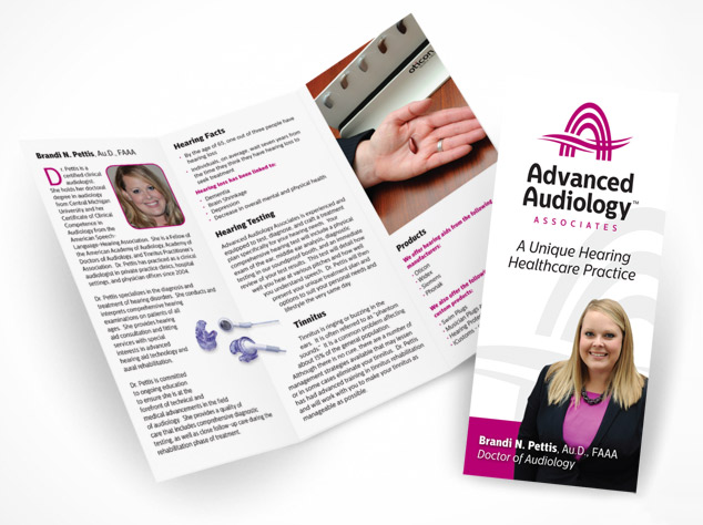
Update: Here is a trifold brochure weย recently completed for AAA:

AAA trifold brochure design

Almost all the logos we design are heavily concept-driven because we feel logos with meaning tend to be more memorable. If you want a logo that people and customers will remember, one that stands the test of time, and catches people eyes, give Visual Lure a call today.

New Logo and Identity Design Package for a St. Louis Wealth Management Firm

Posted on September 18, 2014

Visual Lure recently completed a new logo and identity package for Hauser Group Wealth Management, a St. Louis, MO based wealth management firm lead by Mike Hauser. Mike is a CPA and a personal financial specialist. He is a member of FINRA and the SIPC, and offers securities through LPL Financial. We feel the new clean and sharp logo feels trustworthy and reliable. The perfect traits for a financial management company.

Below you can see both the vertical and horizontal logo formats along with a couple color variations. Below the logos is the identity design package, including the business card, letterhead and a #10 envelope design.

If you are in need of a new logo, or looking to re-brand an existing company, give Visual Lure a call today. We would love to get your branding started in the right direction with our award wining, internationally published logo design solutions.

Hauser Group logo design and branding