OUR BLOG

Here you will find our latest works, company news and more. We update it on a regular basis so be sure to come back soon. Please like, share, pin or tweet the post you enjoy.

New Logo and Identity Package for Iowa Photographer

Posted on May 9, 2014

Visual Lure recently completed a new logo and identity package for Brune Photography, owned by Kathie Brune, one of the photographers we had the pleasure of meeting this year at Shutterfest.ย  Kathie wanted a handwritten script used in the logo along with a set of wings.ย  She also requested to use the color purple.ย  Both the wings and the color purple had a deeper meaning for her and her family.

Below you can see the final logos, both vertical and horizontal options, and below that is the new identity package (letterhead, envelope and business card design).
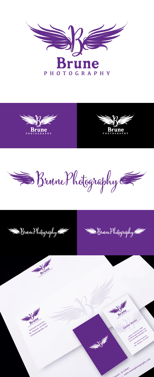
brune photography logo design

Learn more about our logo and graphic design services and donโ€™t forget to check out our logo design portfolio and graphic design portfolio.

Logo Design for a Photographer in the Netherlands

Posted on December 26, 2013

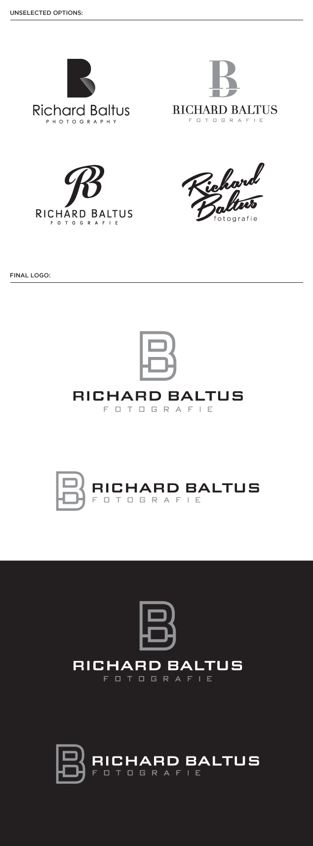
Richard Baltus, a talented photographer from Gelderland, Netherlands, hired Visual Lure to design a new logo for his photography studio, Richard Baltus Fotografie. After reviewing the project brief and the logos he was attracted to, we decided to create a monogram-based logo.ย  Below are three unselected monograms we designed along with a script option we liked, and below that is the final logo; a clean modern monogram with the letters R and B integrated together.

photographers logo design for Richard Baltus fotographie

Learn more about our logo design services and donโ€™t forget to check out our logo design portfolio.

Logo Design for Atlanta Based Photographer

Posted on November 22, 2013

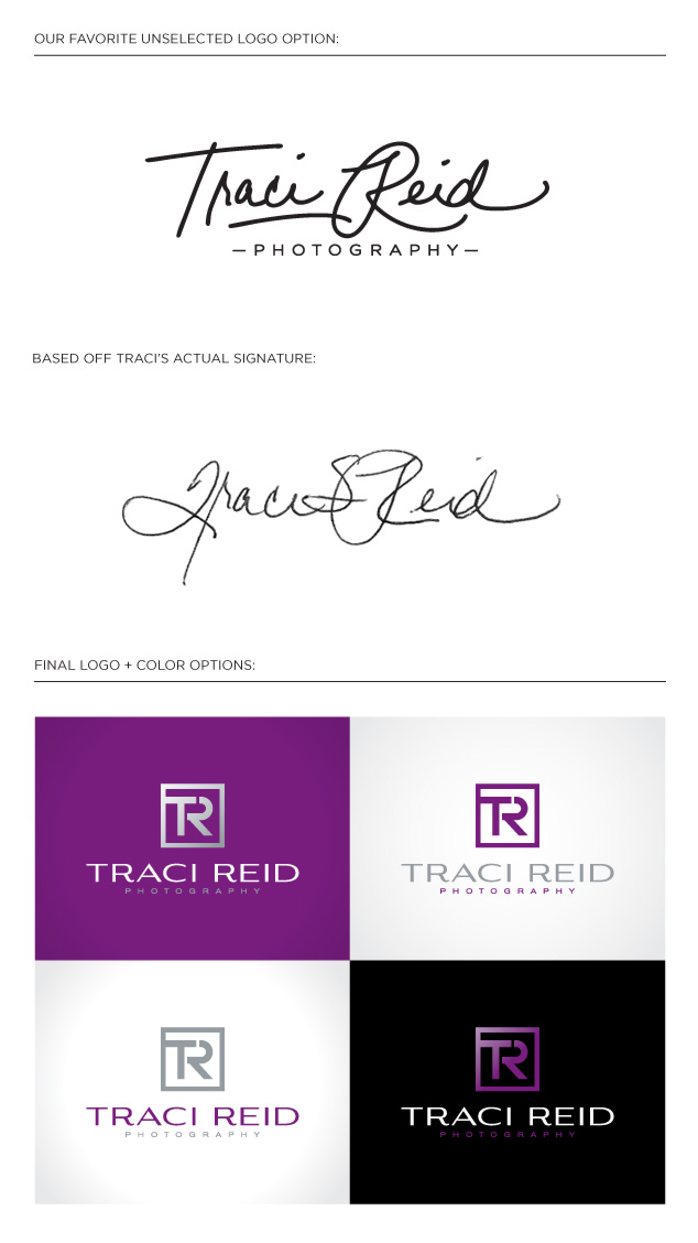
We are in the midst of wrapping up a new logo for Traci Reid, an Altanta, GA based photographer.ย  When we received her signed agreement for the project, we were immediately drawn to her signature and we decided to create a custom hand lettered logo inspired by it.ย  We modified it to make it more legible, as her ‘T” kind of looks like a “J” and her “R” was a little hard to read.ย  You can see both the logo and her actual signature below. Underneath that is her final logo with a sample color palette utilizing her favorite color purple.

Traci was having a hard time deciding between these two logos, so we asked her if she wanted her brand to be more friendly, personal and approachable or more modern, fashionable and luxurious. She decided on the later, so the more contemporary logo won.

traci reid photography logo design

Learn more about our logo design services and donโ€™t forget to check out our logo design portfolio.