Salvatore Cincotta recently contracted Visual Lure to design a complete branding/identity package for one of his lucky on-screen viewers at Creative Live. Gray Photography, soon to be Jeff & Jewels Photography, was the lucky viewer who received the gift. Included was a new logo design, a stationary/identity package, and a custom WordPress website home page layout. Sal also requested that we show our design process along the way. Below you will see everything from initial logo design sketches to final home page design.
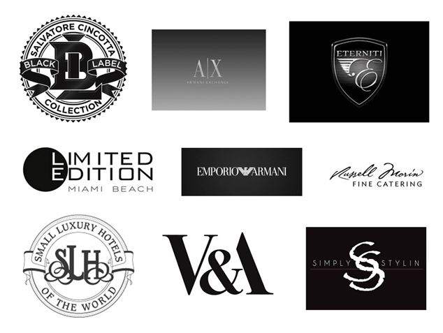
After our initial consultation with the client, they decided that “vintage” and “modern” were what they wanted their image to portray. They wanted it to look high-end yet have a vintage charm, similar to their style of photography. They also wanted to stick with a black and white color theme, which is always a great color pallet for photographers. It allows the photography itself to really stand out.
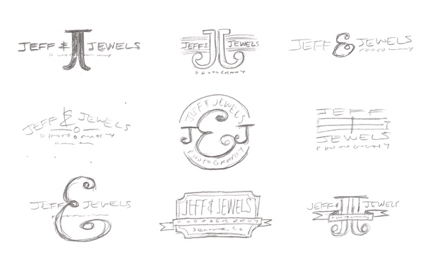
Here are some of our initial logo design sketches:

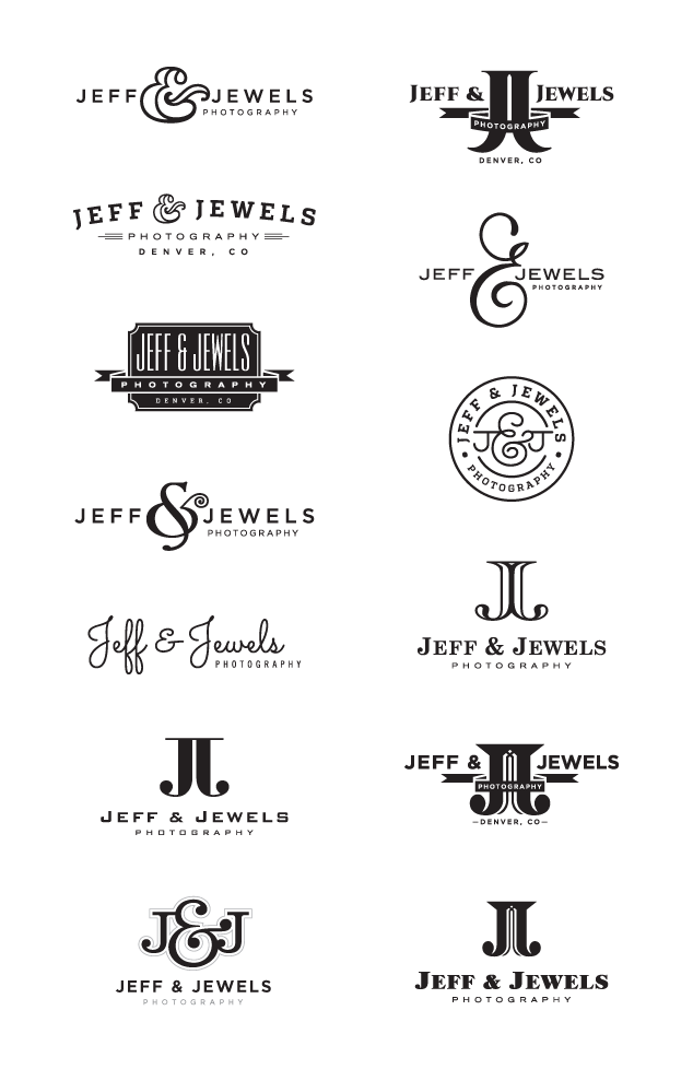
Next, we took the sketches into the computer and developed the initial batch of logo design options. Here are all the initial logos we provided the client:

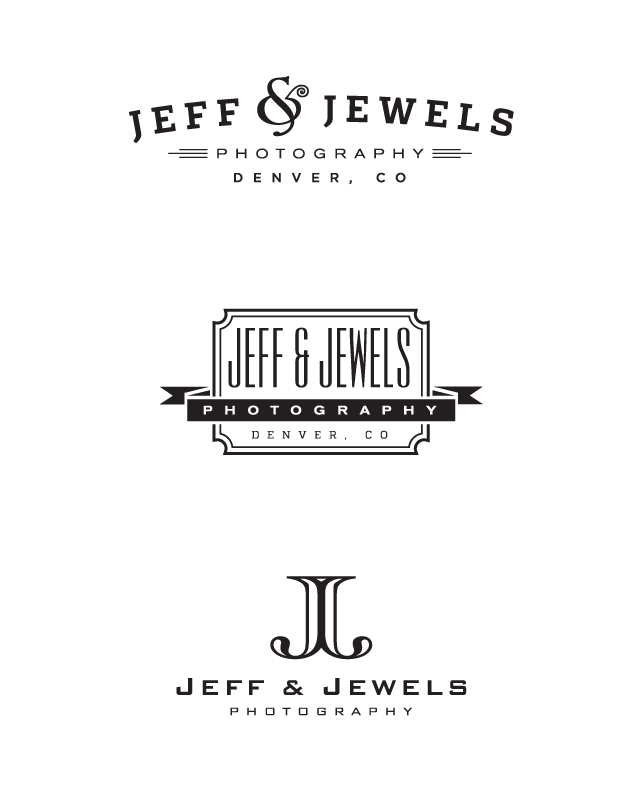
Once we received feedback, we made a couple minor adjustments to three logos they selected. Here they are:

The client loved all three and had a hard time deciding, but in the end, they selected the logo design at the bottom. Here is the final logo and stationary/identity package including fonts and patterns.

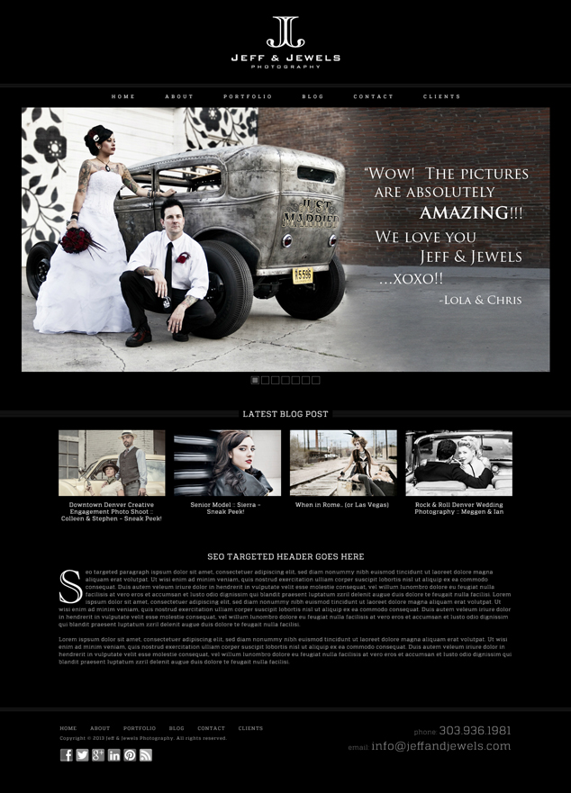
To wrap up the package, we designed a custom WordPress website home page layout. Here it is:

Learn more about our logo design services and don’t forget to check out our logo design portfolio.
Learn more about our Word Press design and web design services, and don’t forget to check out our web design portfolio.
Click here and like our facebook page to stay in touch and see all our latest work.
