Logo Clean-up/Upgrade for O’Fallon, IL Frozen Custard Shop
Gator’s Frozen Custard is moving to a new location and wanted to clean up their existing logo. Unfortunately, they didn’t have a vector version of the artwork. Based on the style and construction of the original, my guess is that it may have been painted by a high school or college student, or possibly an amateur artist.
That said, the logo definitely had a certain charm, so our first instinct wasn’t to completely reinvent it. Instead, we focused on preserving the personality of the original while correcting some of the problem areas—adjusting awkward proportions and angles, refining the line work, and converting the artwork into a clean vector format. This ensures the logo can now be scaled to any size, whether for signage, packaging, or other large-format applications.
In addition to refining the existing character, we also explored an alternative direction of our own—one that completely reimagined the mascot without being constrained by the style of the original alligator illustration. This is the direction they ultimately selected.
Original Gator (before & after)
![]()
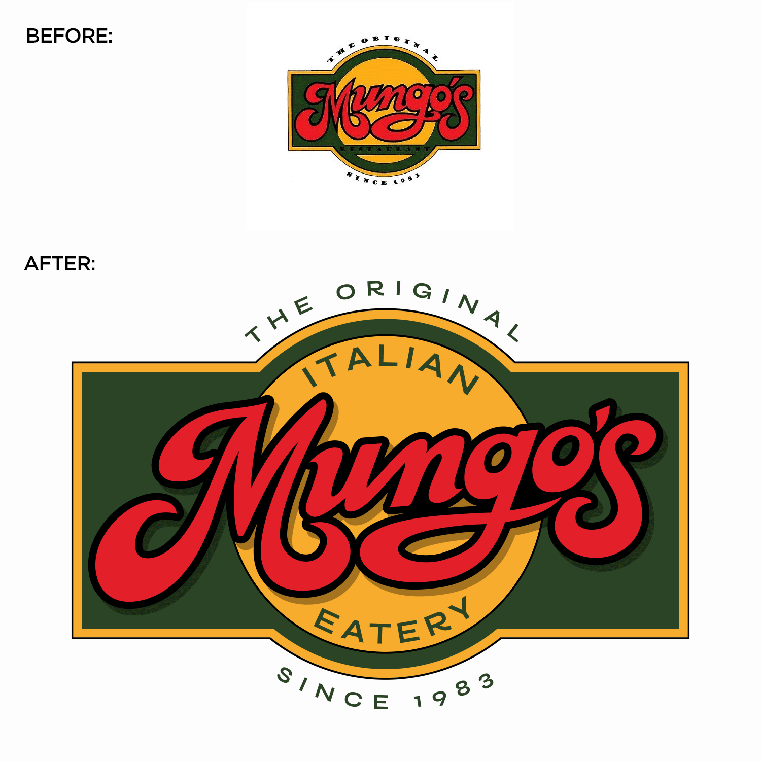
Original Logo Seal (before & after)
![]()
Original Horizontal Logo (before & after)
![]()
Updated Logo Lockups:
…and here is our proposed new logo – which they decided to go with!
![]()
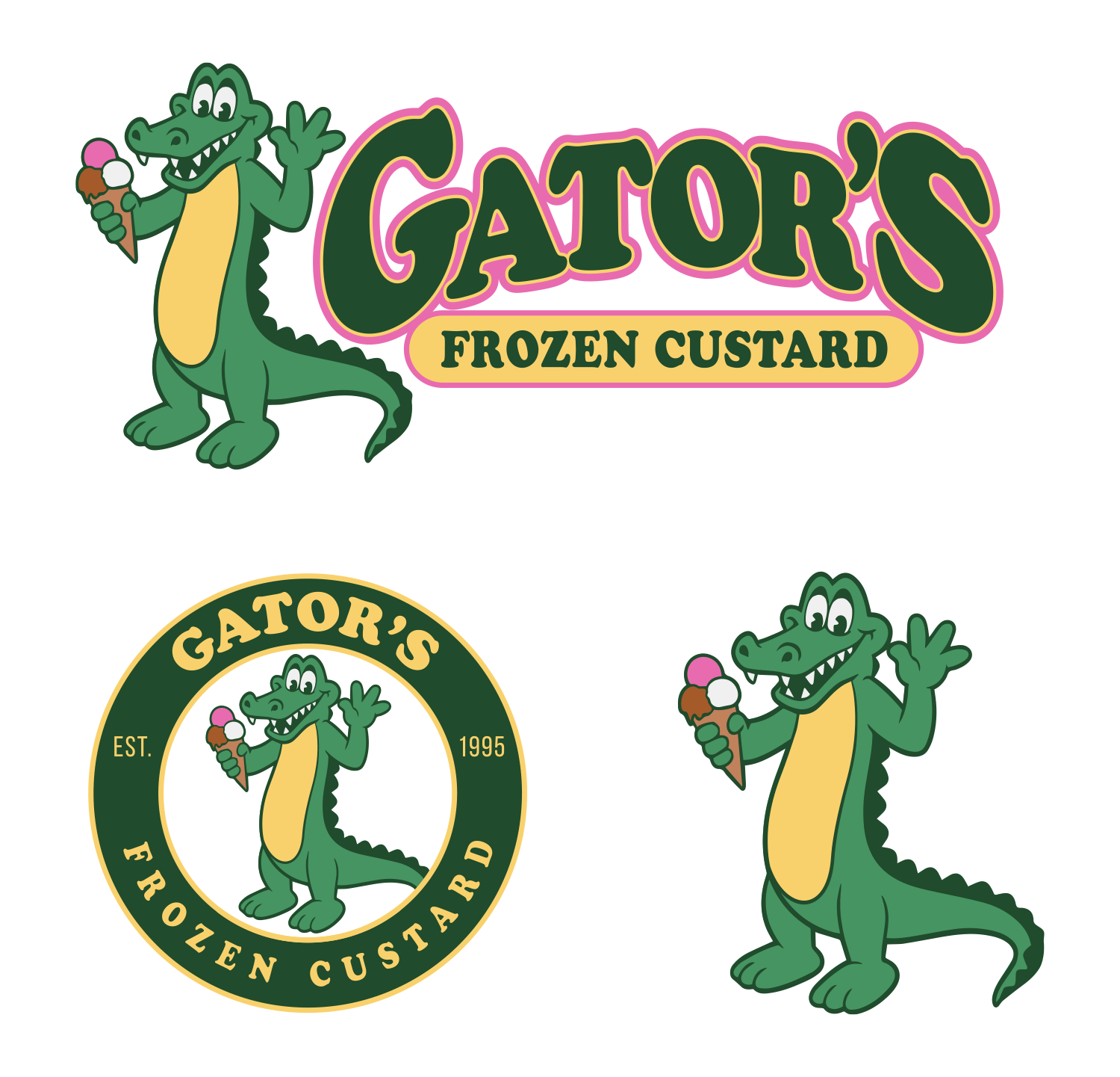
All the Final Logo Lockups:
![]()
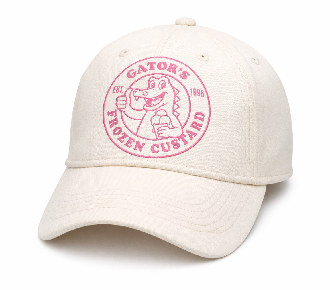
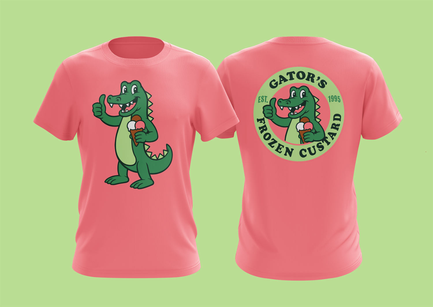
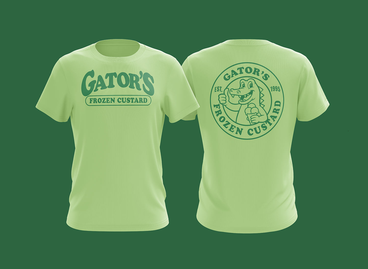
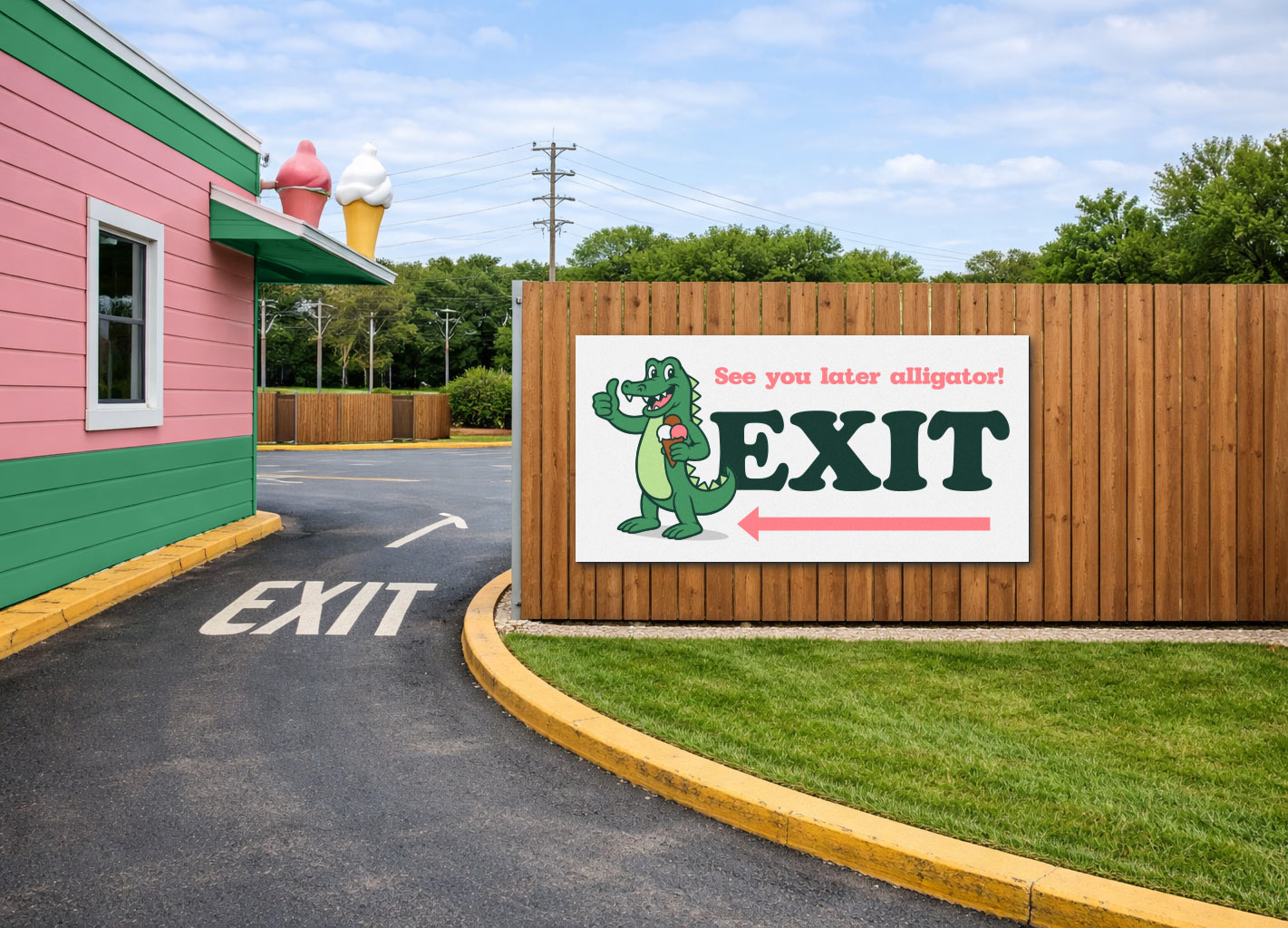
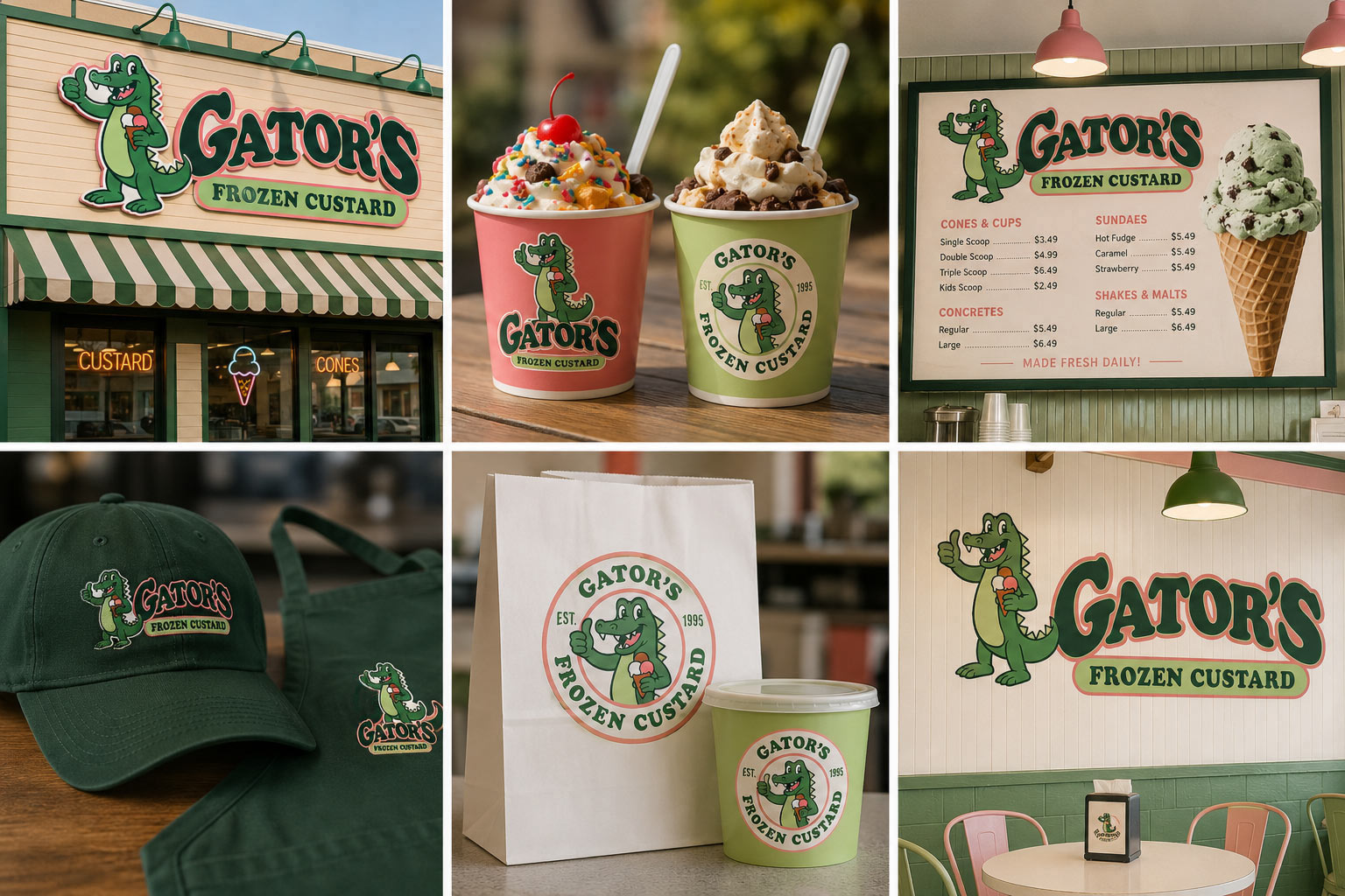
…and showing the possibilities with some mockups:
Ready to Refresh Your Logo?
If your logo feels outdated, isn’t scalable, or simply no longer reflects the quality of your business, it might be time for an upgrade. Whether you need a subtle refinement that preserves your brand’s equity or a complete redesign, Visual Lure can help transform your existing logo into a polished, professional brand asset. From vector cleanups and modern refinements to full rebrands, we specialize in creating logos that are built to perform across signage, print, merchandise, and digital platforms.
Let’s give your brand the professional eye-catcher it deserves. Contact Visual Lure today to discuss your logo update or full rebrand.