OUR BLOG

Here you will find our latest works, company news and more. We update it on a regular basis so be sure to come back soon. Please like, share, pin or tweet the post you enjoy.

Logos & Identity Design for Southern Illinois Agricultural Consulting Company & Insurance Agency

Posted on July 6, 2012

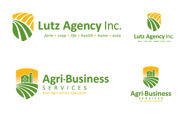
Visual Lure was recently contracted to design an identity package with two new logos, one for Lutz Agency, Inc., and the other for its sister company Agri-Business Services. The Lutz Agency is a full service insurance company that focuses on protecting farmers and agricultural entities, but also provides life, health, home and auto insurance to non-ag clientele. Since most of their clients are farmers, but not all, they wanted the new logo to reflect that, but in a subtle way as not to alienate their non-ag customers. Our solution was a crest/shield (representing protection) combined with fields on green and gold representing agriculture (the gold also represents sunlight).

As far as the new Agri-Business Services logo, they wanted it to be different, but complement the new Lutz logo, so we used the same colors, the same typeface, the same shield shape and slightly modified the field. To finish it off, we designed a simple custom farm illustration.
 

Lutz Agency & Agri-Business Services Logos

New Lutz Agency, Inc. & Agri-Business Services Logos
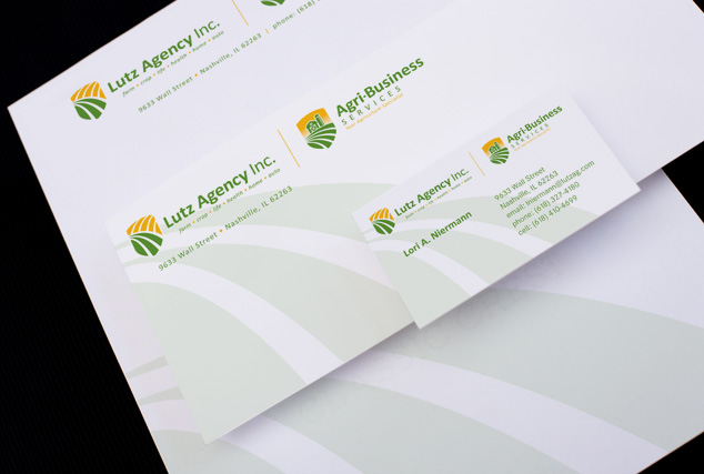
Lutz Agency & Agri-Business Services Identity Design
Lutz Agency & Agri-Business Services Identity Design

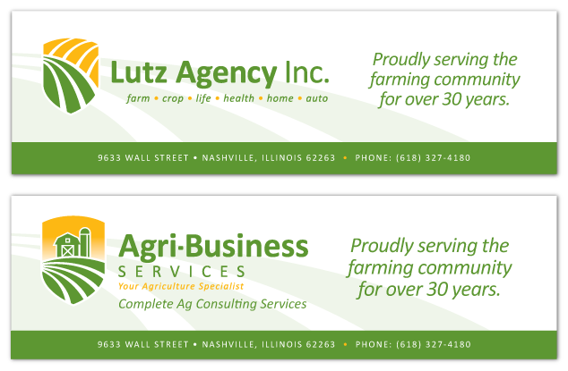
lutz & agri banner design

banner designs

Learn more about our logo design services and donโ€™t forget to check out our logo design portfolio.

Logo Design for a Sacramento, California Photographer & Videographer

Posted on April 20, 2012

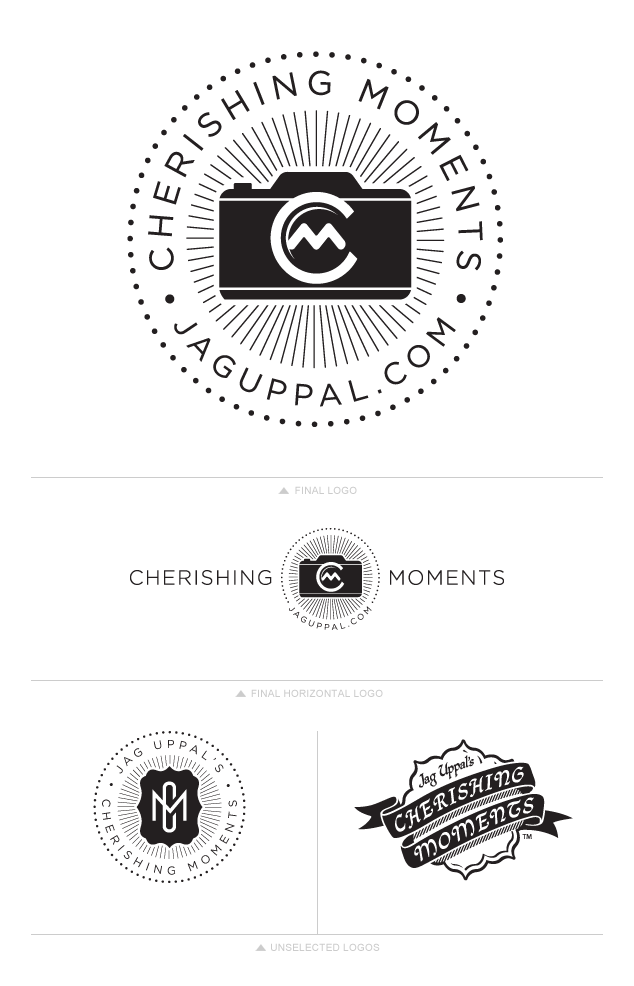
Visual Lure was recently contracted to design a new logo for Jag Uppal of Cherishing Moments, a Sacramento, California based photographer and videographer.ย  We initially started out with some typography based logos but Jag wanted something more original and unique. He also requested that we try to incorporate a camera into the new logo design, so we developed a couple camera logos but where unsatisfied with our initial solutions. In an attempt to gain a fresh perspective, we tried to go in another direction. Since Jag is of Indian decent, and the majority of his clientele is too, we did some research and found that the Lotus flower was the Indian symbol for beauty. Perfect we thought, capturing beautiful moments with beautiful imagery and tying in his heritage. Using this as inspiration we developed the bottom right logo below, a Lotus flower wrapped with a ribbon and an Indian inspired serif/script style typeface. We also explored a simple monogram crest/seal which Jag really liked but was still adamant about using a camera in the logo. By replacing the simple monogram crest with a monogrammed camera (the letter C creates the lens and the letter M a glare) we wrapped this baby up.

Learn more about our logo design services and donโ€™t forget to check out our logo design portfolio.