OUR BLOG

Here you will find our latest works, company news and more. We update it on a regular basis so be sure to come back soon. Please like, share, pin or tweet the post you enjoy.

Logo Design for Educational Website Focused on Exercise, Diet, Weight Loss & Health

Posted on June 2, 2011

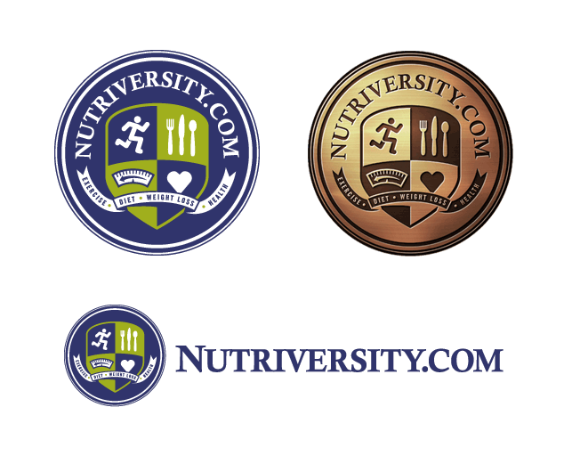
Visual Lure was recently contracted to design a logo for an online “Nutrition University” that educates users how to loss weight, the healthy way, based on exercise, diet and nutrition.ย  They wanted a logo that resembled a university seal or crest, so we replaced the book, flame and candle icons that you would typically see on a university crest, and replaced them with a person running (symbolizing exercise), eating utensils (symbolizing diet & nutrition),ย  a scale with an arrow moving backwards (symbolizing weight loss) and a heart (symbolizing good health).ย  Showcased below are the crest, the crest rendered to look like it was made out of copper and an optional horizontal format.

logo design for weight loss website

Logo Design for a St. Louis Logistics Company

Posted on March 16, 2011

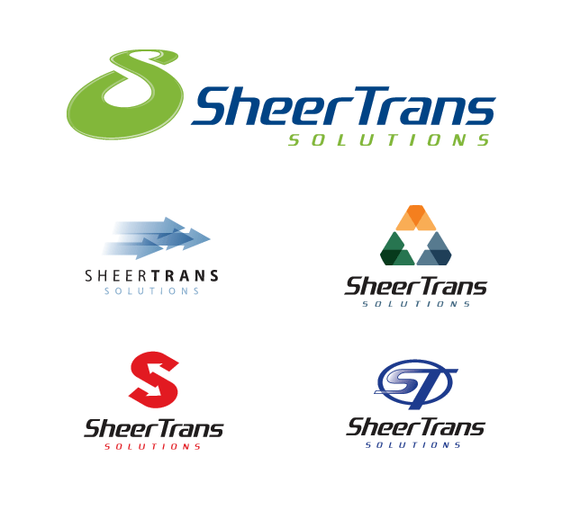
Visual Lure was recently contracted to design a logo for a St. Louis logistics company called SheerTrans Solutions.ย  The top logo (show below) is the final logo with a couple other unused logo design options (underneath it).ย  The final logo creates a path/road/track (which symbolizes logistics & transportation), an infinity symbol (which represents constant & continuing service) and the letter “S”.ย  We find that logos with multiple meanings make for strong, memorable marks (which is what a quality logo should be).

St. Louis logo design | logo design transportation / logistics

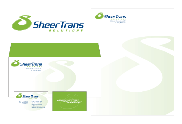
…and here is our proposed identity design:

identity design | business card design | letterhead design

Logo Design Upgrade for St. Louis Metro East Trucking, Construction & Excavating Company

Posted on February 4, 2011

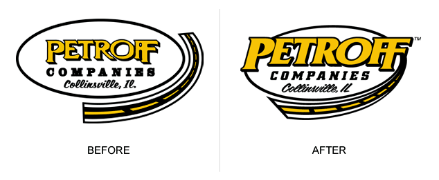
We run into logo design inconsistencies all the time.ย  Companies that have multiple versions of their logo, versions using different colors, different fonts, etc.ย  Sometimes the logo has been created by a designer, or recreated by a “shirt or sign guy”, lacking the skills and attention to detail needed to properly and professionally convert it.ย  This can lead to having a different logo on the company’s letterhead than they have on their trucks or even their business cards.ย  These inconsistencies can have a negative impact on your image and brand. Anyway, in the process of designing a new website, we recently updated, cleaned-up and modernized the logo below.ย  While staying true to the original logo, we strengthened it by bolding and enlarging the now cleaned-up font, we integrated the road so it doesn’t look like a separate design element, and we italicized it to add movement and motion. If you would like to upgrade your identity or logo give us a call at 618-407-9231 or email us at info@visuallure.com.ย  Learn more about our logo design services and check out our logo design portfolio.

Petroff Logo Design, Before and After

Petroff Logo Design, Before and After

Logo Design for St. Louis Metro East Excavating Company

Posted on January 14, 2011

Visual Lure was just contracted for a logo design and a website design for an O’Fallon, IL based excavating and landscaping company.ย  The company, Level It Excavating, specializes in sports fields, drainage, landscaping and all other excavating services.ย  Here are our initial logo design options.ย  We will post the final logo when it is complete.


initial logo design options for Level It Excavating

Getting closer with a couple more logo design options:

logo design Level It Excavating

couple more logo design options

…and the final logo design:

Level It excavating logo design

final logo design

Learn more about our logo design services…