OUR BLOG

Here you will find our latest works, company news and more. We update it on a regular basis so be sure to come back soon. Please like, share, pin or tweet the post you enjoy.

Logo, Identity & Website for a St. Louis Metro East Railroad Company

Posted on March 15, 2018

The Prairie Line is a St. Louis Metro East/Southern Illinois railroad, transportation and logistics company. Lead by a team of highly experienced partners, The Prairie Line prides itself on providing personalized service that often gets lost in the rail industry. Additionally, their ability to cut through red tape and deliver quick decisions (along with their cargo) sets this company apart.

Below you will find everything from the initial logo design options to their newly painted locomotives and custom WordPress website, all which Visual Lure designed.

The Logo:

The top left logo option uses a single line to make two “i”s tying the two word marks together, the top right option (which ended up being the final logo) plays off a line dividing the “P”, the bottom left logo features prairie grasses that make negative space in the type, and the last logo is a P created with a single line that also mimics railroad tracks. Below the options are the final logo lockups.


TPL logo options & final logo

Color Palette, Typefaces & Paint Scheme:

We selected a color palette inspired by colors of prairie grasses with clean, easy to read typefaces making sure signage and locomotive numbers are readable from a distance. The paint scheme was inspired by the curve in the logo and the placement gives the locomotives a sense of motion.


TPL color palette & typefaces TPL business cardsTPL locomotive paint schemeTPL painted locomotive


Custom WordPress Website:

We wrapped up this branding project with a fully custom, responsive designed WordPress website. The site features a sticky header and menu bar for convenient navigation, a couple custom sliders for the “what makes us different” and the “leadership” sections, and an auto-populated news feed that is fed from the fully integrated blog.

TPL website design 2 TPL website design

CLICK HERE to view more of our branding projects ยป or CONTACT US today to learn more about any of our branding and design service!


Logo for EverTinder, a Fire Starting Kit

Posted on February 27, 2018

Visual Lure recently completed a new logo for EverTinder, a fire starting kit that easily makes fire without a lighter, match or any combustible materials (It can even be taken on a plane as none of the materials are banned). Once the initial fire is started, it then creates the char needed to make the next fire in an endless cycle. Therefor it makes infinite fire, hence the dual-meaning tagline “Fire for Life”.

We prefer to do our creative briefs for logos in a conversation as you never know where it will lead. It also tends to be more fun and free flowing than filling out some type of brief questioner.

During our initial meeting, Chris – the owner of EverTinder, demonstrated the product outside our office and I was blown away. I remember as a kid trying to start a fire with one of those Boy Scout fire kits with flint and steel or a couple of sticks. It’s almost impossible. Chris opened his little kit, placed some charcoal looking material in a stainless steel cup with a little steel net. Using a flint and stone he shot one tiny spark into the charcoal material and it instantly created a tiny ember. He then blew on it a couple times and the little ember started to grow. He placed some wood shaving on top of that and in less than a minute or two he had made a fire. We were impressed at how easy it was.


Process EverTinder Uses to Make Fire

EverTinder fire starting process

During our creative brief, Chris mentioned that he wanted the logo to have some type of icon or mark that possibly used circling arrows or the recycle symbol. Even though the product is universal, he wanted it to have a more masculine or “outdoorsy” feel. Lastly he wanted to use a yellow and black color palette.


Getting Started

The first thing we do with any new logo project is write down any words that come to mind when thinking of the product or company. For EverTinder our list included: fire, flame, wood, logs, outdoors, survival, endless, infinite, arrows, recycle, ash, and charcoal. We then brainstormed for ideals on how we can tie at least two of these together in some type of clever way, as we find witty logos tend to be memorable, an extremely import feature you want a logo to have.

From there we ALWAYS start with sketches. We never jump right into the computer as we feel the concept is just as important as the art itself.


Our Initial Sketches

Initially all our sketches were playing with fire and flames. Our first idea that we though had potential was having the logs of the fire be an infinity symbol to represent the endless supply of fires. Our last BIG idea, which we LOVED, was to incorporate a Phoenix. The fire bird that raises from the ashes, almost exactly what this product does (it creates fire from the ashes it makes). As we always try to create logos with a dual meaning or a clever concept, we had the wings of the Phoenix also create the letter “E” for EverTinder.

EverTinder logo sketches


Initial Designs

Here are our initial logo options we presented to the client:

EverTinder initial logo concepts


The Final Logo

After receiving feedback from the client, he wanted the logotype to be in a stencil format so that the entire logo could be cut out of steel. He also changed his mind on the color palette once he saw some additional options. After a couple minor rounds of revisions to the one he liked best, here is the final logo. We also created a couple secondary marks.

EverTinder final logos

…and here are renderings of it engraved and cut out of metal:

EverTinder stainless steel logo

…along with a couple sample mock ups to show how the logo could be implemented:

EverTinder business cards 1 EverTinder business cards 2

Want to see more of our logo design work? Click here to view our logo design portfolio, or click here to view some of our branding projects.


New WordPress Website for Brewster Companies

Posted on November 30, 2017

Visual Lure recently designed and developed a new custom WordPress website for Brewster Companies. Brewster is a family owned and operated excavating company based out of Maryville, Illinois that specializes in land clearing, structural and bridge demolition, site preparation and erosion control. As a Disadvantaged Business Enterprise, Brewster have earned a solid reputation for safety, high standards and delivering projects on time and in budget. They work with private owners, state agencies as well as local municipalities. Their client list includes: IDOT, MODOT, Ameren, Waste Management, Alcoa and more.

Brewster's new WordPress website

The new website was built in WordPress using a custom coded,ย responsive designed/mobile friendly theme. It features a clean, simple layout, multi-column layout options, and simple to maintain slideshows.


Photography

In addition to designing and developing the new website, Visual Lure also provided photography services – shooting multiple Brewster work sites. Below are a couple of our favorite images from those shoots.

Brewster St. Louis PhotographyBrewster St. Louis Photography 2

Visit Brewster Website ยป


Learn more about Visual Lure’s WEB DESIGN SERVICES, WORDPRESS DEVELOPMENT SERVICES, or view our WEBSITE PORTFOLIO.


New Website, Catalog & Print Ads for a Colorado Cattle Tag Company

Posted on September 28, 2017

Ritchey Livestock ID, based out ofย a Brighton, Colorado, is the creator and manufacture of the World’s greatest cattle tags! What makes theirs the best? Ritchey tags are 100% fade proof. How? Their tags have a core color with 2 outside colors. The colors are NOT layers, they can not peel apart or separate because they are made out of one solid piece of material. When engraved, or heat stamped, the core color is revealed – therefor the tag number, brand, or whatever information that has been applied never wear offs.

Visual Lure was recently contracted by Ritchey to redesign their e-commerce website. We were in charge of the design, while another company handled the development. The new responsive designed website was built in WordPress using WooCommerce for the online store. Immediately after completing the design of the website, Ritchey re-engaged us to design a new product catalog along with multiple print ads. See samples below:


WordPress/WooCommerce Website Redesign

Ritchey Responsive website design

Like so many other websites, their old site was not mobile friendly, and with Google’s new mobile first indexing and over 1/2 of all web browsing done on smart phones – this was an issue. The new site, now utilizing a responsive design, renders beautifully on all devices.

New Sample Product Website Page

The new e-commerce store, powered by WooCommerce, has been simplified and streamlined to help improve conversion rates. We also implemented conditional logic on many of the product order forms to make the checkout process fell less daunting.


Old Homepage Design:

Old Ritchey Website design

The old website, which looked like a generic template, had tons of issues. It was not responsive, the checkout process was confusing and not user-friendly, and the design was void of all character.


New Homepage Design:

New Ritchey Website Design

The new design now has a rustic aesthetic using weathered wood, old paper, leather and cow hide textures along with cattle photos to appeal more to ranchers, their core target market. In additional to the website, Visual Lure also digitally recreated all their cattle tags to ensure correct colors and product consistency.


Catalog Print Design

Immediately after completing the design of the website, Ritchey hired us to redesign their product catalog. Other than the website, this is their main marketing tool, and like the old site – it too lacked character. Here is the cover and a sample spread from their old catalog:

Old Ritchey Product Catalog

Building a Visually Cohesive Brand

Using the same rustic wood background, old paper and leather textures from the new website, the catalog now complements it, and becomes the first step in the development of creating a visually cohesive brand. Below you can see the new cover, a new ad for their Hook Doctor product, and a couple sample spreads (along with some of the new digitally rendered cattle tags).

New Ritchey Catalog Design


Print Ads

Lastly, Ritchey engaged us to design some of their print ads. Here is the first one we designed announcing the release of their new pink tags:

Ritchey Pink Tag Print Ad

Ad Redesign (Before)

Ritchey Bw Ad1


Ad Redesign (After)

Ritchey Bw Ad 2

Whether you need help with a new e-commerce website, print/graphic design, or assistance with creating a visually cohesive brand – contact Visual Lure today for a FREE quote.


Commemorative Magazine Design for Blackburn College

Posted on September 19, 2017

Visual Lure was recently contracted by Blackburn College to design a commemorative magazine to celebrate a highly successful fundraising campaign. Blackburn College, located in Carlinville, IL, was founded in 1837 and is affiliated with the United States Presbyterian Church. It provides a coeducational student body with a rigorous, distinctive, and affordable liberal arts education that prepares graduates to be responsible, productive citizens.

The magazine features a clean, corporate, institutional design with a financial summary, infographics about the campaign, large images with ample white space, and inspiring staff & alumni quotes spread throughout the magazine. Check out some of the main pages and spreads below.

Blackburn Commemorative Magazine Design


Our Graphic Design Services

Click here to learn more about our graphic design services, or here to view our graphic design portfolio. Please feel free to contact us with any questions about our design services or to receive a FREE quote.


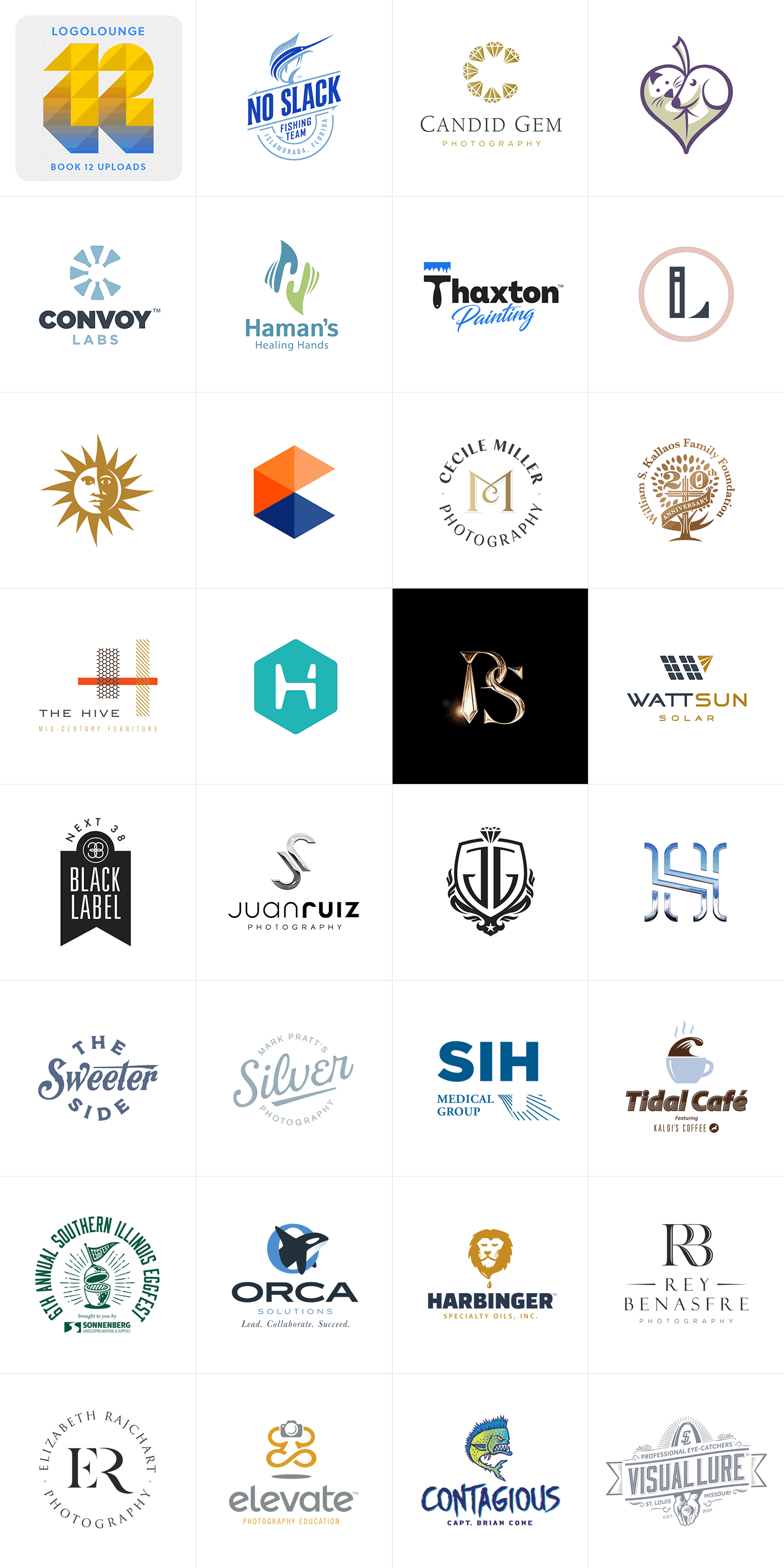
Visual Lure Awarded with 12 Logos in LogoLounge 10

Posted on June 13, 2017

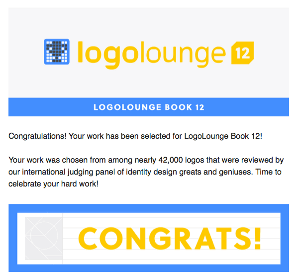
Logo Lounge 10 awards announcement graphic

When we see an email in our inbox from LogoLounge with a subject line that reads “Congratulations from LogoLounge, Your Work Selected!” we get happy. Real happy!

It means that our hard work has paid off, and that some of the greatest logo designers in the World think our logos are some of the best made on planet Earth. This year, there were over 40,000 logos submitted and reviewed by an international judging panel of design superstars, including Andreas Karl, Aaron Draplin, Von Glitschka, Alex Tass, Chad Michael, Yo Santosa, Emily Oberman, Su Mathews Hale, Felix Sockwell and Alex Trochut.

We are both honored and humbled that designer of this caliber have selected our work for LogoLounge 10. This will be the 7th LogoLounge book that our work is featured in, with a total of 31 logos to date. It also beats our previous record of 8 logos in one book – with 12 this time around.


Here are our award-winning logos selected:

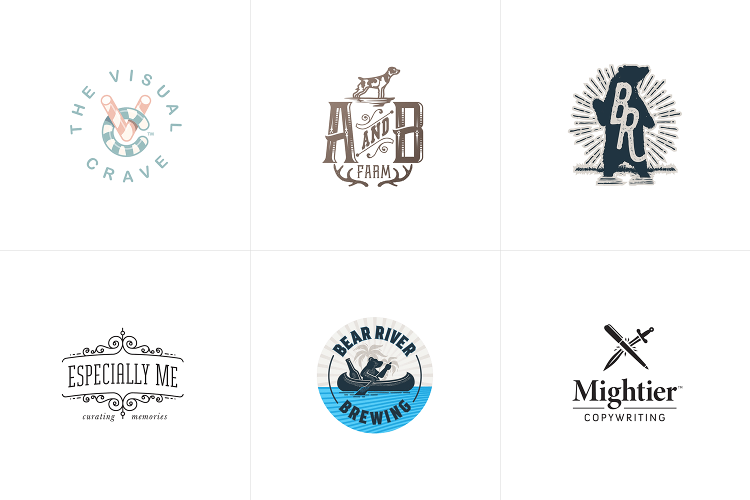
St. Louis award winning logos in LogoLounge 10

Brief descriptions of the chosen logos:

from left to right, top to bottom…

1. All Stars Tree Solutions: this was one of our proposed logos that was not selected by our client. It features a shield/crest with a star tree surrounded by four leaves that represent the seasons, and roots that represent strength and experience.

2. Midwest Mulch & Compost: this was an unselected logo that features two trees and two piles of mulch (in the negative space) that also form a subtle letter M. The final logo is very similar with two trees hidden in the negative spaces of the M.

3. Jeff Allen Photography: this too was an unselected logo. It features a timeless merged JA monogram.

4. Unposed Photography: this was a runner-up logo that almost made it. It was designed for a Galena, IL commercial and wedding photography studio.

5. Hannah Marie Photography: logo options for a well-known Canadian photographer featuring a monogram with a diamond motif border.

6. Studio O Photography: this was a logo that got buried after we decided to change the name of the studio. It features a merged monogram that is both the letter S and O.

7. Like Home: unselected logo option for a St. Louis, MO based French pastry shop.

8. Hopkins Craft Whiskey: this was our favorite logo design option for a St. Louis, MO craft whiskey distiller. They went with a different logo.

9. Salt 911: another logo that underwent a name change after the first round of logos. It features a shield/crest with eagle, stars and leaves mimicking a police badge.

10. Giochi Board Game Cafรฉ: what better way to represent a board game cafรฉ than with a chess piece drinking a cup of coffee. This was an unselected logo, however the final logo uses the same exact concept, just rendered using a different design style.

11. Lee Stark Photography: Here’s a logo that was actually selected by our client. Lee is an outdoor photographer who specialized in rustic landscape photography. The logo was hand-drawn with a sharpie, scanned into the computer, and converted into vector artwork.

12. Pam Baumann Photography: Pam is a photographer from Limerick, Pennsylvania. She wanted an “earthy/rustic” logo so we designed her a camera shutter made out of colorful earth-tone leaves.


Final Logo Comparisons

A couple people on social media thought it was odd that so many of our logos selected for the book where not selected by our clients. So we decided to show the actual final logos that were chosen just for comparison. Here they are in the same order as above:

Our client's final logo selections

About LogoLounge

LogoLounge is without a double the greatest series of logo design publications in the World. Designers, both new and established, submit their work annually and a panel of world-class judges select the cream of the crop.

LogoLounge is also know for releasing their annual logo trends report which showcases the latest design aesthetics and styles of the year. Learn more at LogoLounge.com or find there books at any fine book store.

The LogoLounge Website Features:

  • Over 250,000 searchable logos
  • Fresh inspiration and ideas, with new logos uploaded daily
  • Network of designers, including leaders and legends in the industry
  • Logo design news and articles

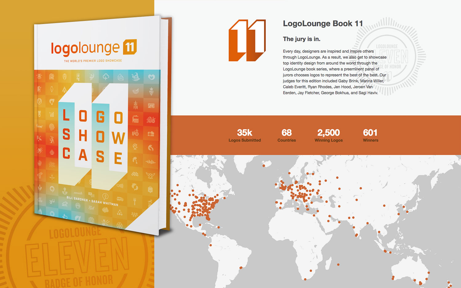
LogoLounge10 Cover Design


Want to see more of our logo design work? Click here to view our logo design portfolio, or click here to view some of our branding packages.


New Custom WordPress Website for Ideal Landscape Group

Posted on April 5, 2017

ideal landscape group WordPress website design

Ideal Landscape Group recently contracted Visual Lure to help improve their online presence by redesigning their website. Ideal is a premier St. Louis commercial landscaping company that specializes in commercial groundskeeping, construction, irrigation, snow & ice removal and playground installation. In addition to design and development of the new site, Visual Lure coordinated the copywriting and photography through our strategic partnerships. Cindy Sorgea wrote the copy and Matt Marcinkowski captured the imagery.

The new custom WordPress website features:

  • Sticky navigation (main sidebar and secondary navbar on template pages) for convenient navigation
  • A custom Core Services section with navigation
  • Custom developed section/WordPress post types for the projects gallery that makes it easy to add, edit, organize and remove featured projects
  • Slider style photo galleries that use WordPress’ native gallery for easy maintenance with a stacked image transition on mobile
  • A seamlessly integrated blog with featured image and excerpt landing page
  • Added column structures to expand layout options
  • Search engine optimized for St. Louis commercial landscaping and all their core services

Old Homepage Design:

old Ideal Landscape homepage design

The old website (home page shown above) was extremely dated; at least 8 years old. It was not mobile friendly or responsive, therefor providing a bad user experience on mobile devices. It had a strange layout, all types of spacing issues and dated photography. Over the years, and especially since Google’s “Mobilegeddon”, the site had seen a steady decrease in traffic and drop in organic rankings.


New Homepage Design:

new Ideal Landscape homepage design

The new home page design is now better organized with a much improved flow. The side navigation bar is sticky, staying in place while the user scrolls. This makes it easy to navigate the site, no matter where you are on the page. There is a custom Core Services section (slideshow) showcasing a featured image, intro copy and learn more buttons to drive users to those landing pages. Below that is an Affiliations section that uses a simple WordPress image widget to add, edit, remove or reorganize the affiliate logos.


Website Photography

We had the pleasure of working with Matt Marcinkowski for the new site photography. We art directed a couple of shots, but it was mostly just Matt doing his thing. With some of the locations providing limited photo opportunities, Matt really turned nothing into something great. Below are some samples of the new photography.

ideal landscaping photography 1ideal landscaping photography 2ideal landscaping photography 3ideal landscaping photography 4

The Results + Organic Search Rankings

Since the new site has been indexed by Google, the (now properly search engine optimized) website has skyrocketed into top positions on the first page of Google for almost all of their core targeted search terms. Currently the website is ranking #1 on the first page of Google for “st louis commercial landscaping”, “st louis commercial landcare”, st louis commercial groundkeeping”, “st louis commercial landscape construction” along with most variations of those search terms. This has led to a solid stream of high value leads for Ideal and they are currently bidding on a handful of projects (leads acquired through the new site) that would pay for the new website 10 times over.


Visit Ideal Landscape ยป

Click here to learn more about our website design and development services ยป