New WordPress Website for St. Louis Area Car Audio Company
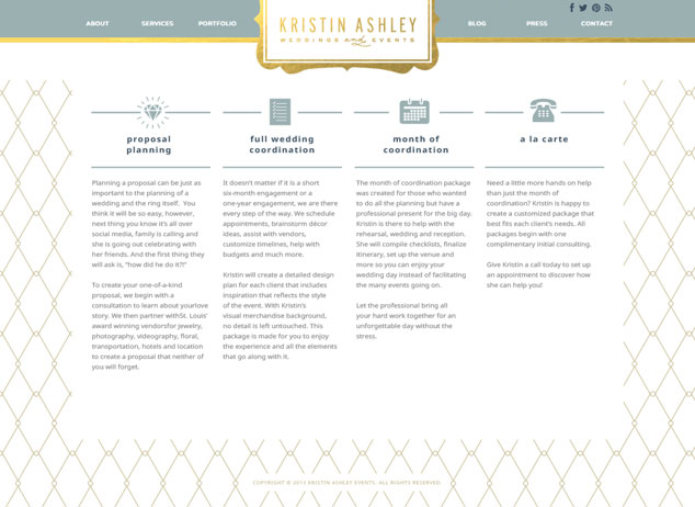
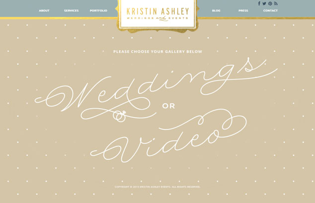
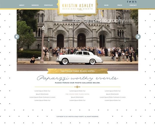
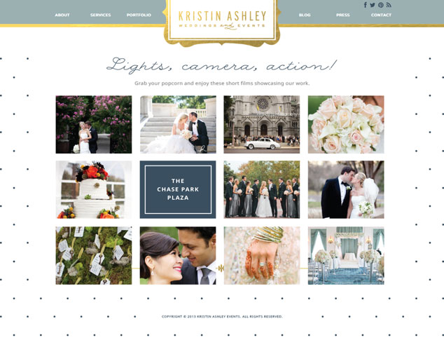
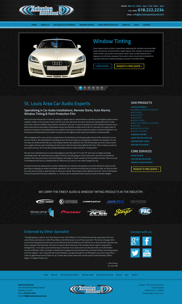
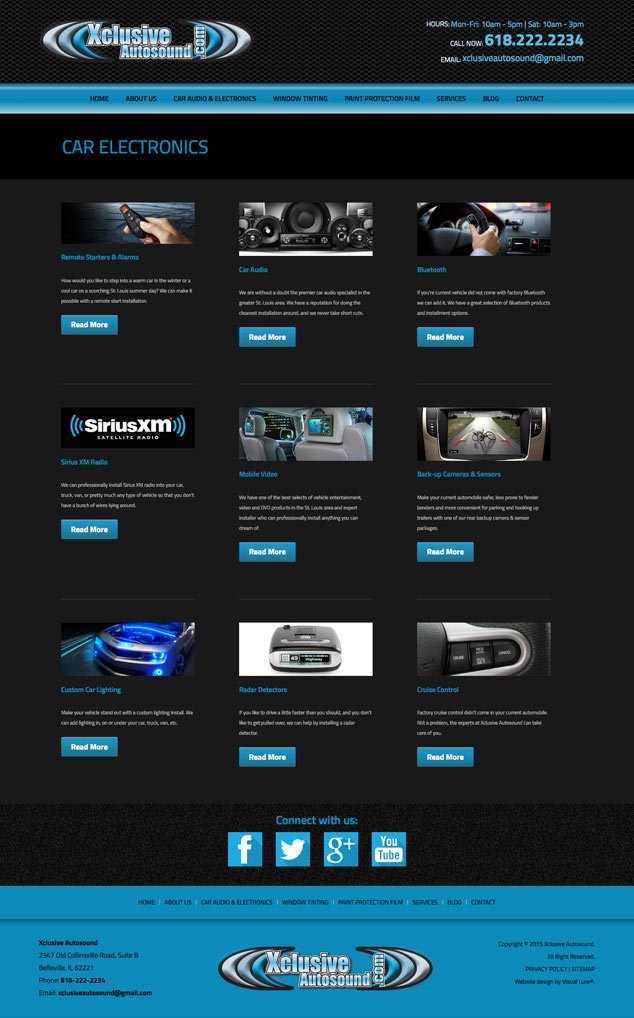
Xclusive Autosound originally came to Visual Lure to search engine optimize their existing website, but after a review of the site, we found that the WordPress theme they were using was part of the problem. Even though it was responsive, it was slow, scoring in the low 60’s in sections of Google Webmaster Tool’s PageSpeed Insights. Xclusive was also having problems with plugin conflicts and missing image files. Simply put, the website was not ranking well, they were tired of all the headaches it was causing them, and they just wanted it done right. To remedy all these issues we helped Xclusive Autosound design, develop and launch a new custom, fast-loading, search engine optimized, responsive WordPress website. Below you can see the new home page design and the car audio & electronics landing page. Please visit xclusiveautosound.com to view the new site.
Xclusive Autosound is a Belleville, IL custom car audio shop that specializes in the installation of car electronics, automobile, commercial & residential window tinting and automotive paint protection film. Their car electronic products include remote starters, backup camera & sensors, mobile video & DVD players, Sirius XM radios, bluetooth and all types of custom car audio equipment.
Even though St. Louis is an entire river away from Belleville, a large portion of their clients make “that arduous trip” due to Xclusive’s reputation (it is actually only 17 miles from downtown St. Louis, MO to Belleville, IL). Their reputation was built by the consistent quality of their work, never taking shortcuts with any of their installs and their eye for detail. This is important because how some of these product are installed and integrated into your automobile are sometimes more important than the products themselves.
Are you having problems with your existing website?
If you’re having problems with your existing website, don’t try to fix them with another sub-par site. Contact Visual Lure today at 618.407.9231 or info@visuallure.com and we can discuss how we can help you build a solid online presence.