OUR BLOG

Here you will find our latest works, company news and more. We update it on a regular basis so be sure to come back soon. Please like, share, pin or tweet the post you enjoy.

One More Visual Lure Logo Selected to be Published in Logo Lounge 7 Book

Posted on September 29, 2011

We just received news that one more Visual Lure logo will be published in Logo Lounge 7.ย  That means three of our logos have been selected for book 7 for a grand total of nine Visual Lure logos published in the Logo Lounge series.ย  The latest logo selected is our good friend Salvatore Cincotta’s Films logo.ย  It features a strip of movie film that creates the letter “S”.

Sal is an extremely talented photographer, filmmaker, writer and educator based out of the St. Louis area. Check out Sal’s work at www.salcincotta.com.
 

Salvatore Cincotta Films Logo design in Logo Lounge 7

Salvatore Cincotta Films Logo design | Logo Lounge 7


Learn more about our logo design services and don’t forget to check out our logo design portfolio.

Two Visual Lure Logo Designs to be Published in Logo Lounge 7 Book

Posted on September 7, 2011

We are proud to announce that two of our logo designs have been selected to be published in Logo Lounge 7.ย  The prestigious Logo Lounge book series showcase the best logos designed throughout the World and it is a huge honor being selected once again.ย  This will be our 7th and 8th logo, and 4th Logo Lounge book we will be featured in.ย  The two logos selected are our Weddings by Salvatore logo, designed for a St. Louis, MO wedding planning company, which features a formal crest made out of a diamond ring, roses/flowers, champagne glasses, a monogrammed shield and a wedding cake.ย  The other logo selected was our King Chemical logo, which features a crown (representing King) created from a splash of liquid (representing chemical).

Visual Lure's Logo Lounge 7 logo designs

Visual Lure's Logo Lounge 7 logo designs

Learn more about our logo design services and don’t forget to check out our logo design portfolio.
Logo Design for St. Louis Metro East Real Estate Listing Service

Posted on August 17, 2011

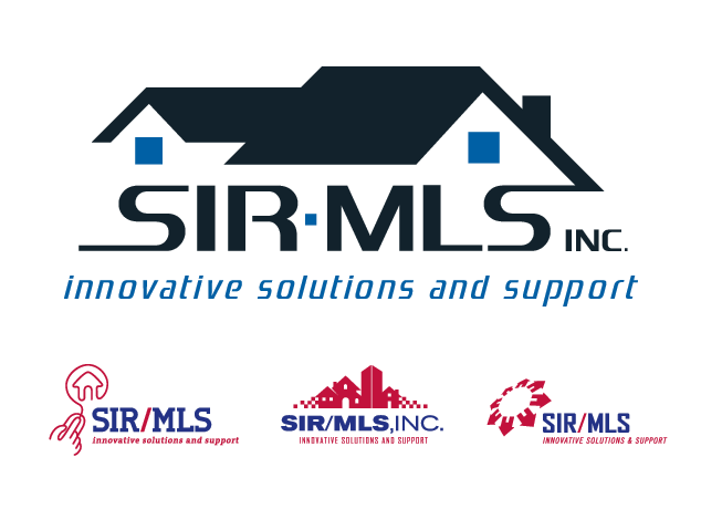
Visual Lure recently completed a new logo for the Southwestern Illinois Regional Multiple Listing Service, most commonly referred to as the SIR-MLS.ย  They requested that their new logo have an icon that reflected data delivery and real estate, with a focus on residential properties.ย  The chosen logo design (shown below) on top depicts homes which represent residential real estate and the “wire looking” typography which represents “data delivery”. Below the chosen logo design are a couple logo design options that we not selected.

SIR/MLS Real Estate Logo Design

chosen logo design on top with logo options below

Logo Design for St. Louis Based Commercial Appliance & Equipment Distributor

Posted on July 18, 2011

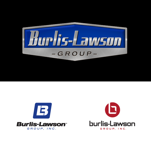
Visual Lure was recently contracted to design a logo for Burlis-Lawson, a St. Louis based commercial appliance & equipment distributor with offices in St. Louis, Kansas City, Omahaย and Des Moines, serving Missouri, Kansas, Iowa, Southern Illinois and Nebraska.ย  Below are a couple of our favorite logo design options. The top logo is our favorite, which features a custom font face and some added Photoshop effects. The two logos below that, play off the B and L initials of Burlis-Lawson.ย  Check back soon to see which logo design our client chooses.

st. louis logo design

proposed logo design options

Logo Design for St. Louis Based Railroad Company

Posted on July 12, 2011

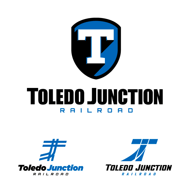
Visual Lure was recently contracted to design a logo for Toledo Junction Railroad, a St. Louis, MO based company.ย  Below are a couple of our proposed logo design options.ย  The top logo is a simple slab-serif T placed on a shield with a hard cast shadow and a slight bevel to give it some additional depth.ย  If feels industrial, strong and reliable which we feel is perfect for a railroad company.ย  The other two logos represent railway junctions, both creating the letters T and J, for Toledo and Junction.

Check back soon to see which logo our client chooses.

St. Louis logo design for railroad company

proposed logo design options

Logo Design for Educational Website Focused on Exercise, Diet, Weight Loss & Health

Posted on June 2, 2011

Visual Lure was recently contracted to design a logo for an online “Nutrition University” that educates users how to loss weight, the healthy way, based on exercise, diet and nutrition.ย  They wanted a logo that resembled a university seal or crest, so we replaced the book, flame and candle icons that you would typically see on a university crest, and replaced them with a person running (symbolizing exercise), eating utensils (symbolizing diet & nutrition),ย  a scale with an arrow moving backwards (symbolizing weight loss) and a heart (symbolizing good health).ย  Showcased below are the crest, the crest rendered to look like it was made out of copper and an optional horizontal format.

logo design for weight loss website