OUR BLOG

Here you will find our latest works, company news and more. We update it on a regular basis so be sure to come back soon. Please like, share, pin or tweet the post you enjoy.

Logo Design for St. Louis Metro East Real Estate Listing Service

Posted on August 17, 2011

Visual Lure recently completed a new logo for the Southwestern Illinois Regional Multiple Listing Service, most commonly referred to as the SIR-MLS.ย  They requested that their new logo have an icon that reflected data delivery and real estate, with a focus on residential properties.ย  The chosen logo design (shown below) on top depicts homes which represent residential real estate and the “wire looking” typography which represents “data delivery”. Below the chosen logo design are a couple logo design options that we not selected.
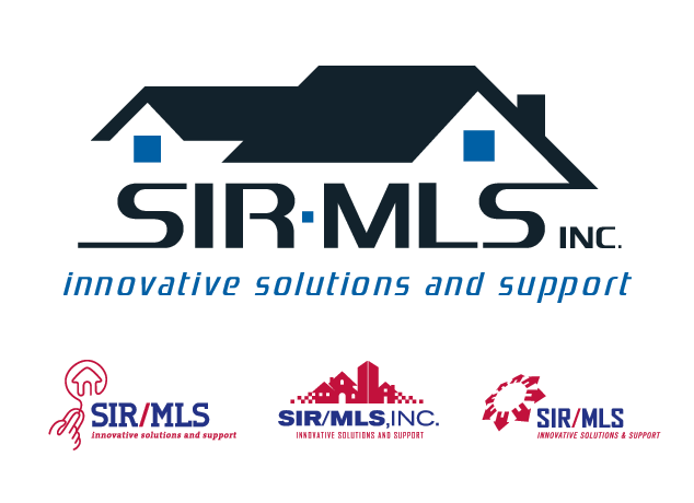
SIR/MLS Real Estate Logo Design

chosen logo design on top with logo options below

Logo Design for St. Louis Based Railroad Company

Posted on July 12, 2011

Visual Lure was recently contracted to design a logo for Toledo Junction Railroad, a St. Louis, MO based company.ย  Below are a couple of our proposed logo design options.ย  The top logo is a simple slab-serif T placed on a shield with a hard cast shadow and a slight bevel to give it some additional depth.ย  If feels industrial, strong and reliable which we feel is perfect for a railroad company.ย  The other two logos represent railway junctions, both creating the letters T and J, for Toledo and Junction.

Check back soon to see which logo our client chooses.

St. Louis logo design for railroad company

proposed logo design options